AIGA V01CE CD
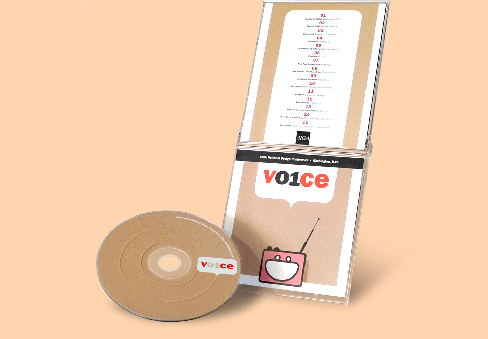
My friends at AdamsMorioka were in charge of branding the AIGA National Design Conference in Washington, D.C. back in 2001. They came up with the main elements—such as the conference logo and the speech bubble which in it lived—and then asked design firms all around the country to create individual objects based on their style guide. They asked me to design the conference soundtrack CD.
As always, there was hardly any time. It’s entirely possible that I wasn’t their first choice, and if so, that’s fine by me. I’m always happy to come to the rescue. Either way, I was delighted to be able to show off for all the big name designers who were speaking at the conference.
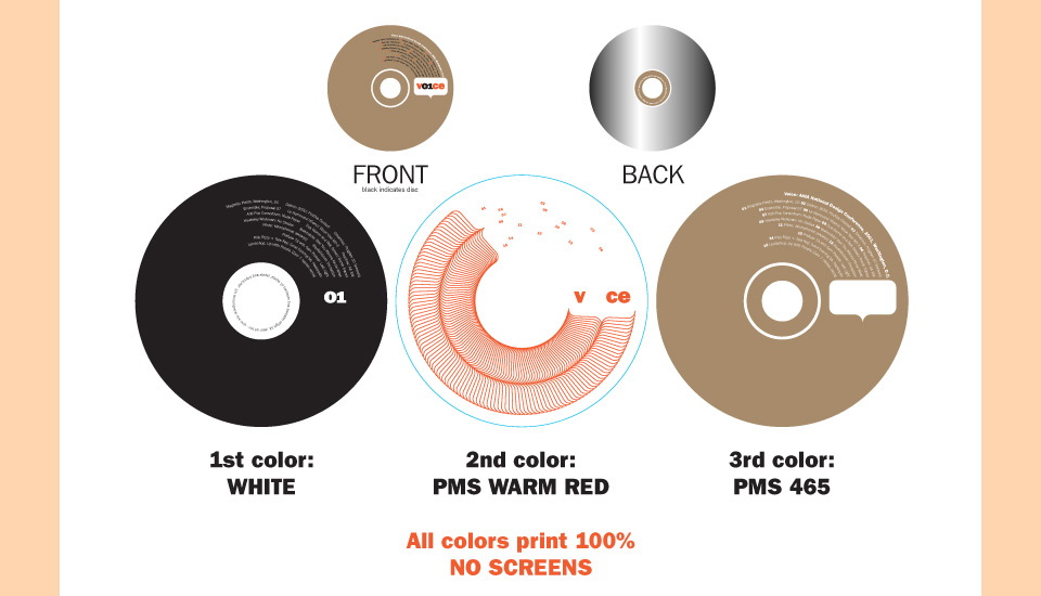
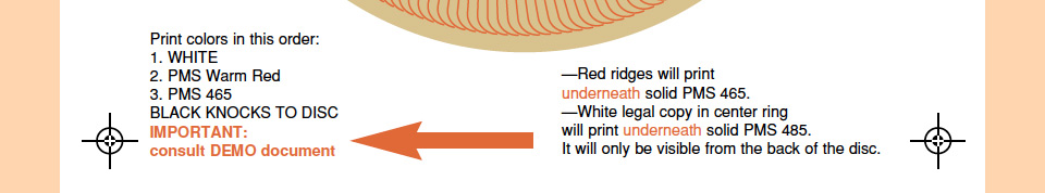
To that end, I wanted to put together a few nifty tricks I had learned working with my record label clients. I paid particular attention to the disc itself. On Solar Twins I’d hit on the idea of silkscreening solid white ink over a white line art design to get a subtle textured effect for the CD label. For the V01CE disc I did a circular step-and-repeat of the AdamsMorioka speech bubble as a red hairline design under the beige donut—a solid field of ink printed on a CD label—to create sort of a circular Klingon forehead effect.
Next, I picked up the hidden legal copy I’d used on the Whitney Houston CD. The trick is to invert the legal copy, print it on the clear plastic center ring of the disc, and then cover it up with a second ink, so that it’s only visible from the back. Very clever. Very satisfying to designer and recipient alike.
I knew that this sort of thing isn’t standard and raises alarms at the printing plant, so I prepared a detailed demo document that accompanied the files. When you’re working with new vendors it’s always good to make extra sure all your files are flawless and your instructions are clear, particularly if things are happening out of town and on a tight deadline. Here is the PDF I sent along:
Could I have been any clearer?
All in all, I wasn’t too worried. I had set everything up very precisely, I’d left instructions. And let’s not forget that this was a job for AIGA National. Presumably, everybody was taking extra care to make sure everything would be done right for an audience of the pickiest people on the planet. At the prepress stage everything was still fine. As you can see, my instructions had been carefully transcribed to the proof:
Again, pretty clear, right?
And yet, the printer saw my files, and said, “Silly designer, this way you’ll cover up half your design! I’ll just switch that ink sequence to make sure everything’s visible.” If only there existed some way of communicating quickly across great distances—some sort of electronic mail or telephonic device perhaps—that would allow a printer to contact me and ask what my intent was. But no. No, no. That would’ve been too easy. Instead, all of the discs were printed with the red line art and the inverted legal copy on top of the tan donut. Go team!
When I found out I was furious. I wrote bewildered e-mails, angry e-mails, pleading e-mails. Nothing worked. “It actually looks pretty good, don’t you think?” “No. What? NO! I don’t think that! I think you ruined my design, is what I think! You have to reprint these!” But it was all for naught. It was too late, nobody wanted to spring for the reprint, and I was left thinking, “If I can’t persuade the American Institute of Graphic Arts to fix a design that was butchered in production, then all is lost.”
Then the conference was postponed from October 2001 to April 2002 due to 9/11, and even with the extra time, nobody wanted to do a corrected reprint. As you can see, this all happened a long time ago. Am I still pissed? Oh, you bet! But what can you do? I retouched the image at the top of this page to finally make everything look as it was supposed to. Here now is the ugly truth:
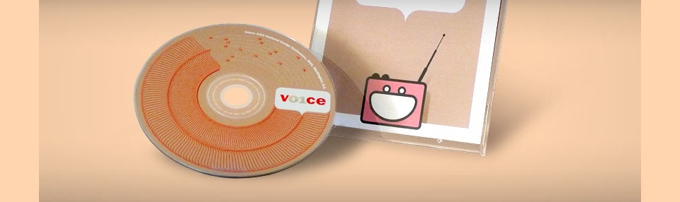
The red ribs, the red pockmarks that are the track numbers, the inverted legal copy—it still hurts!
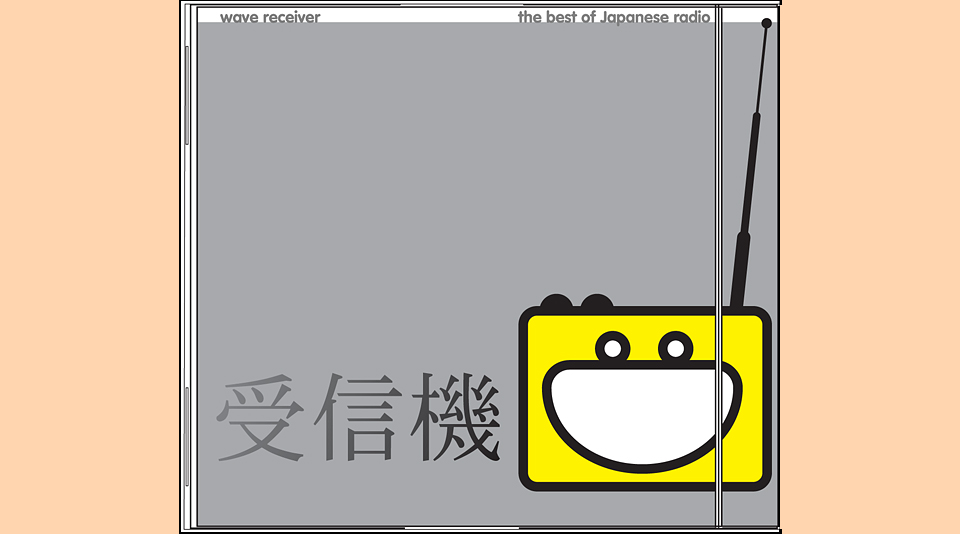
On a happier note, the little radio on the cover—Mr. Radio—had been waiting for his star turn for about five years. I first cooked him up while I was an art director at Wieden + Kennedy. I forget exactly what project put him in my mind. I think I was working on a brand book for Microsoft’s R&D department. I know that it was my first animated GIF. I had just learned GIFbuilder, a marvelous little app that, miraculously, still exists today. Here is Mr. Radio in his original format:
Quite possibly my first animation in GIF Builder. Don’t blink, or you’ll miss it.
When I got fired from Wieden, I interviewed with a number of record labels, who were woefully unimpressed by my advertising portfolio. Or rather, they liked it, but couldn’t see how advertising design would ever apply to music work. “Sure, you’ve art directed shoots, and you know typography, but what we do is different!”
On the advice of John Jay, one of several kind and generous-minded creative directors at the ad agency, I put together a portfolio of a dozen CD covers for made-up bands. This was one of them. Looking back, I feel like I asked somebody to make sure those characters say “Japanese Radio.” I hope they do. Please tell me if they say something horribly stupid or offensive. Either way, the V01CE CD was Mr. Radio’s time to shine! And so he did. In pink! Because why not, dammit? I love Mr. Radio.
