COLD
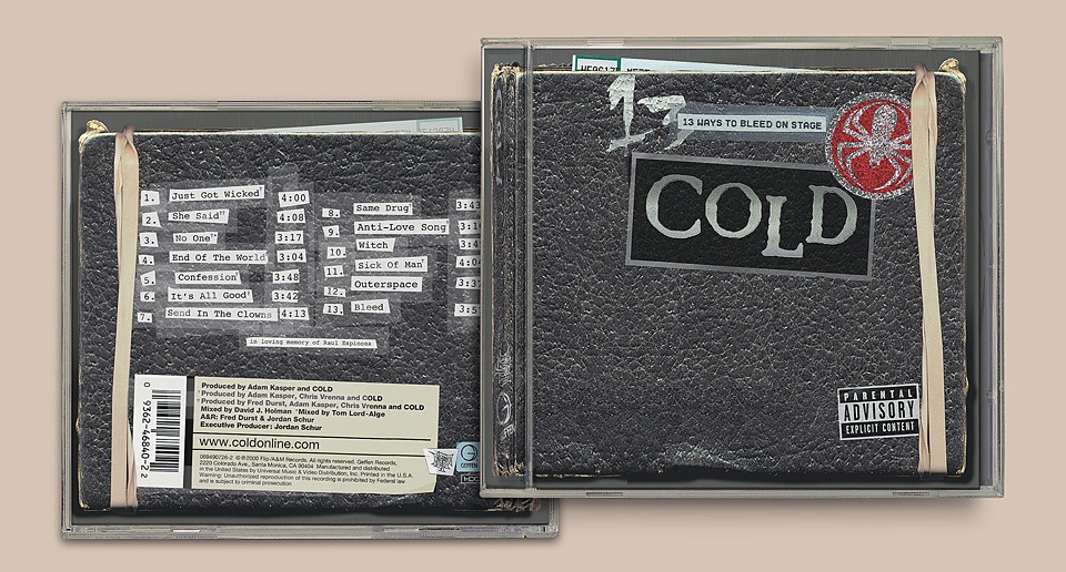
One of my first music jobs post-Maverick was designing the second album of the post grunge band nü metal band Cold. Cold had been discovered by Fred Durst of Limp Bizkit fame, and Fred signed them to his Flip Records label, which was distributed by Geffen Records, which had become part of Interscope-Geffen-A&M. The album was called “13 Ways to Bleed on Stage” and they wanted suitably badass artwork.
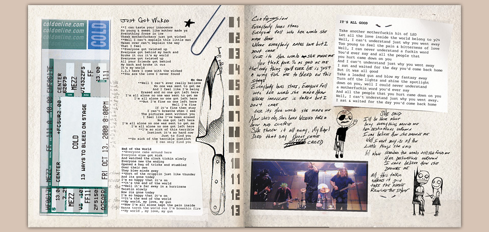
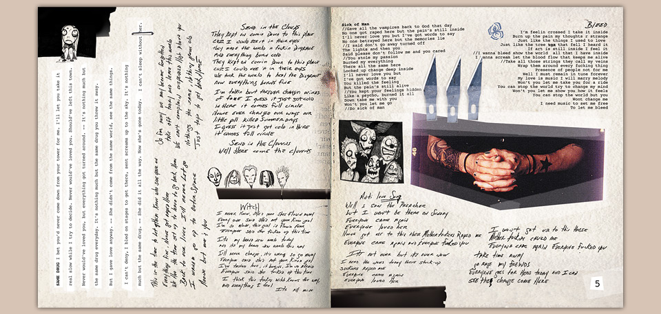
A few mandatory elements were already in place. Drummer Sam McCandless had designed a spider logo for the band, and I think the COLD logo was his, too. The band also wanted to use their handwritten lyrics and Tim Burton-inspired drawings in the booklet. Also part of the mix were photos by Myriam Santos Kayda and Jason Timms. And let’s not forget the Parental Advisory sticker.
With all of those disparate elements I needed a solid unifying device. I sold the band on the idea that the package would be the sketchbook of a person obsessed with blood. I drew knives and needles, copied hematology diagrams, and bought a whole bunch of old dental tools. Which is where the band pulled the emergency brake. “Dude… it’s kinda freaking us out.” It is, isn’t I? Excellent! It’s always easier to pull back than to push, and we’d found our limit.
The sketchbook itself was scan of my own trusty Canson sketchbook. The whole thing was as big a big Photoshop orgy as I could pull off back in 2000, and was a lot of fun to put together. I like getting into the minutiae of things—creating a convincing cast shadow, figuring out how to simulate Scotch tape, creating a believable concert ticket…
When I was working on major label CDs the pay for the actual package design was often paltry. Luckily, each release was usually trailed by a slew of ads, which were paid out of a different, bigger budget. Between the CD itself, the ads, and a few merch items, it was possible to make a living.
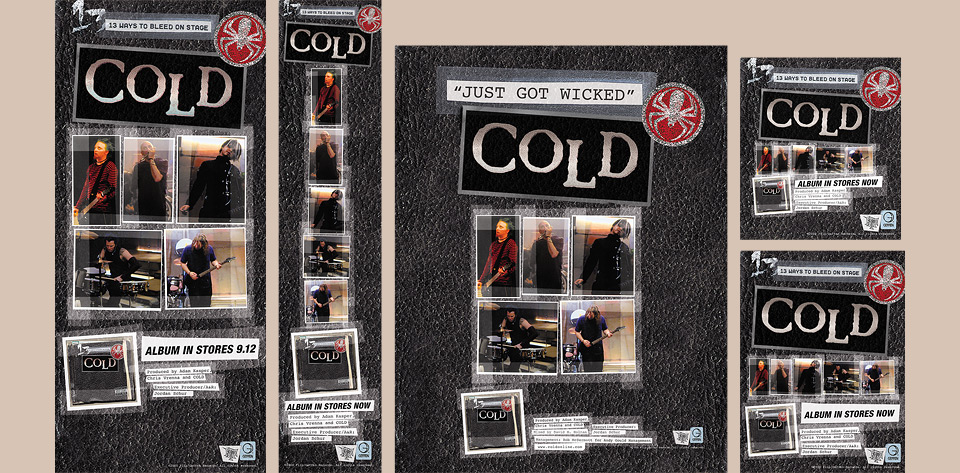
A few of the ads for the album and the first single “Just got wicked.”
The ads were usually just clever extensions of the key art, perhaps supplemented by another beautiful photo. Considering the very different ad formats this sometimes led to pretty forced layouts. In the case of Cold, I had all the booklet elements to play with, which made for lots of nice variations.