DAVID HOCKNEY CATALOG
It’s very rare that I’ll knowingly compete for a job. (Bad for the soul.) But when I saw that L.A. Louver was looking for a new designer, I had to throw my hat in the ring. And this project is why. L.A. Louver represent David Hockney. I’ve been a fan of David Hockney’s work since I was a teenager. I’ve been a fan of the man himself since I read his book “Secret Knowledge.” I knew that a new catalog of his work would happen eventually, and I knew that when it did I wanted to be the person designing it.
- Buy one
- from L.A. Louver
By the time the project finally materialized I was two years into my relationship with the gallery. By then they were comfortable entrusting me with the task, and I knew that I could get the job done. When I got the news I was giddy!
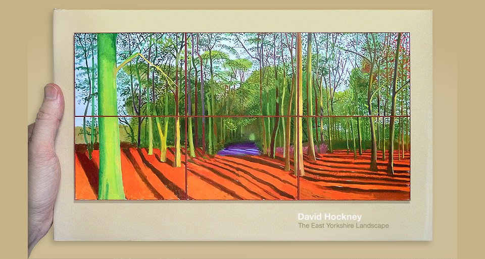
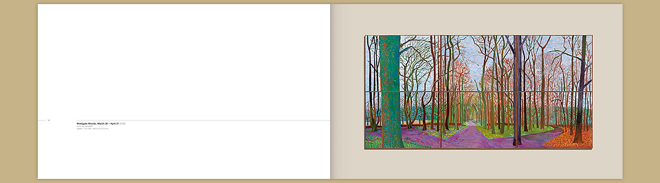
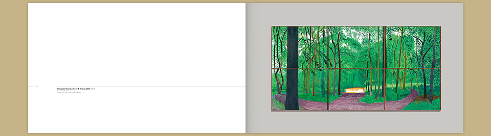
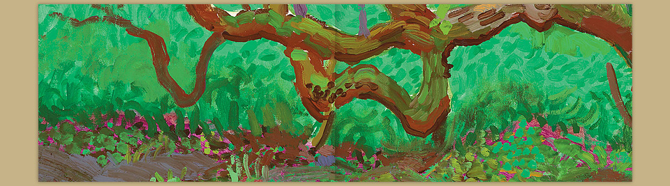
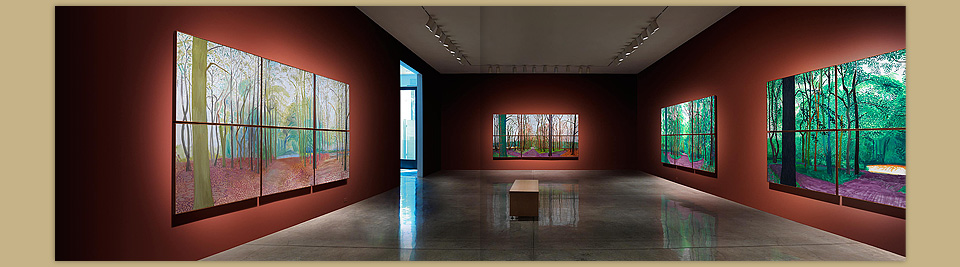
One of the things I love about David Hockney’s work is that he constantly mixes things up. His previous show at L.A. Louver had been a collection of water colors. His portraits, whether drawn or painted, are incredible and a personal favorite. He has since shown paintings made on iPads. But man, I love his epic landscapes. I’m a fan of landscapes in general, but these are something else. The entire cycle covers the same spot in the woods near Bridlington, painted at different times of the day and of the year.
In preparation of the design process I had a chance to see the pieces in the show (along with a few others) at David’s office here in Los Angeles. The first thing that struck me was their sheer size. They’re huge. The second thing that hit me were the unbelievable colors. They are lurid. Shockingly vivid and sensational. Duly inspired, I went home and started designing layouts.
Peter Goulds and the team at L.A. Louver wanted this catalog to celebrate their 30 year association with David, and they wanted it to be a gift for his 70th birthday. Accordingly, no expense was spared. I knew I wanted the catalog to be as large as possible to convey the great scale of the paintings. 15 inches across was the largest width our bindery could accommodate. I’d done a bigger book for Tarsem, but it would’ve meant sending the job to China. Doing that wouldn’t have allowed for the precise color correction the job demanded. And as much as I would’ve loved an even bigger book, 15 x 9 in. (38.1 x 22.9 cm) already caused some trouble. But more on that later.
Once we had arrived at the format, the layout fell into place pretty easily. I went with a very simple, elegant all-Helvetica layout. Hate if you must, but nothing looks quite as nice as a gorgeous image with lots of negative space and a touch of Helvetica. Here is the acknowledgments page. Look at that lovely little grid:
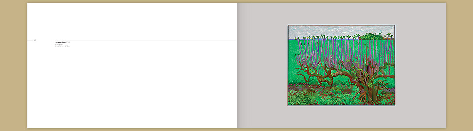
On the pages dedicated to individual paintings, each credit was anchored by a horizontal hairline that aligned with the horizon line of its painting. This idea came from an installation I’d read about years earlier. A museum in San Francisco had hung a show of landscape paintings so that all the horizon lines lined up when viewed from key points in the room. Genius! Adapting this idea for the catalog worked beautifully. It doesn’t detract attention from the paintings, but if you notice it, it’ll make you smile.
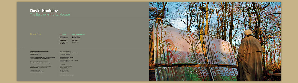
David’s assistant Jean-Pierre Goncalves documents each of David’s paintings exhaustively as it takes shape. Each day he assembles a time-lapse montage, so David can retrace his steps and find his way back into any of the pieces currently in progress. David’s office kindly made these images available to us, and I had the pleasure of digging through a treasure trove of photographs to select a few of them for inclusion in the catalog. Here the size of the catalog became a little bit of an issue, as some of the photos were not shot with large format reproduction in mind. I spent many hours massaging them up to the necessary resolution without having them appear fuzzy. That’s not a glamorous problem, nor were my solutions particularly brilliant, but it was part of making the whole thing come together.
With image selections and basic layouts in hand, I got to accompany Peter Goulds and Lisa Jann to show our progress to David himself. Next thing I knew I was walking past the famous painted pool into the man’s private studio. Now, I’ve lived in Los Angeles for a long time. I worked at a record company. I’ve met famous people. I’m cool with it. But Hockney? Yeah, I was pretty excited.
As I mentioned, I became a fan after reading “Secret Knowledge,” his book on the lost optical techniques of the old masters. I was dying to ask him about it, but I didn’t want to reveal myself as a fan boy right away. Luckily, I didn’t have to. Within five minutes of walking in the door, David asked me, “You’ve read the new edition of the book?” “There’s a new edition?” He called to one of his assistants to bring over a copy, marked page 199 with a big arrow—“This is the new bit.”—and told me to study up for our next meeting. From there began a two hour lecture on painting, optics, and art in general. I was in geek heaven. Peter and Lisa had surely heard all of this before, but they kindly indulged me.
Meeting your heroes is always a dicey proposition. Some people are better admired from afar. Hockney? His brain power pinned my ears back, and he was nice about it to boot. I wish I could’ve had him as a teacher for longer than a few hours.
One of the things he talked about was that he was painting these giant landscapes to be viewed from a distance of about 80 feet. At that point the broad, expressive strokes and fluorescent colors blend into landscapes that are almost photo realistic and definitely alive. And if you’re wondering why he’s painted them across six connected canvasses instead of one giant one, here’s why: He likes to paint in nature, and the smaller component canvasses fit into his truck. There you go. I’d always felt bad about assembling my larger illustrations from letter-seized pieces, because they fit on my scanner. Not anymore. If it’s good enough for DH, it’s good enough for me. (I don’t call him DH.)
Back at the meeting, David approved the layout, and off we went. We were scheduled for a follow-up meeting a few weeks later, but the weather in East Yorkshire changed in a way that allowed David to work a part of the cycle that he hadn’t yet completed. Bummer. But that’s a pretty great reason to cancel, don’t you think?
Before he left, David had toured an exhibit of Constable’s great landscapes at the Huntington Library—entitled “Constables Great Landscapes”—and it left a strong impression on him. One of the things he loved was the color of the gallery walls, which he wanted to emulate for his show, and so the walls of L.A. Louver were repainted oxblood red. The question became if we’d replicate this background in the catalog, but where it made the paintings glow in the gallery, it overpowered them on the page. At the same time, putting the paintings on a white background robbed them of presence. It was too clinical. Instead we determined a soft background color for each painting. And as always, we added details at their original size.
Beyond that, I suggested a few stronger solid colors to serve as divider pages. Due to the size of the catalog, Typecraft asked that we use Pantone colors for these dividers. It’s almost impossible to create large, flat solids out of four color process colors. Even the slightest move in registration causes visible mottling. It’s a bad bet. Initially, I had specified about 20 colors, which would’ve gone beyond the bounds of even this extravagant budget. With some shuffling of pages and a few judiciously applied tints I got it down to a handful of colors.
Shooting the paintings in the now beautifully moody gallery was another challenge made more difficult by the format of the book. First off, the space ain’t that big. With the widest angle lens Robert had available, we couldn’t get far enough back to capture two full walls. And even if we had, the resolution wasn’t sufficient to squeeze 30 inches of width out of one capture. So we took three shots, and I went to work in Photoshop. Here is an in-progress version of the file, followed by the finished spread:
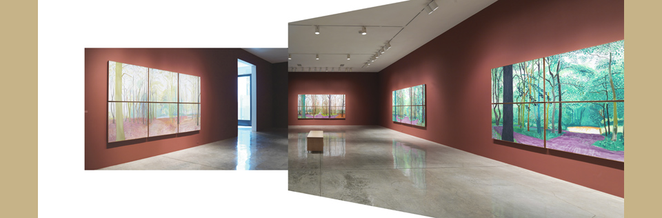
In the end, I think the bench and the concrete floor beneath it were the only things left unchanged.
As the wall color was a significant part of the show, and as we were shooting upstairs and downstairs under changing daylight, I decided that there was only one way to make sure that the walls would be of a consistent color in print: I ripped them all out in Photoshop and rebuilt them from scratch, lights and all. Usually, I’d have removed the ceiling lights and the electrical outlets—part of my L.A. Louver standard package—but there was so much trickery at work here that I wanted to leave in a bit of fake authenticity. Misdirection! Magic! Took a little time, but it all worked like a charm in the end.
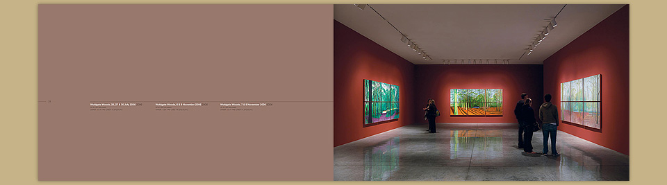
A little bit less work done on this photo. The walls are new, the lights tweaked, people from two shots. Fun!
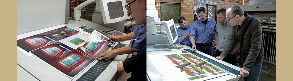
We spent quite a bit of time getting the paintings ready for press. The one truly sad moment of this project was converting the paintings from RGB to CMYK. So much was lost. I nursed the images back to vibrancy as best I could, but those radiant greens… you just can’t get there with four colors. We looked into hexachrome printing, and ran tests with yellow and PMS touch plates, but it made the process too unreliable. For a job like this you need proofs everybody can agree on and stick to.
In the end it still comes down to adjusting things on press. David has his own pre-press staff at his L.A. studio, and they worked with us throughout, which made everything a bit more relaxed. Luckily, all the preparation paid off: David was happy with the result.
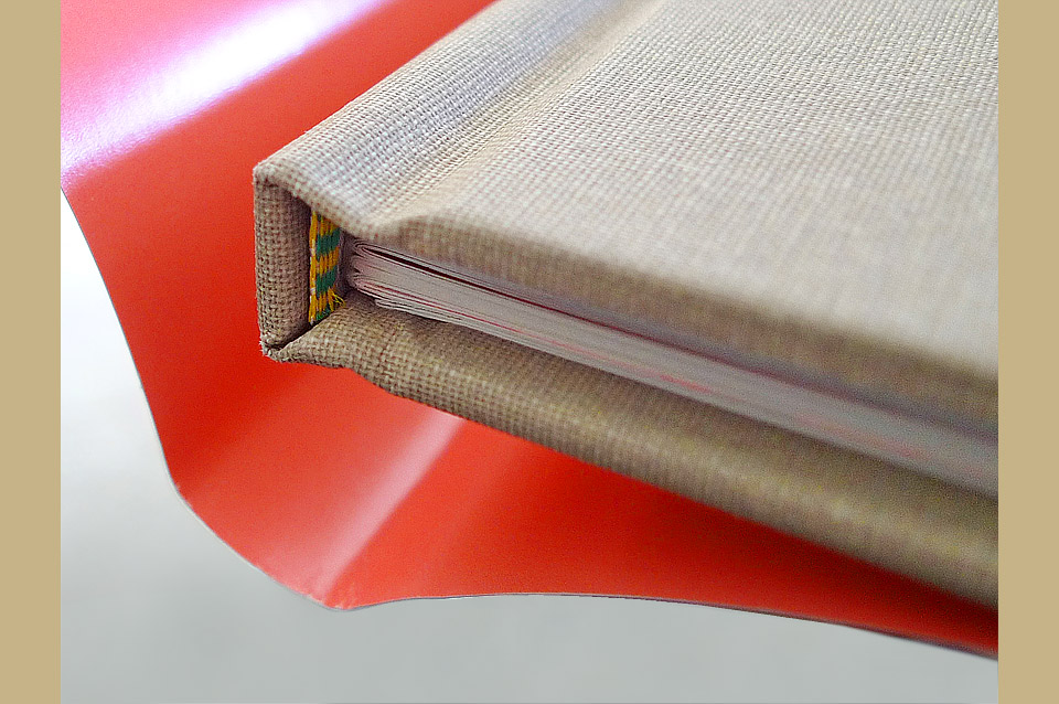
As a final touch, I picked a particularly nice cloth for the binding, spec’ed a pretty headband, and added a pink flood to the inside of the dust jacket. It’s a luxurious item, and one I’m extremely proud of. This is my Hockney catalog. There are many like it, but this one is mine.