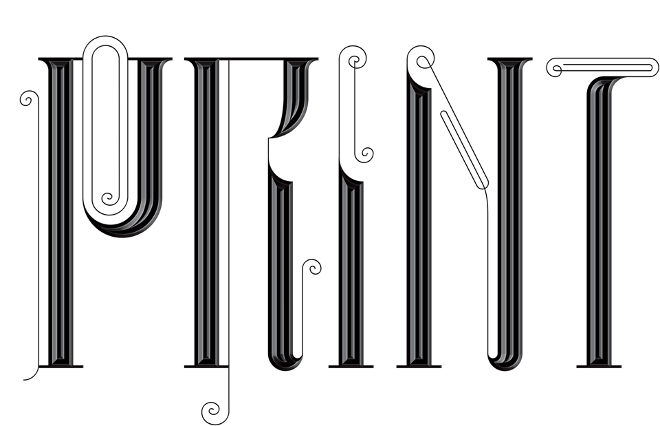
PRINT 75
Debbie Millman was asked to curate a collection of designs saluting PRINT Magazine on the occasion of its 75th anniversary. I was honored to be on her list, and happy to fête one of my favorite magazines.
Assignments like this are always a pleasure! I get to do something nice for people who’ve been kind to me over the years, and I get to try out some new moves. In this case, I immediately thought that I should play around with some lettering. The initial P came to me as I was out on a walk—brain surgery on a letter, a look inside the mind of Print—and the rest of the letters flowed from there. With custom type it’s always a matter of discovering the rules that govern that particular alphabet. In this case, I went from left to right, and moved from simple swirls to hairlines that loop back around to ones that fold in on themselves to double back, affecting the main stems along the way. It’s a little puzzle. Happy 75th Birthday, Print Magazine!