The ZE FRANK POSTERS
Ze Frank and I first met when we were both speakers at the 2005 AIGA Y Conference in San Diego, California. He was fascinated by my maniacal attention to (and creation of) minuscule details. I was fascinated how that giant brain of his somehow fits into a regular sized skull.
We stayed in touch over the years, and it was partly based on Ze’s comments that I started the Daily Monsters, and he’s become one of their patron saints. Among other things, he wrote the foreword for 100 Days of Monsters, and the characters have made a few great guest appearances on his website star.me.
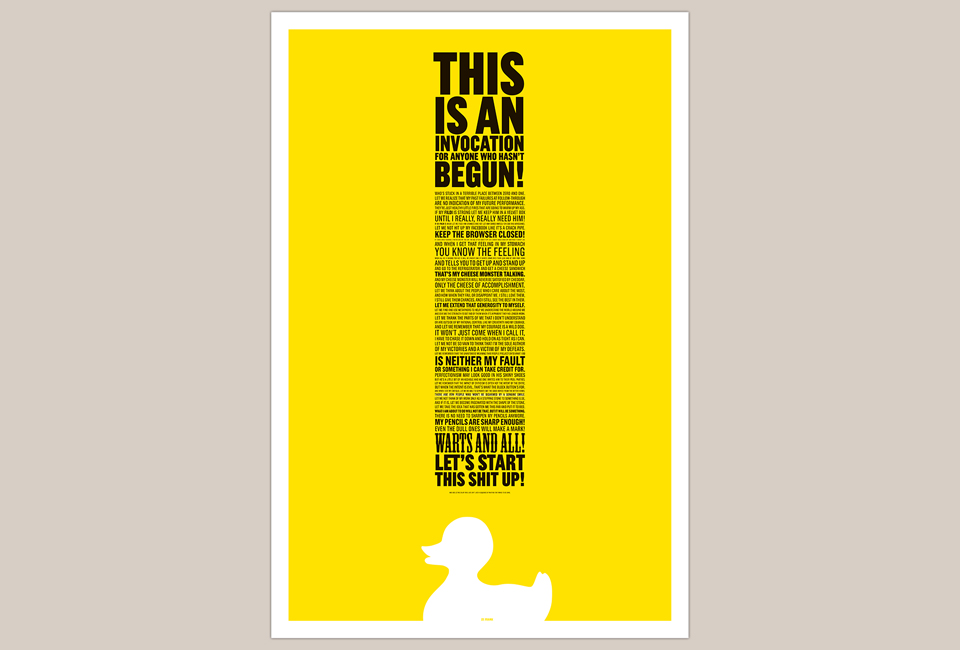
When he started a new run of his insanely successful online program “A Show With Ze Frank” he kicked it off with an invocation for anyone who hasn’t begun. It’s an invocation against fear in all its forms, and it touched a nerve with his audience. It certainly touched a nerve with me. When Ze asked me if I could refer him to a designer who’d have time to turn the text into a series of posters on a budget I responded with these designs instead.
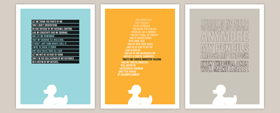
I hadn’t done any full-size posters in a long time, and I was excited about working with copy I loved. I started with the big, yellow invocation poster, and then turned three quotes Ze had pulled from the full text into a set of smaller designs.
The invocation in its original form, on the first episode of “A Show With Ze Frank.”
I knew I wanted to typeset the invocation as a circus poster of sorts—various typefaces at different sizes, justified left and right. This echoed the design of “Professor Clutterbuck’s Elixirs” which I had designed for the Echo Park Time Travel Mart. As it was then, so did this block of type come out quite long and skinny. It wasn’t a great fit for the 24 x 36 inch format I had in mind. I could’ve cut the format to something like 10 x 36 inches, but that felt flimsy.
Luckily, Ze had asked that his signature rubber ducky be visible on the posters somewhere. I thought it should be prominent, and would make for a great signature. When I scaled it up to about 7.5 inches wide and placed it at the bottom of the poster, underneath the column of type, it made for a great exclamation point.
Only months later did I realize that I’d inadvertently mimicked the classic poster created for the Yale School of Architecture by Michael Bierut and Genevieve Panuska in 2003. My apologies to both. It surely wasn’t conscious. (Had it been, I definitely would’ve added a cool little taper to my type column, too.) Finally, I placed Ze’s name at the bottom of the duck, aligned with the edge of the poster, so he’d have a built in place to sign the poster for his fans.
My hope for the three smaller posters was that they’d be very different from each other, but still work as a set. Having the white frame, the solid color and the big duck left me a lot of room to play with the typography. I traced the words of the gray poster with pencils of incrementally decreasing sharpness, and then spent a fair amount of time adjusting the scans, so that the grainy feel of the graphite lines would translate to print. As I’ve mentioned before, this is a bit of an obsession of mine.
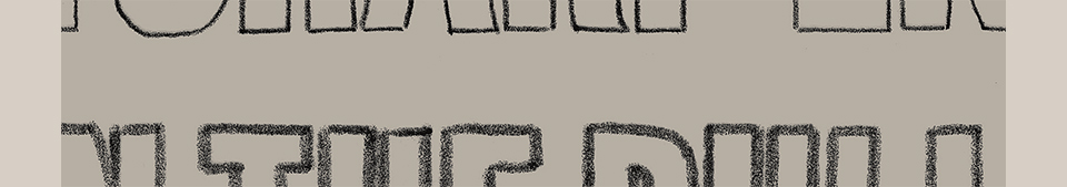
Dig that texture! So dull the pencil, yet so sharp the reproduction!
The orange poster is meant to evoke a knife cutting into a block of cheddar. The type on the blue poster? I just always wanted to use that style, and I saw my chance.
As per usual, I printed the posters at Typecraft. I love printing big fields of Pantone color. My usual press checks involve endless adjustments and compromises to make four process colors reproduce paintings or photographs accurately, which a friend called solving a CMYK Rubik’s Cube. With posters like this, life is much simpler. It’s just fun watching the big blocks of color come off the press.
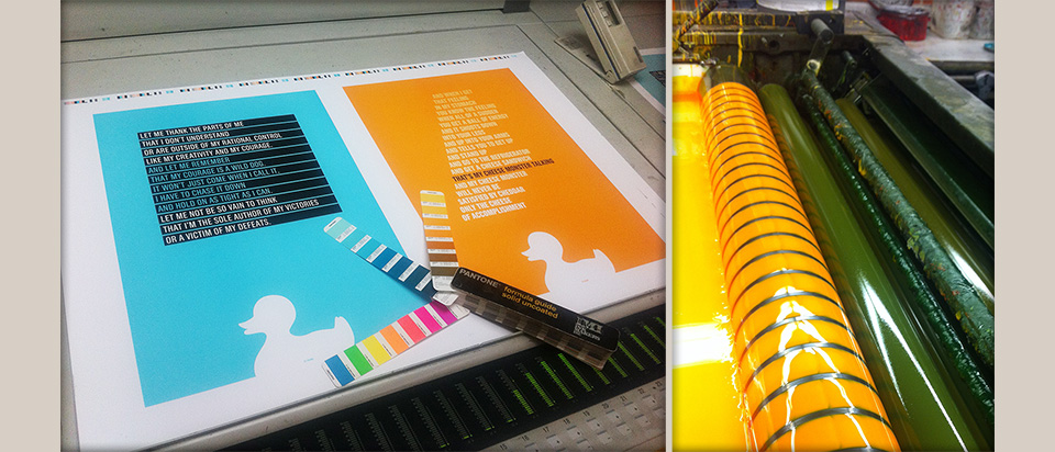
Each column of buttons on the left cntrols how much ink goes on one of the rollers on the right.
Ze later asked me to contribute some time-lapse drawings to his site, which became the recurring segment “Stefan Makes A Solution” in which I solve problems experienced by the audience. I doubt it’ll be the last time Ze and I work together on something. I’m certainly crossing my fingers. Good things happen when Ze calls. If you’d like to own any of these posters, you can still buy them on Ze’s site.
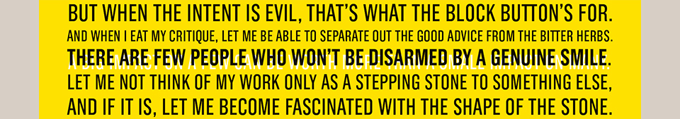
The white line represents the part of the Invocation where Ze overlays different audio tracks.
