CHRISTMAS CLASSICS
Sometimes there is no happy end. Sometimes a job goes well, but the project loses funding or gets canceled for other reasons. And sometimes you land a great gig, you try your very best for round after round, but despite all valiant effort you just can’t get your client to sign off. In the summer of 2004, this was that job for me.
In the beginning, this job looked like it would be a cake walk. Capitol was going to put out a 2-CD set of Christmas songs from their storied back catalog—one album of songs in their original form and one disc of contemporary remixes. Verve had found great success mining their catalog with their Mixed/Unmixed series—which featured gorgeous art direction by Hollis King—and other labels wanted in on the trend.
I find holiday artwork difficult. It’s hard to avoid the tropes, it’s easy to go too Christian, and I’d already used up my “Let’s make the logo into a snowflake!” get-out-of-jail-free card at Maverick a few years earlier. But it was catalog music, so I wouldn’t need approval from the artists or their management, which tends to speed things up. This project also came with a bonus luxury: The name of the collection hadn’t be settled, so I could pitch titles along with designs.
All I had to do was please the creative director of the catalog division and the people in their sales and marketing department. This seemed doable, particularly considering that the creative director was a former neighbor of mine, and fellow Art Center grad. She knew me personally, we’d always liked each other, she enjoyed my work, and she thought this was a great fit for me. I thought so, too, but to borrow a phrase from Upworthy, what happened next will surprise you!
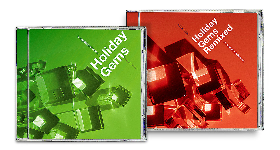
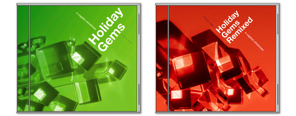
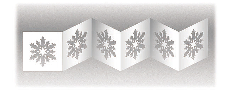
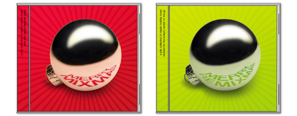
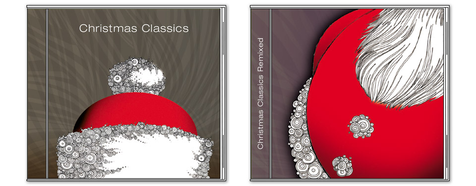
Or not, considering that I’ve already set this up as the story of a train wreck. It’s hard to see now how the thing went so totally off the rails. I started with a strong first round of comps. I was particularly fond of the glittering ice cubes (shown in the main image above, and again below). They’re plexiglass props I’d seen at my friend Jason Ware’s photo studio during one of our product shoots. I loved the way the sunlight hit them, and took a bunch of photos for this project. I thought they looked festive. They said both “winter” and “christmas” while hinting at the “Can I mix you a drink?” vibe of the music. They looked great with angled type. I thought I had a slam dunk on my hands.
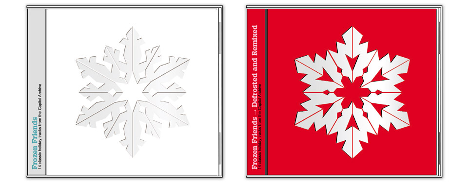
For this design the snowflake would’ve been die-cut through the entire booklet, leaving the glittering silver surface of the CD visible on the cover. Like so:
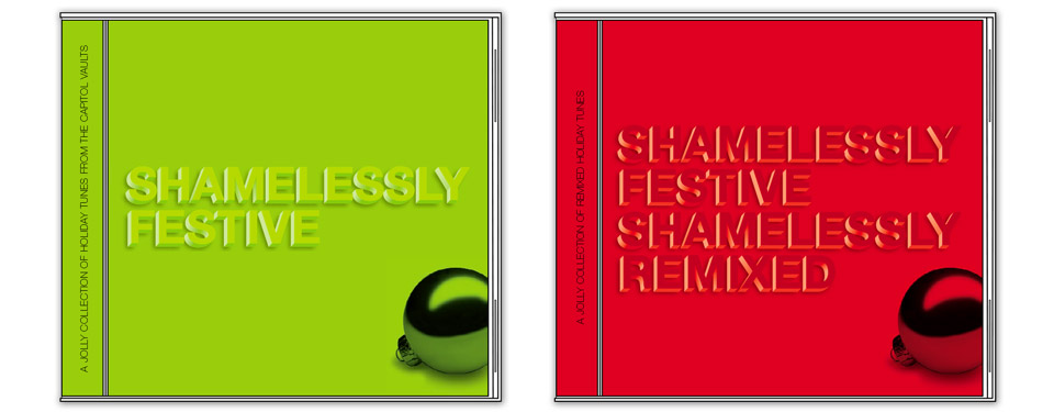
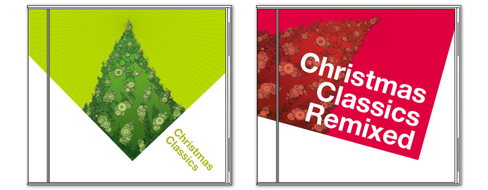
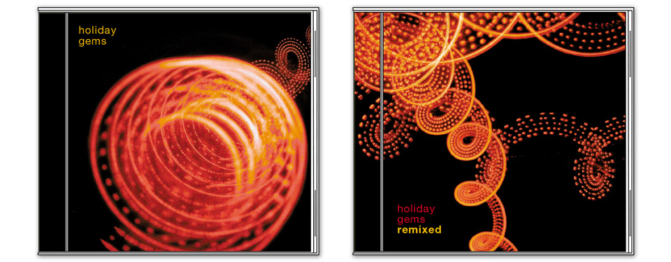
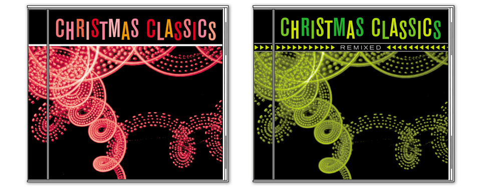
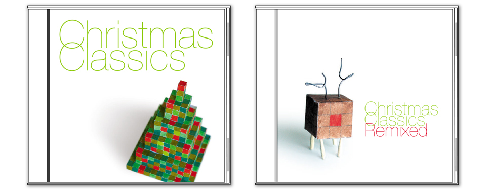
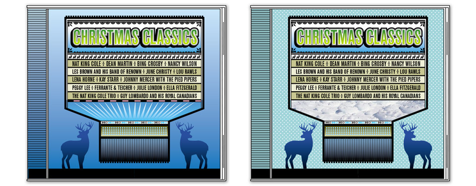
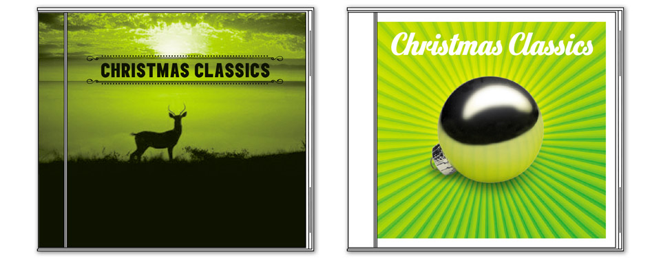
There were no winners in the first round. In fact, there was nothing the client wanted to evolve for a second round. I started over from scratch. I usually get attached to some design early and keep pitching it, but here I thought, “No. Fight your tendencies! Make new things! Make each comp as different from the next as possible. Show range!” I made glittering stardust, I drew my patented circle doodles, I built cube-shaped reindeer out of grid paper, I twirled my Disneyland light writer! I give you Round 2:

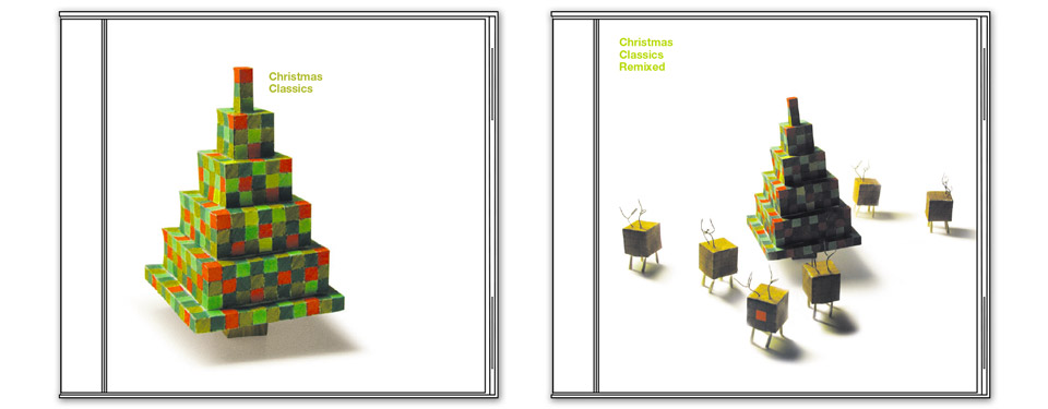
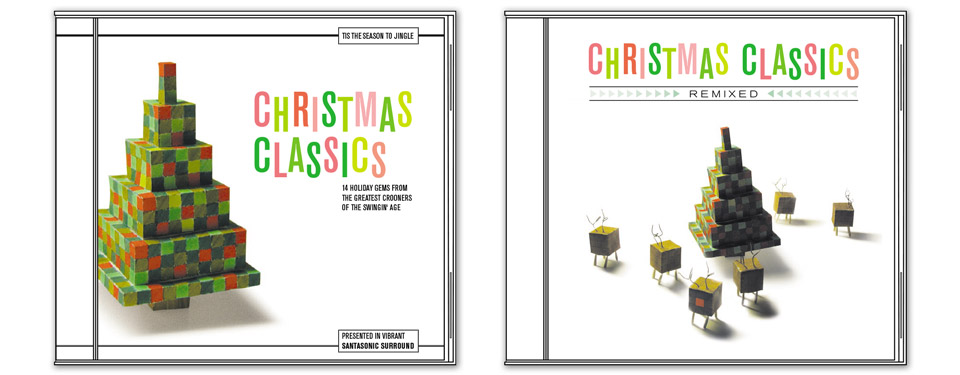
The cube sculptures piqued the client’s interest, and they liked the light streaks. They’d worked well on the bossa:nova “Living Stereo” sampler, and they’d work well later that same year when they became a Hail Mary pass for the cover of my first book, All Access. They’re unusual and pretty, but the type I’d used to frame them was deemed too minimal. Something more fun and festive was indicated. But, hell, this was good news! We had two ideas to refine! I love refining! Off we go to Round 3:
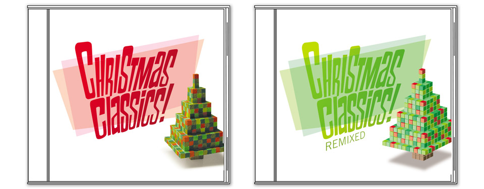
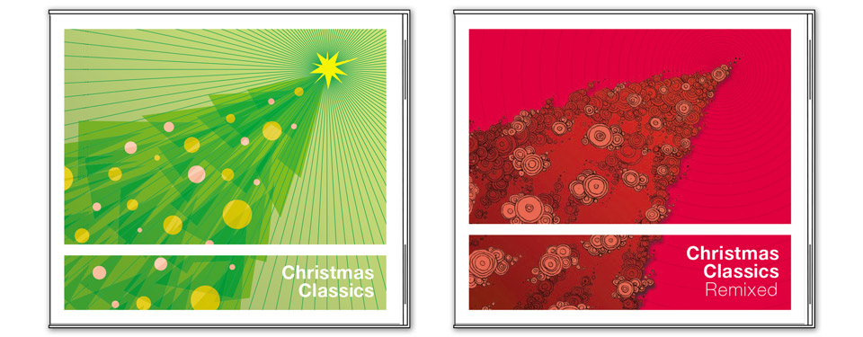
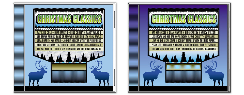
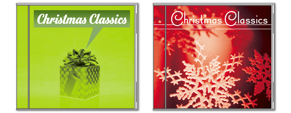
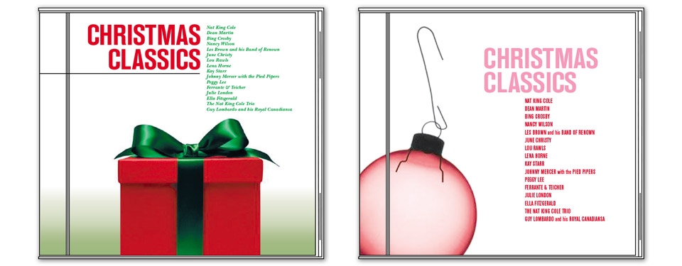
Round 3 was another strike-out. The typography was fun, but now it had become a bit TOO fun. The client also thought it was somewhat cliché, which is a fair critique. This may have been the first time she brought up the idea of just paying me my kill-fee. In retrospect, I should’ve accepted, but I thought there were some really fun ideas happening, and having a cool CD cover in stores was more important to me than a check. I asked to keep going. I had some ideas for the typography. I went on to Round 4:
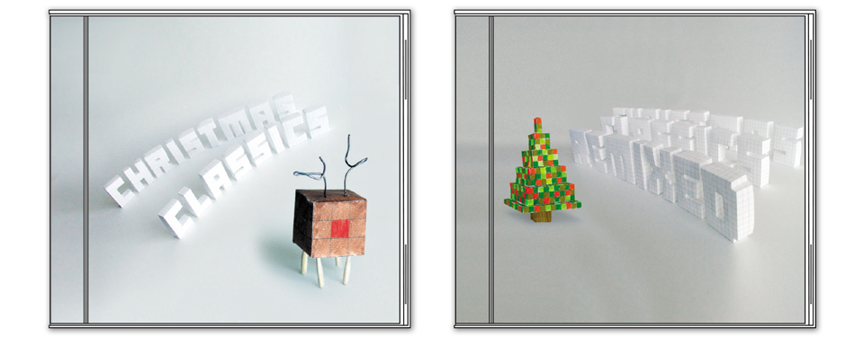
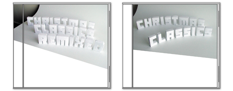
Up until this point, the vibe between my client me had been cordial if not outright lighthearted. Things were obviously not flowing as easily as we’d both thought, but we were both professionals working the problem. When she saw the paper lettering, though, she actually snapped at me. I think she thought I was messing with her. Which… those things took a long time to build. I’m not the type of person who plays pranks on people, and even if I were a prankster, I’d be a lazy prankster! No, I was serious. I thought the paper type could’ve looked very cool! I still think so. We just needed better photography of the letters. At the same time I knew that this was a long shot, so I’d covered my bases with more conventional typography. But nothing was flying. And my client was now actually mildly pissed at me. A lot was resting on Round 5:

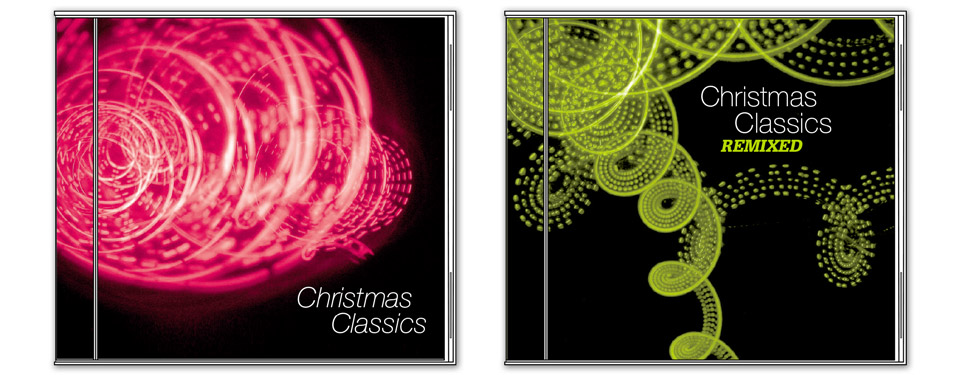
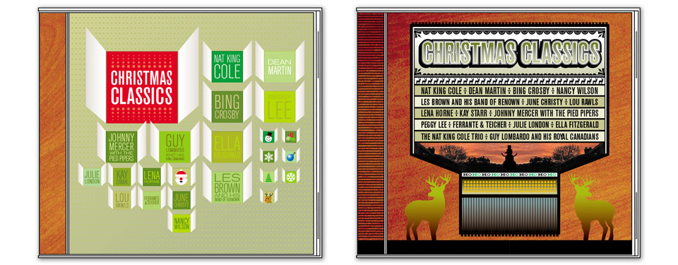
This was, admittedly, a left-field approach. I thought it would lighten the mood. I thought it might actually be worth exploring. It did not, and was not. Quickly! On to Round 6:
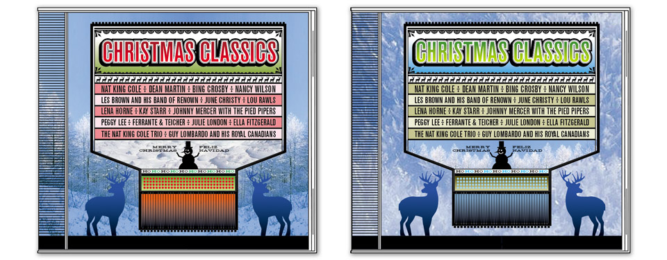
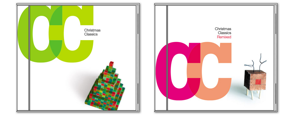
Please note that I offered a choice of authentic reindeer and (more badass looking) regular deer.
As you can see, I’d hit on a completely different approach once again. I don’t usually veer all over the place like this. When I do, it’s a sure sign that nothing is working. I’m either not understanding the feedback I’m given, or I’m just not receiving any direction from the client beyond “No.” In this case, my client’s office was a quick 15-minute drive away. The smart thing would’ve been to say, “Let me just print out everything I’ve done so far and bring it by. Let’s talk about what worked and why, and see if we can come up with a plan.”
I don’t know if that thought didn’t occur to me or to my client, or if we were both so frustrated that we didn’t want to be in a room together. At this point I might have been the one to mention the kill fee, but by then Capitol had nixed the Remix CD, so it would’ve been only half of a small honorarium. Nope. We were gonna tough this out, and Round 6 wasn’t a hit, either. Much as with the Sting CD a few years earlier, I was asked to make something simple that we could all agree on. We all wanted to get this done, and deadlines were now definitely looming.
Once again I started over from scratch. “Just get some great stock images,” my client had suggested, “and I’m sure it’ll come together.” Part of the bewildering variety of approaches stemmed from a frustration that my first creative director at Wieden + Kennedy had expressed with my work. Too many of my comps were mere variations on each other—a font change here, a different background color there. It’s an art school disease. If you love an approach, these small tweaks feel huge. To a client or a supervisor, they’re merely frustrating. They didn’t ask for 20 variations of one idea, they want 20 different ideas.
That’s what I was trying to do here. It may have been too much. As another creative director at Wieden had later pointed out to me, “We hired you for your opinion. How can you have 600 different opinions?” But as always, I was trying to be a good worker, and my original opinion had been rejected long ago. So I plowed on. One last chance. Round 7:
Looking back, I’m still proud of these comps. There were so many viable approaches here. I had fun ideas how I could expand each of these covers into booklets, back covers and discs. But the project had become hopelessly corked. The whole process completely threw me. Was I not listening? Was I not understanding the feedback? Had I developed a pungent personal odor that was repelling my client? Back then I still firmly believed that any problem can be solved by doubling down and working harder. But this was beyond reason. Something in the relationship with my client had turned, and it simply wasn’t meant to be. I took my kill fee and went home.
Later in the year I looked up what cover they’d finally put on the CD. It was a posterized silver snowflake with one of those little 45rpm record adapters at the center—the one that looks like three coiled snakes. That and a line of lower case slab serif type. It couldn’t have been simpler. Well, a wiser fellow than myself once said, “Sometimes you eat the bar, and sometimes the bar… well… eats you.” Merry Christmas!