The ZERO-TOLERANCE FACTOR
One of the lessons I learned when I first started out in Germany is this: Don’t work for your friends. It never ends well. No matter the discount you offer, they’ll feel like you’re gouging them, and you’ll get more resentful with each revision. If you want to help a friend, don’t give a discount, give a gift. That’s what I did here, and it worked out beautifully.
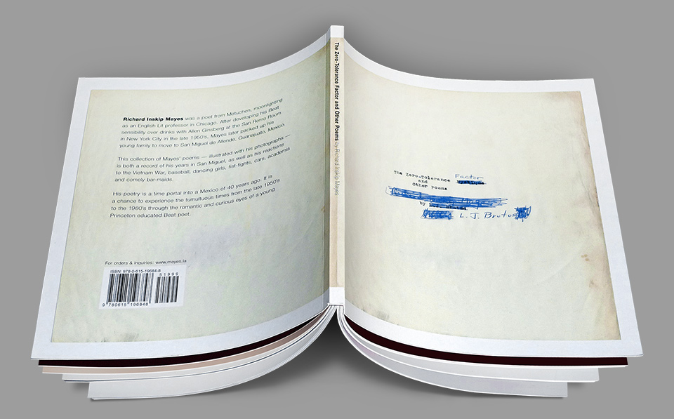
My good friend David Mayes of Typecraft Wood & Jones had set himself the mission to publish a volume of poetry by his late father, Richard Inskip Mayes. Richard had been a Princeton graduate, an English professor, and a poet. After developing a taste for Beat poetry over drinks with Allen Ginsberg at the San Remo Room in New York City, he packed up his young family and moved them to a writers’ colony in San Miguel de Allende, Guanajuato, Mexico in the summer of 1968 to work on his PhD thesis.
While there, he began assembling a treasure trove of poems dealing with his new life in Mexico, with baseball and bar maids, cars and fist-fights, as well as with the Vietnam war. All the while he kept taking photographs of his environment, his friends, and his family. In 1988, four years before his death, Richard handed the entire, sprawling collection to his son David, so that he could ready it for publication. As with many personal projects, life intervened, and it ultimately took David 20 years to finally see his father’s book printed.
David approached me about designing the book in the middle of one of the many L.A. Louver projects we were doing at the time. As I recall, I tried the usual evasions, but David was adamant, and I saw the light. This wasn’t somebody asking for a freebie business card, this was a friend on a mission to honor the memory of his father. And you don’t say no to that. Nor do you charge a fee. I asked David to hand me what he had, and got to work.
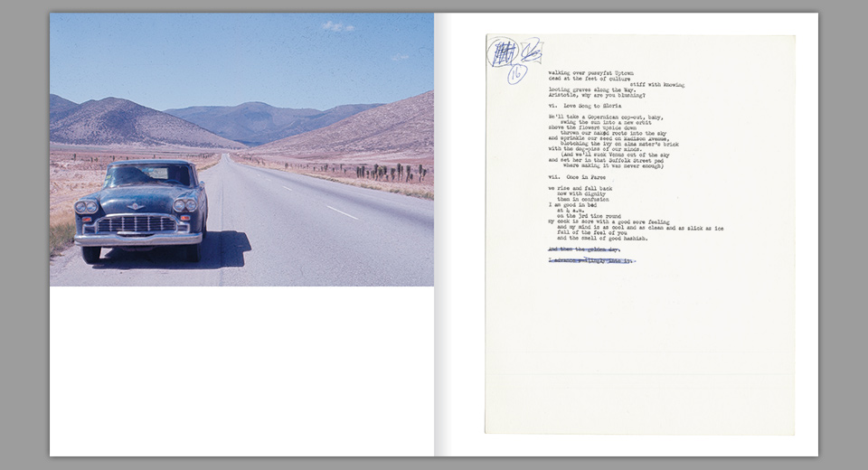
Hundreds of photos had to be edited down to less than 40, and I had to figure out a design. The poems were carefully composed and spaced by the author on his mechanical Royal typewriter. David had already spent many hours recreating them in Quark Express, so that I could get a running start.
Instead, I took one look at the beautifully worn manuscript pages, and knew that we had to reproduce them just as they were. Seeing Richard’s notations, corrections and additions made for a much more personal reading experience than any “proper” typography could have offered. Richard is on the page with you. Shedding a tiny tear for his hours of transcription, David agreed. We’d show each sheet opposite a photograph, hopefully creating some evocative pairings along the way.
“and then the golden day.”
Sequencing photographs has been one of my favorite past-times ever since I worked on the design of American Photography 17, and I was happy to return to it here. David and his wife Janet liked most of what I came up with, and added a few pairings of their own. Things came together easily and happily.
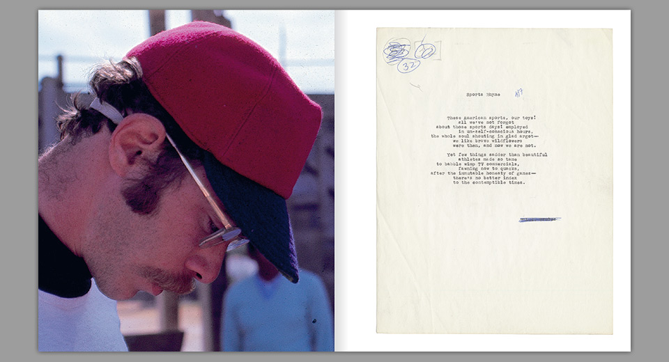
“Yet few things sadder than beautiful / athletes made so tame”
Beyond the regular spreads, I allowed myself a little cinematic flourish. I had opened the book with a photo of Richard looking directly at the camera at a baseball game in Rio Laja in 1968. That same shot would now close the book, repeated over three spreads in extreme closeup, getting darker and blurrier with each page turn. A fade to black, to be followed by David’s memories of his father. A little sentimental maybe—probably—but it’s one of my favorite little design ideas.

Even though the book is perfect bound—a paperback—I added simulated end papers. The book was so light on color that I wanted a burst of ink to create some separation between the outside and the body. David wrote a long list of words that came to mind thinking about his father and about their time in Mexico. Together they formed a nice texture, letting you notice new bits and bobs each time you pick up the volume.
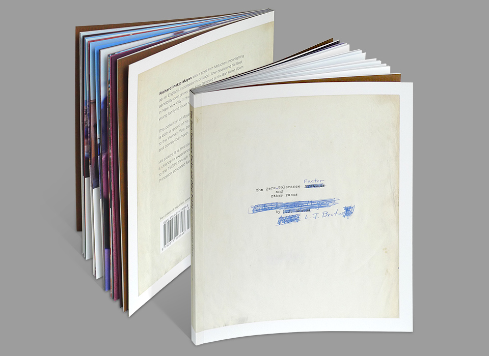
David printed a first run, and began selling it at readings along with framed prints of spreads from the book. One night he gave a copy to one of Typecraft’s clients, who was on press with a poetry volume of his own. For this first edition I had convinced David to put the typed word BRUTUS on the cover—after his dad’s pseudonym L.J. Brutus. The collection itself was called “The Zero-Tolerance Factor and Other Poems.” I thought that BRUTUS was a sufficiently cool name to warrant the discrepancy. David’s client disagreed, and strongly urged a reprint with Richard’s original title.
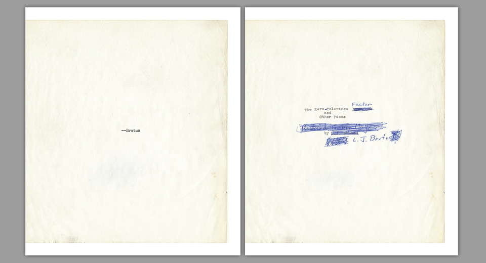
Before and after. I love that Richard scratched out his own name and replaced it with his nom de plume.
David approached me gingerly about making this change, saying he knew how much I loved last minute changes in general, and meddling by outsiders in particular. But I saw the poet’s point. Also, the poet in question was Viggo Mortensen, and you simply don’t say no to the King of Middle Earth. It ended up looking a lot cooler his way, too.Designing this book for David was a gift I was honored to give, and both David and I were happy with the way it turned out. David also slipped a little money into my decolletage and told me to go buy myself something nice. He’s a class act.