DEBORAH BUTTERFIELD CATALOG
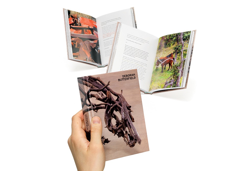
The catalog for Deborah Butterfield’s 2009 show of sculptures was one of the most ambitious projects I produced for my friends at L.A. Louver: 280 pages culled from literally thousands of behind-the-scenes photos, a retrospective of Deborah’s past work with the gallery, an in-depth interview between Deborah and Lawrence Weschler, all of it accompanied by Robert Wedemeyer’s photos of the current show.
Kimberly Davis wrote the introduction. Lisa Jann’s credit in the catalog is misspelled. It says “Edited by” when it should’ve been “Edited, wrangled, kept alive and breathing in the face of adversity, and made altogether possible by.” In other words, business as usual.
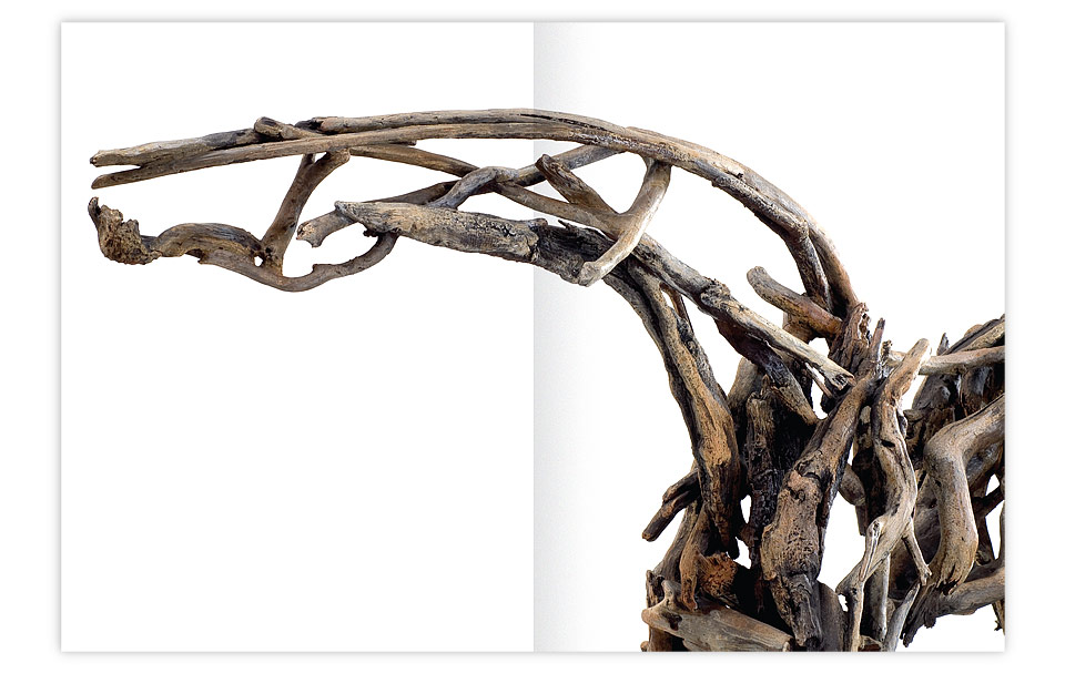
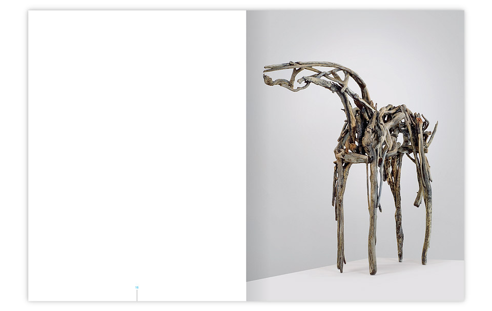
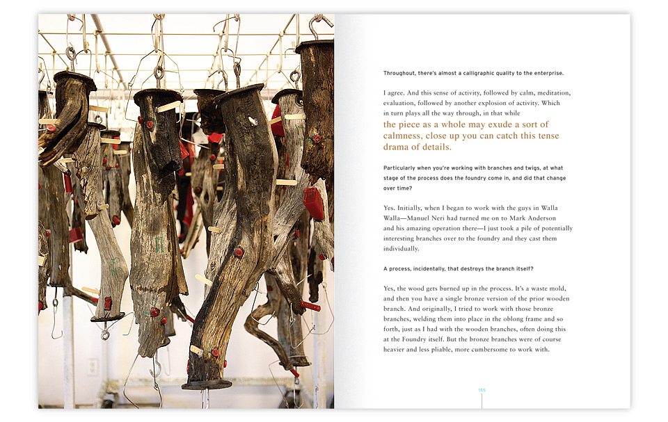
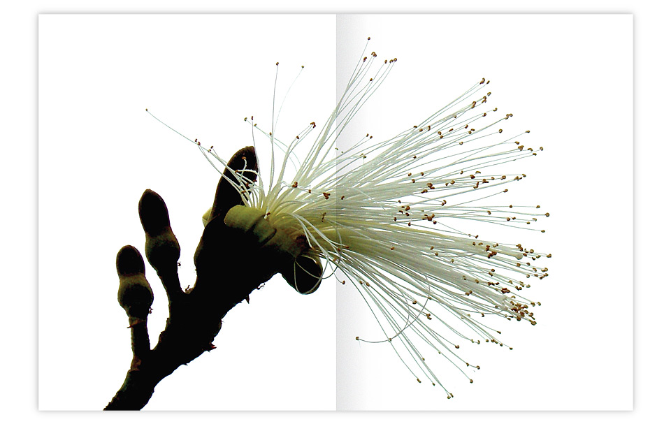
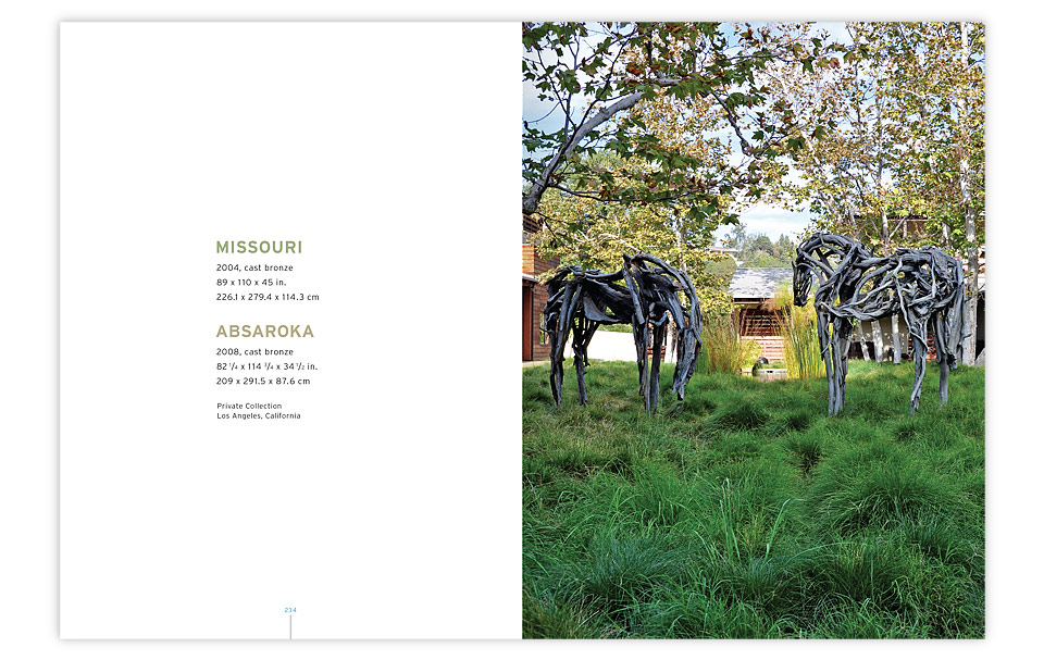
The sculptures themselves are fascinating, because they look like wood, but aren’t. Each horse is originally composed from branches Deborah finds in Montana and Hawaii. Once she’s happy with the sculpture, it’s photographed extensively before all pieces are numbered and sent to a foundry in Walla Walla. There each branch is cast in bronze in a waste mold, meaning that the original branch is destroyed in the process. The bronze branches are then reassembled, welded, and finally painted and varnished to look like the original wood. In other words, enormous effort goes into a deceptively simple result, the true complexity of which is almost entirely hidden. (You can see why I’d like it.)
Because of this process, the horses look like they’d weigh as much as a stack of wood, when they really weigh tons. The book mirrors this. It’s a petite volume at just 5.25 x 7 in. (13.3 x 17.8 cm), but clocks in at a surprising 1lb. 6oz. And by “surprising” I simply mean that when you pick it up you’ll say, “Whoa! That’s heavier than I thought.”
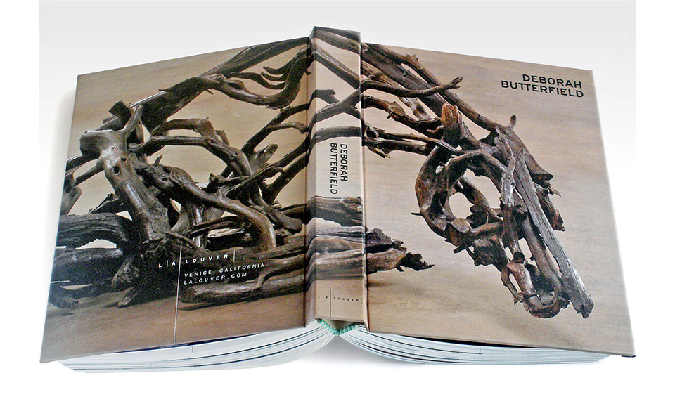
This book is only 1.5 in. (3.8 cm) wide, but weighs over 27 pounds. Note the snazzy green and yellow tail band.
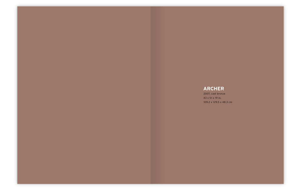
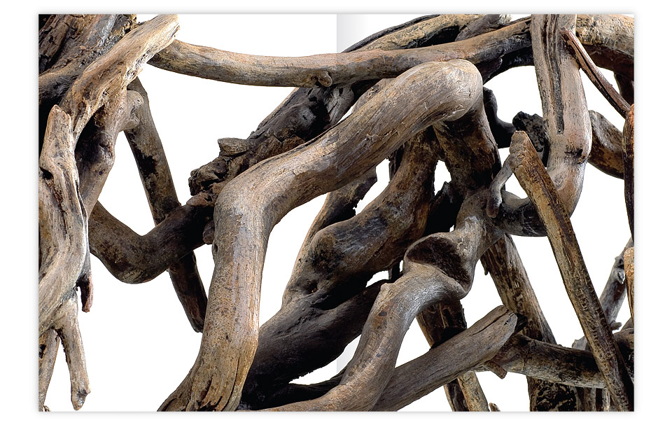
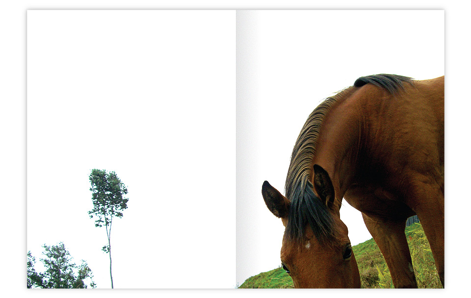
The way the catalog is laid out, each new sculpture is introduced with a title page, then shown in extreme close-up, revealed further in a medium view, and finally displayed in its entirety on the fourth spread. The details are important on every work of art, but I don’t usually have the luxury of a high page count to really show them for each piece. I’m glad I got to do it here. I hope it conveys the scope of the sculptures, and sets up a nice rhythm for the book at the same time.
The book then moves to the interview section, which has pretty little pull quotes that color coordinate with the images on each spread. I almost ditched those pull quotes, because we were getting close to the deadline, and I was exhausted. But as luck would have it I found myself giving a sanctimonious lecture to a student about the need to always go the extra mile on typography. In the middle of my sermon I started getting pretty red in the face, and realized that I had to stay up another night to take care of business.
You can see how this is the kind of job that takes a fair amount of time to put together. Let’s not even talk about the printing—except to say that it took five days and five nights. On top of all the regular complexities, I put in oodles of crossovers that make printers go crazy, and make it so I get to sleep next to the press for a week. As per usual, my friends at Typecraft worked miracles. As with every book, this thing nearly killed me in the process, but I’m happy that we brought it into existence.