The SUPERBOWL LOGO

The New York Times has loomed very large in my mind for many, many years. Growing up in Germany, it was one of the big symbols of America. When I moved to the States, just getting to read the Times was exciting! So when I was invited to actually contribute an illustration, I’m glad the request came via e-mail, so I could keep my dignity. (It’s a blur now, but I’m pretty sure there was whooping.)
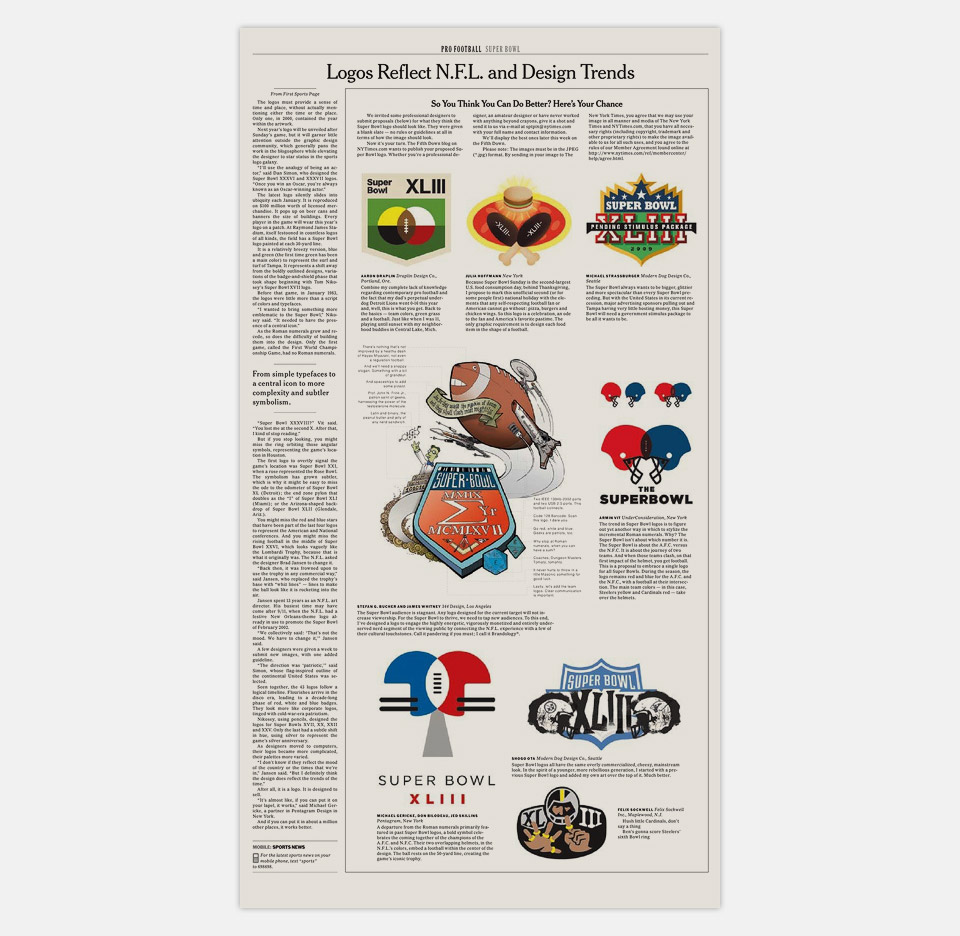
The assignment was to re-imagine that year’s Super Bowl logo. The editors had invited a few design firms to do this. Design for national sports events is such a specialized field that they wanted to show what designers from other sectors of the field would do. The whole piece also led off a call-for-entries to the New York Times readership to see how they’d redesign the logo.
This had to be special! I had already done a piece for Steven Heller’s Campaign Stops blog on the NYT website, and I didn’t think I’d really nailed it. And that was online. As a CMYK guy, doing something for the print edition raised the stakes. Something special was needed to go right past redemption to pride! Also, let’s not forget that my logo would be shown next to those by other designers. I didn’t know who they would be, let alone what they’d do. I did know, however, that I wanted to show them up. What can I tell you? I’m competitive.
As far as the design itself goes, the trap with these “Designers Re-imagine _________” assignments is to take them seriously. The first instinct is to think, “Oh man! The people who actually commission this stuff out in the world… they’re going to see my solution, and then they’ll hire me to do this for real!” They won’t. They might see it, but they won’t hire you. And if they do, they certainly won’t do it because of a pie-in-the-sky design you whipped up on a three-day deadline.
No, to take this stuff seriously is to expose yourself as entirely too earnest.—Unless you really knock one out of the park, in which case I salute you. Then you’ll have exposed me as the jester who was too scared or too lazy to be serious. Which is probably true, but also beside the point right now.
The point is that I was super excited to get my work into the New York Times. I wanted my solution to be funny, and to stand out from the crowd. As you can imagine, I didn’t have a deep reservoir of sports knowledge or appreciation to draw on. Had I grown up in the United States I’d have at least some understanding of football from being beaten up by varsity players after class. Growing up in my particular small town in Germany I was beaten up by internationally ranked trampoliners. (This is true.)
Funny was really the only way to go, and as I’ve said elsewhere on the site, I strongly believe that in print a dozen small jokes beat one big joke every time. They draw you in, they build on each other, they reward you for your attention. They also stack the deck in my favor. If I come out with one gag and you don’t like it, that’s it. Done. But if I give myself 12 chances and make you smile three or four times and get one solid laugh, we’re in business!
In this case, I decided to play off the fact that I have absolutely no business designing anything even peripherally sports related, let alone the logo for the Great American Jockathon. I made it my goal to design the nerdiest Super Bowl logo of all time! If you take the time to look at the callouts above, I’m pretty sure that I succeeded.
While we’re at it, let me say a word about those callouts. They had to appear with the logo, for the illustration to work. Which was a risk. The editors had asked for a logo, not for a quasi-cartoon with captions. But I crossed my fingers, and sent it over, hoping they’d find it funny enough to run it. Which—happily—they did. With the captions. Which was especially great, because for the captions to be legible the whole illustration had to run at about four times the size of all the other logos. (And yes, I had planned it that way. I mentioned that I’m insanely competitive, right?)

My logo is much bigger than all the others. Therefore it is clearly much better.
In fact, the editors were happy to do it, because it distracted from the fact that a few of the other designers had come up with somewhat similar looking logos based on the same idea: Two overlapping football helmets create a football-shape between them. Which is a brilliant idea! It really is excellent. It’s smart, it’s elegant, it’s memorable. I’m so glad that I didn’t think of it, because there is absolutely no way that I wouldn’t have stopped right there and beamed with pride. I got lucky that I didn’t think of it, that’s all.
Oh, and the Steelers beat the Cardinals 27 to 23.
I looked it up on Wikipedia.