SOUNDBLAST CATALOG
In the late 1990s I was a board member of the Los Angeles chapter of the American Institute of Graphic Arts—AIGA/LA for short. I got involved after I got a few pieces into the chapter’s 1998 show of music packaging design. By the time the 2000 show rolled around, I was already very active on the events committee, and I pounced.
By the time I learned that the chapter leadership had already assigned somebody else to design the event graphics, I had the poster all done. I forget who they had picked out, but I know that the person was late delivering comps. Happens all the time with volunteer gigs. You’re full of excitement when you agree to do the job, and then a paying client calls. Next thing you know, you’re way overdue.
Another man’s overcrowded schedule certainly worked out well for me. I admit that it was a bit of a mercenary move. As soon as I found out about the other designer I could’ve said, “Oh! I didn’t know. Never mind. I’ll just be over here.” But, you know… I was young, I wanted the job, and—just by virtue of actually existing—my designs were superior. I usually have no trouble feeling guilty about the smallest thing. In this case… eh. I slept well.
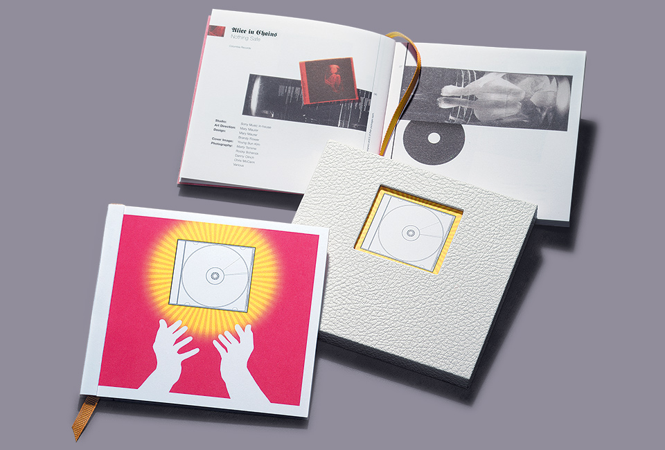
To my mind, the show was about venerating CD graphics. We would come to worship. I had a whole little Catholic aesthetic worked out. Black letter type, metallic inks, pastoral backgrounds that reminded me of little country churches I’d seen in Bavaria, the works.

The ink wasn’t yet dry on those rejected Sting comps, and I was already looking to recycle. Tsk-tsk.
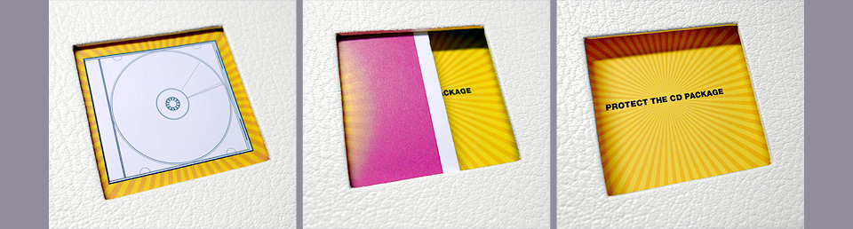
Everything was built around the vector art jewel case template I used when designing CD graphics. Somewhere along the line I thought, “Oh, what about praying hands?” As I was working alone, I put my camera on a tripod, set it on a timer, and then quickly thrust my arms around the tripod to get the shot. It didn’t occur to me until after that I was using my hands in silhouette, so I could’ve just walked around to the front. It’s just as well. This way I got to do some lunges.
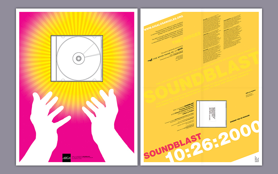
Everybody on the committee looked at the worshipping hands design and said, “That’s the one!” I was still enamored with the faux Old Country aesthetic, but the hands were just so clean and punchy. Luckily, I was smart enough to listen to the gang for once.
When I set to work on the Soundblast catalog, I tried to revive the alpine idea one more time, but it just wasn’t as good. I also tried one other thing for the catalog cover: I created an Illustrator version of a plastic CD opener. Places like Tower Records used to sell them or give them away as keychains. They had a tiny recessed blade that let you slice open the shrink wrap on new CDs. This was never a problem for us Xacto blade users, but many others griped about that shrink wrap a lot. (Another problem forever solved by iTunes.) The fact that the little plastic gizmo already requires explanation makes it clear why it would’ve been a bad choice for the poster. Why date your designs more than absolutely necessary. Such a strange and beautiful shape, though.
Note that we didn’t have Neal Ashby locked down as the fifth judge yet.
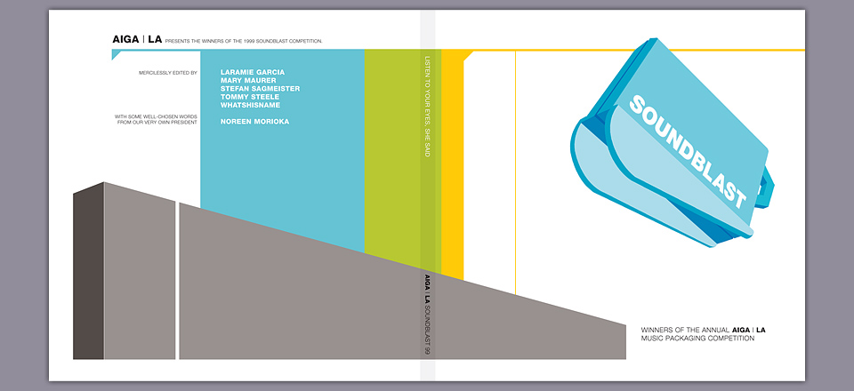
For the catalog itself I chose a very small size that just about matches a CD jewel case. It should’ve been a quarter inch wider and an eight of an inch longer. As I recall, it was a problem of how many pages had to fit on one sheet on press. Gardner Lithograph had kindly donated the printing, and I was pushing them hard enough already. They did let me add a golden page marker ribbon, for one thing. I also made life more difficult for them by squeezing a 31-question quiz into the margins that let readers find out just how big of a music packaging nerd they were. I also preserved a tiny bit of the original comp by using Fraktur as the title typeface for each winning entry.
Jason Ware shot the CDs, making this one of our earliest collaborations.
To put a little cherry on top, and as a gift for friends and family, I asked my favorite bookbinder Alice Vaughan to build a limited edition slipcase for the catalog. As we were looking through possible materials she said, “Oh, you know, I also have this white leatherette material. It’s a leftover from some hymnals.” Perfect! I created a special liner for the inside. When you pull out the booklet, the window reveals an extra little message.
I should note that this was the first time I ever got to design a book—even a teeny tiny one—so I went a bit overboard. This happens to me with the first of everything I do. I always figure that it’ll be the only time I ever get to design a book / CD / poster / hovercraft, so I need to cram in every possible idea I ever had for that particular category. With each subsequent opportunity I calm down a little bit, which often leads to a nicer result. In this case, however, my hyperactive approach suited the subject matter perfectly. And there was a long-term benefit, too. My work on this catalog was part of what led Gary Koepke at Modernista! to let me design American Photography 17. And that one really set a lot of things in motion.
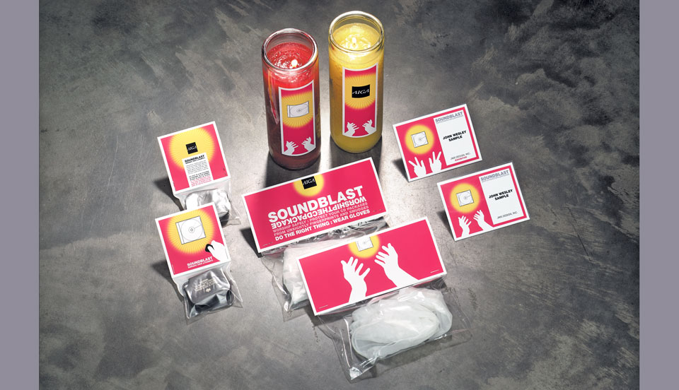
I comped up a bunch of swag for the event—CD openers, gloves, candles. In the end we only made the name tags.
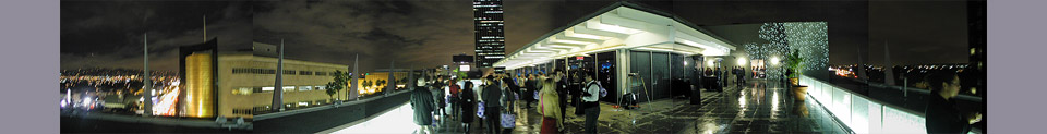
Due to extremely generous donations by Fox River Paper and Kirk XpedX we not only got a cool poster and a nifty catalog, we also got to host an amazing exhibition. The event was organized by Holly Greenwood, Tony Manzella and me. We rented the rooftop pavilion at the Peterson Automotive Museum on Miracle Mile, at the corner of Fairfax and Wilshire Boulevards, right across the street from LACMA and the old May Co. department store with its beautiful golden corner tower.
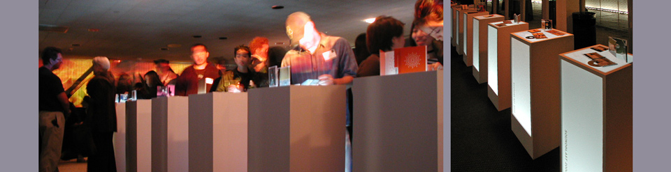
We had custom altars built for each entry—each one lit from inside by battery powered fluorescent tubes we bought at the hardware store. We arranged them in two rows that steered visitors between two walls of projected flames of hellfire toward the DJ podium at the end of the room. Behind the DJ billowed radiant clouds. Salvation for the music lover. The projection came courtesy of Paul Sangster of Future Lighting, who I knew through his work for bossa:nova. The DJs for the evening were AIGA’s own Mick Hodgson, and KCRW hosts Tom Schnabel and Liza Richardson—another frequent bossa:nova guest. Over 600 people showed up. It was a truly splendid night.