The AWESOME POSTER
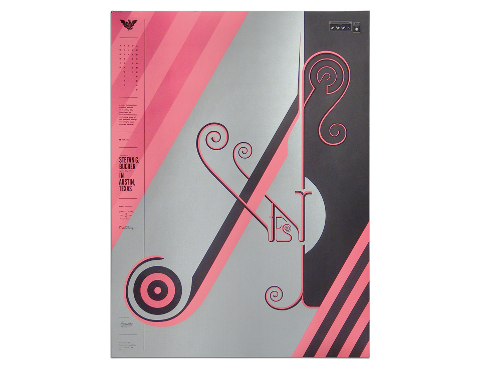
My friends Bryony Gomez-Palacio and Armin Vit invited me to speak as part of their event series, the Austin Initiative for Graphic Awesomeness (AIGA). Traditionally, speakers design their own event posters, which are then lovingly silk-screened as a gift for the audience. The only stipulation was to include the customary event branding on the left and the word AWESOME.
- Buy one
- Order a poster
No problem. I’m always a fan of putting the mandatories out front—look at these barcodes, for example—and this was a cool manadatory. It gave me the chance to use an idea I’d carried around for ages. I wanted to design lettering where the first letter of the word hid the second, the second hid the third, and so on.
The idea had come to me from the White Stripes “Seven Nation Army” video, where the band are shown under a series of advancing wedges. Doing nested letters would probably work with relative ease as an animation. In print, the letters quickly get too small to handle, and the whole thing becomes too fussy. Luckily, AWESOME has but seven letters, and the first letter could fill a whole poster. Let’s zoom:
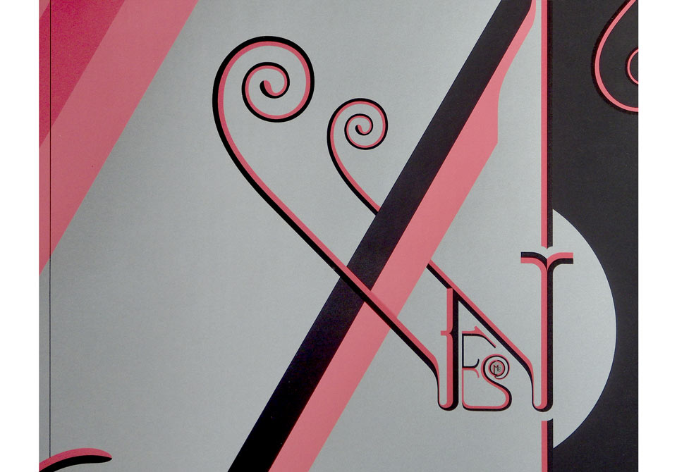
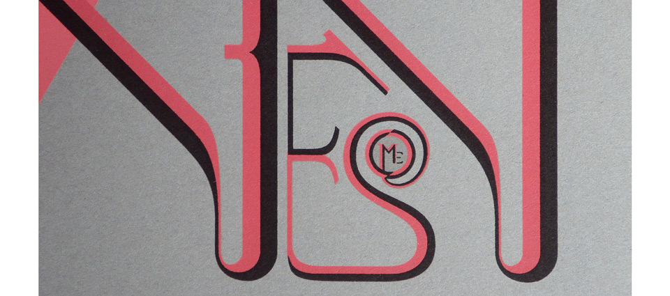
As you can see, Austin’s own Industry Print Shop did an incredible job with the registration.
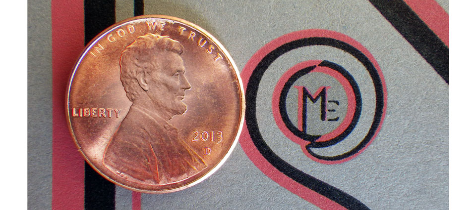
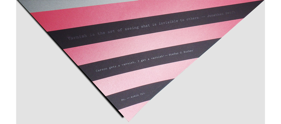
Beyond the basic design I wanted to add some Easter eggs. There had been a bit of a kerfuffle the previous year when Armin added a surprise layer of varnish to David Carson’s poster for his event. I like varnish. I felt that I should get some varnish, too, so I added stripes and a little 344 logo in the bottom right bulls eye. Armin challenged me to tie in the varnish more conceptually to justify the extra cost. Fair point. I added three quotes:
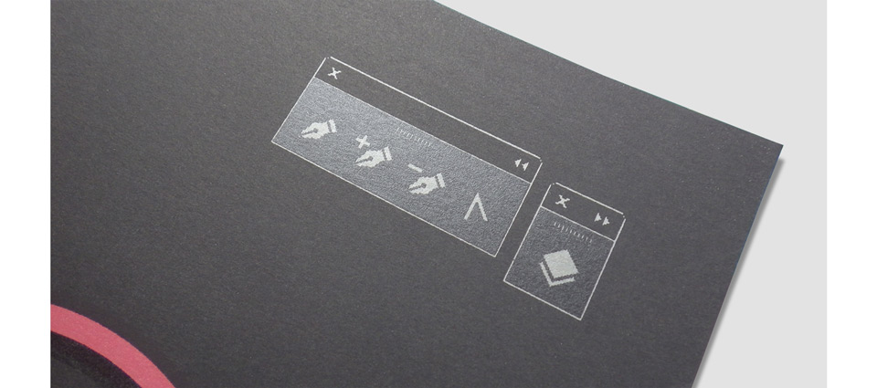
As I was getting the poster ready for print, I took a screen shot to document my progress. I accidentally included two Adobe Illustrator toolboxes, and they looked so nice in the layout that I recreated them as one-color graphics and included them in the actual poster:
The event itself went swimmingly, and I gained about three pounds in 48 hours of eating myself through Austin. Such are the risks of the traveling speaker’s life. If you’d like to own a copy of this poster, you can order it from UnderConsideration here.