CHARLES GARABEDIAN
After taking a few years off to help the Blue Man Group and build the world of the Saks Yeti I was happy to return to one of my favorite clients, L.A. Louver, to design this exhibition catalogue for painter Charles Garabedian.
- Buy one
- at L.A. Louver
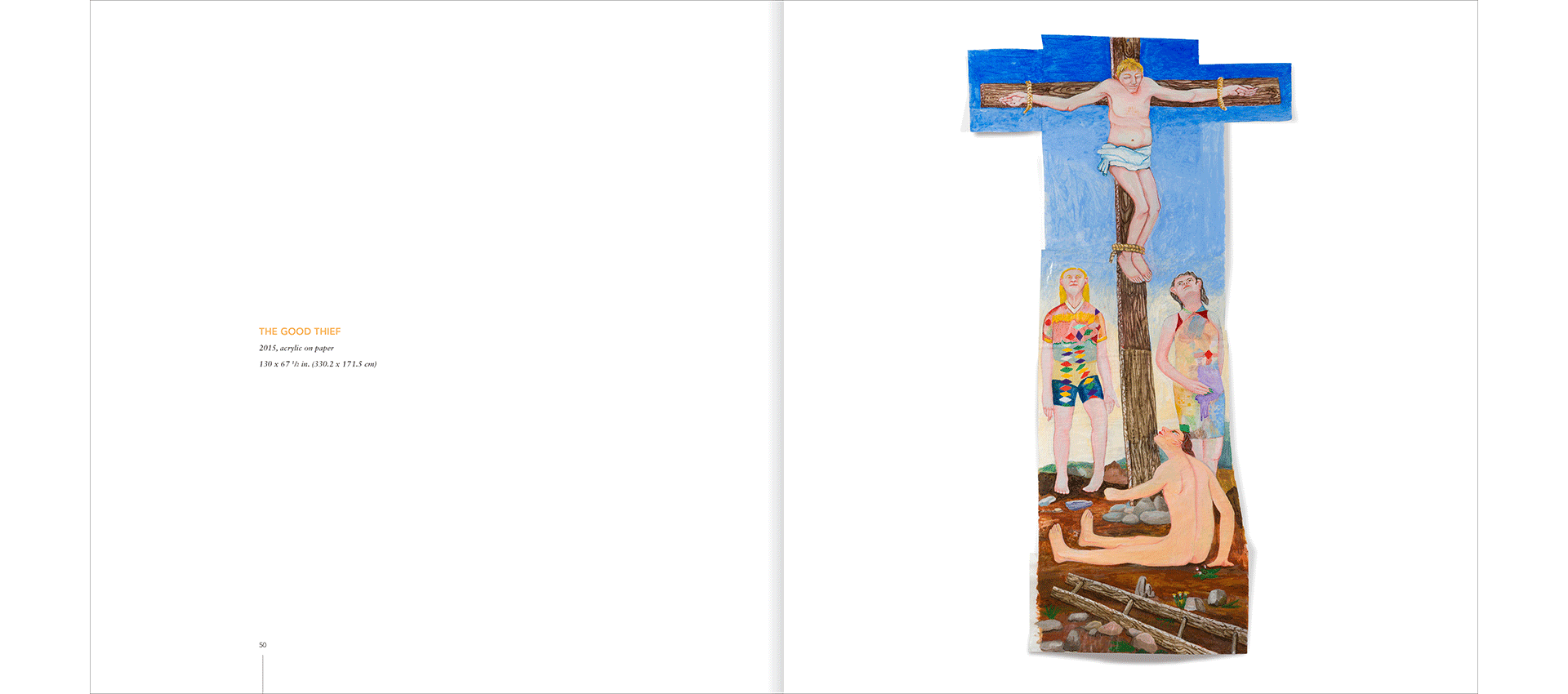
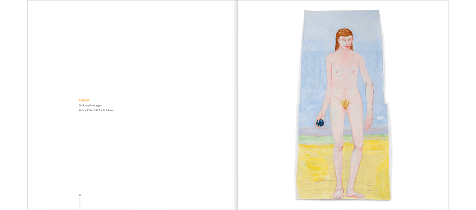
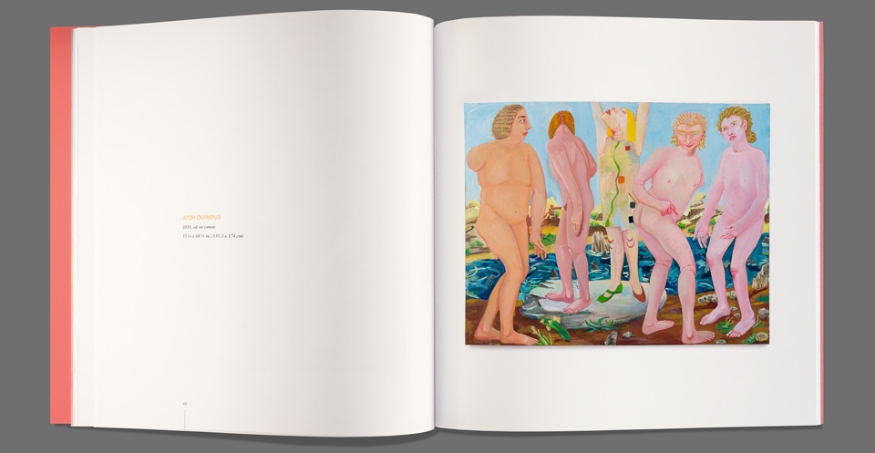
Charles Garabedian’s paintings reintepret scenes from Greek mythology in vibrant colors and in large scale. (Some of the pieces shown here are over eight feet tall.) His dreamlike scenes are rendered in oil on rough paper that grows with many attachments as each painting takes shape. These aren’t neatly framed rectangular canvases. The paper warps toward you and expands in whatever direction the image demands. It was important for the catalog to reproduce this physicality by showing the shadows cast by each piece. And of course, the color had to be vivid.
One of the first decisions on these catalogs is always the format. I’d entertained the idea of a tall, skinnny book to give the most area to the largest pieces—The Good Thief and Target, both shown below—but it would’ve done a disservice to the many horizontal works. We went with a square format to split the difference.
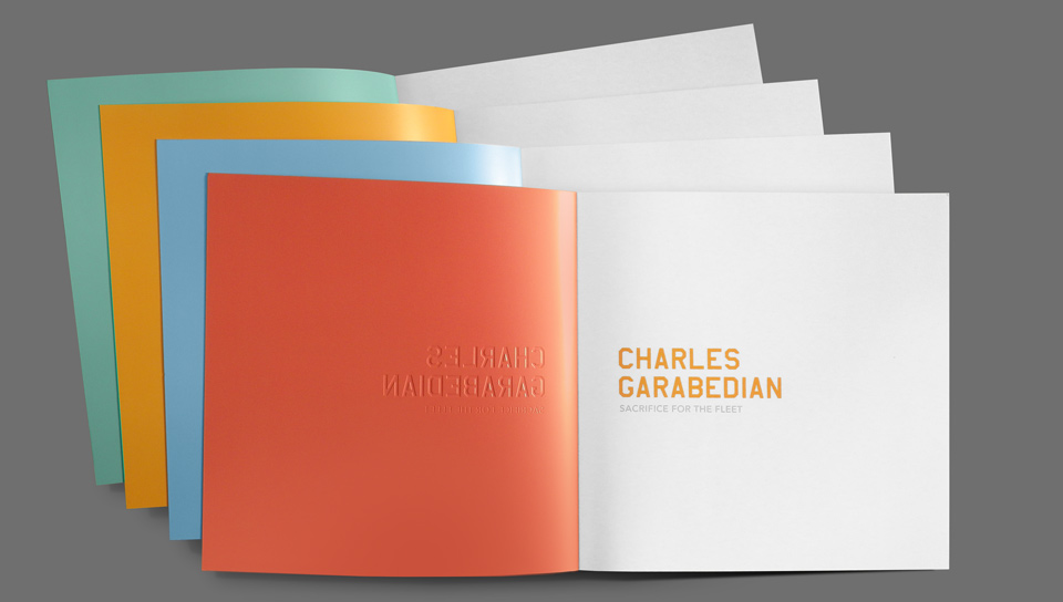
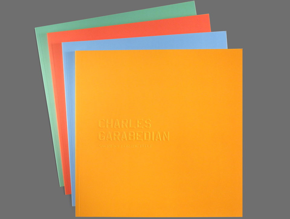
The traditional route for these catalog covers is to select one painting or pull a beautiful detail, marry it to a tasteful bit of typography and call it a day. As color is so important to Garabedian’s work, we decided instead to pull a few representative tones from the paintings and print a series of four separate covers, each embossed with the title of the show, “Sacrifice for the Fleet.” The inside cover of each edition was printed in one of the other colors. Orange was paired with red, teal with cyan. To underline the tactile appeal of the work we added a Curious Touch coating to the cover stock to give it a skin-like feel.

The embossing was done with two separate dies. Charles’ name rendered in large beveled letterforms used by the U.S. Air Force, as a nod both to the title of the show and to his service in the Air Force during World War II. The title of the show was struck into the paper with a regular magnesium die. It was necessary to do two separate die strikes, because the pressure necessary to get a good impression on CHARLES GARABEDIAN would’ve obliterated the more delicate show title.
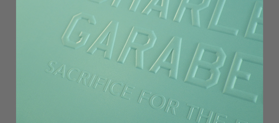
Specifying brass dies on a deadline is always a bit nervewracking, as the digital previews of the bevels are only ever so accurate. Much also depends on how the paper will react, particularly when it’s covered in a lot of ink and has been specially coated. You can only apply so much pressure to the paper before it cracks. The debossed side also tends to have a much sharper impression, as it’s in direct contact with the male die. The raised side gets a little softer. In this case that didn’t bother me, as the title page mirrored the type on the cover, so all the elements played well off each other.
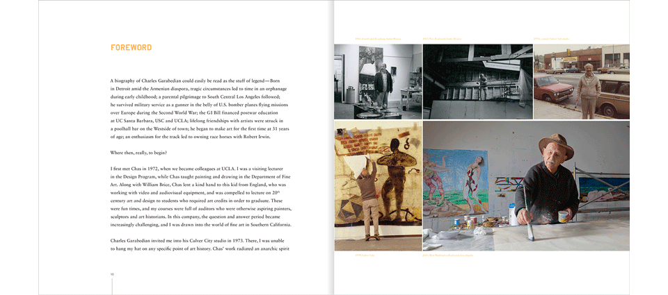
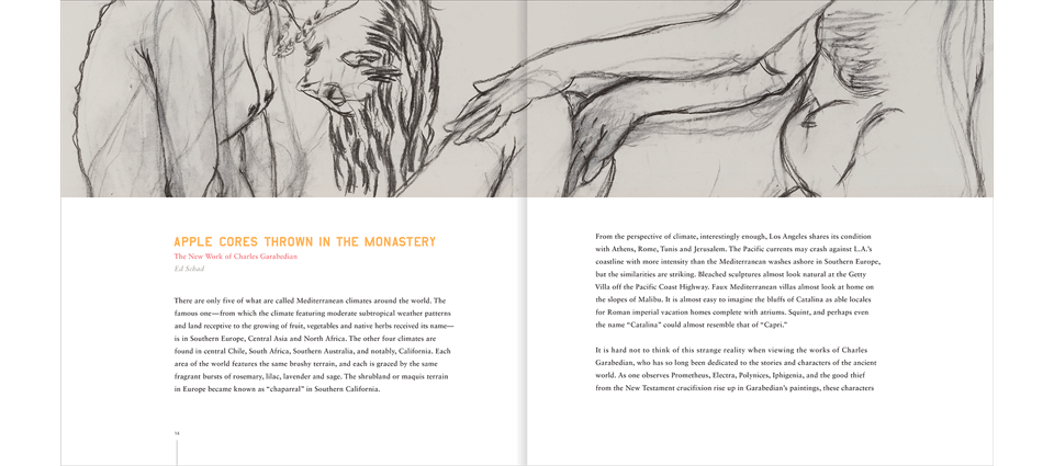
The catalog opens with a very personal foreword by gallery founder Peter Goulds, highlighting his forty year working relationship with Charles. An essay by Ed Schad—”Apple Cores Thrown At The Monastery”—gives a critical assessment of the new pieces and places it in the context of Garabedian’s work over the years. Both the foreword and the essay make it clear why Garabedian was revered by other artists as a painter’s painter.
We completed the catalog in time for the opening of the show in October of 2015, and I’m happy to say that Charles was very happy with the result. Sadly, he had been quite sick, and “Sacrifice for the Fleet” turned out to be his final show. He passed away in February of 2016 at the age of 92. As sad as it was, think about it: Charles painted these amazing, joyful, physically epic pieces between ages 90 and 92. He grew as an artist until the last possible moment and enjoyed himself along the way. May we all be so fortunate!