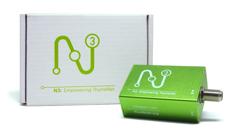
N3 LOGO
Have you heard of SDR? Software defined radio? In the simplest of terms, stuff that used to be hardware (filters, amplifiers, detectors, and so forth) is now software on your computer. Conceptually, this isn’t a new thing, but computers have finally become fast enough to do all kinds of nifty things that used to take specialized and expensive equipment. Things like receiving radio signals from space. You do still need a receiver, however, and that’s where the N3 unit comes in.
- Buy one
- at nongles.com
The makers of the N3 call it a Nongle. As their engineers will tell you, “‘Dongle’ is just too limiting a term for what we’re doing here, so we had to invent our own word.” These little boxes offer a broad range of filters, amplifers, breakout boards, front end modules with an R820T2 chip, back end modules with an RTL2832U chip, bias Tees, impedence matching transformers, maybe even a radio PAD! Next time you see me in person, feel free to ask me what any of these things are. I’m told that my blank stare is quite winsome.
What I do know is that it’s an amazing box that does cool things experimenters, hobbyists and budget conscious scientists have been clamoring for. People love this gizmo! We needed to give the box an eye catching look and a cool logo, so that people would notice it in a lab setting and ask about it.
The logo itself is basically a diagram that shows the unit (symbolized by the center circle) as part of a daisy chain of equipment between an antenna and a computer. As a secondary read, the three circles — it’s an N3, after all — are supposed to invoke the expanding lines of the WiFi symbol. And the whole thing makes an N, because… you know… logo! We added an apple green classic flake finish to the case simply because it’s the kind of thing you don’t see a lot in a laboratory setting, and it’s just so damn nifty!
Why is the N3 called the N3? The receiver went through two major pre-release versions—Nongle 1 and Nongle 2—so this is Nongle 3, and everybody liked the sound of N3. That’s also why we added the number three in the logo, so that the logo can easily accommodate an eventual N4 and N5. The three dots will still function as a diagram, and they will forever harken back to the N3 as the original release version.
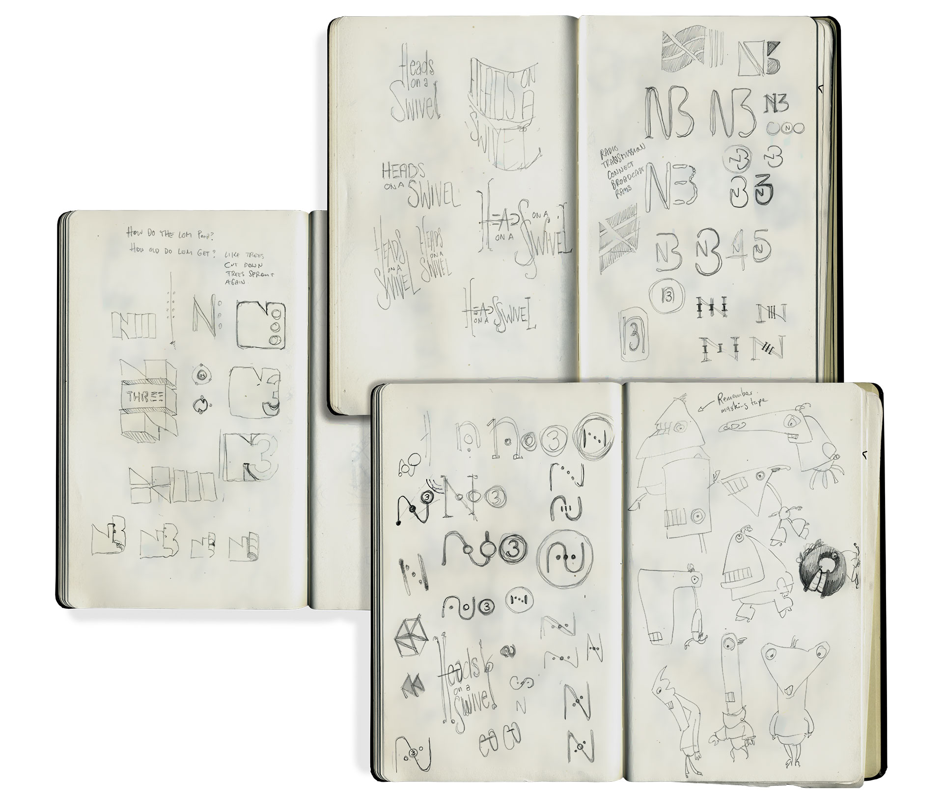
So many logos, so little time. And a bit of bonus R&D for the daily monsters, too.
As always with logo assignments, I did a number of thumbnail pencil sketches to explore. On the whole, I find thumbnails problematic. You can cheat lines too easily, so the ideas frequently don’t translate into feasible designs. In the case of logos, however, they force a simplicity that’s appropriate for the job. A good logo should be so simple that a kid could replicate it with a ballpoint pen. It needs to be iconic. I think the N3 logo fits that bill. This was a fun job for great clients, and I couldn’t be happier with the result!