SOLAR TWINS
When this album first came into the Maverick offices, the band was called “Luxe”—Joanna Stevens on vocals and David Norland on everything else—and I immediately fell in love with their music. I knew I had to art direct this package from start to finish. I was a lowly freelancer, but I was pretty sure that I had proven my worth, and besides… I was feeling feisty.
Once I met David and Joanna it was just all over anyway. We immediately hit it off. We had the same sense of humor, we liked a lot of the same music, we just got along. It was… eye-roll inducing. I mean… yeesh! Way to play it cool, Bucher. But what can I tell you? It was just utterly great! I had an art crush. I was 25, I was working with a cool band at a cool label, and I was bursting with ideas. What could’ve possibly been better?
A lot of work comes in on a rush deadline, and I need to go straight for layouts. In this case, I was determined to do things right, so I started a sketchbook. I listened to the album (somewhat obsessively) and drew inspiration from the video projections that were part of their regular shows at the Viper Room. I saw David and Joanna as travelers through time and space, but instead of some dingy old Tardis, they’d get around by means of a giant gleaming white loft space—each window giving them access to another locale. While I was sketching, the band had to change its name. “Luxe” was taken by a band in the mid-west, who wanted some exorbitant amount for it. They briefly became “Astral TV” and ultimately landed on “Solar Twins.”
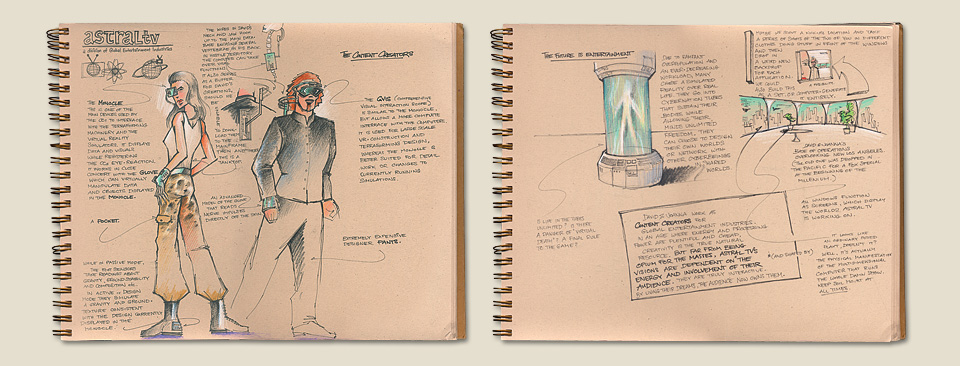
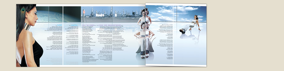
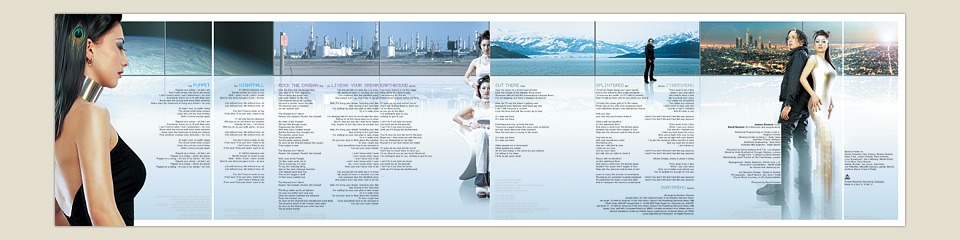
Note in the top left corner of the left page that the band’s name was still “Astral TV” at that point.
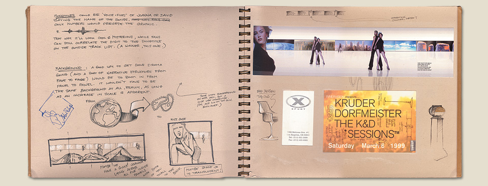
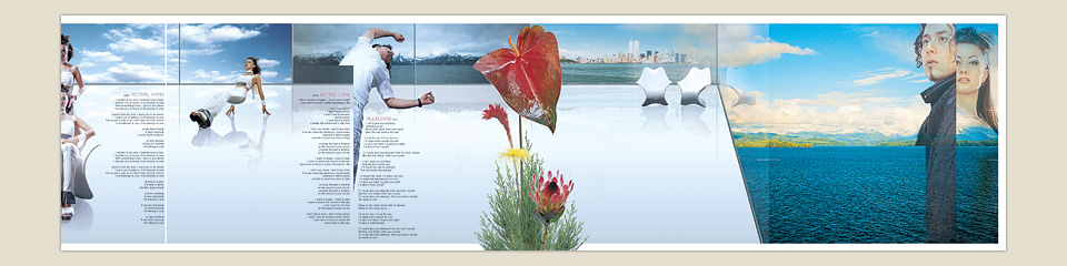
The original idea was for the window views to progress from global to microscopic scale.
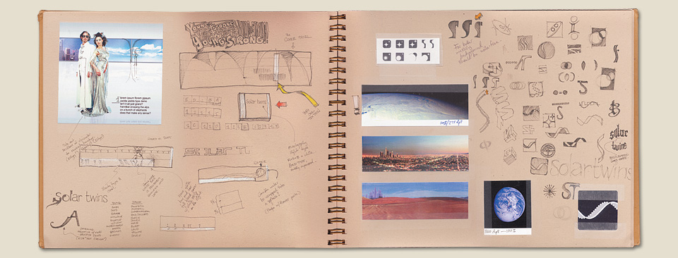
The ST cobra logo made it onto the spine of the single, but the band never loved it, so it went no further.
With all of this in mind I scouted for photographers. I was dying to work with Seb Janiak after seeing his photo of Gillian Anderson in Entertainment Weekly. That didn’t come together, but his style definitely influenced the design of the album. Luckily, we found Geoff Moore, who you might know his work from the opening credits of “The L Word.” Geoff took beautiful shots for us, even though he was a bit frustrated with me. I needed David and Joanna captured on a flat gray background, so I could composite them into the environment I was building for them in Photoshop. This is not exciting work for a photographer. Geoff kept pushing for a trip to the desert, but we only had money for one day of shooting. “We could do the first half of the day in the desert and come back to the studio after that.” Right. I’m usually far too much of a people pleaser to stick to my guns, but it’s surprising what a clear vision will do for your temperament. We stayed in the studio.
On the day of the shoot—my debut as an actual on-set art director—we spent the first eight hours lighting and working on the finer points of styling. The hair person came up with the great idea of weaving peacock feathers into Joanna’s hair, for example. By the late afternoon we had yet to take a single shot, but I wasn’t worried. I knew what I needed, and that it would go fast once we had everything set up. It was a bit of a gamble, but everything came off exactly as I’d hoped.
And with that began many months of Photoshop work. It wasn’t supposed to be months, but Maverick kept pushing the release of the record, so I kept noodling. It never occurred to me to hire a retoucher. There was a particular otherworldly look I was after, and I was having fun. Among other things, we had shot Joanna doing a sort of backwards pushup. For this, she was resting on an apple crate, so I had to do some reconstruction of natural curves.
Over the years I’ve occasionally had tense moments with people who felt insulted by the idea that I’d retouch their portraits. Which always strikes me as politically noble, but practically silly. Even the most naturally beautiful people need a little digital assistance once they’re captured on film and put on paper. You have to optimize reality for the medium at hand. Luckily, Joanna—being naturally beautiful—had no qualms about letting me do my work. When I showed her the various retouched shots she was delighted, and singled out one image in particular. “That’s my favorite butt out of all of them.” I love working with professionals.
There were other fixes and enhancements, too. For one thing, we had picked a silver gown that looked great on set, but fusty on paper. You can see it in the sketchbook images. I transformed that one into a sleek, skin-tight dress that ended in a sort of beam-out pixelation. On a more mundane note, the release of the album was pushed back so many times that David had taken off his mustache in the meantime. He was happy to find out that I could give him a Photoshop shave for the cover.
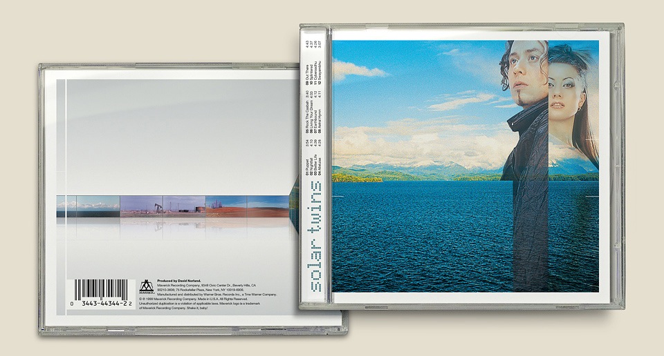
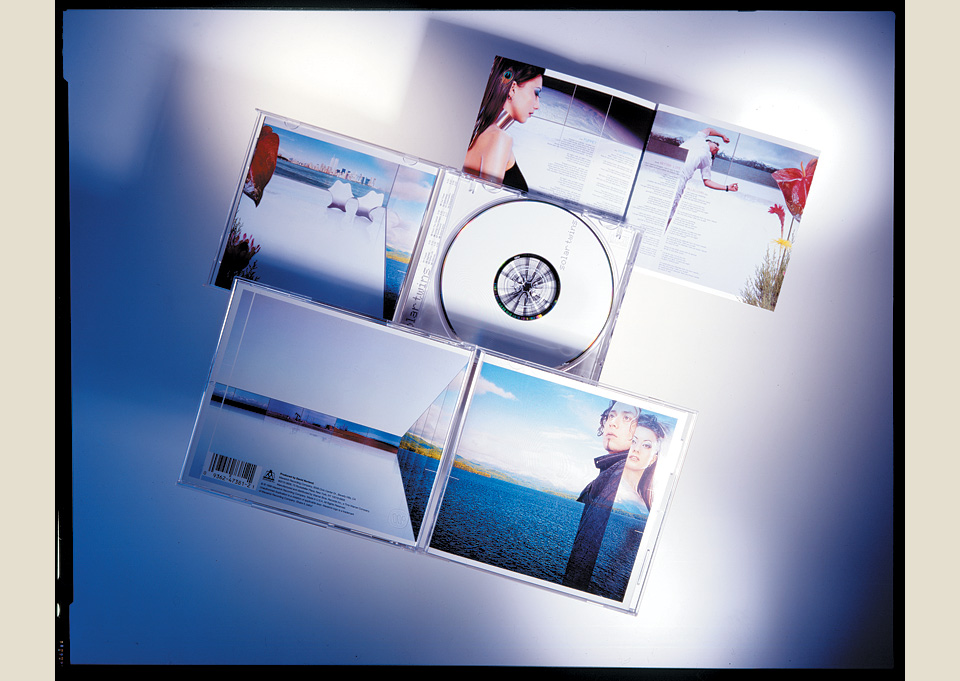
Please note that the fold of the last panel completes the sitting/standing Joanna Twins.
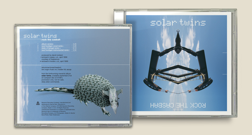
I’d been driving around L.A. on weekends to shoot scenes that would be visible through the windows of the artificial loft space. One memorable outing led me to an oil refinery in Bakersfield. The first single off the album would be a cover of “Rock the Casbah” by the Clash, and I wanted a reference to the original video. I parked my car by the side of the road, and started taking pictures when a security guard came running toward me. “You can’t take pictures here!” This was 1999. Imagine if I’d tried that in early 2002. I’d have been arrested. As it was, I actually managed to do that thing that you always see photo-journalists do in the movies. By the time the guard reached me and popped open the back of my camera, I’d switched in a fresh roll of film. So suave! I changed a few of the refinery towers around for the album, just to be safe.
For the first window I’d found a great shot of Earth as seen from space. I wrote to NASA for permission, and got it. Can you imagine a better photo credit than “Planet Photo Courtesy of JPL/Caltech/NASA”? But the cover image still proved elusive. I knew wanted a landscape, but nothing felt right. As I was walking out of the office one afternoon, I bumped into Maverick accountant Ann Short, who was showing off photos from her Alaska cruise. There it was! The perfect shot! “Can I just borrow that for a minute?” Yoink! And just like that, Ann had herself a cover credit!
At the last minute, David and Joanna did have second thoughts about the cover, prompted by a discussion with a few higher ups at the label or with their management. I forget the particulars. The design was at that point more or less as you see it today, but without the stylized chunks taken out of the portraits. There weren’t many versions. The booklet came together as a whole, cover and all, based on the sketches I’d shown the band. To my own surprise, I didn’t back up any of the earlier comps, but I’ve reconstructed two covers based on the original layered file. From this you can see the point they were making: It didn’t exactly look like an electronica album. Which had been our intention all along, but the cover had become a bit too straight along the way. I remember feeling weirdly ambushed by their eleventh hour criticism, even though they delivered it with a level of kindness and consideration way beyond what was necessary. And they were right, of course, and the cover became so much better because of their extra push.
The left had been the cover through most of the process. The right was a “Let’s just see” attempt. Note that David’s mustache was still present in both comps.
A slight sticking point for the label was the fact that I’d put the name of the band (and the track listing) into the clear spine of the jewel case instead of including it on the cover proper. This usually made everybody very nervous. On CDs the band name had to be big across the top third of the cover, so it could be easily read in a store bin. Ideally, it’d be in the top left corner, so the right was open for price tags and promo stickers. Moreover, the name needed to be large enough to still read clearly when the cover was reduced to a mini version for ads and online use. Luckily, I’d developed a good relationship with Fred Croshal, the head of sales and marketing, and presented him with a big silver sticker for the shrink-wrapped CD. Giant band name. Featuring “Rock the Casbah.” (And, in 6 point type, our little tagline “Obey Alien Commands.”) So far, so good. But there was still the problem of a cover that wouldn’t reduce to a marketing-ready mini. I asked why the mini had to look exactly like the album cover? What if I added the type big across the top for this purpose only. “Oh. Can you do that? Yeah, that’ll work.” Nobody had ever thought to ask.
I’ve tried that same approach a few more times over the years, and have been consistently rejected. As much as I love working from my own desk at my own office, it comes at a price. Getting anything unusual approved is much easier if you see your clients in the hall every day, and once you’ve had a chance to help them out on any number of little deadline emergencies. It’s tough to build that kind of trust from afar. Plus, Fred is a good guy, and I’m pretty sure it was obvious to him how much I cared.
As a last touch for the album we printed a pattern of concentric white ridges onto the CD label, covered by a solid layer of white ink. This way, the lines formed subtle ridges in the solid top layer that felt like the grooves of a record. Only the band name knocked out to the silver of the disc, creating a great rainbow color effect. I hid the legal copy on the clear center ring. It’s a pretty disc. This, too, is a thing I tried to repeat on another job and failed, because I was missing the help of Warner Bros. Records production supervisor Kathy Malloy, who always went the extra mile to help me realize my little follies.
For the “Rock the Casbah” single I had created another homage to the original Clash video, which featured an armadillo running through a number of the shots. For this new electronic version of the song I built an armadillo out of fighter jet parts. I chopped up a few photos of an F16 and went to town. This was meant to be the cover of the single. The back would be an oil derrick I had shot in Bakersfield—another Clash reference. When I started messing around with the photo it didn’t look great from the waist down. The dusty ground? The dry weeds? Not sexy. So I flipped the image to create a reflection, and suddenly a sort of demonic mask appeared. I was deeply invested in the jet-powered armadillo, but this was just much cooler. The band agreed, and the armadillo moved to the back cover.
Lastly, I designed a website for the band. It’s not something I usually did, but I had become completely obsessed, and wanted to control every last part of this album. For the section headers I cut up all the lyrics and recombined them. Some phrases already existed in the lyrics—such as the great “fate oscillator”—while others emerged in the process. “Vain electronic logic” became a favorite, and lives on as a rare sticker. Were the section headers clear? No. But they were fun.

Internet Explorer (1999) — The March of Progress
And after all that, how did the album do? Solar Twins had garnered a nice following from their appearance on the soundtracks for “Brokedown Palace” and “The Next Best Thing.” Their version of “Rock the Casbah” was starting to take off in clubs and on the radio, particularly in Britain. And then Will Smith released the single “Will 2K” which was built around a sample of the original “Rock the Casbah.” And that was it. Radio DJs wouldn’t play two songs with the same hook. Thanks a lot, Will.
Around the same time, Maverick signed the band “Olive,” which fit into the same niche as Solar Twins, so they pulled the plug on David and Joanna. A second album was in the works for a while, but ultimately didn’t come together. Joanna started a solo career, and is a frequent guest vocalist on other artists’ albums. David composes for film and television. If you haven’t seen the excellent documentary “Anvil: The Story of Anvil,” check it out. That’s one of his. You can download the album on iTunes, but I’d much rather you find a copy of the actual CD online.
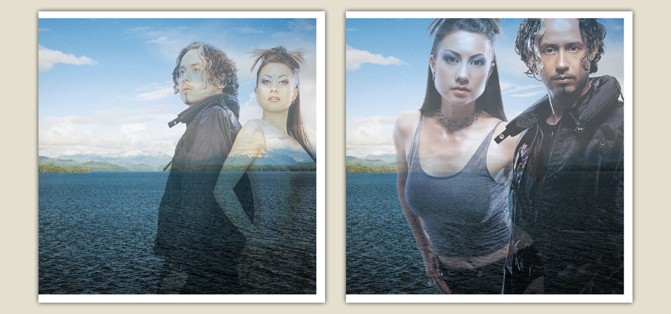
A postscript on preparing things for your portfolio: You’ll see this shot throughout the site—with different album art stitched on. This is the original. The CD was to be featured in Communication Arts magazine—My first time in their pages! A huge honor!—and they’d requested a 4x5 transparency. By the end of the week. A colleague referred me to product photographer Jason Ware, who has since shot all my major projects for publication. I asked him if he could bail me out, and he squeezed me into his schedule. He shot a lovely composition that ran in Issue 294—and that came out all pink. The booklet looked a bit warped, too. In other words, I hadn’t sprinkled the whole thing with my neurotic attention. So a few weeks later we started over, and shot the thing again in this much more elaborate setup. The fact that Jason still takes my calls speaks to his kindness and eternal patience. (But I do worry a little bit every time I pick up the phone to call him.)