T-Post
T-Post is a Swedish magazine that is published as a T-shirt. Each month features an article by a respected writer or journalist, which is printed it on the inside of the shirt. On the outside, they run an editorial illustration that plays off the article. They draw on an excellent international roster of contributors, and in 2009, I had the opportunity to join their ranks.
Right here I have to say that I have been vexed by T-shirts for years. Try as I might, I’ve never managed to produce one that I really like. They should be simple and straightforward to produce, but for whatever reason, the silkscreen printing is always a problem for me. So when T-Post writer Chad Rea asked me to do editorial artwork for his story about the impact of a toilet paper shortage on the people of Cuba, I was ready! Here was my chance at T-shirt redemption!
This was an interesting problem to illustrate. Because of trade sanctions imposed by the United States, Cuba could not get sufficient toilet paper to supply their people. They can’t get it from the U.S., and shipping it in from China was taking too long. The shortage was causing a huge public health crisis as a result. All of which was reflecting negatively on the government and even calling into question some long held ideals about the effectiveness of Communism. No matter how you feel about Cuba, the fact that a major political movement could be stymied by something as mundane and inexpensive as toilet paper is both an irony and a bit of a tragedy.
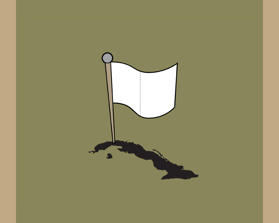
My first thought was simple. I drew a map of Cuba and stuck in a white flag of surrender, made of toilet paper. Ha! How clever am I? Right? I wanted something with a deeper meaning, though, so I set that little gem aside.
I was trying to be Christoph Niemann. A noble goal, nobly missed by a mile.
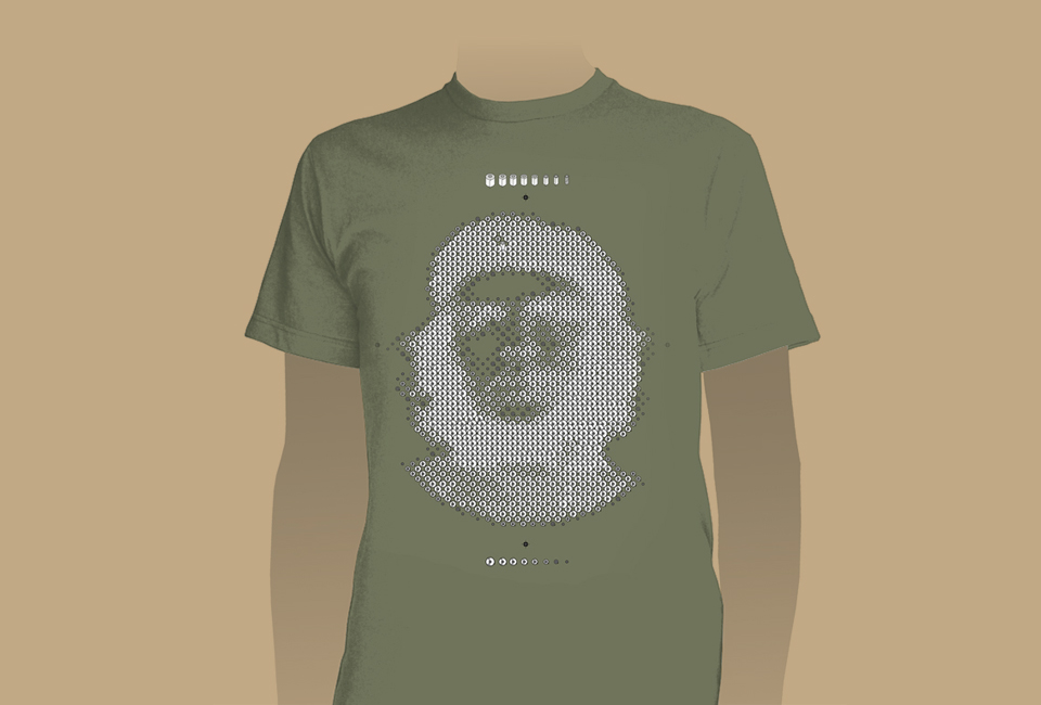
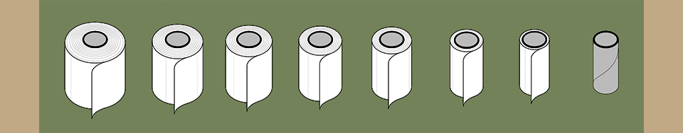
My second thought: Che, baby! Yes! Genius! You may have seen the photo of the revolutionary leader in shaggy hair and beard, beret, and fatigues taken in 1960 by Alberto Korda? Of course you’ve seen it. You’ve seen it on a hundred T-shirts. You see where this is going. I did. The whole thing popped into my head fully formed! I decided to do a new version of the iconic portrait using a system of halftone dots created… wait for it… from toilet paper rolls. Because why do something that’s punchy, easily silkscreened, and… you know… fast, when you can spend 12 hours making a halftone image dot by dot? Just making convincing rolls in Illustrator took hours. They ranged from light ones (empty rolls) to heavy (full rolls) with several steps in between.
Stochastic screening my ass. This is the future right here!
After the first half of the face had formed I noticed something: A heavy ink dot is black. It makes the image darker. A full toilet paper roll is white. It makes the image lighter. The image was coming out negative. A moment of panic! But it worked. Che looked beautifully ethereal—like a counter-culture Shroud of Turin! And who doesn’t love that? Another layer of meaning! Onward and upward with the arts! After arranging hundreds and hundreds of dots, I stood back and basked in the warm glow of my genius. Yes, there it was! Clear as day:
This would be a piece loved by everyone, acknowledged as almost unnaturally smart, and it’d win a ton of awards. No question.
I specified the T-shirts to be a combat fatigue color as a nod to jungle warfare. I tirelessly refined my vector artwork, knowing that my toilet paper dots might be a challenge once they hit the silkscreen. The problem was that the magazine’s printer took my Illustrator file—carefully labeled layer by layer and screen by screen—flattened it, and just screened the whole damn thing with coarse halftone dots.
Thin black lines, carefully spaced, bled right into blobby black dots where a second, separate layer of gray ink should have been. All on top of a white mask. I set up a three color job, and they turned it into a two color job. Go team!
To add insult to injury, they didn’t use the correct shirts, either. This was partially my fault. I had selected an American Apparel shirt in a perfect olive color. As it turned out, that color wasn’t available in time. A substitution had to be made quickly. The publisher asked if an earth color would work. Not perfect, but OK. An earth tone shirt is still pretty fashionable. I’d wear that. OK. Approved.
Many magazine subscribers, and it is an annual subscription-only publication, were put off by my work. Several people who commented on the T-Post: Cuba issue on the magazine’s blog indicated that I was making a cheap visual pun that was boring and obvious. Some thought I was mocking the revolution or Cuba or Che or all of the above. Others thought I had commoditized the Cuban Revolution. In short, they thought the whole thing was extremely disrespectful, and badly drawn at that. That certainly wasn’t my intention.
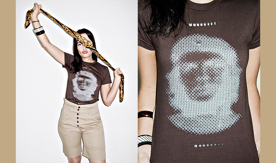
Do these shorts make my butt look big? Yes. Yes, they do.
At this point a comment attacked the choice of T-shirt color. It boiled down to, “A toilet paper illustration of a revolutionary hero on a brown background? Really?” Earth color. Brown shirt. Toilet paper. Brown.—Ugh! Of course.—It just hadn’t occurred to me. Even when I saw these photos from the publisher it didn’t enter my mind that people might think I was making some sort of emissions joke. All I could think of was “Who chose those hideous shorts? Who tucked in the shirt? Why that expression?” We all have our blind spots. (Nice scarf, though.) To his credit, the publisher backed me up against all comers.
So what’s the lesson here? When you’re dealing with silk screening it’s much better to have one big, clear concept than an orgy of layers, both in your file and in your meaning. This piece was too clever for its own good. One day in the far off future some design historian may look back on this illustration with fresh eyes and recognize it as what it is: proof of my depth, both as an illustrator and as a human being, proof of my humility and of my undeniable genius. For now, I’ll see it as the noble failure it turned out to be. Which works on so many levels. (Should’ve just gone with the white flag.)