344 FLOWERS

Before I got my first computer in 1996, during my first term at Art Center, I was obsessed with creating perfectly clean lines, perfectly flat colors, and perfectly smooth gradations. I wanted my design to look pristine. This was motivated by insecurity. If you disagreed with what I was saying, you’d at least have to respect how cleanly I was saying it. And so I spent the next seven years chasing the perfect modernist design.
Looking back, I think I got there. Here and there. Now and again. It always felt wonderful. Soothing. But after seven years, it was also becoming a bit boring. Once you really learn a trick it loses its appeal. It’s still a nice go-to, and you can spice it up by making the circumstances more difficult. Three-Card Monte played underwater? Fun! But still Three-Card Monte.
Back then I was going through another phase of being fascinated by the work of Jim Steinman, the composer of Meat Loaf’s “Bat Out of Hell.” All of his stuff is extremely overwrought, and the lyrics lean toward the horribly cheesy, but the music is a force. I like crazy and over the top! He’s done some work as a producer, too—Steinman—and his maxim was “Everything louder than everything else!” When I heard that, I felt incredibly self-conscious about my work so far. Everything was so sedate. Some of it bordered on being prissy. Twee, even. It’s a tendency I’m still fighting now, but at the time it suddenly felt very urgent that I do something impulsive and loose.
It was clear that I had to break out of my digital straight jacket! I had made a few head fakes toward spontaneity with the bossa:nova flyers, but I needed to go much further! I had to unleash some crazy loud energy! “Ink!” I thought. “I’ll throw some ink on paper. I’ll splatter it, and blow it around to music!”
As this thought had occurred to me late at night, and I didn’t want to wait, I cut up some trash bags as a makeshift tarp in the middle of my living room, and went at it. The splashing was satisfying, but I didn’t know what to do with the results. Blowing on the ink with a cocktail straw, though, gave me some really pretty lines. (And a giant headache.)
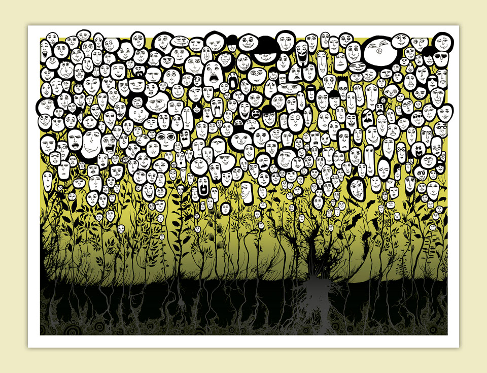
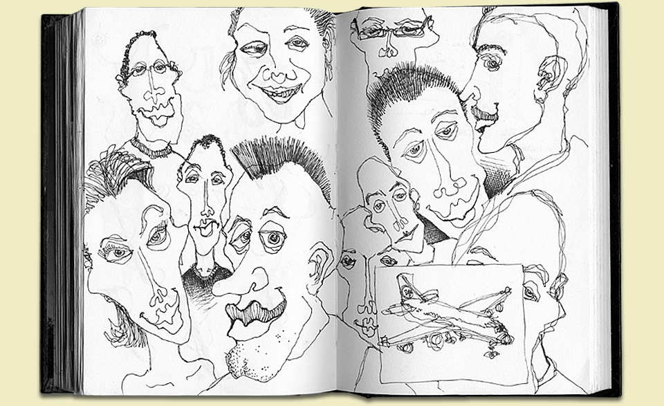
Around the same time I was also doodling a lot of faces in my sketchbook. I wanted to do something with those faces, but I didn’t know what. When I saw the ink blown lines, they seemed like great flower stalks. The faces could be the blossoms! There it was! The perfect Valentine’s Day poster! (I’d already blown the New Year’s poster deadline.)

I have the hardest time drawing recognizable portraits, but making faces is fun! Note the 344 company jet.
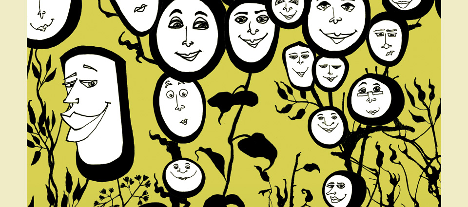
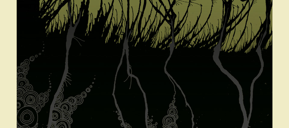
What came next? I scanned all the stalks, drew 344 faces on letter-size sheets, about 20 faces to a sheet. So many faces! Doing a few hundred of something is such a great exercise! Just when you think you’re exhausted, some little variation will spring into a full-sized idea that surprises you, and carries you through another dozen variations. I assembled the whole thing into a 24 x 18 in. (61 x 45.7 cm) poster. Then I drew lots and lots of leaves, which I also scanned and added to the composition. Oh, and I decided that there should be a root system visible in the ground. This was also a way of introducing my now patented, then brand new circle doodles as the life force powering the whole enterprise. That whole section took about 80 hours. Time well spent.

Each one of those faces has a story to tell. And each one of those leaves has a great anecdote.
Lastly, I thought the thing needed a layer of grass. This is significant, because it’s here that I realized that blowing into the cocktail straw with enough force to generate good grass might give me a brain hemorrhage. Instead, I turned to compressed air and used one of those duster cans they sell at the office supply store. This worked like a charm, and it obviously sets the scene for the Daily Monsters. You’d think. Instead I forgot about that technique again for another three and a half years.

Did I mention that all the gray bits are printed as a clear varnish over solid back? I live for that sort of thing.
As it was, I wrapped up the poster on the computer. On my then brand new PowerMac G4. Oh yes! And because the G4 had all that power I decided to create the poster at 1,200 dpi—you know, in case I’d ever need to blow it up to wall size. (I’m ever plagued by the fantasy of a big gallery show.) Doing anything of any size at 1,200 dpi will still slow thing to a crawl now, let alone back in 2002, but boy… that is one sharp file. And a huge one, too. If it wasn’t my first file to break a gigabyte, it certainly came close. I seem to remember over 700 layers. Maybe that was one of the reasons this poster turned from a Valentine’s Day gift to a springtime offering without a particular date. When I work with clients I pride myself on making my deadlines, but when it’s a self-generated piece I’ve learned to put the quality of the result ahead of timely delivery. (Coincidentally, this website took over three years to launch. Ahem.)
All of it was worth it. “344 Flowers” wasn’t the explosion of raw animalistic power that I was chasing. It turned into another exercise in obsessive compulsive behavior. I have a knack. Still, it got me out of perfectly straight lines, and perfectly flat colors, and into something new that would change my life pretty soon thereafter. I did add a perfect gradation in the background, though. And why not?