ALL ACCESS
Oh, this book was such a bad idea! In fact, it wasn’t meant to be an idea at all. It started as an innocent little essay for the book “tellmewhy” by my friends Jan & Hjalti about the first two years of their design firm, KarlssonWilker. I wrote a little riff about the book being their superhero origin story. There is something daring about showing your humble beginnings. They were putting all their early work together on the record, doing away with the possibility of quietly removing it from their portfolio later.
- Buy one
- on Amazon
Which is a great thing for their audience, because I don’t think a carefully edited “Everything we touch turns to gold!” presentation is all that helpful. I know that sort of thing always makes me feel somewhere between inadequate and stupid. “They have it all worked out, and I don’t.” It’s demoralizing. I thought that they were doing a generous thing by showing their efforts warts and all.
I e-mailed the essay to a friend to get her opinion, and she told me that it would make a great pitch for a book of my own—collecting the origin story of a whole bunch of designers, along with lots of their early work, done before they were famous. She told me to send the piece to Kristin Ellison, who was then the acquisitions editor at Rockport, one of the main publishers of design books in the United States.
I’d just met Kristin a year earlier at the AIGA V01CE Conference, and there seemed to be no harm in asking her if she thought it would make a good book. It didn’t occur to me that her response would be “Yes, and we want to publish it.”
Around that time I was banging my head against the wall, trying to get work designing books. I had so much fun creating the Soundblast catalog for AIGA/LA, and I loved—I mean, I loved—putting together the American Photography book for Mark Heflin. That one also won a ton of big awards, and was for a client in New York, so I figured that it would be a great calling card for more book work. It did open a lot of doors, but the meetings would usually end when the art directors realized that I wasn’t local. “So what part of New York do you live in?” “Oh, I live on the west west west west Westside. I live in L.A.” Which then quickly led to them wrapping things up. “Thanks for coming in. We’ll call you.”
It drove me nuts. That’s why we have e-mail, FedEx and plane travel. The cost for all of which I was willing to cover out of my fee. But clients like to stay local. If somebody is willing to fly across the country for you, it upsets the balance of commitment. For the standard process to work, the designer has to be more commodity than partner, and this goes against that. You can’t just move a meeting at the last minute if the person you’re calling in has already paid for a plane ticket.
What I’m saying is, I wanted to design more books, and I wasn’t getting anywhere with it. When Kristin said, “We want to publish this book.” it seemed like I had to say yes. So I’d have to write a book just so I could design it. Fine. It wouldn’t be the first project I’d started out of spite. I said, “Let’s do it.”
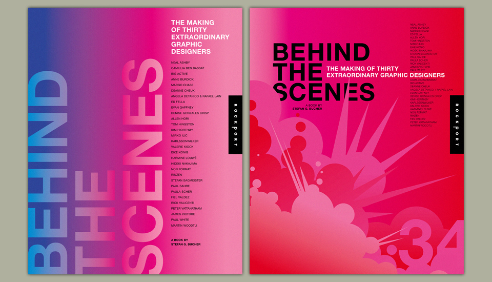
One of the first cover comps, and one of the last. There would be many in between.
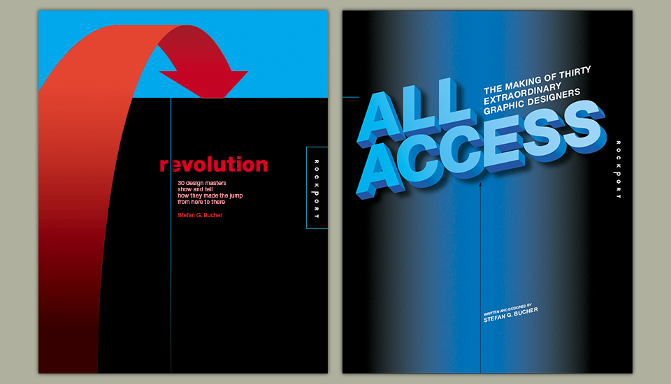
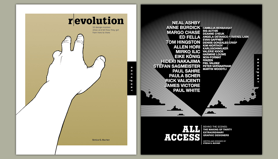
Back then the book was titled “Superheroes of Graphic Design,” in keeping with the original creation myth idea. We immediately shortened it to “Heroes of Graphic Design,” because it rolled off the tongue a little easier. When I approached the first group of designers quite a few said no. “Designers aren’t heroes.” was the recurring theme. This was still fresh after 9/11, and it was a sensitive word.
We changed the title to “(R)EVOLUTION—How Graphic Designers Become Design Heroes.” But no. Even in the subtitle “Heroes” wouldn’t work. From there we went through a few different titles until we landed on “All Access.” Which came from Rockport, I believe. To them, this was the heart of the book—the look behind the scenes. Which is fair enough. I’d always referred to this as VH-1’s “Behind the Music” for graphic design.
An early layout idea. I wanted it to be boring to focus on the content. Objective achieved.
Getting the perfect lineup of designers was a challenge. I was asking for a lot. I wanted samples of early work, lots of which had never been shot or scanned. And I wanted in-depth e-mail interviews that covered a lot of things designers don’t usually talk about.—Where did you grow up? How did your family feel about your becoming an artist? School stories, first jobs? What were the screw-ups and outright failures along the way?—Personal things.
Which is all fine when you’re talking to fine artists or musicians. They’re supposed to have complicated lives. Early missteps and misdeeds feed their mythology. But my subjects were all practicing graphic designers, who had to face their clients in the morning. It’s a bit different now. After years of Facebook and Twitter there is less expectation of privacy, both in what people feel comfortable revealing and in what we expect to know about them. Back in 2004 a few prominent designers initially said yes, but then backed out when they received my initial questions. One person sent me back the questionnaire by mail, with almost every question crossed out in red marker, and the repeated note “No personal questions.” This wouldn’t work for the book. The whole point was to get the personal side of the story. This was a designer whose work I adored, but I had to say, “Maybe next time.” Others got it, but just didn’t know what to make of me. One, I later learned, asked around about me:
“Who is this guy? Can I trust him?” Apparently not. He said no.
I spent weeks wooing Storm Thorgerson of Hipgnosis fame. Finally, I talked to his assistant on the phone. By that time, I had decided to include not just 15 already famous designers, but 15 people that were still just bubbling under. And this was Storm’s problem. Why should he be in a book with people that weren’t famous? I pleaded with his assistant, who was a kind soul. “Let me see if I can just get him on the phone with you for a few minutes.” I heard him walk into the next room, and then I’m pretty sure that I heard somebody yell “FUCK!! OFF!!” But I can’t be sure. Ha! No Storm for you!
Most people on my dream list of contributors got what I was after, though, and were willing to give me a break. Among the very first was Stefan Sagmeister, of course, because he’s awesome, pulled-together, and forever generous of spirit. The fact that he was involved convinced a lot of the others to say yes.
From there followed months of interviews conducted at all hours. Some were relatively short and to the point, while others grew into intense, spirited discussions going on over weeks. One of my favorite chapters is on Paul White of Me Company, and his chapter could’ve easily been twice as long.
Look! I put the gutter in the gutter! Oh, I crack myself up.
Speaking of which, my contract was for a book of mostly images with 35,000 words of text and captions. In the end, it was more like 75,000 words. And that was after a lot of chopping. I hate writing. Deeply, deeply hate it. But when I get going I try to capture everything that has to be said, and things can get out of hand. (If you need further proof, this site was supposed to be captions only. Sigh.)
Along with great stories and insights, the featured designers let me have access to a treasure trove of their early work. I’d asked them for 20 pre-fame pieces. Some sent well over a hundred. Ed Fella called and said, “Why don’t you just come over and look around?” That turned into an eye-popping eight hour tour of his archives. Oh, and did you know that Mirko Ilic is an incredible comic book artist and illustrator? I didn’t then. So many fantastic revelations with every batch of images that arrived.
By the time I had to fit all of this great stuff into layouts I was so exhausted from the work that I’d convinced myself that a very simple, consciously boring design would be best. “We don’t want to distract the reader from the great content with some flashy design.” Kristin didn’t buy it and pushed me. I’m glad she did. I needed that push. For a while, I struggled mightily, but finally saw a big fat headline in the pages of NYLON, set in black all-caps Helvetica Bold, and that was enough to get me rolling. Everything else flowed from there.
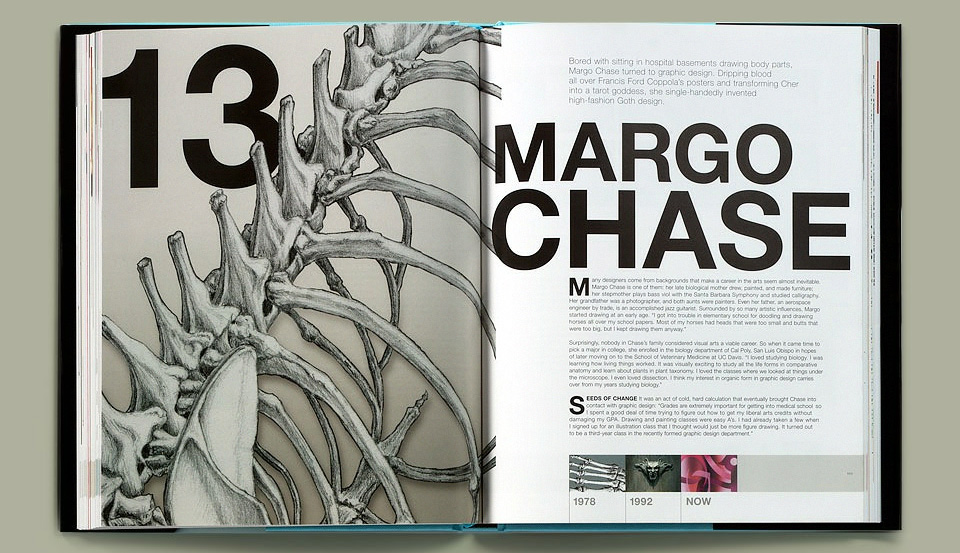
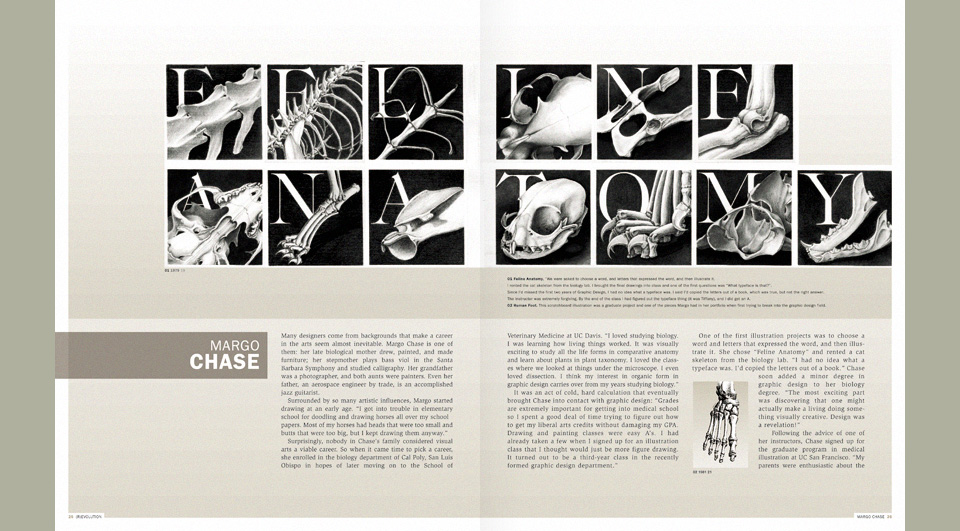
Those bones come from the biology class that made Margo Chase choose art and design as her life’s work.
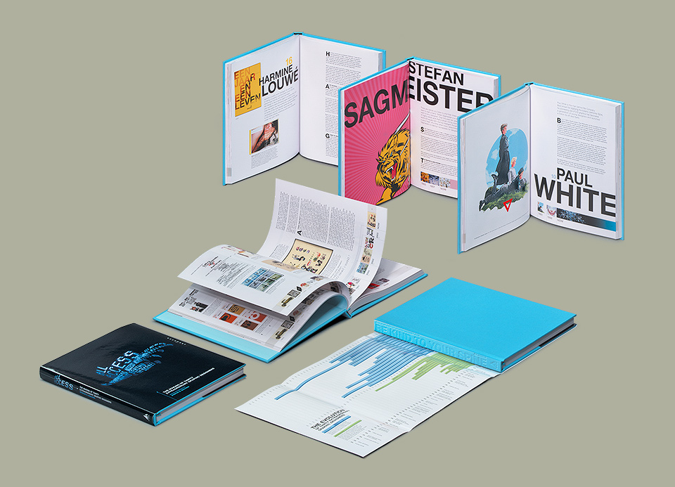
Each chapter started with a sort of illustration I created from a detail of the designer’s work, along with a big intro paragraph. At the bottom of each page I included a timeline of all the work included in that chapter, complete with the year and age of the designer at that point. When I look at a piece of art I always like to know how old the artist was at that time, to see if I still have time to catch up. I thought I should lure the reader into that same idiotically competitive mindset.
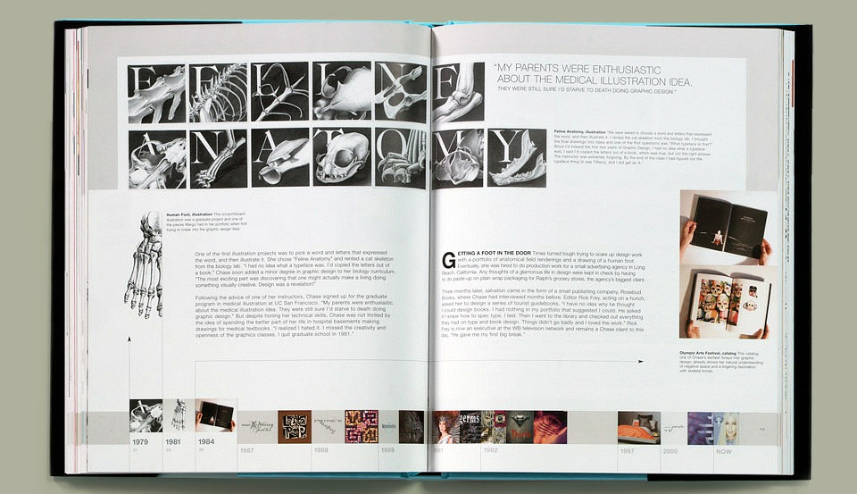
Margo Chase again. Check the top left corner for the Bones, and please note the timeline feature.
Along those same lines, the inside of the dust-jacket features a graph that maps the work in each chapter on a timeline for each designer’s life. All of those timelines are in turn set on a timeline of historical events. I did this, because it’s easy to look back at certain pieces and think, “Yeah… that was the fashion then. Big deal.” The graph lets you realize when people started that fashion. It also lets you see what everybody in the the book was doing at a particular point in time. I’m big on cross-referencing. The backs of the bars further double as a fold-out-able Table of Contents for the book, so that you can have that open while reading. I nicked the design from the 344 Things poster I had done earlier that year.
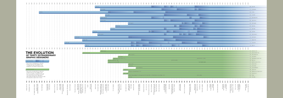
1944: Ballpoint pen introduced. 1945: World War II ends. Post hoc ergo propter hoc. Click, click, click.
The actual table of contents connects each designer with the list of their home countries on the left. My foreword has three paragraphs with eight paragraphs of call-outs. Hell, even the legal copy has bonus features. The spine on the hardcover is blind embossed “BE KIND TO YOUR SPINE.” The first 200 copies had an electric blue page marker ribbon. “Calm down, younger me!” I want to say, but that’s what happens with the first of any type of project. You feel like it might be the one and only time you get to design a book, a CD, a Zeppelin, a submarine, a pinball machine. You’re gonna trick it out with every last thing you can think of. To paraphrase Barry White, it’s your first, your last, your everything.
Which brings me to my relationship with the team at Rockport. When you get so wrapped up in a project that it’s the one and only thing you care about, every change request is a personal affront at best, and a mortal threat to the life of your baby at worst. I was decidedly un-mellow about it all. I had gone into the project assuming that, as a first time author, I’d get all kinds of feedback on the writing, but that they’d trust me on the design. It was the exact opposite. The writing was just fine, apparently, but good Lord, was there one piece of the design that could go undissected? Apparently not.
Or so it felt at the time. I’m sure it wasn’t nearly as bad as it seemed, but I was just so baffled. The back-and-forth on the cover was particularly bad. Eight months we went round and round. I pleaded. I cursed. I offered to fly to Massachusetts to meet with the always cited, never seen owner of the company. I threatened to return my advance and kill the book. It was dreadful. The nadir was the comment from one of the marketing guys, delivered as part of the 873rd cover discussion:
“You just don’t understand what this book is about.”
“Really? I don’t? I could’ve sworn that I came up with the idea, wrote the thing, designed the thing, my name’s on the cover… but yeah, you’re probably right. What do I know?” Ugh. Just dreadful. And as you can tell, the memory of it remains vivid.
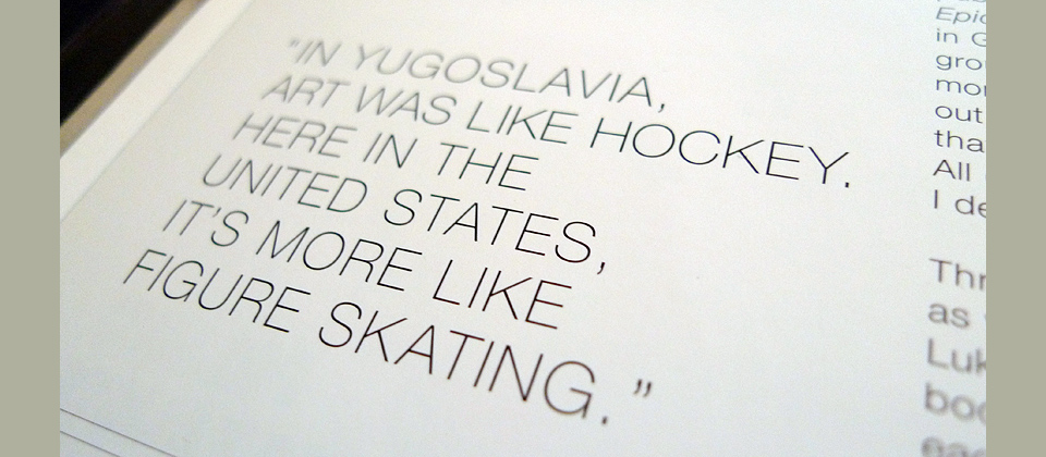
Mirko Ilic tells it like it is in one of my favorite pull-quotes from the whole book.
Over the years I’ve learned that this is all fairly standard practice. It had been the same with CDs, where everybody fought over the cover, but left you more or less alone on the insides of the package. But it still caught me off guard. I thought that as the author you’d have the final word. I mean… surely, right?
Of course, the rational comeback is that the person closest to the work is usually not the best editor. Star Wars Episodes I through III are more beautiful than IV through VI, but who’d call them better movies?
This is the part where I prove that I’ve grown as a person, by apologizing to the publishers for my lack of perspective. Except… I won’t. I have apologized to my editor, the wonderful Kristin Ellison, who was often caught in the middle, and had to talk me through so many crises big and small. I apologized to her not for the substance of my argument, but for my manners. (And I thanked her again for pushing me on the page layout.)
The thing is this: There is feedback that makes the project better, and then there is the need to mark one’s territory. By the time I did this book I had done many record covers. I knew how bad it could get, and I wanted to avoid that. Many times I asked, “What have you found out from your past books? Is there a particular thing that sells best? Because if I know that going in, I can build my design around it.” But it was always “We’ll know it when we see it.” Which means we’re working at gut level, and at that point I’ll choose my gut over yours, thank you very much.
Two rejected covers, shown out of sequence from the rest, just to give you a break from all that text.
But you can only dig in your heels for so long. Eventually, you just don’t have any fight left in you, and all you want is for the thing to be done. I’ve felt this way on a few of these longer gigs, and it’s the most dangerous part of the project. You could kill the project and walk away, but at this point you’re however many months and years into it, and you can’t quite bring yourself to let it all die. So you agree to whatever is on the table that day. As a designer, you can take back “no,” but you can’t take back “yes.”
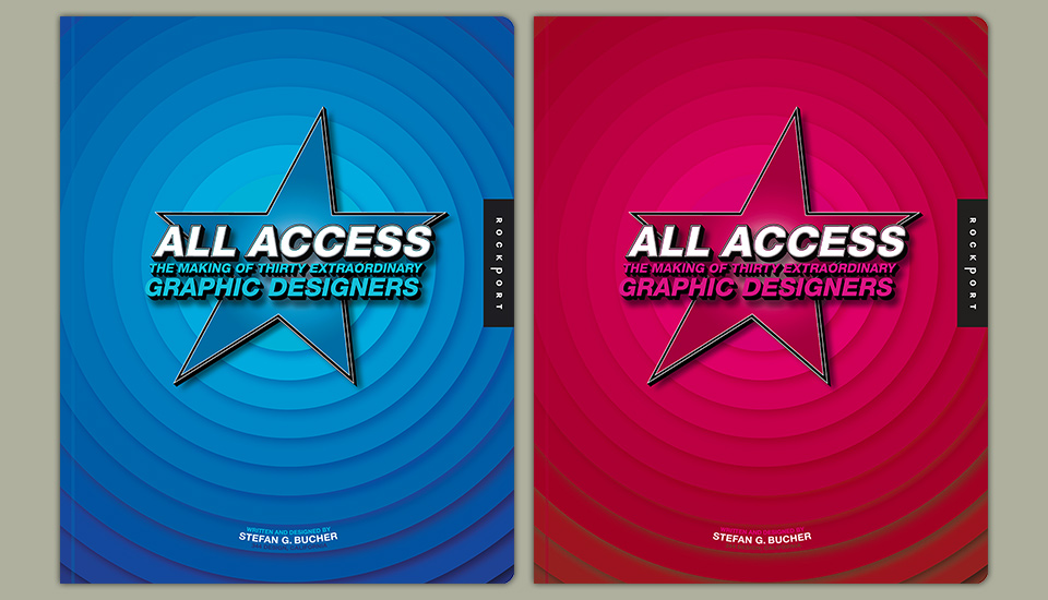
In the case of “All Access” we just could not agree on a cover. My initial design of the hand reaching for the next thing (now happily reborn as the symbol of Habit wine) had been dismissed as “too refugee camp” months earlier. After trying many other things, I said, “Let’s put all the designers’ names on the cover! That’s what the book is about! That ought to help sales, right?” I really liked that big zoomy type in the desert. Unfortunately, the art director at Rockport looked at it in a marketing meeting and said “It looks like Hiroshima.” I think she meant the Trinity test site, but once you dub something “The Hiroshima Cover” it ain’t getting approved. (Bikini covers are different.) Ever since, I’ve toyed with the idea of turning this technique around on somebody. “Oh really? You want to change it to periwinkle? Yeah, no, sure… I mean… that was Hitler’s favorite color, too, but yeah… we can try that.”
The “Refugee Camp“ cover on the left, and “Hiroshima” on the right. Good times.
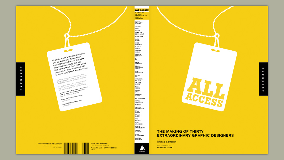
In the end, we negotiated our way to the silhouette of a backstage pass with the words All Access on it knocked out of a solid field of bright yellow. Not too bad. We ran a color test and somebody high up said, “No. Hate it.” Now they wanted to print it on a silver foil, which I hated. There was more brinksmanship, more threats, more bile. I remember being told that the team was disappointed that I wasn’t delivering anything as fresh and fun as the work on my site. I mentioned that all that work looked fresh and fun, because those clients had trusted me to do my work. That didn’t do the trick. So I said, “Fine. You know what? Why don’t you go through my site, pick something you like, and then I’ll replicate that for the cover.” I had no fight left in me.
Note that I was trying to get Frank Gehry to write the foreword. That cold call that didn’t go far.
When they picked the bossa:nova “Holiday Selector” you could’ve knocked me over with a feather. That was one of my favorite pieces. I didn’t see the connection to the book, nor did I comprehend how it would help sales, but we finally had something. I went to work creating a little light sculpture for the cover. Which they then requested I change to blue. I have no idea why, but sure, OK. (“Hitler’s favorite color, blue… Did you know? Oh yes. It’s true!”)
And there we were. Book done. It didn’t sell great, but it sold OK. The people who bought it seemed to really love it, and told me that the stories were helpful. Which was the point. Just as importantly, the designers in the book loved it, which was a huge relief. We had two launch parties, one in Los Angeles, and one where it all began, at the offices of KarlssonWilker in New York. There, Paul Sahre told me that he’d become really nervous after our interview. He felt that he’d revealed too much about his life. “But,” he said, “I figured I should trust you.” I love you, Paul Sahre.
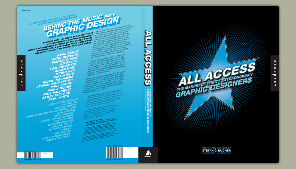
A best-selling cover? Apparently not. Also, the 3 in 344 got lost on press. 44 Design lovs yo.
A year and a half later I had recovered somewhat, and we did the paperback edition. This time, I decided to trust Rockport. The book hadn’t sold as well as I’d naively expected, and I was ready to try it their way. I gave them the dressing room door star they’d asked for. Big! Blue! Large type! Well… It didn’t make a single bit of difference to sales. That’s the reason I get so irate about these ridiculous battles. It’s a complete crap shoot. And if that’s true, why not trust the author or the artist? A giraffe might not win the Kentucky Derby, but man, I’d watch that race!
Of course, there was a small fight on the paperback cover, too. I wanted Looney Tunes, Rockport did not.
Seven years later, the folks at New Riders trusted me to know my own book. “That’s the title you want for it? 344 Questions? Cool! And that’s gonna be the cover? It’s beautiful! Good work!” It’s so much more fun working for somebody than against them. 344 Questions turned out to be my best selling book, too. So far. Possibly ever. I feel like I redeemed myself with that one, and exorcised a few demons along the way. Kristin and I are good friends again, too. It all sorted itself out. Poetically, the germ of 344 Questions came from the mind-map graph I had added to a foldout in the back of the “All Access” paperback. Don’t you love a good Circle of Life when you see one?
Going through the book for the first time in a long time now, I am proud of it. I got to do a lot of what I wanted to do. There’s a lot of good stuff happening there. Nobody ever interfered with the substance of the book. I stand by everything I’ve said here, but at the same time I feel small for saying it. I shudder to think what the folks at Rockport would have to say about me. The answer may be, “Nothing. Just another pissy author. Big deal.” Nobody went into this thinking, “Great! A chance to really mess with people!” Not me, not them. Everybody wanted to make a great book. Sometimes we just disagreed on the way to get there. Love at first sight turned into a bad relationship, and in the end we split up. But we made our peace. For the children. For our hardbound and paperback children. It’s a publishing Kramer vs. Kramer. Can I make you some French toast?