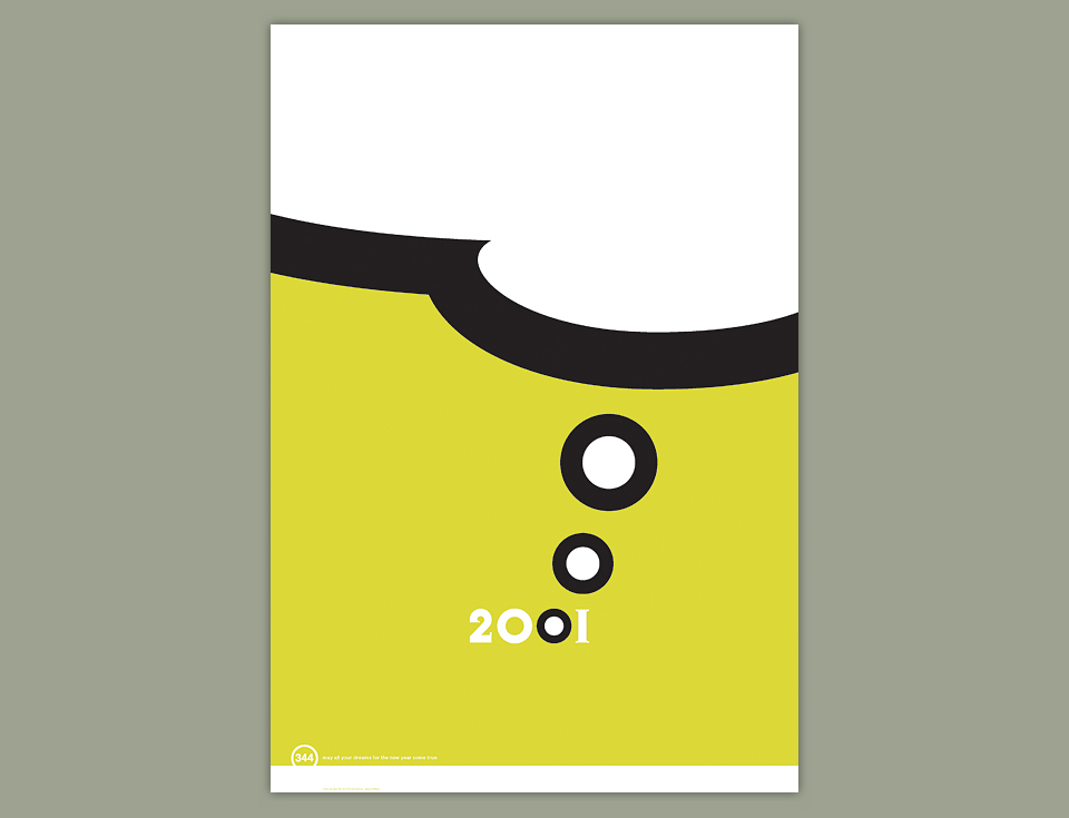
344 POSTER 2001
After switching from Christmas cards to the more inclusive New Year’s greeting on the Y2K calculator the year before, I upped the ante for 2001 and went from postcard to poster. I had saved up a little money, and found a bargain basement printer. I was off to the races.
2001 was such an evocative number. The new Millennium, the discovery of the Monolith on the Moon, other important things beginning with M. 2001 was all about dreaming of the future, and a giant thought bubble made for a nice, bold poster. All I needed was a typeface with perfectly round zeroes. Jonathan Barnbrook’s Exocet did the trick with just a tiny bit of cheating.
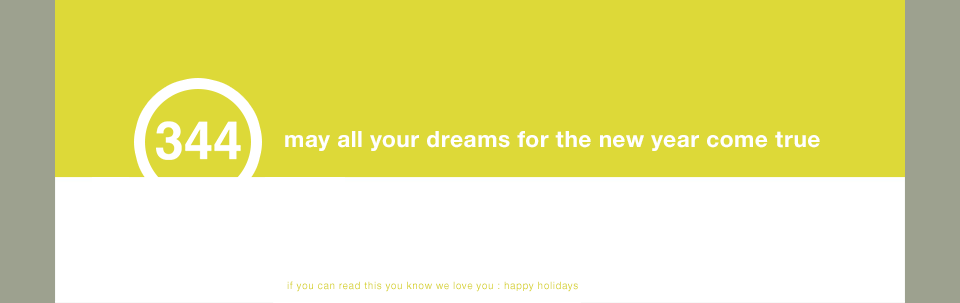
Of course, I wanted to make good use of the scale a poster allows, so I added a tiny little message at the very bottom of the poster. Nice touch, right? Years later, I’m still happy with this design. There’s not a whole lot to it, but it’s a strong visual, a nice curve on the bubble, and a pretty crop. I’ve done worse.
People can diss Helvetica all they like, I love the way it looks reversed out of a healthy block of color.
At this point, everything was ready for the printer. I forget the name of the place, but it was located somewhere in the Inland Empire, east of L.A. It took about two hours to drive there for the press check. Maybe it would’ve taken somebody else 90 minutes, but this was well before GPS or even MapQuest, I think. I remember a Thomas Guide, bad directions, and several phone calls from my brick-like cell phone. Anyway, let me not get sidetracked again.
When I finally arrived the print rep took me into the pre-press room. I could see trouble from clear across the room. All the circles had become octagons. When I blurted out, “Well, that’s not right!” the print rep asked what the problem was. “Octagons instead of circles is the problem!” He looked at me, he looked at the poster, then he pulled out a loupe. “Are you sure it’s wrong? Do you want to take a closer look?”
This is the kind of thing I love. Did I want to take a look? “These are big old circles. That now have corners. I think I can make it out with the naked eye.” There was some spirited back and forth about the file setup, but in the end it turned out that there was a problem with their RIP—that’s Raster Image Processor, if you’re not a print person—and they fixed it. Grudgingly. Of course, this “change” cost us a few days, and I foolishly didn’t shows up for the second press date. It’s a two color job, how difficult could that be?
When I took delivery the finished posters, the circles were fine—Hallelujah!—but my little secret message had become so secret that even I couldn’t read it on half the run. Where did all the ink go? I called the printer, and was told that on a poster with this much ink coverage the rollers were running dry by the time they got to the little bit of text at the bottom. “Well… if you knew that, why didn’t you run the poster upside down?” These are the things that make me glad I get to print my posters with Typecraft now.
Still, after picking out the legible copies, I mailed the posters in time for the New Year, and all was well. Somewhere in my flat files rests the one remaining copy of this little beauty. Another thing I learned on this project was to always order more than you think you’ll need.