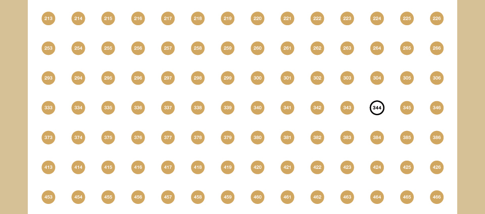
344 POSTER 2002
Following the optimism of the 2001 New Year’s poster, 2002 presented a whole new challenge. Just two months after the 9/11 attacks things weren’t looking all that sunny out here. This obviously wasn’t the time for something lighthearted and fun, but I also didn’t want to send out a message that boiled down to “Happy New Year! We’re all gonna die!”
As I was mulling what kind of poster I could possibly do, I tried to grasp how the attacks would fit into history, and that gave me some comfort. A lot of pretty horrendous stuff has been happening with a fair amount of regularity for the past few thousand years, and yet the Earth keeps on spinning. This is in no way meant to diminish the horrible thing that had just happened, but when you hold it up against the World Wars, the Black Plague or a major earthquake or tsunami…
In the process my thoughts turned to how I view my own life. In the moment things tend to feel very intense. The joys seem like they mean more, and so do the misfortunes seem like they’re the worst thing that’s ever happened. But time passes, and hindsight smoothes the highs and lows into something more manageable. Focusing on the now is a wonderful thing, but it causes its own set of problems.
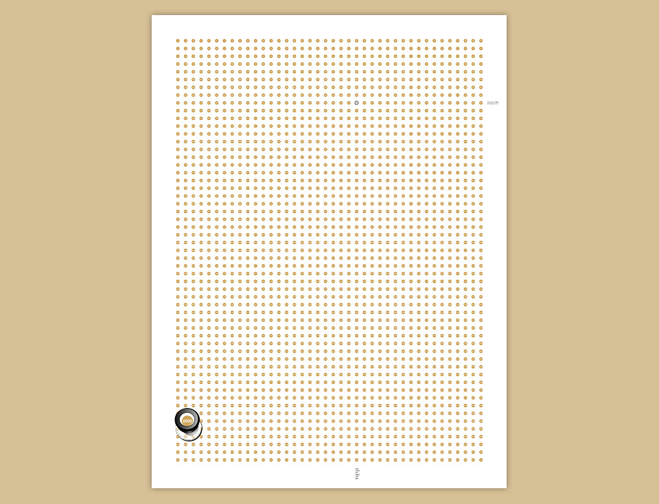
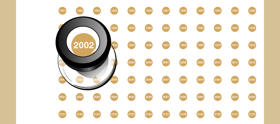
This poster was my attempt to make that perspective visible. Every year from 1 through 2,200 is marked by a numbered dot, and the then upcoming year 2002 is under the magnifying lens. Did people intuit the rather dark origin of the idea? Probably not, and that’s fine. But I think that the general spirit came through—all of us just bobbing along on the wave of history.
On a production note, this poster is more of a sequel to the Happy 2000 card than to the 2001 poster. I went back to creating an object in Illustrator, and I went back to a proper printer a friend had recommended. ColorNet in West Los Angeles. They did a beautiful job, but it was the only thing we ever did together. I just wasn’t up for a long distance relationship.
In terms of the design, I added a few bells and whistles. The glass part of the loupe got a clear varnish, which I also used for a hidden word—“welcome”—to the left of the eye piece. If you leave the poster exposed to the air for a few years the varnish will yellow, and the word will show up. Otherwise you have to move your head and you’ll catch the sheen.
See the clear varnish “welcome” to the left of the loupe? No you don’t. You’re welcome.
One of the things I decided very early on is that I love giving and receiving gifts, but I hate promos. Some are nicer than others, but it’s still advertising. “Happy Holidays, check out our website!” It gets a quick look, and then it gets tossed. Why would I keep somebody’s ad around? All my posters had a little 344 sigil—the same 344 in a circle that you can see at the top of this page—and that’s it. Not even the word “Design” appears. There’s no URL, no phone number, no nothing. I figured that people would remember who sent them a poster they liked. I always do.
Subtlety, motherfucker! Boom.
In this case, I simply placed the logo among the years. To give people a hint that it was even there I covered it with a spot gloss varnish, and placed it at the intersection of the two visible greetings. Move down the column of dots and you’ll see “have a safe and happy new year.” Follow the dots to the end of their row and you’ll come to “every year is better for having you in it.” Which is true. Despite its sad origin, this may be my most calm and elegant poster—an 18 x 24 in. (45.7 x 61 cm) zen garden on paper.