ANAMOD LOGO REDESIGN
AnaMod Audio invited me to redesign their logo. The name AnaMod carries considerable cache in high end audio production circles, so we wanted to give everything a bit of a visual lift without losing the equity invested in the existing logo.
Before we get into the design considerations, here’s a bit of information on the company: AnaMod was founded in 2006 by audio industry veterans Greg Gualtieri and Dave Amels with a mission to design, manufacture, and market audio equipment based on an entirely new concept—The AnaMod Process™.
Greg holds degrees in Physics from Columbia and Princeton Universities and spent 10 years as a research scientist at Bell Laboratories studying the properties of exotic semiconductor materials. Greg is also the founder of Pendulum Audio which specializes in the amplification of acoustic instruments and vacuum tube recording products. Dave founded pro audio software company Bomb Factory, and musical instrument manufacturer VOCE. Together they combined their vast knowledge of electronics and mathematics and developed a new approach to designing recording equipment: modeling analog with analog.
By avoiding microprocessors and digital signal processing chips and instead using time-proven analog computing technology, AnaMod products deliver exact sonic re-creations without the drawbacks of digital processing and none of the hassles of maintaining antique analog equipment or finicky digital software. AnaMod products are entirely and purely analog, never process audio in the digital domain, are free from degradation caused by analog-to-digital and digital-to-analog conversions, and introduce no latency.
As you can see, these are serious audio people creating serious audio products in a seriously classic way! I set out to refresh their logo in a way that honored great audio branding of the past. I wanted a look that would’ve passed muster with the great audio engineers of the 70s while still looking entirely modern.
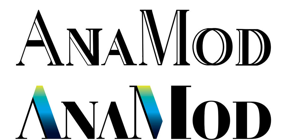
Out of a sense of duty, I presented a very conservative update to the existing logo, seen below. Happily, AnaMod agreed that this was entirely too timid.
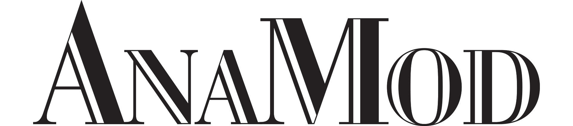
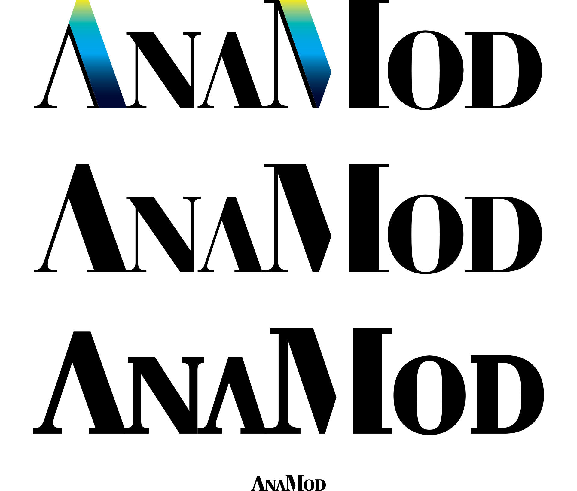
They went with my recommendation of making the logo much bolder and less fussy. We omitted all white accent lines, fattened up the letterforms and cleaned up the serifs. The tips of the A and M are cut off to create more mass and to help with clean, consistent reproduction across media. The white accent lines are reimagined as spectral gradations in the flagship version of the logo that will be used on screens and packaging. The solid black version appears silk-screened or engraved on sound cards and modules.
For these smallest of applications I created a special micro version that retains the character of the main logo while holding up to the requirements of small size printing. You can see it at the bottom of this lineup. The third logo is an enlarged version of the tiny logo on line 4:
.
.