DON’T LOOK BACK NOW
It’s always a pleasure when a one-off project for someone you admire leads to a creative relationship that gets to develop over a span of years. After first creating an animated video for singer/songwriter Wesley Stace in 2014, and designing a logo and posters for his “Cabinet of Wonders” shows in California and London, I was honored to contribute titles to his first concert movie. “Don’t Look Back Now” documents a 2008 show at Brooklyn’s Union Hall, played under his erstwhile stage name, John Wesley Harding.
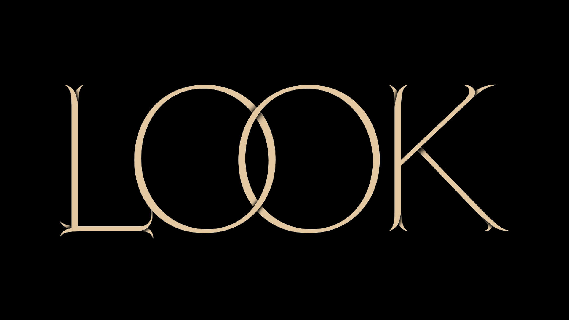
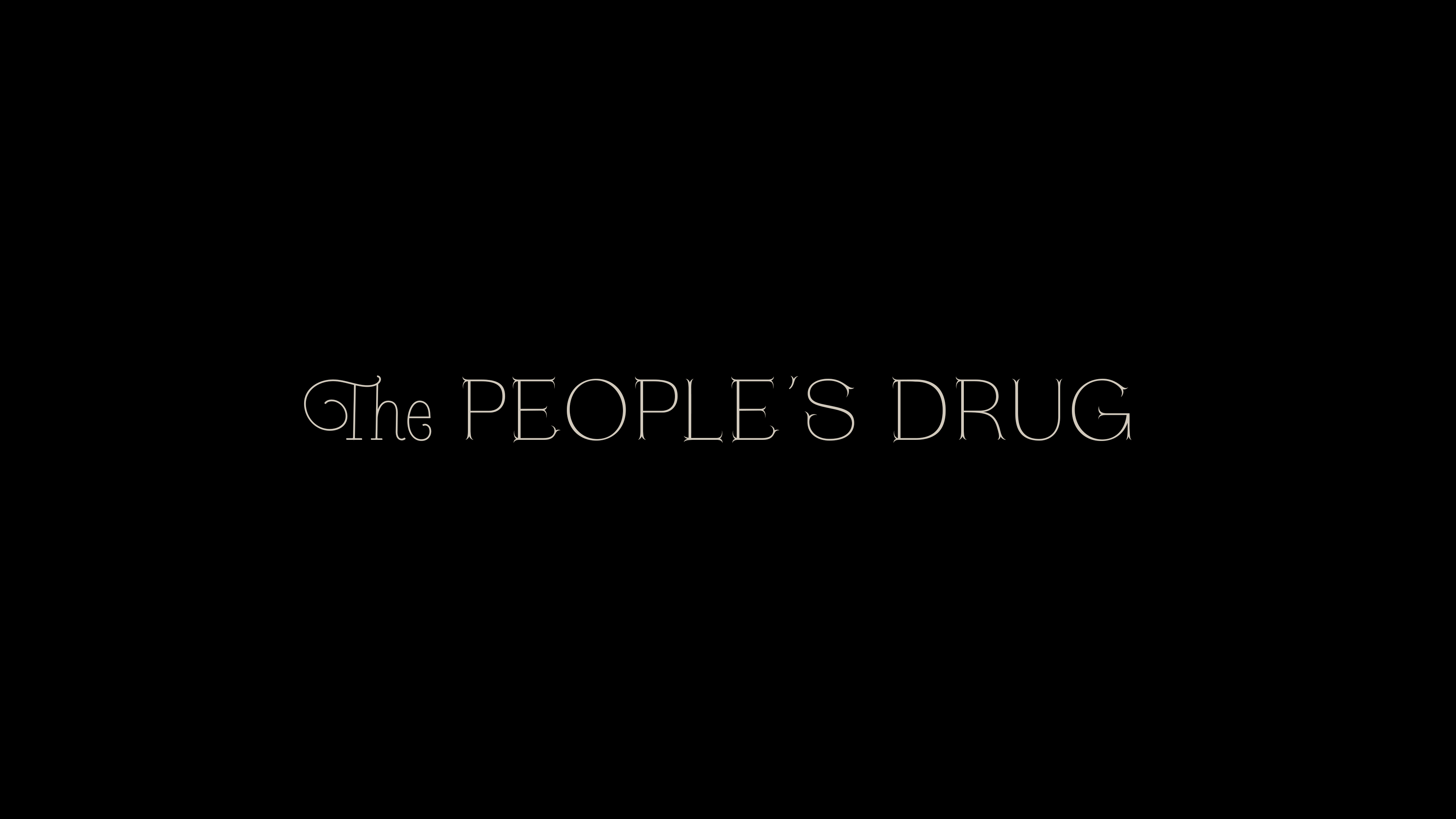
The main graphics and interstitial song titles use the beautiful Lapicide typeface designed by Emilie Vizcano. I customized a few of the letterforms, and created a variety of ligatures—letter pairs that are joined into one combined shape—to create little visual surprises throughout the film. To suggest dimensionality on the main titles, I also added drop shadows to the split serifs and to at least one corner of each letter with more than one angle. (Not on the I’s and L’s, in other words.) If you play close attention, you’ll see that the serifs grow in as the type blooms on the screen. It’s the little things…
Production credits are set in Giorgio Sans, designed by Panos Haratzopoulos, Ilya Ruderman, Vincent Chan, and Christian Schwartz. It’s a big, bold font that offers a nice contrast to the delicate shapes of Lapicide. It may be a slightly counterintuitive pairing of beauty and brawn, but that’s why I like it.
A closeup on the detail work
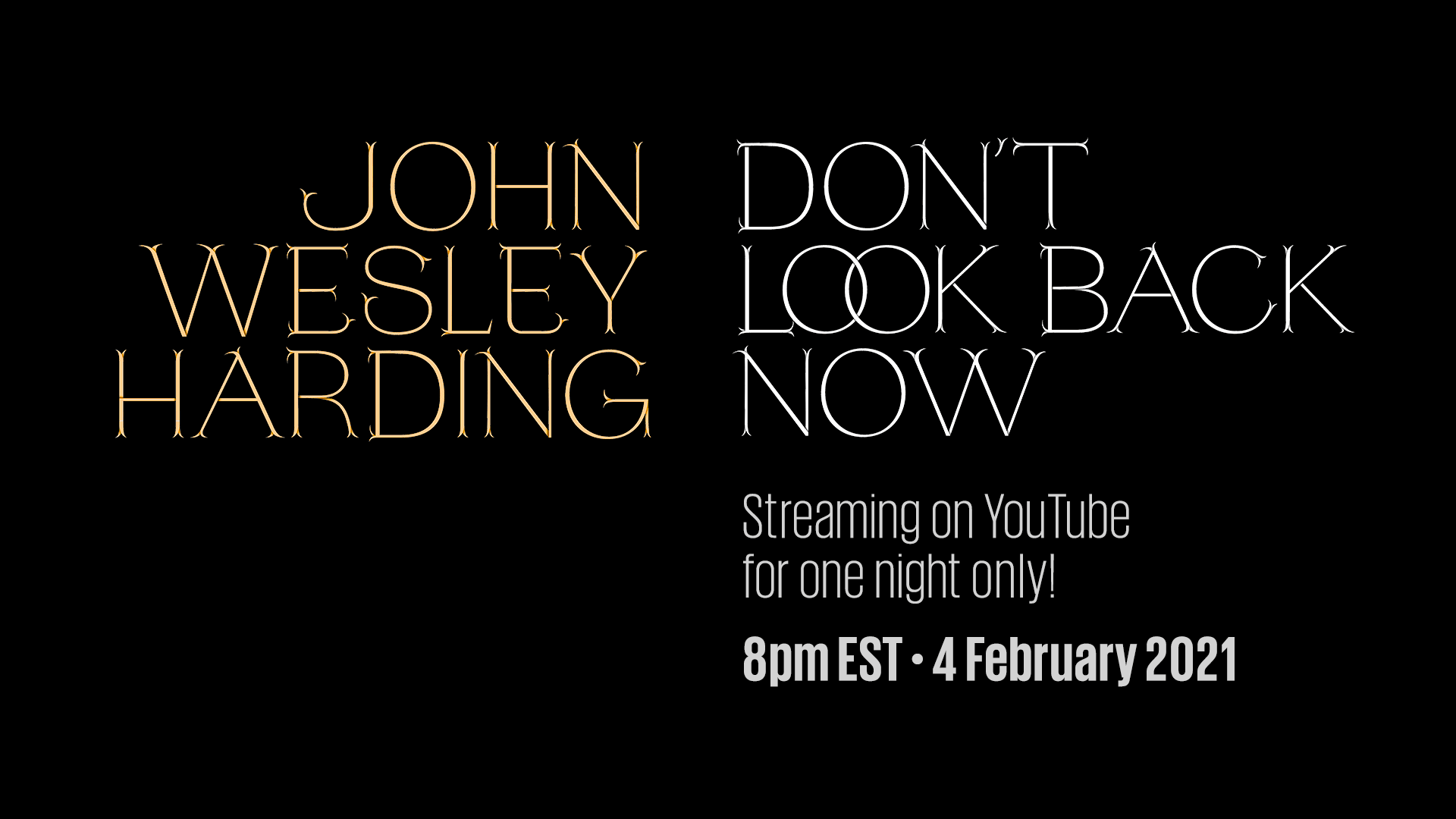
Teaser card for the YouTube premiere
Of the show, Wes says this: “As a promotional enhancement for Who Was Changed and Who Was Dead, we decided to put on a “Greatest Hits Live” concert: invite the real fans on a guest-list-only basis, and play only the absolute favourites in the rare-but-desirable trio format—featuring not only Robert’s playing but Chris’ harmonies—and then perhaps add some special sauce, whatever that might be. The three of us did one or two warm up shows, then got to Brooklyn—added Deni and Josh—and played the same show twice in front of two audiences. It was multi-tracked and filmed on four cameras, and it was a superfun night. I haven’t attempted anything like it before or since.”
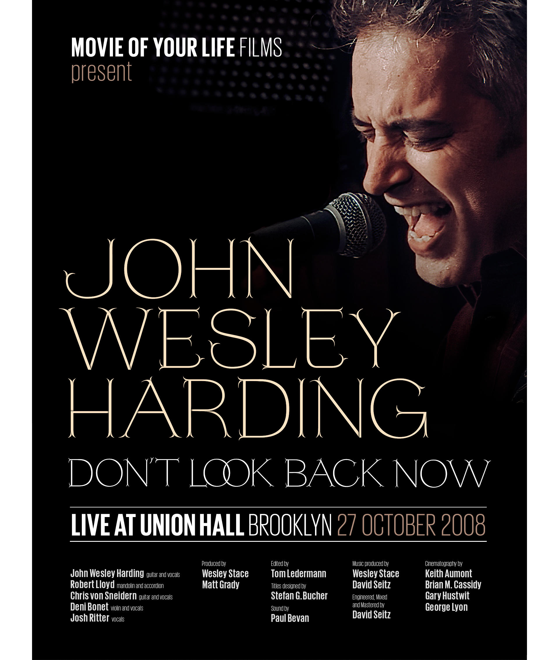
Digital Poster for IMDB
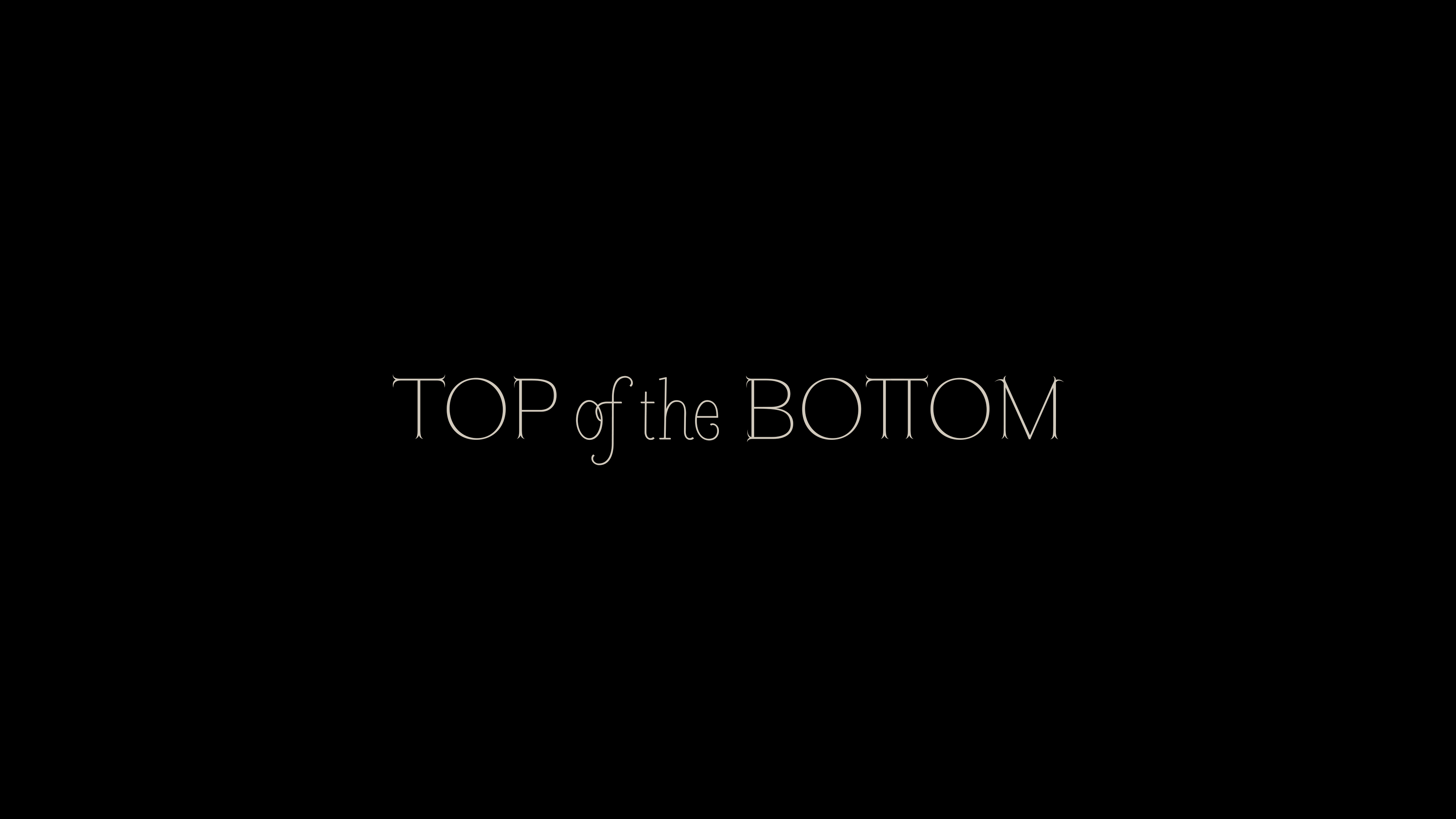
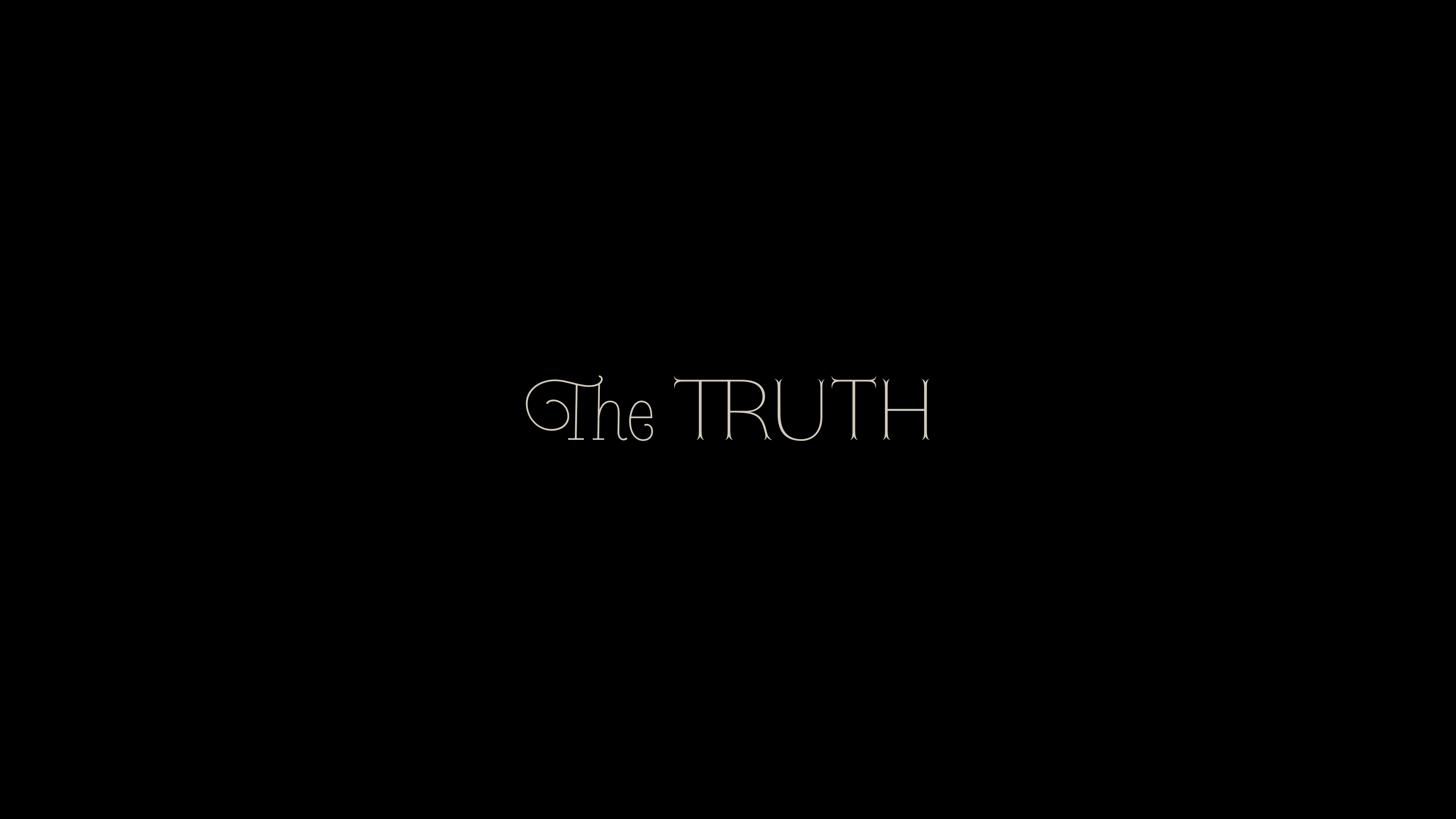
Following below are a few of the song titles featured in the film. The script is Heroe Monoline by Maximiliano R. Sproviero of Lián Types. If you’d like to see the full set list, listen to the music, or order the album you can find it on Bandcamp, where my typography makes another appearance on the soundtrack album cover by Morgan Narkiewicz.
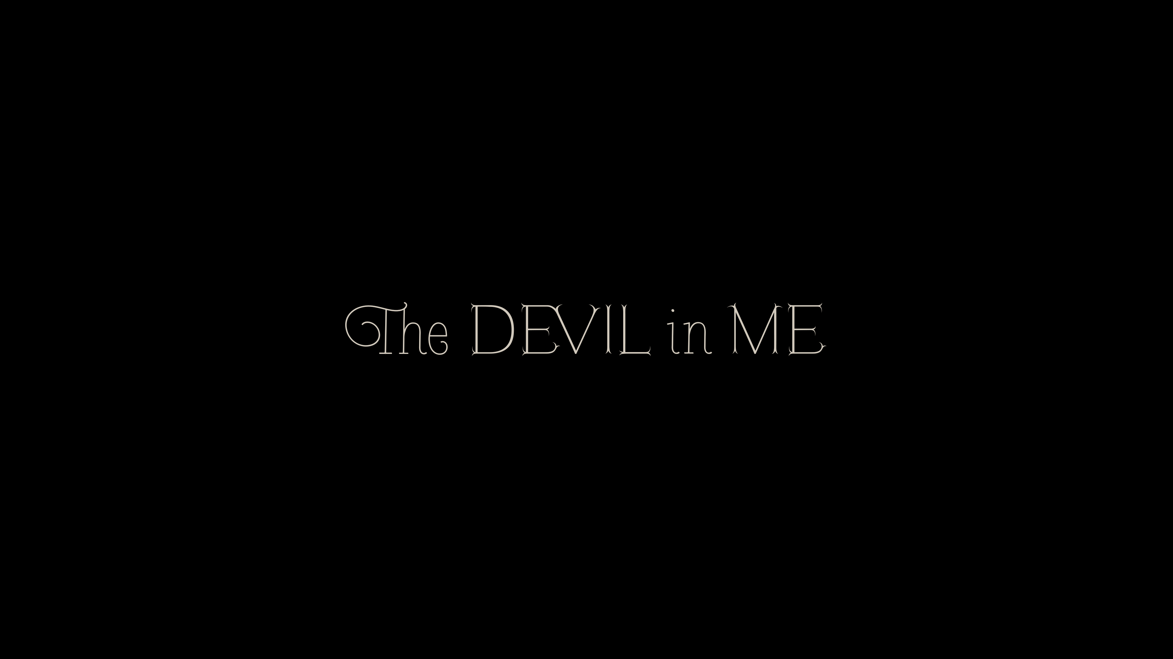
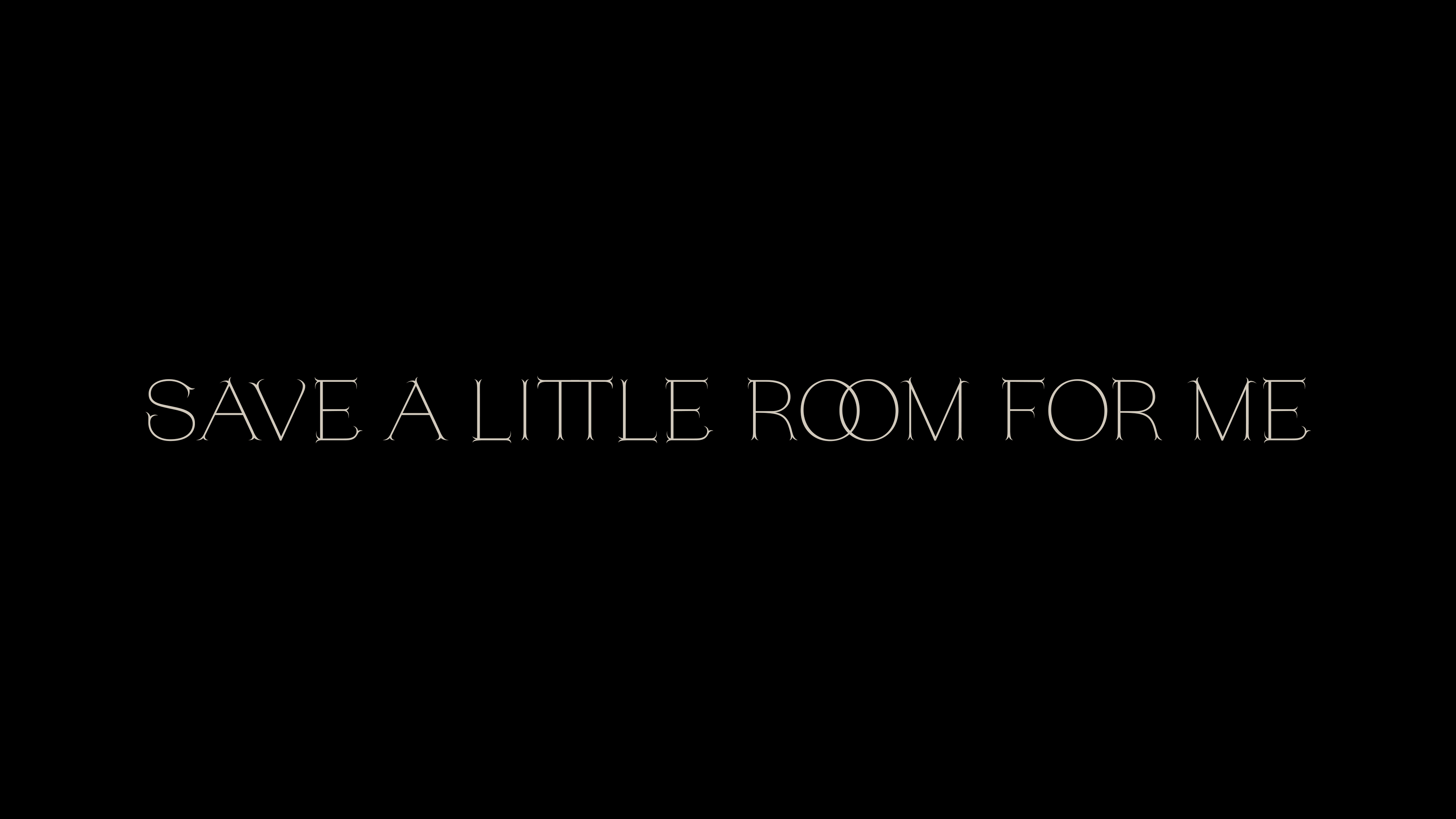
Please note that this is the only acceptable way to typeset a pair of capital T’s:
I’m not sure this card made it into the movie, and I’m not 100% sure of its intended use, but it was requested, and it came out well. Please note the nice ET ligature.
