CABINET OF WONDERS
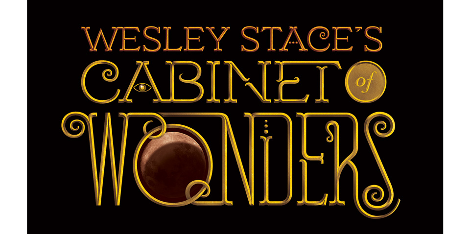
While I was working on the “Goodbye Jane” video for Wesley Stace, I also pitched him on a new logotype for his fabulous touring variety show “Wesley Stace’s Cabinet of Wonders.” I can’t help myself. When I see a project I love, I want to contribute in some way, and that way often involves lettering.
Wes was open to the idea, so I set to work. The Cabinet brings together a great mix of musicians and writers for a delightful evening of indie entertainment. Wes has traditionally advertised the event with vintage artwork of the Pied Piper of Hamlin—a vibe that felt totally appropriate to the event. I wanted to add a bit of old world circus typography into the mix, too, and also play up the variety show aspect by making a logo that could give a star turn to each of the different performers on the night’s bill.
To this end, I designed the word WONDERS with a big perfectly circular O that could serve as a window, showing the different guests in the style of the old “Love Boat” opening credits. I also included allusions to the different kinds of performers on the show—a speech bubble apostrophe for the comedians, an elipsis as crossbar for the A to symbolize the writers, and the swoosh on the R was meant as a reference to the f-hole on a guitar. (That last one was a bit of a stretch, admittedly.)
Demo of the logo as a possible opening credit sequence. (Captain stubing has not appeared on the show. Yet.)
Wes liked the design, and pitched it to his management, who liked it, too. Alas, it never got implemented. There was simply no place for the type to go. As a designer who gives talks, I’d simply assumed that there would be images projcted during the show as designers do during their presentations. Lots of bands do it, too, of course, but Wes does not. And I hadn’t stopped to ask. I could’ve also asked, “There are posters, right?” I did not. And there aren’t. There is a lesson here.
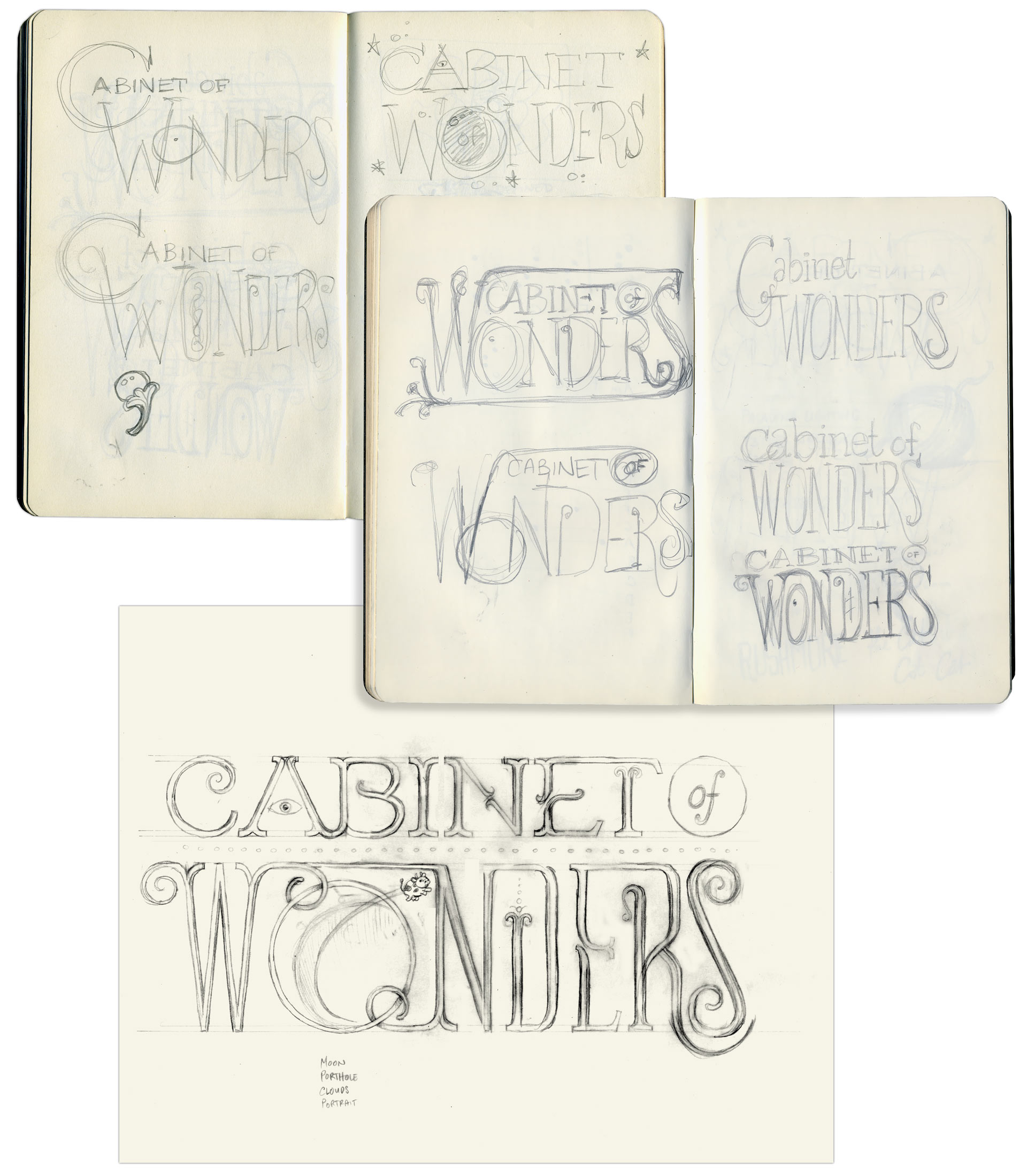
Sketches for the logotype. Note the cow—Cabinet of Wonders, get it?—jumping over the moon.
The logo could’ve gone on the website or on social media announcements, but the whole thing just ran out of steam. I was busy with the video and didn’t want to make a nuisance of myself. Sometimes these self-initiated projects come together, sometimes they don’t. I’m glad I tried, I’m still happy to have this piece of lettering, and a few years later I got to design a special limited edition poster for two Cabinet shows here in California!