The NEIN NEIN Poster
One of the fun bits about giving talks is that I sometimes get to design the event poster, too. Of course, finding a new idea gets a little harder each time I go out. In this case, I got lucky. When AIGA San Antonio invited me to speak, the scheduled date turned out to be September 9th. 9/9. Nein Nein! The German expression for a humble dismissal of compliments—”Oh, no, no…”—and stern judgement of a job done poorly—”No! No, no, no!” Perfect! Mein path was clear!
Yes, it’s a pun, and a bilingual one at that. And puns are bad. They make me feel a little dirty. But “Nein, nein!” was just too nice to pass up. It was just sitting there. It was specific to the event, and—being a cranky person of German extraction—it was somewhat specific to me. As my friend Simon Malz said, “Well, who else could make this joke?” So I got down on my knees to harvest some low-hanging fruit.
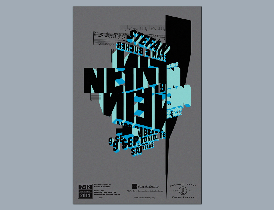
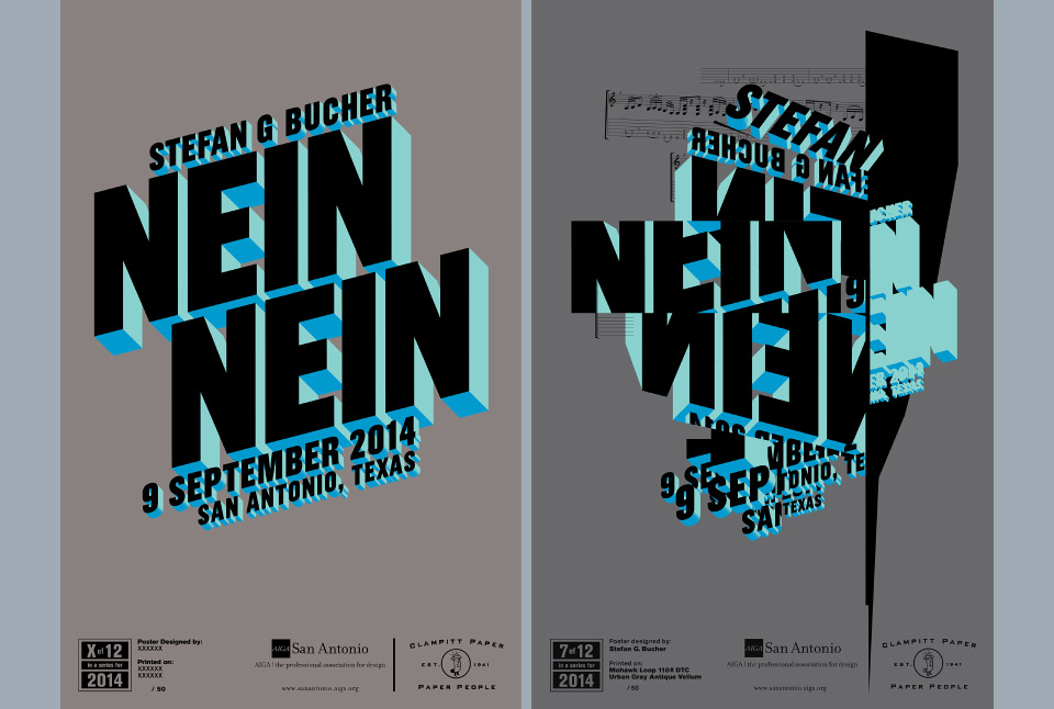
AIGA San Antonio structure their event posters as a series. All are the same format, and all are lovingly silk-screened by the excellent Mark Gutierrez of design studio Mellow Giant. With that in mind I went for a clean, bold look and electric colors. A simple design for a simple gag. Popping the letters into the third dimension in Adobe Illustrator took me a few days, but I prefer a handmade extrusion to a quick filter. When I was done I thought, “Well… that’ll work.” And that was the problem.
Of course, it would work. It had worked for me before. Many times. The last few years have brought significant changes in my personal and professional life, and yet my work looked the same. I suddenly got self-conscious about just going through the motions. There has never been a direct emotional line from my life to my work. I don’t make happy work on happy days, nor complicated work when I’m feeling unsettled. Each piece wants to be what it wants to be. But in this case—advertising a talk about building a life as a commercial artist—my original design felt disingenuous. It was too easy. I wanted a design that reflected my state of mind, so I decided to do a remix.
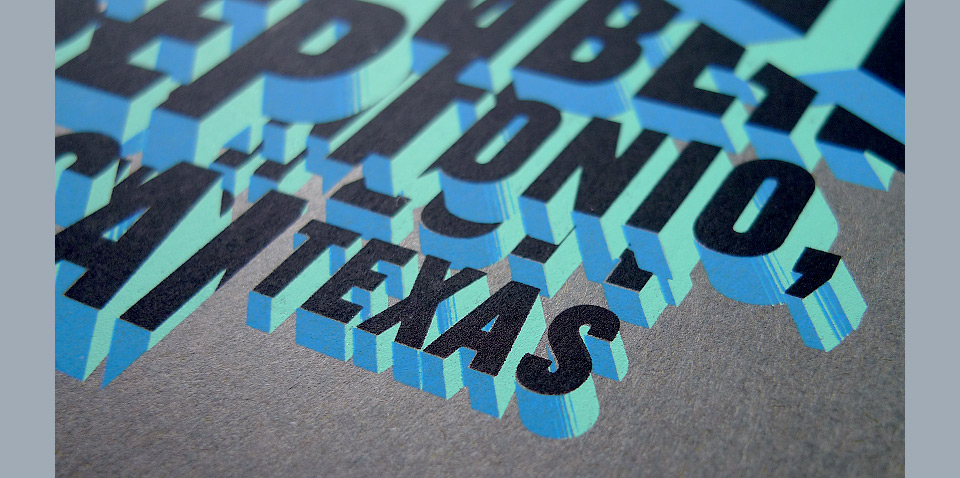
I cut up a printout of the original poster design and reassembled it into a new composition. I scanned the result and recreated the whole thing in Adobe InDesign. From there I moved the file into Adobe Illustrator to do some fine finishing. The final piece feels true to what I was working through. I was questioning some of the fundamental aspects of my life, and everything was a little bit jumbled up and full of sharp little edges and corners. Even my name had begun to feel foreign and uncomfortable. Something new was starting to emerge, but it wasn’t clear to me what it would be. That’s the little electric blue bit on the right of the poster, in case that wasn’t clear. You’ll have to forgive me for the high school level interpretation of my own piece. That’s why I usually shy away from work like this. It can be a bit cringe-inducing in its sincerity. But I am proud of this poster.
And yet, with all the talk of metamorphosis and doing things differently, I still couldn’t completely shake my natural tendency to clean up after myself. I spent many hours massaging the individual letters to create elegant overlaps and transitions. I wanted a wild garden, but I still had to go in and trim a few leaves here and there.
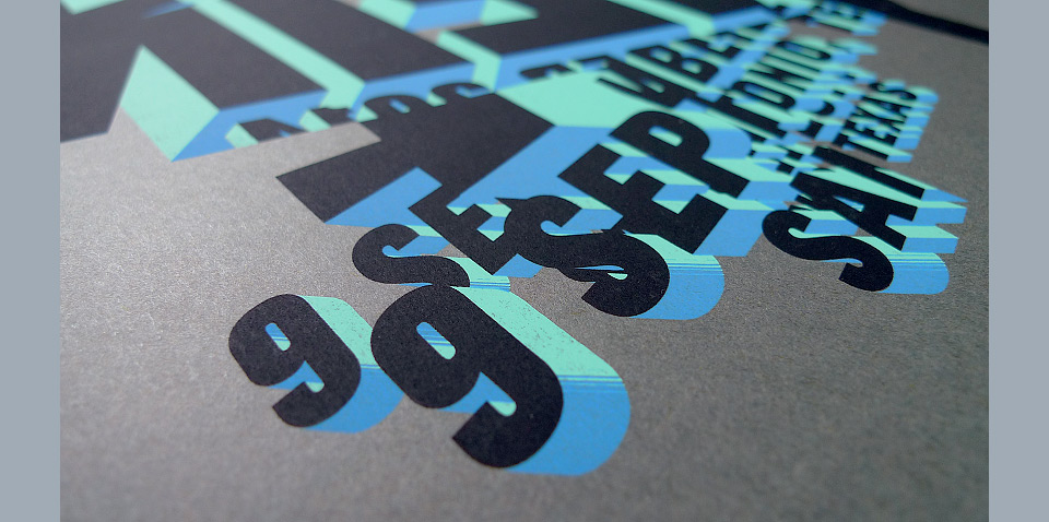
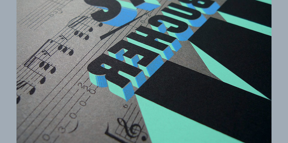
All in all, this made for a fiendishly difficult print job. The registraton on this poster is not for the faint of heart, but Mark was eager to take on the challenge, and he delivered in style! The finished piece looked amazing! I was even more astonished when he told me that the paper sonsor, Clampitt Paper, had sent him sheets that were already trimmed to the final size. He aligned all three screens without the benefit of crop or registration marks. He did all this by dead reckoning!
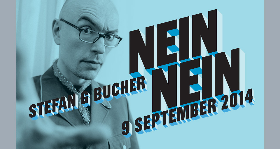
When all was done, it did occur to me that people would no longer see the original idea of “Nein, nein!” nor would they know that the poster represented a remix of an original simpler design. Luckily, I still had banners to design, so AIGA San Antonio could promote the event online. I went back to my initial Illustrator file and combined it with a shot by photographer Linda Abbott that made me look extra Teutonic. And that was that. Yes, yes.