JASON BENTLEY SELECTOR

Jason and I met through our mutual friend Jennifer Stone when we were all working at Maverick Records. Jen and Jason were in the A&R department—which Jason was running—and I was down the hall, freelancing in the art department. That’s how I got into doing the flyers for bossa:nova, and when Jason left Maverick to work as a music supervisor with Machine Head in Santa Monica, he asked me to design this CD package for him.
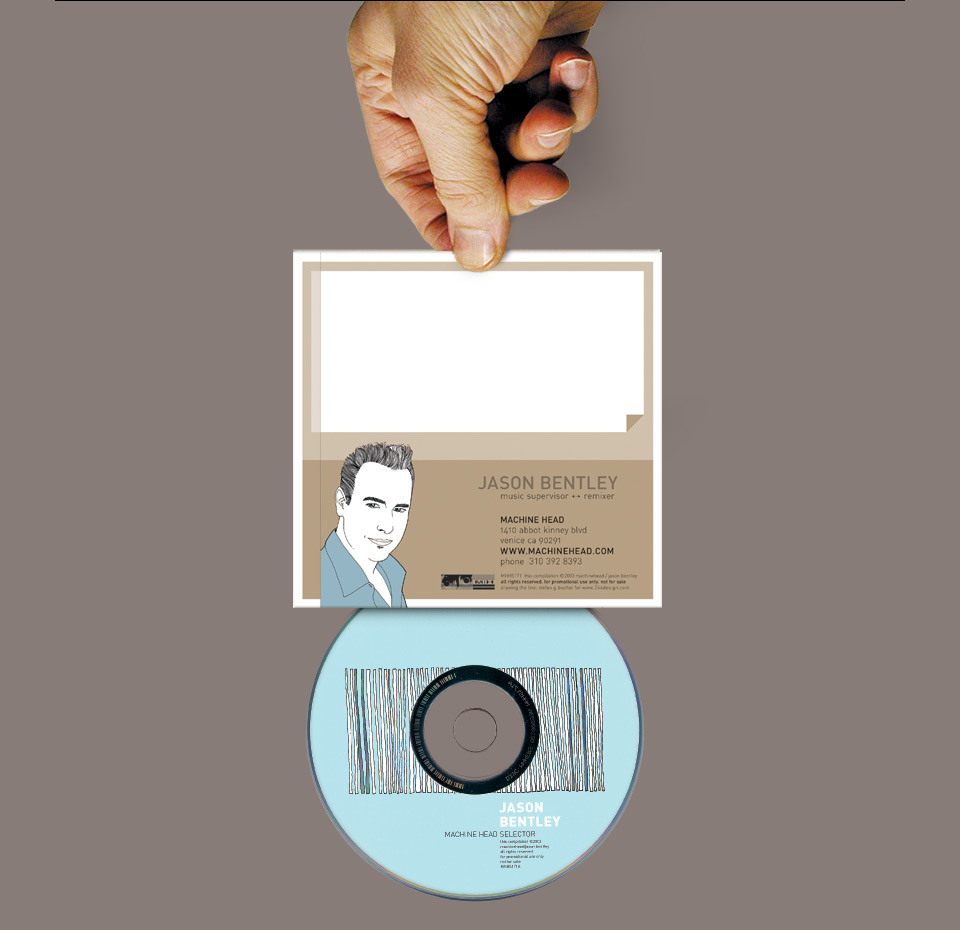
The CDs were recordable blanks he could burn for clients. Those needed a Sharpie-ready space for a title. The sleeve needed a space for a big sticker that could hold the track listing or other project-specific information. No problem. Done and done. For the cover I illustrated a hand selecting records from a bin of records, shown from what I thought was an unusual and graphic angle. (As always it’s my own hand.) The side view of the stack of records also went on the CD label, with one album cut out of the ink, revealing the silver of the CD.
For the back, I drew a portrait of Jason. Like many other designers, I’m forever trying to emulate the Beatles’ “Revolver” cover by Klaus Voormann, and the little hairline portraits with the hair rendered strand by strand are something I keep coming back to. I used the same style for the John McCarty record a few years later.
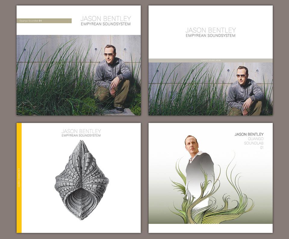
Jason was always extremely kind to me, and never questioned my little stylistic obsessions. I went on to design two more sleeves for him—a follow up Machine Head Sampler and one for a private event. In the fall of 2007 he hired me for his first actual mainstream you-can-order-it-on-Amazon release, which was a great honor. The record was called “Empyrean Soundsystem,” because Jason always comes up with the best titles. This was to be the first in a series of DJ compilations for Quango Records, titled Quango Soundlab, so the design had to work with different photos and names going forward.
In the process Jason and I got into a polite but definite argument about the cover photo. I said some things that seemed like “speaking truth to power” at the time, but were probably just rude. I was coming off a bad breakup, and I’m sure that standing my ground suddenly seemed especially important. I still like the cover designs, and they were worth defending. Mostly, I just really didn’t like the photo Jason wanted to use. But was that worth making a big thing out of it? I don’t know. I do know that I still feel queasy about it. It just made for an abrupt end to an otherwise fun collaboration.
It’s not that I absolutely had to have one of these covers, I was fine with trying other stuff. No, I turned into a diva about the one I didn’t want. After all, it’s my name on the… oh, never mind.
This brings up the question: Is it better to draw a line in the sand, and walk away if that line gets crossed? Or should you rather stick with a project until the end, making it the best it can be, even if that means taking the work in a direction you don’t fully believe in? I’m not sure. Artistically, I’d say it’s the former. But on a personal level it really feels like you’re being an ass for foolish reasons.
A few years earlier I’d dropped out of designing the “Legally Blonde” soundtrack. The whole thing was finished and approved, but a few more changes came in after the deadline. Capricious aesthetic changes, as I recall. By then, I was sitting in a hotel room in New York, using a borrowed laptop on a phone line connection. I was tired and cranky, so I said, “No. That’s it. I’m not doing it.” Needless to say, the record company hired somebody else to make those last tweaks. I asked that they take my credit of the album—the biggest weapon in the designer’s arsenal, which tells you about the pitiful arsenal designers can draw on. They said, “Bummer,” took off my name, and hired another designer to make those last few tweaks. That guy then added his name as “Art Director.” Classy.
Legally Blonde—a design worth fighting for? It sure seemed like it in the summer of 2001.
What does it matter either way? The thing that makes it a difficult decision is that I want the product to look its best, I want to be friends with everybody at all times, and I want to see my name printed in association with stuff I like. I liked that movie. And whenever I have the chance to see Jason spin I remember how much I love what he does. Makes me happy. That’s why it’s difficult. I don’t have an answer, either. I’m just glad everything came together on this CD and on the bossa:nova flyers. I got to try out a lot of new things that nobody else would’ve approved at the time. And when they did approve them later, it was in no small part because Jason had approved them here first.