JOHN McCARTY—PLANS WE MADE
Daniel Holter at Burst Records approached me to design this album for singer/songwriter John McCarty. They had already done a photoshoot—lots of beautiful, moody black and white stuff—but I was feeling frisky, so I said I’d do it… but only if I could use my own illustrations instead.
- Buy one
- on Amazon
Looking back, it feels like I was rude to do it. But I was so fed up with all those grainy pseudo Anton Corbijn photo shoots. Artists love them, because the photos make them look like their heroes before them. Labels love them, because shoots like that are quick and dirty. Wherever you are, there’s a gloriously dilapidated downtown rooftop less than a mile away. Or an abandoned hotel with a drained pool, if you’re in California. And if all else fails, go into the desert, or walk by a riverside at dusk.
Not that any of those settings are necessarily bad. The photos in this case were really lovely. There’s just so much of that stuff floating around. I wanted to do something else. So I pushed for illustration.
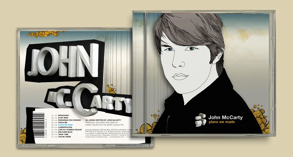
For an independent recording artist without a major video budget the CD cover is still one of the primary calling cards for radio station programmers and bookers—and to his or her fanbase, too. The initial impulse is definitely to slap a big handsome photo on the cover to make the whole package into a headshot. I give Daniel and John a lot of credit for taking the chance on letting me go with an illustrated portrait instead.
I’m forever fascinated with Klaus Voormann’s “Revolver” cover for the Beatles, and this was yet another attempt at taking my work in that direction. Of course, I worked hard to make John look his very best. (Just check out that glorious hair!) And I did use the photographs by Peter Batchelder and Nathan Harrmann as the basis of my drawing. One of their photos actually appears at the center of the booklet. It was a bit of a hedge. “See? Here’s what he actually looks like.” That’s OK. I understand.
The booklet itself is pretty simple. I just carried the background of the cover through the whole thing and added nice, floaty Helvetica typography. The big stylistic move was the back cover. I was struggling to figure out something fun to do. Hand-lettered typography would have been way too much. Together with the cover illustration it would’ve taken the package into cartoonish territory, and that would’ve been bad. But just slapping on some more Helvetica felt bland.
Luckily, I remembered that I’d bought an incomplete set of old clay display letters at a flea market years earlier, and stored in my Mystery Bag. It’s something I like to do. I often have no idea what I’ll use things for, but I know that they’ll save my ass years down the line.
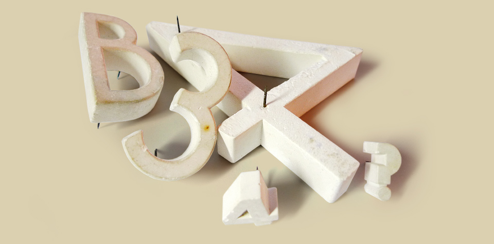
Would I be able to spell “John McCarty” with the letters I had? No. No, I wouldn’t. Certainly not all in one size. But by mixing and matching a bit, and by using an inverted broken-off question mark for the c in Mc, everything just fit. I stuck all the letters into a big piece of black foamcore board, took some photos, and I was off to the races!
Looking at the back cover now, I notice the website addresses on top of the legal copy: BURSTRECORDS.COM — 344DESIGN.COM — JOHNMCCARTY.COM I put my own website on the back cover? Before the artist’s own website?! Oh for crying out loud… the hubris! Give me a second to let the excess blood drain from my face. (You know what? As an act of penance I’ll link those URLs to their sites. Go check ’em out if you like.)
During my little clay type exploration I noticed a pair of attractive semicolons. Which I posed perpendicular to each other. This struck me as a nice symbol of a relationship that’s gone sour. Two sentences that aren’t yet complete, but that have—for the moment—stopped in their tracks. Not a bad symbol for a bittersweet album about love, titled “Plans We Made.” Really, really, this should have become the cover all by itself. A cool, enigmatic sculpture that relates to the music. Daniel and John felt the same way, I think, but I really loved that illustration, so I dug in my heels. We did put the semicolons on the cover as a little accent by the title. Why not?
In retrospect, I might have put my own aesthetic needs before the artist’s, but looking at the result, I think it was the right call. In a whole stack of independent releases with moody photography, this definitely stands out. I think. Right? It’s one of my favorite CD designs (as far as my own CD designs go) and it helps a lot that I love the music on it.
Daniel hired me to design a promo kit for his label later that same year. In the course of that job it became apparent that he may be the one person more obsessed with kerning than I am, so we decided that it might be better just to be friends. Which we are.