JONATHAN LASKER CATALOG
Sometimes all your effort goes to the invisible. This catalog for painter Jonathan Lasker came together quite easily in terms of the aesthetics, but it’s a tour de force of photography, image editing, color correction, typesetting, and press work.
- Buy one
- from L.A. Louver
When everything is produced to exacting standards, the result looks effortless and elegant. But, boy… there were so many things on this catalog that didn’t go wrong, because of everybody’s extraordinary effort. Not because the project was particularly fraught, but because minimalism leaves few places to hide.
Jonathan’s paintings are incredibly sculptural, so the first task fell to L.A. Louver’s photographer Robert Wedemeyer, who captured the paintings both one by one and in a series of incredible detail close-ups. Looks easy. Isn’t.
Jonathan’s paintings live on bright colors, so all the amazing images Robert had captured next had to be readied for print. Very bright colors don’t do well in CMYK, so it fell to Tracy Dragoo at Typecraft (and a little bit to me) to keep them alive as we switched them from their native RGB. Sounds easy. Isn’t.
On the editorial side, L.A. Louver’s managing director Lisa Jann worked ridiculous hours assembling Jonathan’s many years of achievement into one comprehensive biography, which I then got to typeset very carefully. Smells tedious. Is.
Of the catalog’s 82 pages a full 34 are biography. So extensive was this section that I ended up giving it its own table of contents. The fact that Lisa didn’t lose her mind in the process of putting it together speaks to her resilience. Because it was a torturous process, and it’s a thankless one. Most people judge artists bios by length, and would never notice errors or omissions. But these catalogs are scholarly documents as much as they are sales tools and pretty vanities. They are the permanent record, and not a single corner was cut.
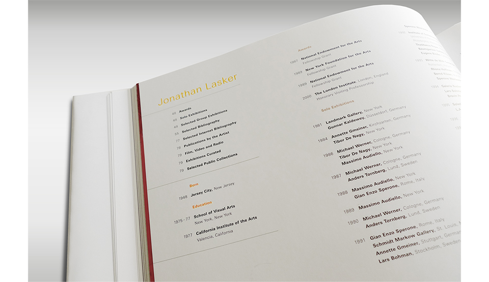
First time I’ve worked on a bio that needs its own table of contents. The man has done a lot of work!
Lastly, all this goodness has to be put on press and bound. Which is, of course, where Typecraft comes in. And many, many long press checks. By the time things get on press, they should already be very well color corrected. But even then, the way the press sheet is arranged makes a difference to the way things print. A green painting next to a red painting will give you trouble. If you take a little yellow out of the green painting, you’ll also take it out of the red painting, which will turn magenta. You can sometimes change the page orientation, run shorter signatures, or just change the page sequence at the design level to avoid that sort of pile-up. In the case of Jonathan’s paintings, those pile-ups exist within each painting. There is no escape. Thanks, Jonathan!
That’s where the art director comes in on a press check. Somebody has to make an executive decision which nuance to sacrifice to save another. This gets especially tricky if you’ve already printed half of a double-page spread at the end of another signature—the 16-page booklets that get gathered into a single book. At that point you need to match that first half for a smooth crossover. And if that match requires a compromise on another crossover on that sheet, then you’ve just locked yourself in for the signature that won’t even be on press for a few hours. A friend once described it as a printing Rubik’s Cube.
None of it is that difficult when it’s your own work, and you can use the press like an instrument to create something fun. But when it comes to gallery catalogs the point is to represent the artwork as faithfully as possible. And that’s why these press checks always gave me stomach cramps. Making the paintings look dull is obviously not going to work, but making them pop too much is verboten, too. Both misrepresent what’s actually there. It’s a very small window of success. And you have to hit it in a short amount of time, to give the bindery enough time to do their work.
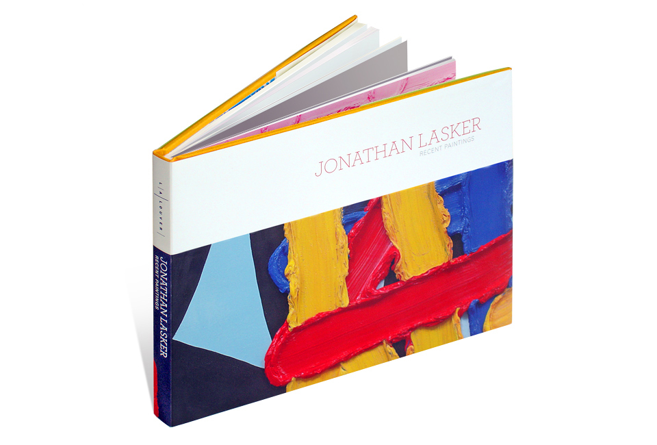
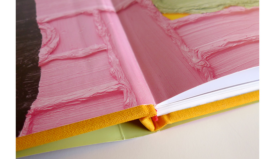
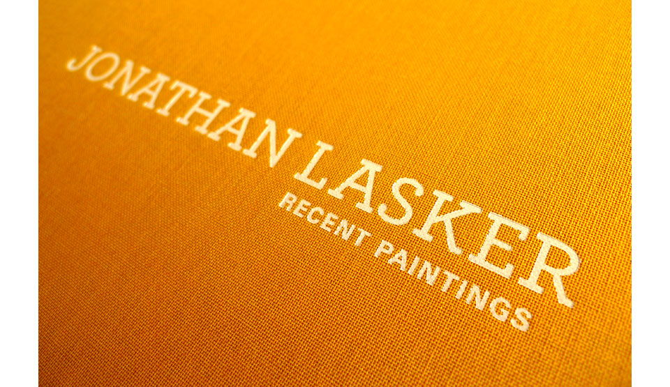
Picking out the cloth and headband may be my favorite part of making books. It’s just so luxurious. In this case, we went with a saffron linen and a red headband. The cover is embossed in white, and the inside dust jacket printed a solid green that mirrors the green on the painting detail that opens the book on the front end sheet.
It’s the little things. I love hiding color inside the dust jackets. It’s fun, and it’s a relatively cheap thrill.
But it all came off beautifully. And when you hold the catalog in your hands, it just feels… perfectly natural. How else would it look? How else woulds you set it up. There is no flash. All the love goes to the paintings. Which is exactly as it should be. But now you know.