MEDICINE DRUM — SUPERNATURE
This is the project where I tried to evolve from a “go along to get along” designer to an assertive art director with an incorruptible vision. It was a conscious experiment that failed. I overshot my goal, and went right past “assertive” to just being kind of a dick.
- Buy one
- on Amazon
Here’s what happened: The kind folks at Higher Octave Records called me in to show my portfolio. Higher Octave specialized in New Age and world music. Guitarist Ottmar Liebert was one of their big acts. They also had a sub-label called CyberOctave that put out electronic music.
On a sunny California day I took a trip up the Pacific Coast Highway to meet the Higher Octave staff at their Malibu compound—a gated villa overlooking the ocean—and laid out my work samples. They liked what they saw, but were skeptical. “If you’re doing major label projects, why do you want to do indie stuff for us?” I told them that I was interested in taking more control of the artwork than the major label process usually allowed. I also told them that I’d take a pay cut to do it. I’d present three choices, and they’d have to pick one.
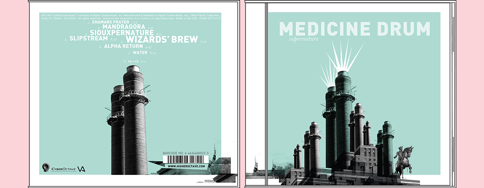
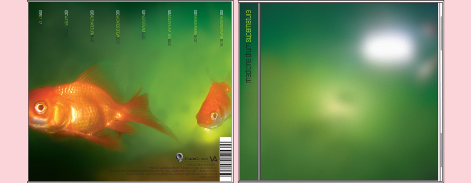
I culled the three comps I presented from a whole series of digital sketches based on photos I had taken during my time working for Modernista! in Boston. I noticed the original pair of smokestacks on my walk to work each morning, and the fishes lived in the murky office aquarium. The final cover was part of this initial presentation, too.
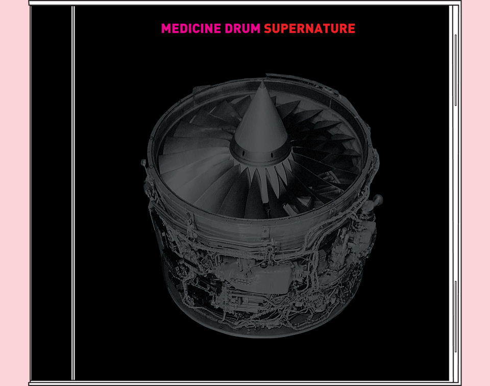
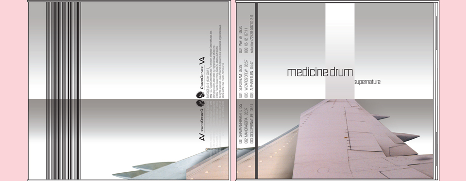
On top of these three comps I had also designed a cover based on a jet engine flipped on its side. I loved that cover, but didn’t present it. It was too easy, it looked too finished, and it fit the name “Medicine Drum” too neatly. Had I shown it, I’m convinced that the label would’ve picked it. Why risk having to use a stock photo on a job I had taken on specifically to create something of my own?
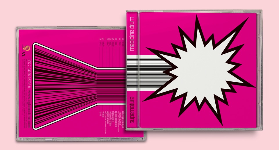
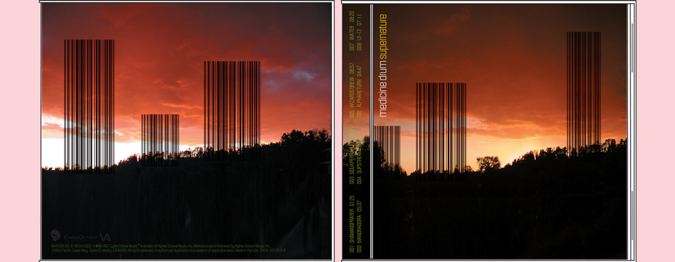
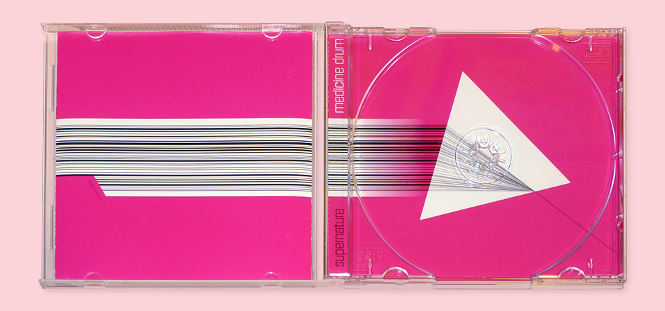
Out of the three, the label picked the big, bold magenta design that was essentially the final product. It certainly jumps out at you in a line-up. I wasn’t sure about whether I loved it, though, and presented two more ideas—a landscape planted with giant Stonehenge barcodes, and a collage of airplane wings receding in space to ultimately angle toward the sky like a light gray monolith. Or is it an airplane wing volcano? Your choice. Either way, it was too late. The big bright pink comp couldn’t be overcome. The wings would finally get their star turn in the pages of The Graphic Eye, and I’ll find a good home for those giant druidic barcodes yet.
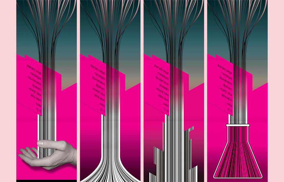
In the meantime, I forged ahead with the magenta design. The label wanted changes on the inside. The flowing barcode was supposed to emanate from my cupped hand. Well, Chris Deckker of the band was apparently creeped out by that, and wanted it gone. Myself, I hate toes, so I can certainly understand the impulse, but this was about control. I fought. I cajoled. I threatened, but ultimately didn’t quite have the heart to scuttle the entire job over it. Out went the hand.
When the hand went, I wanted to avoid repeating the back cover art. I lost that little battle, too.
The label then asked me to add album minis of other Medicine Drum releases to the booklet. I’ve seen it done. I think it’s tacky, and of course, I always know best. So I fought that request, too. In the process, the day-to-day working relationship with the label got worse and worse. They lied a bit when they said they’d let me have creative control, and I lied a bit when I said that I’d still be flexible within reason. By the time I had to turn in final files, the label didn’t trust me and I didn’t trust them. When they said “if there are any more text edits, we’ll just take care of them,” I feared the worst, and gave them print-ready art—flattened Photoshop files with the text baked in. Which is pretty much the graphic design version of Fuck you!
You can imagine how that went over. They were angry, I was indignant. More threats, more posturing, and in the end… a perfectly nice looking CD package that I’m actually still quite proud of. Which brings up a few old questions: Is it worth it to turn into an asshole to push for a design you believe in? And is it actually necessary to turn into an asshole?
At the time I had seen so many divas in action that I thought so. A lot of entertainment industry and advertising processes were set up to reward extreme behavior. So many people were screaming and yelling with little or no provocation that a reasonable request delivered at regular volume was often just ignored. (I remember a few instances with industry printers, for example. “I told you that this part wasn’t correct.” “You did. I remember. But you seemed calm about it, so we thought it was OK.” So much needless anger. So much angst. But I thought it was worth a try.
It does work, too, I think, but only if you’re fully committed. You’ve got to stay in character full time, and you can’t care what anybody thinks of you. That’s hard work, and tough on the soul. Next thing you know, you’re hanging out by the river, hustling Hobbits to get back the Precious. It wasn’t for me.
Over the years, I’ve had far better luck getting good designs produced in a spirit of cooperation. Starting up my own projects has helped with this, too. Having things like ink & circumstance and The Daily Monster as an outlet for my more personal ideas made it so I didn’t have to shoehorn them into client gigs anymore. This allowed me to maintain a bit more professional distance, which made me a far easier person to be around. Ironically, and somewhat obviously, this led to clients trusting me more. Which made for better results. It’s all very “Zen and the Art of Archery,” which is annoying, I know. I’m sorry. But it’s true.
As for this album, the whole thing looks a bit too much like the Rolling Stones’ “Flashpoint” album—a parallel that had never even crossed my mind until I saw both albums side by side in the excellent book “The Anatomy of Design” by Steve Heller and Mirko Ilic. It’s really just the big black and white starburst—theirs on the back cover on solid red, mine on the front over deep pink. The rest of the design is completely different. Even still, the unintended similarity is unfortunate. Should’ve shown ’em the jet engine…