INK & CIRCUMSTANCE — YEAR 1
Back in 2006 I had a lot of things on my mind. I was giving talks pretty frequently, and felt like I should write down a few of my thoughts and explore them in more detail. The thing that usually stopped me was that I hate writing. It’s hard and painful work. But sorting things out within the flowchart aesthetic I had cobbled together for my STEP Conference Reports wasn’t half bad. Emily Potts once again allowed me to air out my brain in the pages of her magazine STEP inside design.
These monthly illustrated columns, called Ink and Circumstance, gave me a way to explore topics rarely discussed in American design magazines—the emotional aspects of being a graphic designer trying to succeed in both the artistic and commercial sides of the business. Plus, the monthly format forced me to really get a handle on my comic book flowchart style.
Each of these early pages I did live without a net. I’d start with a question or problem I was facing and just start drawing. I sometimes had a general sense of layout—I’d construct the headline separately and use it as an anchor—but not always. When I made mistakes, I’d incorporate them into the piece. Over time I created a series of pieces that helped me as much as it helped other designers.
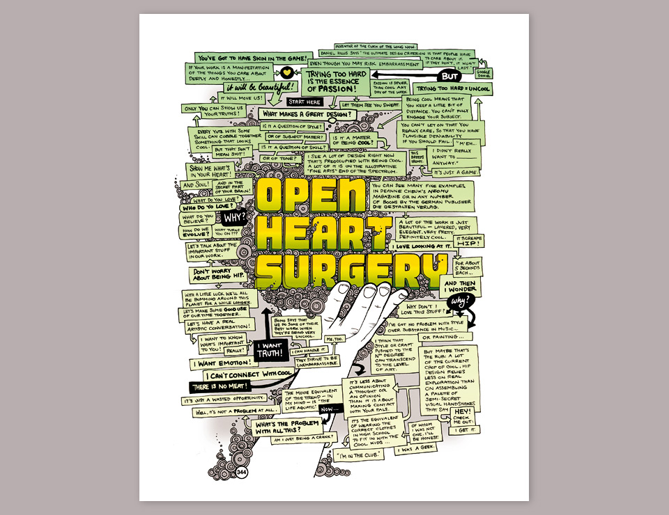
The inaugural Ink and Circumstance column OPEN HEART SURGERY (shown above) was a rant against the need to be cool. Don’t be cool! You can’t openly care and be cool! But you can’t be great without caring. You have to get your hands dirty, and sweat and curse as you work things out! When you’re done you can clean yourself off, stand next to your masterpiece, and act all nonchalant. “What, this old thing?” And that would be bullshit! And it would help no one! Be honest! Be honest for the person who looks to you as an example. Admit that you wanted it, and you worked for it! Don’t pretend like you just pulled something out of thin air by force of genius alone.
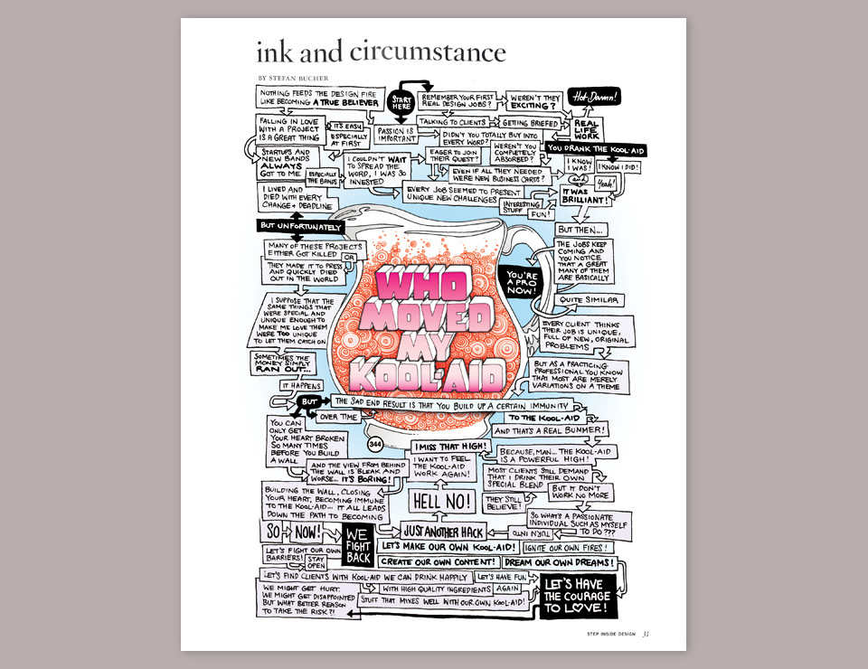
WHO MOVED MY KOOL-AID: Once you’ve been doing work for clients over a long period time you can get bored. You can get jaded. How do you keep yourself from going down that road? How can you reconnect with your work? Note also that I’m still pushing the trademark 344 circles pretty heavily here. I stay on brand.
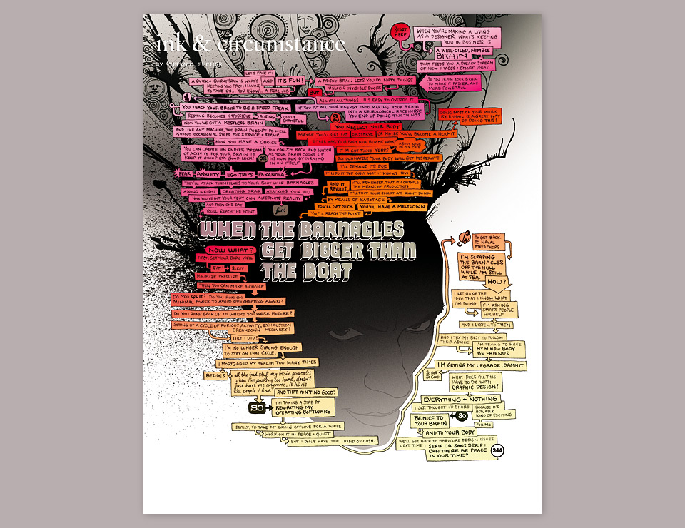
WHEN THE BARNACLES GET BIGGER THAN THE BOAT: Around the time of Episode 3 I had myself a good old-fashioned nervous breakdown. I had worked myself to a pulp to avoid a bad relationship I had entered to avoid working so much. I’ve never said that I was particularly bright. It was a dark and trying time, and I put it into this column. Talking only about success creates an unattainable ideal, and that strikes me as not particularly helpful. I try to use all parts of the buffalo. I’ll obviously make my mistakes over and over again before I get it right, but if situation reports like this one help you avoid any of them, then let’s do that, please!
The faces in the head splatter are a reference to 344 Flowers, which is also the point of origin for the blown ink that would later power the Monsters. A problem with this style of traced portrait is that the lips tend to get too prominent. I should’ve just defined the corners of the mouth and vignetted the rest, but it is what it is. I was really proud of the colors on this one, though. I was just finding my footing away from the comfort of black and white, and from here on in color would actually become a nice navigational aid for the columns.
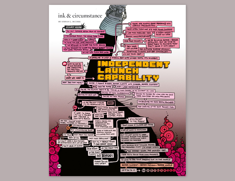
INDEPENDENT LAUNCH CAPABILITY: This is my encouragement to designers to create their own products. The whole thing was prompted by my frustration of doing great designs for some not so great clients. Essentially, it’s me warming up to develop the Monsters. Not that I knew it at the time. The 344 circles still take center stage, but at this point I was already secretly working on the precursors to the Daily Monsters—the Upstairs Neighbors—and my new inky black tendencies spilled over into rocket exhaust.
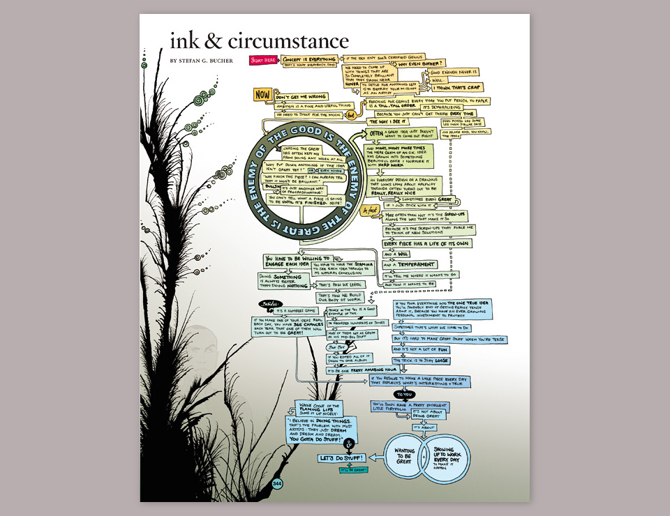
THE GOOD IS THE ENEMY OF THE GREAT IS THE ENEMY OF THE GOOD: Back in my Wieden + Kennedy days my writing partner Jed Alger came up with that circular mantra—or introduced me to it, anyway—and it has always stuck with me. It’s a critical question: Is it better to produce a lot of stuff to get the ideas out—even if the ideas aren’t fully clear or the execution isn’t perfect—in order to evolve the theme in the process, possibly over several pieces? Or is it better to work tirelessly on getting everything 100% right before you put it out there?
Perfectionism versus iterative ambition—this is one of the most important questions that has haunted me over the years. It still haunts me now as I put together this website, in fact. Note that the blown ink is becoming more prominent. Please try not to note the last minute addition of another self-portrait. I was trying to make myself more recognizable. Vanity, in other words, and executed in a somewhat high-schoolish way. I cringe now, which fits the theme of the column, so… fine.
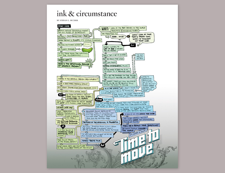
TIME TO MOVE: I finished off Year 1 venting my frustration about the limits of graphic design as an emotional force. Design can be clever, it can even be funny—note the pickle in the top left corner—but can design make you cry? Can it make you ecstatic? The best design by the best designer on her best day doesn’t stand a chance against the cheesiest of pop songs. Phil Collins beats Milton Glaser every time. Rick Astley beats Milton Glaser. With graphic design the best you can hope for is a reaction of, “Oh… hey… neat.” By contrast “Never Gonna Give You Up” makes me genuinely happy. Am I proud of that? No. But it does. Against my will. And if you know of a piece of graphic design that moves you the way music does, please tell me, because that’s my holy grail.