STEP INSIDE DESIGN COVER
About a year after I’d finished my run of ink & circumstance columns for STEP, editor Tom BIederbeck invited me to design the cover for the magazine’s annual “Best of the Web” issue. The very definition of an easy “Yes.” STEP had been a wonderful home for my work for two years, and I loved Tom to bits, anyway, just as I had loved his predecessor Emily Potts, who first brought me into the fold.
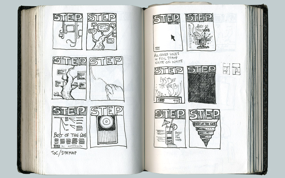
Tom and creative director Michael Ulrich asked me to send in a few sketches first, so we could discuss and decide on a direction. Usually, I just barrel ahead and send in something finished that I’ll then revise if necessary. But for my friends? Sketches coming right up. And it’s not like Tom and Michael didn’t know my way of working. They were having fun pushing me a little, and I enjoyed being pushed by people who know how to work with creative people.
Off I went to make thumbnails. I knew that I didn’t have a big Statement about the Future of the Web in me. I’m a print guy at heart. Anything I’ve done online has always been at the prodding by smarter, better informed friends.
As you can see from the thumbnails below, I ran through a few of my standards first. Vines and trees. A hand. A flowchart, varnishes, the unblinking eye of the HAL 3000. Getting around the graphic lure of a giant W took a while, but by the fall of 2008 there really was no further need for any more W.
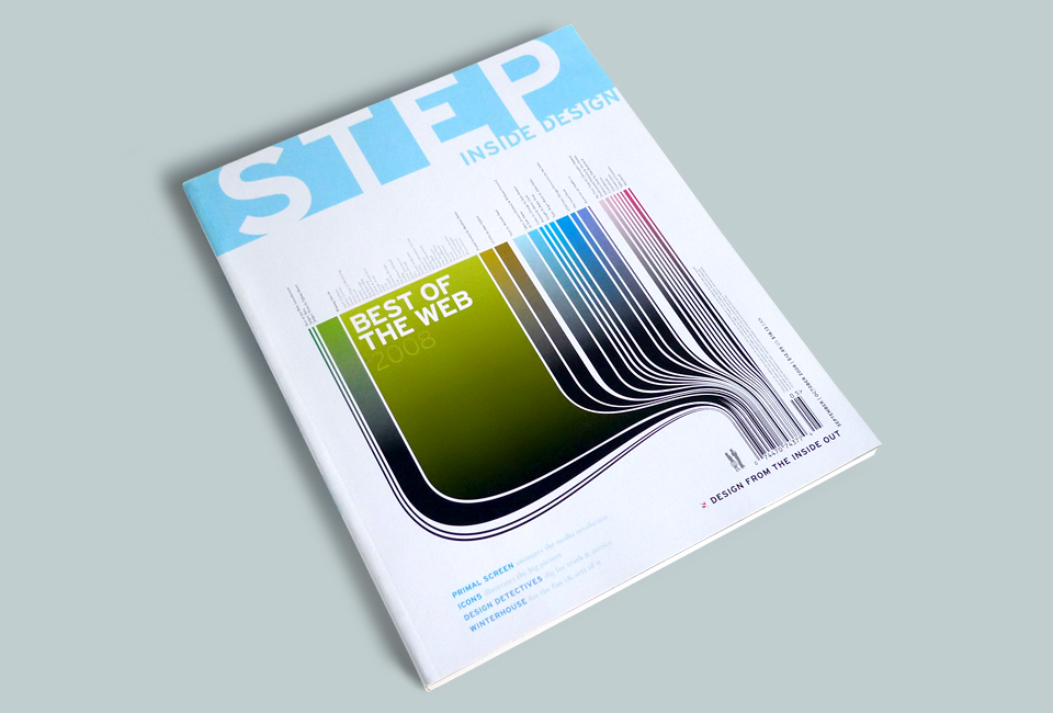
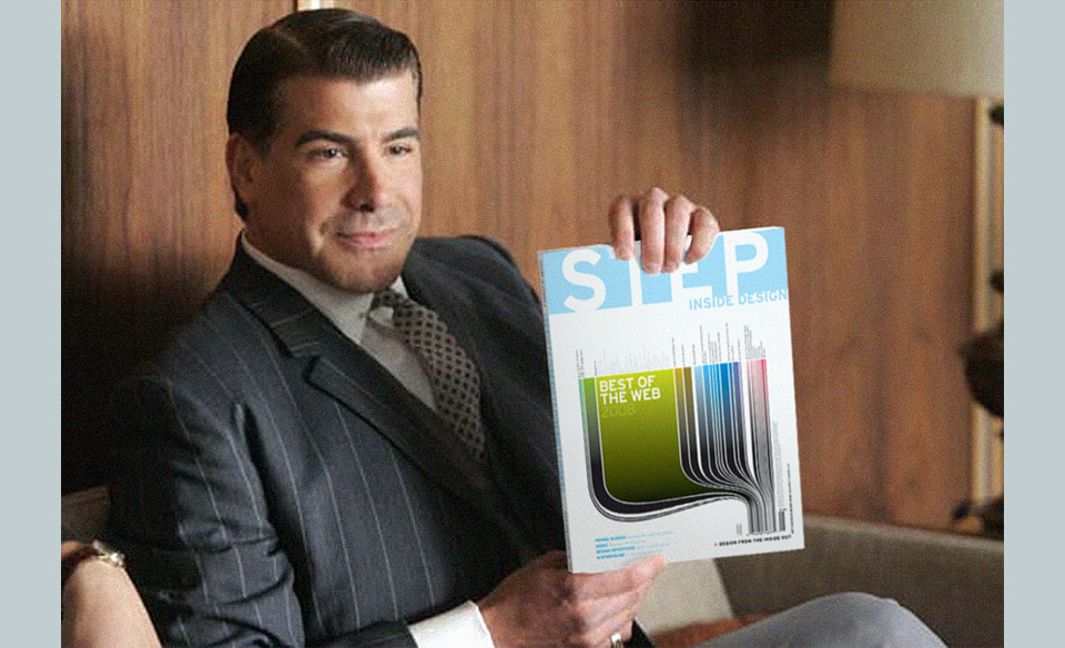
Right from the start, I had been flirting with the idea of an information graphic based on the content of the issue. It first popped up in the form of an indexed pousse café. (Which is a layered drink. I just had to look it up, too.) In the top left corner of the following page is a concentric graphic that looks like a Daily Monster eye, but is in fact what was to be my version of a Don Suggs painting.
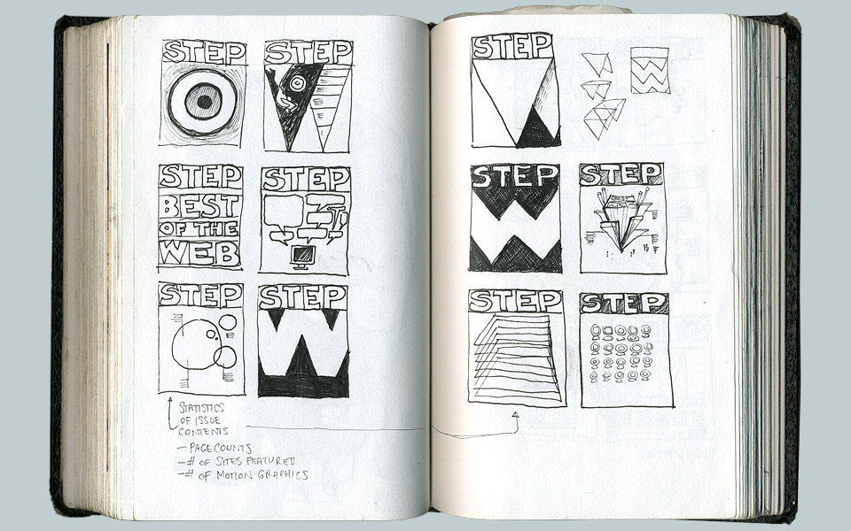
Don created a series of concentric paintings on round canvasses that he called “Patrimony.” Each piece is a statistical breakdown of the colors in a famous painting. He does it so precisely that you can look at the circles and recognize the original painting he analyzed. Pretty amazing. He’d had a show at L.A. Louver in 2007 that has stuck with me ever since. But of course, I didn’t want to just rip off Don’s technique. Besides, we’d then need call-outs, which would ruin the serene perfection of the circles. But Tom and Michael liked the general idea of doing an index-y cover, so I searched on.
Thinking back now, I don’t remember when and where the barcode idea popped up. It connects back to the 344 Important Things poster. I might have monkeyed around with another solution, and grown frustrated about having to work around that big barcode/tagline/issue number/price lockup in the bottom right corner. In fact, that’s probably exactly what happened. If you have a big mandatory element like that you have two options: You can ignore it, hoping that everybody else will, too. Or you can use that thing, and hide it in plain sight. Which is much more fun. And much more impressive if you pull it off, and I do enjoy showing off. Obviously.
Once I hit on the idea of making the barcode sprout into a quantitative breakdown of the issue, the rest was nothing more than an aesthetic exercise. There’s a little bit of trickery where several barcode bars unite to form the big green bar representing the “Best of the Web” section. I wrote a few lines of nerdy copy to fill the whole between the chart and the mandatory vertical type. Lastly, I added a pair of spectators from an 1980s clip art book. The two of them are printed in a solid fifth color, which we had to add for the names of the design companies atop the chart, anyway.

Early 80s business clip art will never go out of style! Especially in a Pantone silver.
Why did we have to? By spatial necessity, the type was very, very small. By aesthetic necessity, the names had to be a bit lighter than the surrounding category titles. The good folks at STEP indulged me. And it was the cover of a design magazine, so if ever there was an audience that would appreciate that sort of high quality detail… Why am I defending this choice? You know what I’m talking about.
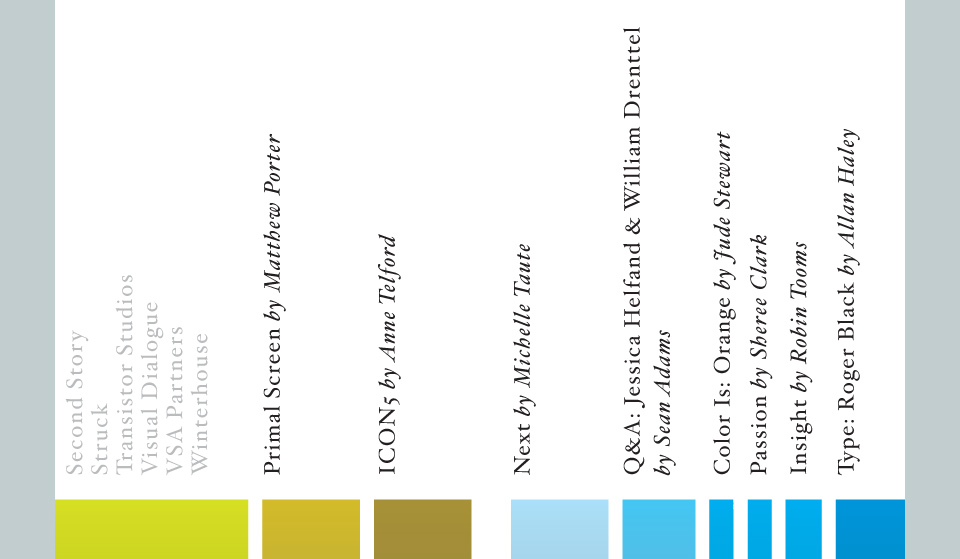
Note the gray company names on the left. That’s PMS Warm Gray 5, if I recall correctly.
To everybody’s great shock and sadness, the corporate owners of STEP and its sister publication Dynamic Graphics suddenly pulled the plug on both magazines only a few months later. Which is a cryin’ ass shame. Those were two damn fine magazines staffed by damn fine people who were adding a really interesting editorial voice to the conversation about design and illustration. I miss receiving my copies in the mail, but I’m glad I got a chance to work with Emily, Tom, Michael and Dynamic Graphics art director (and stalwart Monster contributor) Sam Berkes while things were happening. Gather ye editorial rosebuds while ye may. Sigh.

The aforementioned nerdy copy. If only more people had heeded my call…