JUAN USLÉ CATALOG
The challenge with any long-running client relationship is to walk the line between finding a solid groove without falling into a rut. What’s the difference between a successful house style and phoning it in? L.A. Louver director Peter Goulds would occasionally needle me about this, and sometimes he’d just give me a good solid shove.
- Buy one
- on Amazon
Things could get particularly tricky in this area, because I had learned through trial and error that anything that called attention to the design over the artwork wouldn’t fly. Setting the titles of each piece in a color that coordinated with each piece was fine, showy typefaces were not. Type alignment that reacted to the piece, yes. Decorative flourishes, no. With this in mind, I was always happy to bring in an idea that could thread the needle.
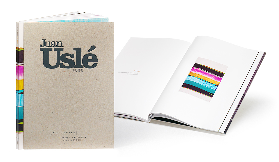
The last big book I’d done with L.A. Louver was the luscious catalog for David Hockney’s “East Yorkshire Landscape” show. I’d put in all the bells and whistles on that project to match Hockney’s almost lurid paintings, and I was allowed to do it with hardly any regard for cost. By contrast, Juan Uslé’s paintings for this show were equally bright and welcoming, but they were (with one exception) significantly smaller in scale and so felt a lot more intimate. Because of this I was eager to do something that felt a little more earthy and compact, without coming off as flimsy. And, as I said, I was eager to expand the L.A. Louver design vocabulary a little bit, too.
To that end, I suggested a flush cut debossed raw cover. Which is about the least sexy string of words I can imagine, but that’s the official printer’s specification. Let me give you the rundown: It’s a Smythe-sewn book, which means stitched signatures instead of perfect binding you would find in a square-backed magazine. Those signatures are gathered and glued into a soft cover. Next, embossed pieces of chipboard are glued to the softcover, and the whole thing is trimmed flush on the fore edge. On the opposite side we let the softcover spine protrude 3/8th of an inch to expose a colorful detail of one of the paintings.
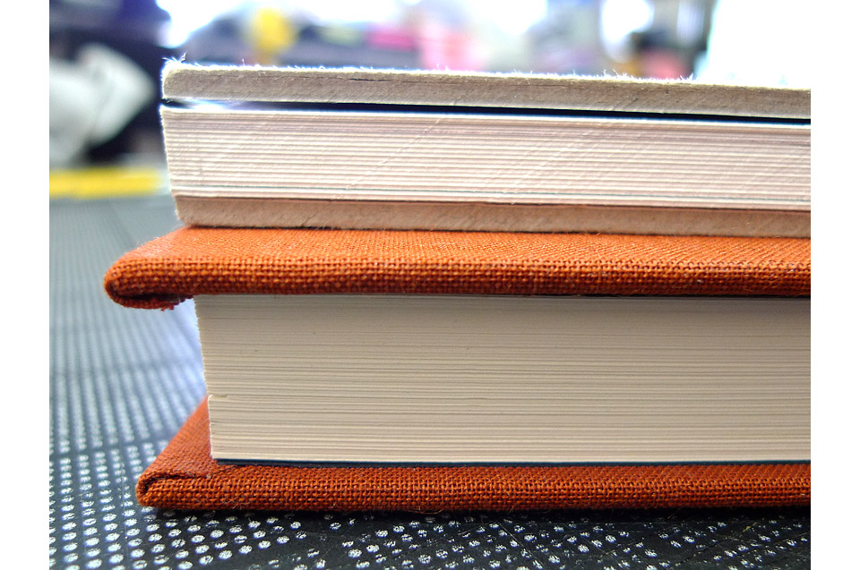
The flush cut Uslé catalog on top of a regular hard case binding with a 1/4 inch lip.

A close up look at the exposed spine. And at my sloppy kerning. Too little space between the U and s in Uslé.
Peter loved the idea, and I set to work. Embossing the cover turned out to be a little more difficult than I imagined. Working on screen for most of the time, with only inkjet and laser printers for loose proofing, I don’t always anticipate what happens when heavy machinery gets involved. To deboss the big, fat letters of “Juan Uslé” in a way that gives you a nice, visible edge you have to apply so much pressure that the surrounding board starts developing cracks. And you can forget about the fine lines of OJO-NIDO and in the L.A. Louver logo. After much trial and error I asked if we could get the best result with two separate die strikes. This isn’t usually done, because it’s hard to achieve the tight registration people are used to from offset printing. There’s going to be a bit of variance. But as always, the good folks at Roswell Bookbinding in Phoenix, Arizona came through with flying colors.
Another small lesson I learned in the process is that straight black embossing foil looks like a mock-up. There’s too much contrast. It doesn’t feel like it’s of a piece with the rest of the object. Once we switched to a dark gray foil the book looked like an actual thing again.

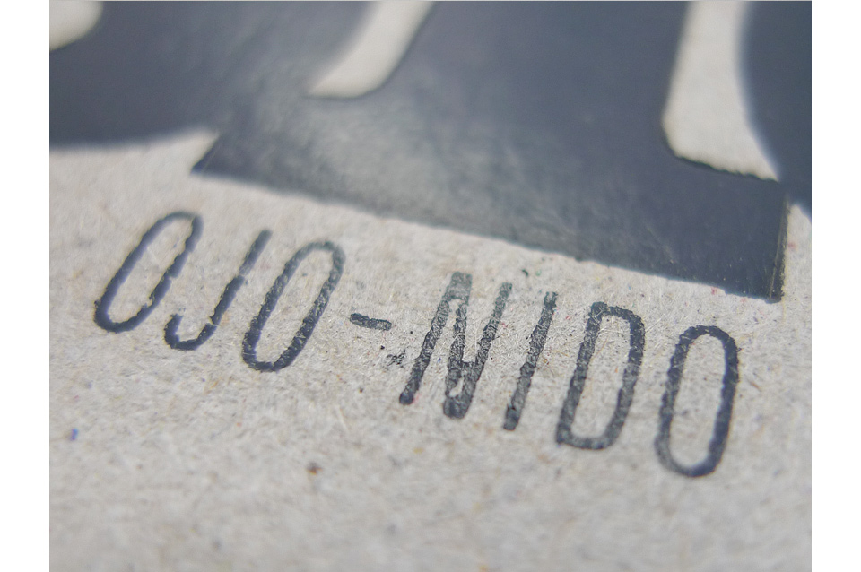
You can see how two steps were necessary to serve both the large and the small type.
The inside of the catalog stays more or less within the L.A. Louver gamut of expression, though I used Sabon for the introductory essay by Kevin Power instead of the usual Helvetica or Univers. Univers remained for the titles and for the bio, however, and for the English translations of Uslé’s poems. I didn’t want anybody to think that I’d gone completely off my rocker. I seem to remember that I took the proportions of the text and margins from an old book on classical typesetting, but I might be wrong on that. As always, Lisa Jann did the editing, and Robert Wedemeyer photograped the pieces in the gallery.
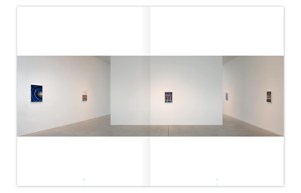
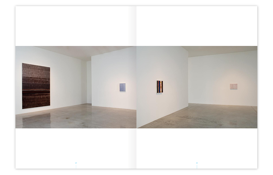
Another of the many luxuries I had with L.A. Louver was that the catalogs often trailed the show itself, which let us include photos of the work as it was installed in the gallery. I always try hard to let the the reproduction give you a sense of the relative size of each piece. I always made preparatory graphs to that end. But you can’t really get a good feel for the actual sizes until you see the work in an environment that provides a sense of scale, visual clues against which you can measure the art.
One such clue might be the ceiling light fixtures at the gallery. Or electrical outlets. But I find them messy. They interfere with the Platonic ideal of the gallery space as it exists in my head. If you find them in any of my L.A. Louver catalogs it means that the rest of the image is so heavily Photoshopped that I’m trying to fool your eye with bits of fake authenticity.
Hey, where are those spotlights coming from? It’s not for you to know.
Let me close with a few selected pages from the heart of the catalog. There’s not a tremendous amount of design going on here. Just a few quiet touches. But these paintings are gorgeous pieces, and they are my favorite part of the catalog, which is as it should be.


We frequently included close-ups of the paintings at 100% scale in these catalogs to let you see the great subtle details and textures of the work. There are some paintings that love being reproduced. They actually look better in print than they do in life. Most don’t. And in those cases it’s nice to have a few choice details as a tease, if nothing else.
