TESLA
After a long absence, I had the opportunity to do another book cover for my friend, art director Francine Kass at W. W. Norton. “I thought Tesla might be up your alley,” she said, and right she was! Nikola Tesla is a fascinating character, and author Richard Munson makes a persuasive case that we owe to him much of what we’d consider “the modern world.” It was a privilege to find a great visual representation for this idea.
When dealing with publishers and record labels I’ve traditionally treated the first round of designs as a bit of a rage finding exercise. I’d show a lot of different approaches to discover what works best for the client. I’ve revisited my stance on this only fairly recently. Showing a lot of work tends to get even experienced clients into a mix-and-match mindset that often leads to decision paralysis. I now show no more than three designs in my initial round. Alas, when I was working on this cover, I had not yet mustered the courage to pare down.
This job came with a two interesting hurdles: First, we had to establish that we were talking not of Elon Musk’s car company, but of turn-of-the-century inventor and electricity pioneer Nikola Tesla. Of course, the car is named for Nikola, but he’s not as well known to the general population as one would hope, so we had to avoid confusion.
My thought was to change the title of the book from “Tesla—Inventor of the Modern” to “Nikola Tesla—Inventor of the Modern.” This is the sort of plucky marketing initiative not generally welcomed when one is brought in to fill one specific role in a well established production process. Predictably, the idea did not advance. (It’s not like I don’t know first hand the endless battles that go into naming a book even without designerly interference.) A visual solution was called for.
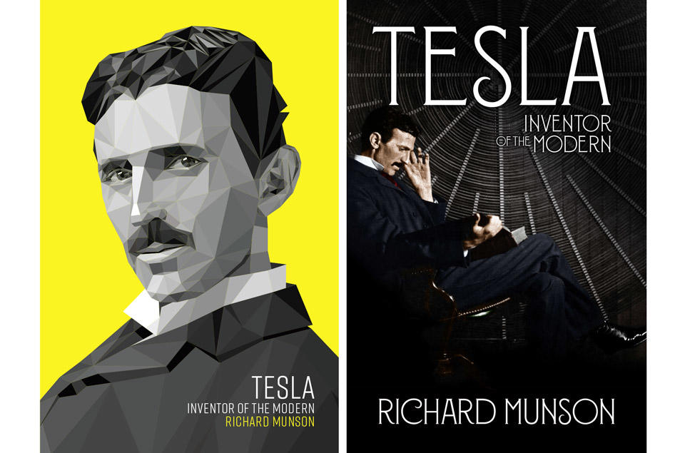
Another issue was that of available imagery: While there are not many photos of Nikola Tesla, there is one great photo of him. He looks young and handsome, he’s got a sly little smirk on his face. It’s a great photo. Everybody uses that photo. I wanted to use that photo. But of course, we wanted the book to stand out from the crowd, too. What to do?
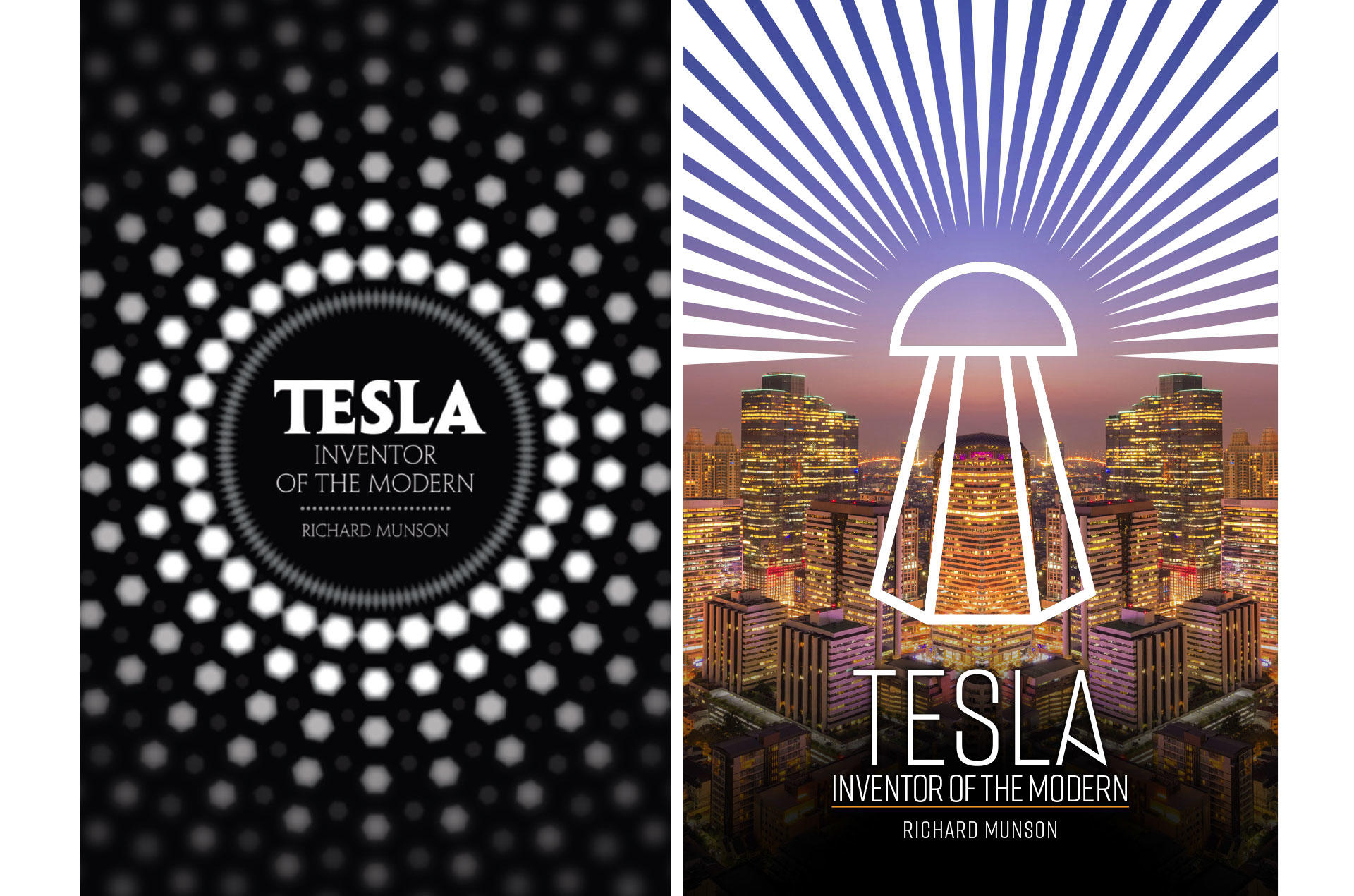
To direct the reader’s mind away from sleek new electric cars, I showed a cover that looked immediately vintage, taking its style cue from Art Deco light bulb advertisements. Another design superimposed a stylized version of Tesla’s iconic power transmitter, the Wardenclyffe power station, over a modern cityscape. This worked conceptually, but if too few people could identify a photo of Nikola Tesla, fewer still would know a giant Tesla coil on sight.
Next I showed what I thought was a slam dunk: I remade the classic “Sexy Tesla” portrait into a polygon rendering—a Tesla for the digital age. It immediately established that we were talking about a person, not about the car company; and it paid off the title “Inventor of the Modern.” Plus, I put the whole thing on a screaming yellow background! Imagine it on the shelves! Imagine the visual presence online!
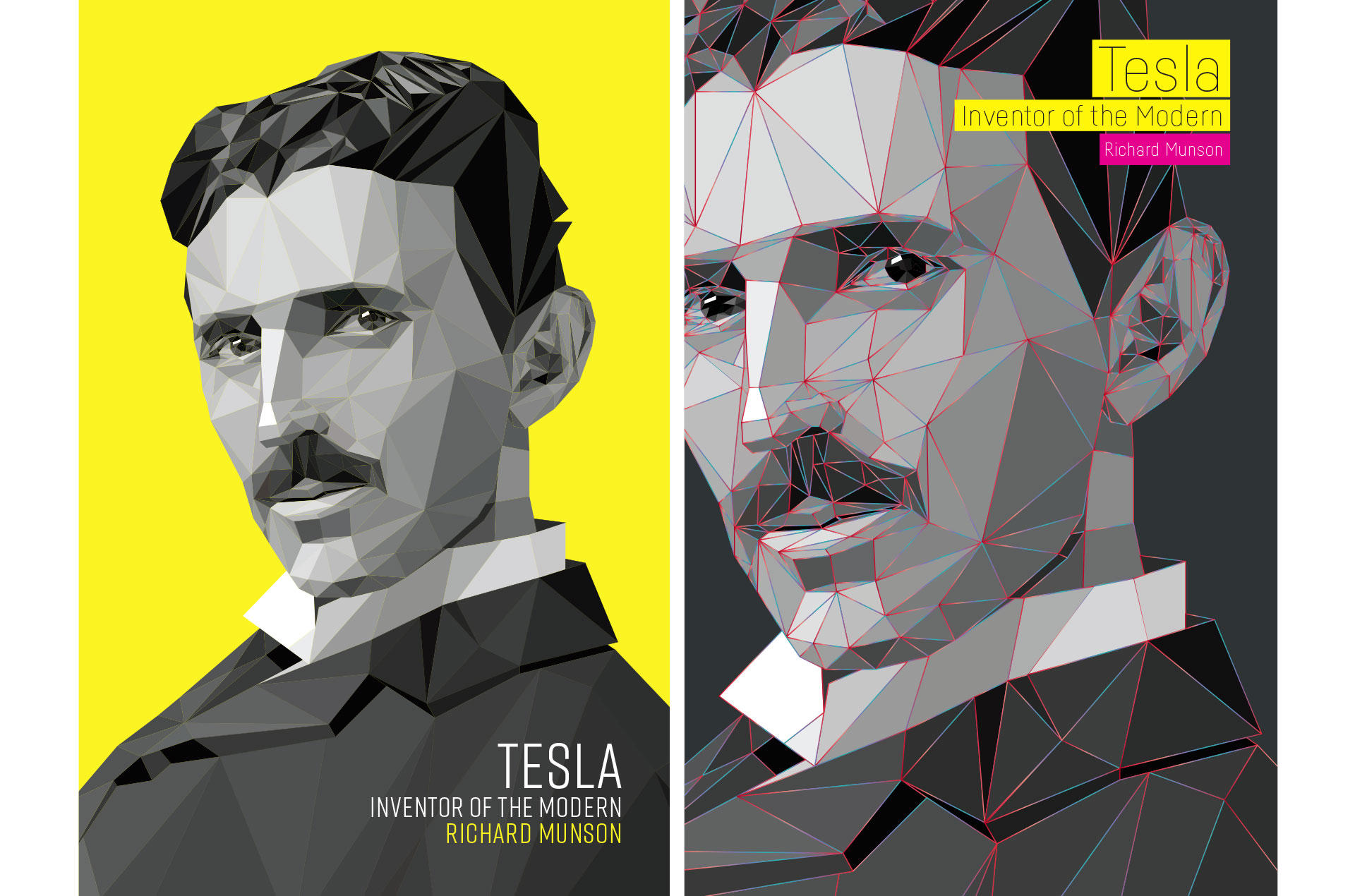
It was a non-starter. The marketing staff simply didn’t like it. If I remember, it didn’t feel modern enough for them. As it was my favorite—a stone cold winner in my book—I went back with a revised version, where the polygons were separated by glowing red and blue lines, like alternating current coursing through Tesla’s very being.
Once again, it didn’t fly. I was disappointed, but you can’t keep a good man down, and I had another high concept idea ready anyway: I’d found—courtesy of my friends at NASA’s Jet Propulsion Laboratory—a gorgeous shot of planet Earth’s night side, its cities illuminating the dark. What better way to show the legacy of the man who essentially invented the modern electrical grid? I bracketed the planet between two white rectangles, creating a giant T that would draw people in from across the bookstore.
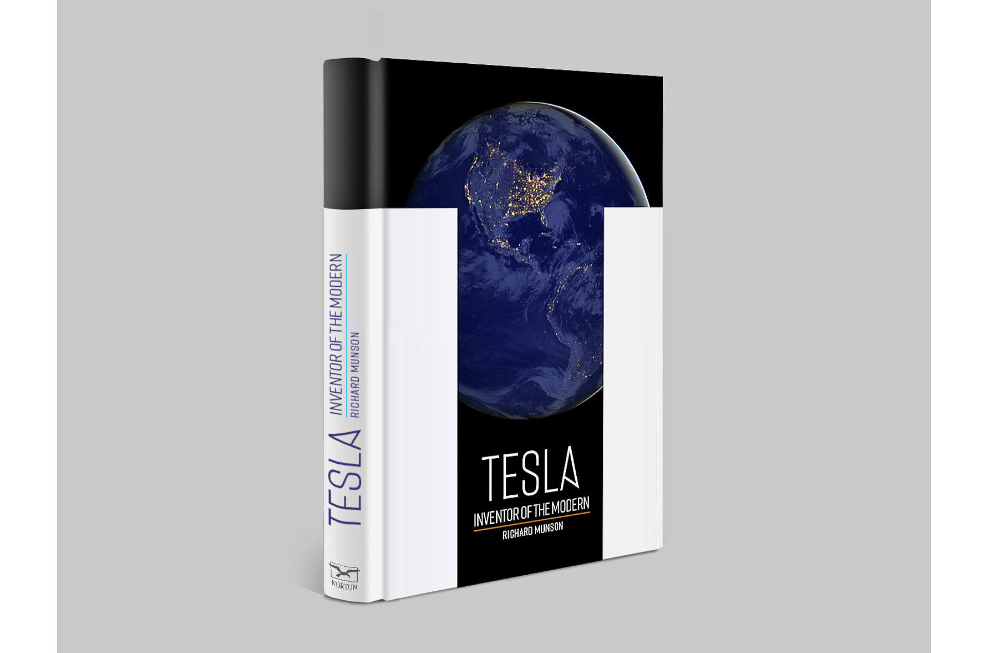
This design got a little bit of traction. We went through several permutations of the typography. I got my hopes up. In the end, it was deemed insufficiently focused on Tesla, the person. Word came down the pipe, “We need to use a photo of the man.” So I went back to “Sexy Tesla,” added some electrifying copper rays, and then placed him behind bars. Tesla faced great opposition in his lifetime, and I liked the idea of showing a “redacted” Tesla portrait to allude to his struggles.
This design went over a storm at the publisher’s, and we refined it over a few rounds, arriving at a final mechanical. We got our sign-off! Francine even found us a budget to print the whole thing with copper ink. At long last, it was going to be a beauty!
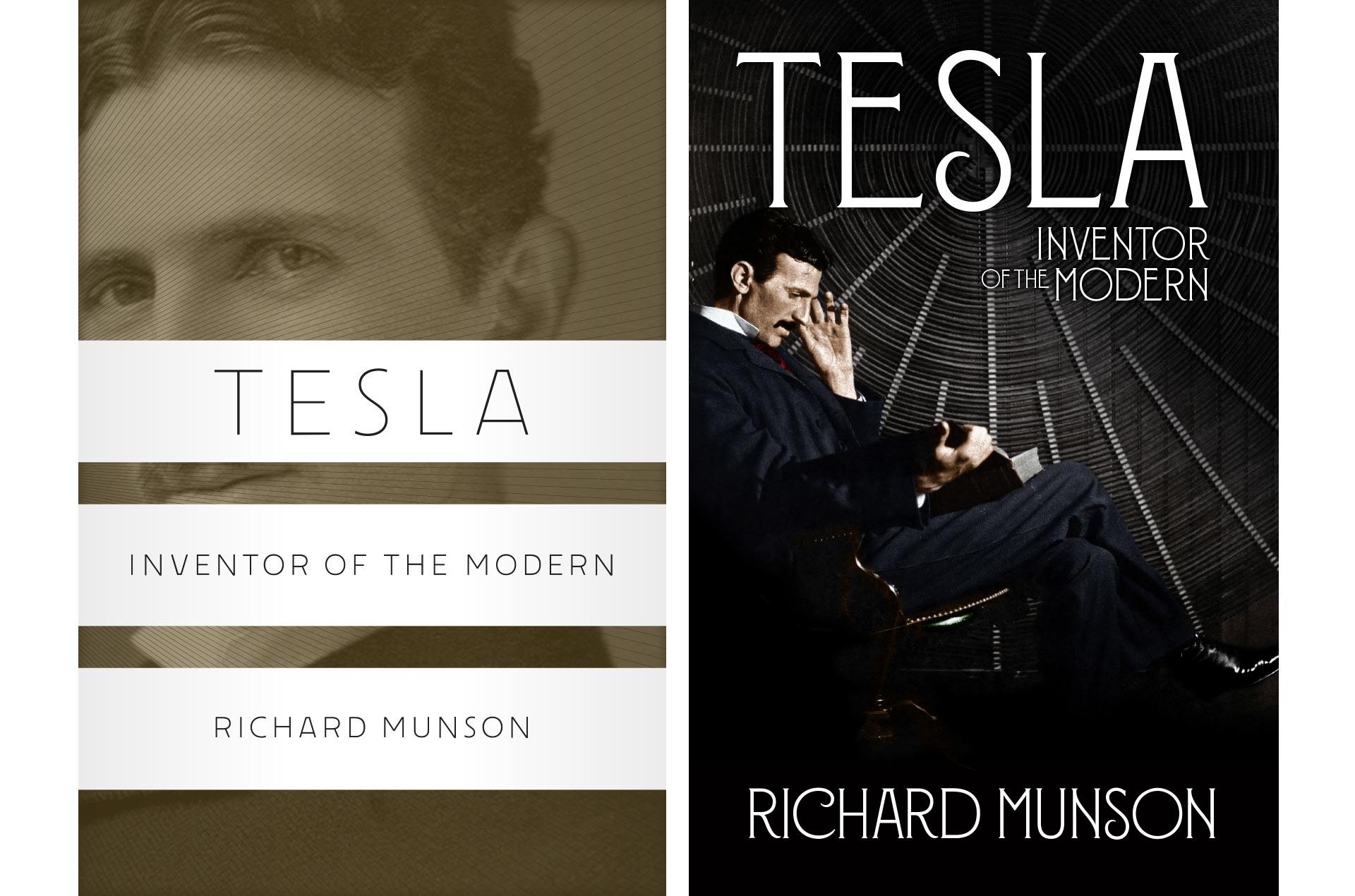
Weeks passed, I moved on, and then a call came in that the approved cover was now un-approved. The book had to look more like a proper biography. Historical heft had to be signaled. A photo had been picked, and could I just do some type treatments, please?
This happens from time to time, and I always struggle with my reaction. One wants to display Artistic Integrity™ and refuse such compromises in a proper huff. I’ve done this a few times over the years, and it never feels as satisfying as I thought it would. There is the loss of my full fee to consider. There is the negative energy generated by the drama of it all, and usually doors close permanently. In the end, somebody else is brought in who just does as they’re told, and the whole thing becomes a waste of everybody’s time. As much as I want to take a principled stance, I prefer to finish the job—if only so I can tell the story from beginning to end.
I took the photo provided, did a whole run of typographic variations, and finally got an OK on using Louise Fili’s beautiful typeface Montecatini. And so the cover went to press at last. With all being said and done, it was still a pleasure to work for my friend Francine again, and there’s always hope for a new cover on the paperback edition.