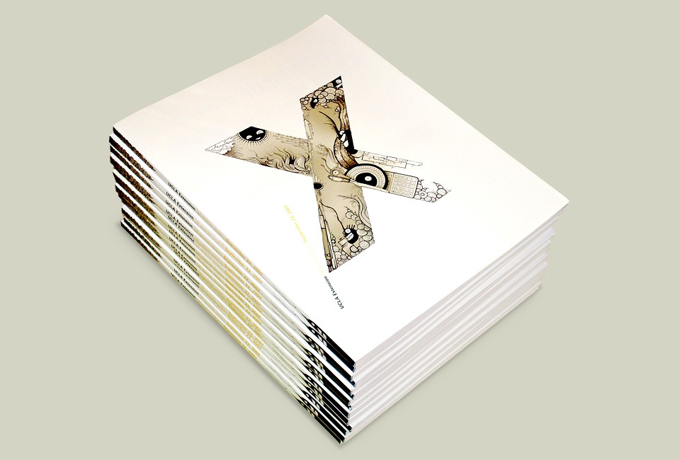
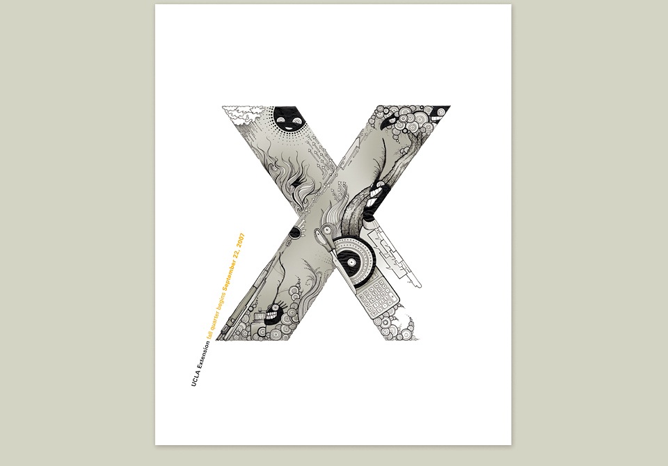
UCLA EXTENSION (FALL)
Creative director InJu Sturgeon has been curating the covers for the UCLA Extension catalogs since 1990. Her first cover artist was Paul Rand. She’s commissioned covers by Saul Bass, Lou Dorfsman, Paula Scher, Michael Bierut, David Carson, Wolfgang Weingart… the list goes on. And it’s a ridiculous list. (Did I mention Milton Glaser and Frank Gehry? And Eiko Ishioka, who I already knew through Tarsem?) Based on a generous recommendation from my good friend David Mayes, InJu invited me to join the series for the Fall 2007 catalog.
Looking back at the history of the program, my favorite pieces were the ones with lots of negative space. (Surprise, surprise—I know.) These covers function like little posters, and I wanted to treat it as such, instead of seeking refuge in ornament as I had previously done for the HOW Typography Annual cover.
Thinking about a great shape to place at the center of the cover, I kept loving the x in UCLA Extension. X is the variable in an equation. It’s the missing element, and it marks the spot. It’s a neat little symbol for continuing education, and what it can do for you. It’s also a great shape.
With that in mind, I filled the X with as much fun and mystery as I could cram in. There are eight monsters, drawing supplies, a weather system, strange plants, lots of circle doodles, speech bubbles… I suppose it’s a small inventory of my brain. I like that the content makes the shape, instead of filling a hard outline. It’s an open X. In fact, I stopped short of defining the bottom right corner of the X, so people could continue the drawing if they felt so inclined. I don’t know if anybody ever did, but that was the idea.
Because of the way InJu set up the series, each designer is free to use only minimal copy, specifically “UCLA Extension Spring/Summer/Fall/Winter quarter begins” and the date. Such a luxury! The obvious move would’ve been to place that text along one of the sides of the cover, but with so many design greats having done covers before me… I wanted to show off a little. Not that putting the type at an angle and the color transition at the very pint of the letter is all that, but I thought it was sort of an old school Swiss move. I’m not sure if Weingart ever saw this, but if he did, I hope he approved.
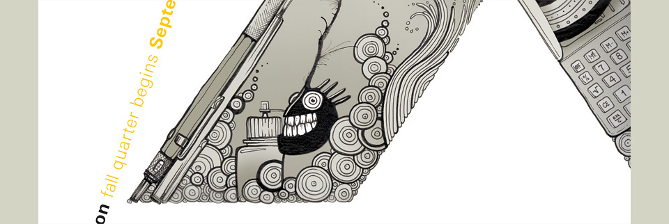
That pocket calculator is the same one as in the 2000 New Year’s Card.
I drove out to UCLA to present the cover to InJu. She looked. She sort of cocked her head to the side, and asked me what it meant. I explained. X. Missing element. Hidden treasure. School metaphor. She looked again. And just said, “OK. It’s great.” I was convinced that she hated it, so I was completely shocked when she asked me to design another cover a year later. Phew! And also, go figure! Sometimes I just can’t tell. I do know that it’s one of my favorite pieces, and that I could hardly be in better company.