THE FALL
Tarsem had been one of my art heroes ever since his lush music videos blew my teenage mind back in Germany. He dropped by my Basics of Film class once for an impromptu Q&A session. He had gone to school with my teacher, photographer Stephen Berkman, and I remember thinking, “There’s a guy who’s doing it right!”
- Buy one
- on Amazon
In 1998, a few years after graduation, I ran into Stephen at the local supermarket. He asked me if I’d be interested in doing some titles for his short film “Room 103,” which deals with a writer who attempts to finish his novel while his life becomes more and more like Kafka’s “Metamorphosis.” Light fare. Fun stuff. Happy to help.
Fast forward to 2005, when Stephen called me and asked if I’d like to design a special project for Tarsem. Could we meet at this house? Tarsem had been shooting The Fall off and on for years, always on his own dime, usually at the back end of directing a commercial to save on setup cost. He was still working on the final edit, but he needed to start talking to potential distributors. He didn’t want to show them an unfinished print of the film, because he didn’t want it to become an object of negotiation. “We’ll distribute it, if you just make this one little change.” He needed something—a presentation, an object—that would let him convey the mystery of the characters and the splendor of the visuals without tipping his hand on the story.
We had the ingredients: Stephen had travelled with Tarsem throughout the process and had shot literally thousands of still images on the various locations. Add to this photos by production designer Ged Clarke, a few by Tarsem himself, and portraits of the actors dressed in Eiko Ishioka’s stupendous costumes shot by Stephen Colover. Of course, I suggested that we make a book.
I got in touch with Marcia Mosko at Tobu Print Group, who wrangled a few beautiful book dummies for me, so I could present Tarsem with something tangible for our second meeting. As the film moves between reality and the story the character Roy tells the little girl Alexandria, I thought it would be great to have two books bound together with a hinge. that way, images from both states could live side by side. It’d be a high-minded mix-and-match book. Tarsem liked the idea, but we didn’t have nearly as much photos of the “real” scenes compared to all the amazing sequences.
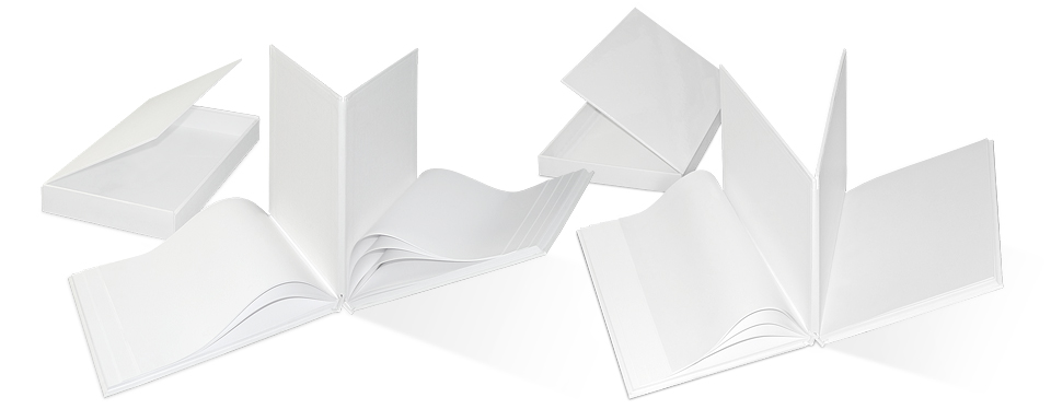
As a backup, I had asked Marcia for a third option—a straightforward hardcover book, though of impressive size. Tarsem loved it. He signed off on the budget and handed me boxes upon boxes of photos. He gave me complete freedom to select and sequence the images as I pleased, which gave me license to step back into my American Photography frame of mind.
What was different in this case wasn’t just that I had more than ten times the images to work with, but that about half of them didn’t even come with contact sheets. After you’ve stared at negatives through a loupe for a few hours straight, looking at your e-mail inbox becomes mildly psychedelic. I was also editing half blind as far as the story was concerned. Tarsem had shown me a working version of the film. Whenever there was a black frame, he’d talk me through the missing scene. I remember my pupils dilating ever so slightly when he said, “and this is where the marionette sequence will go.” But as he’d already told me not to worry about matching my sequence to the plot of the film, I forged ahead.
When I showed him the finished running order a few weeks later, he was delighted! There were only a few substitutions he wanted to make. His assistant Stephanie called a few days later to set up a time for Tarsem to swing by my place to look at a few options. How much time should we schedule? “Tarsem seemed pretty happy overall,” I told her. “I think an hour and a half should be plenty.” He stayed for seven hours the first day, nine the second, and another four or five on the third. I scanned dozens of alternate images on the spot, and made printouts we could lay out on the floor. After all of it, he looked at the final selection and said, “Huh. That’s just about what you had, isn’t it? You really picked the good ones.”
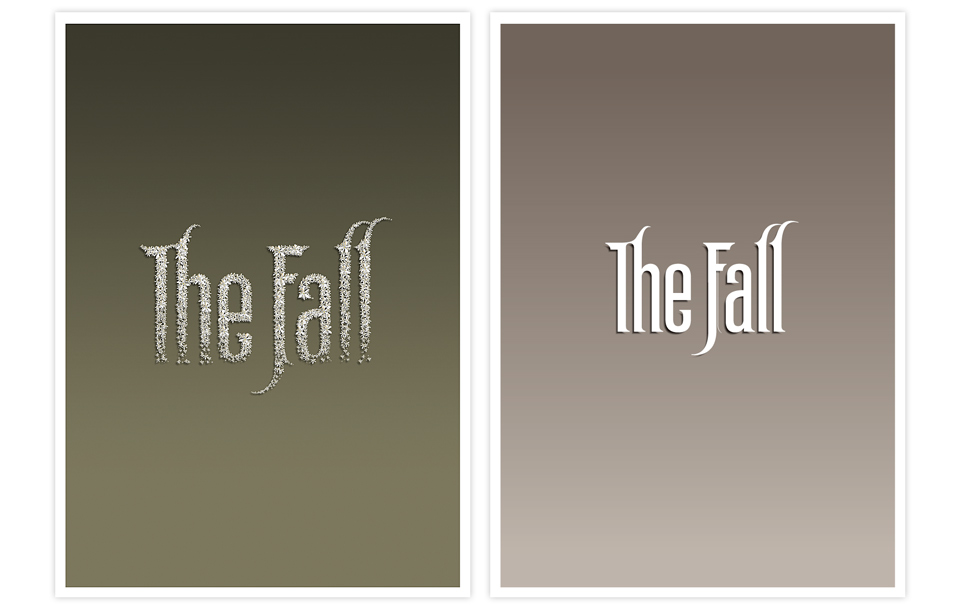
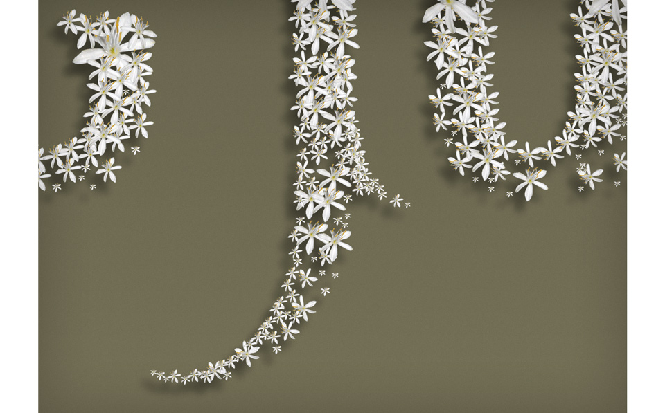
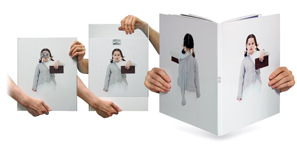
Along the way we had been talking about the cover of the book. I’d designed a logotype for the title page, and thought it might make a nice cover, too, but the photo of Alexandria in her cast was just too good, particularly since Stephen had shot her from the back, as well, making it a perfect package. I spent an inordinate amount of time touching up the less attractive imperfections in her sweater in the process of scaling the image for our 14 x 17 in. (35.6 x 43.2 cm) book.
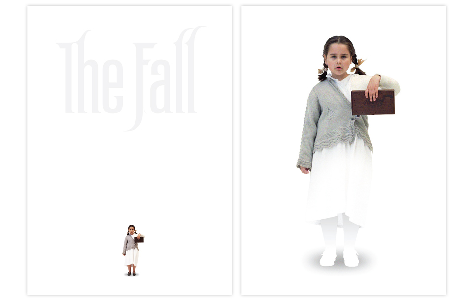
A slight problem arose because of Alexandria’s legs and feet. They were a bit out of focus, and they were dark and visually too heavy compared to the rest of the image and the white back. I didn’t like them and they had to go. But Tarsem loved them. Loved them! Three times I wet back to him over the course of a month. In the end he said, “If it’s that important to you, I trust you.” And how often do you hear that? I love that man.
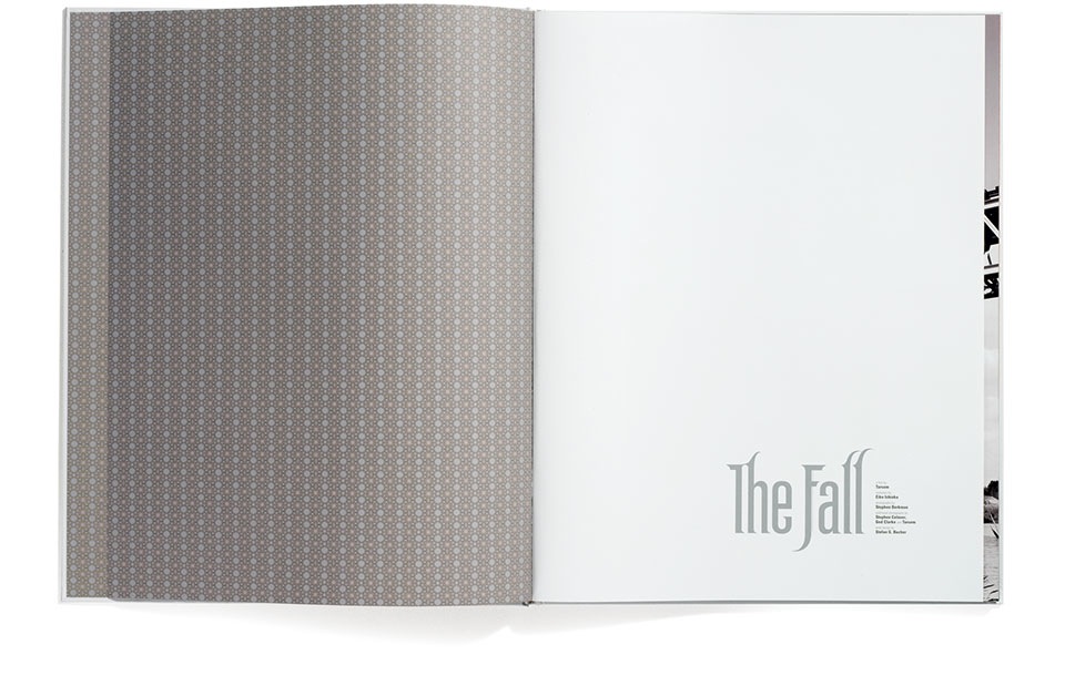
I created the pattern for the endpapers based on the decoration of a temple in the film.
As a last touch, Tarsem wanted Alexandria to wear the paper bandit’s mask. In the movie she puts it on whenever Roy tells her their story. It made sense. It also wrecked the photo. Her face had to stay open for the cover to work. We played with an acetate dust jacket, but worried that nobody would ever take it off. Then Tarsem found the solution looking at the plastic slipcase for the Twin Peaks movie “Fire Walk With Me.” Marica sorted out the manufacturing with the printer in China, and we were off to the races.
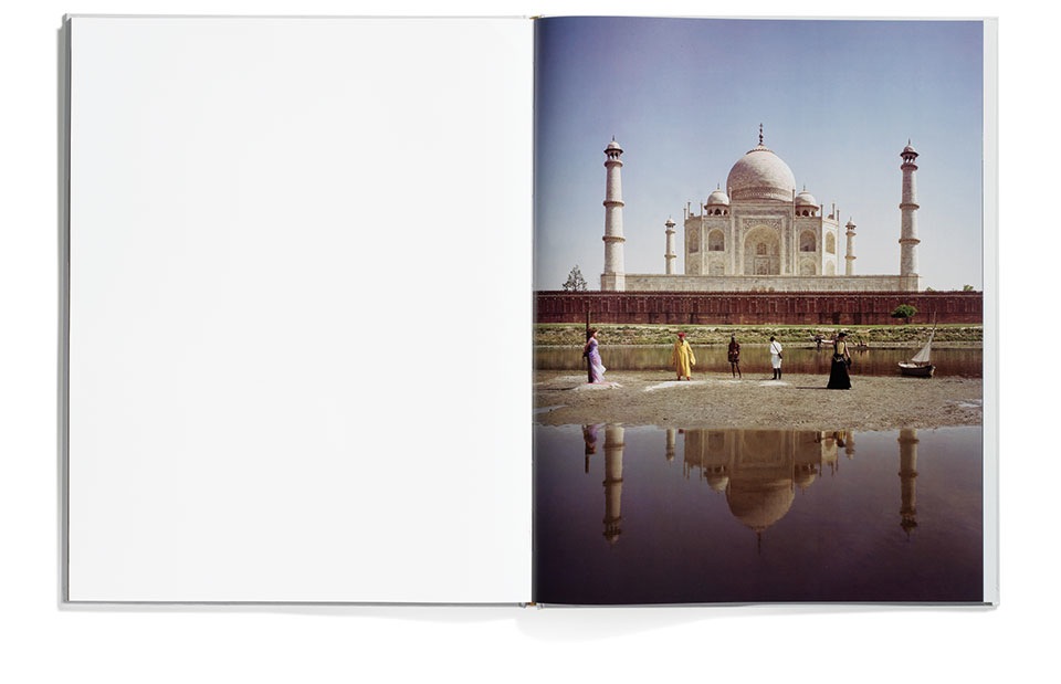
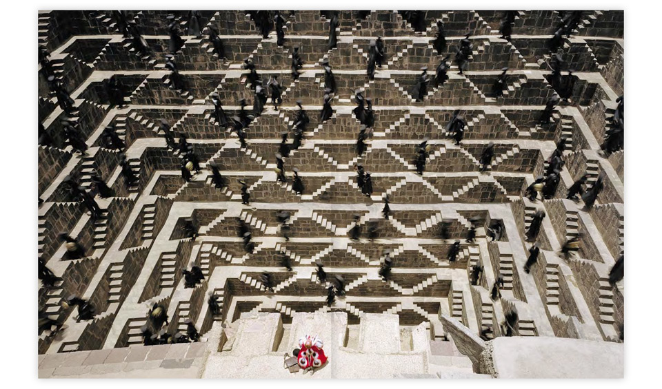
A number of the images in the book needed some retouching. The tree that gives birth to the Mystic was held up by wires, for example. The Taj Mahal was crawling with visitors and surrounded by scaffolding. Lots of little things like that had to be removed. No problem. I like doing that kind of thing. It’s very Zen. Things got difficult with the evil guards climbing the M.C. Escher staircases. One of the horizontal walkways was secured with a six foot fence that went all the way around. That took about 24 hours of cloning. Once the fence was gone it became much more obvious that this walkway was also much wider than the others, which wrecked the symmetry. Another eight or nine hours took care of that. It took that long, because a 28 x 17 in. (71.1 x 43.2 cm) CMYK image at 300dpi is unforgivingly detailed and takes up a ton of memory. But the result was worth it.
I also extended the blood soaked banner in the dessert, where the masked bandit lays his brother to rest. I’m proud to say that Tarsem liked my proportions for this so much that he had them changed to match in the movie itself.

Lastly, there was the matter of the logotype. Tarsem wasn’t wild about it. In his mind he had seen the title written by an old-fashioned typewriter. In other words, he wanted “Trixie.” And that wasn’t going to happen. But as he showed my comps to more friends and colleagues they loved the logo, and he came around. In fact, he considered using it as the main title of the movie. It’s almost like I planned it that way. But that’s another story.
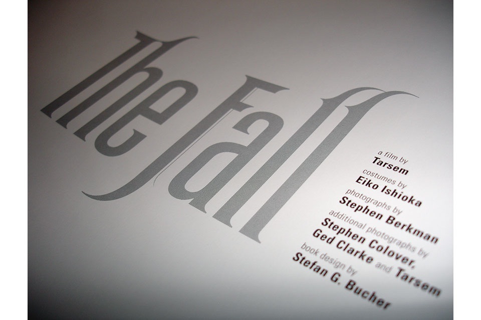
The book itself came out beautifully, and did its job exactly as Tarsem had hoped. Sadly, contractual issues kept us from ever releasing the book commercially. But Irving Penn got a copy, I’m told. And possibly Steven Spielberg. And also the lucky audiences at L.A. premiere screenings. You can still find one on Amazon or eBay every now and again. It’s a little treasure, and I think it’s fitting that it has to be hunted down.