WORTHWHILE LOGO
Worthwhile Research & Consulting is a boutique firm applying the science of linguistic anthropology to real world problems. Lead by noted linguistic anthropologist Dr. Suzanne Wertheim—get it?—the firm specializes in communication analysis and training, branding and self-presentation, intercultural communication, and ethnographic research, and data validation. They also needed a logo.
What does all that mean? Say you’re a company that’s looking to expand into an international market, Worthwhile can use the tools of linguistic anthropology to examine your website and materials and make sure that the messages you’re sending are the ones you want to send, and are appropriate for your market.
If you’re traveling abroad to do business, Worthwhile can help prepare you for the cultural norms of the country you’re visiting—how business etiquette works, how to make sure you’re being polite, how to interpret behavior. In other countries there are both obvious and subtle differences. For example, anyone can tell you that in Colombia meetings probably won’t start on time. But only someone who has done cultural analysis can also tell you that Colombians prefer to show disagreement by joking and sarcasm rather than speaking directly. That’s the kind of knowledge that can help you navigate meetings and negotiations more successfully.
How do you press all that into a successful logo? You don’t. Really. It’s too great a payload for a simple mark. Instead, you work to simplify the brief. For me, it came down to “We take difficult systems and decode them for you.” Boil that down to its essence, and you get “Complicated becomes simple.” Which is something I can represent visually.
My first round of sketches focused on making dense, intricate, somewhat abstract shapes that would reveal the letters WW (or just a single W) as soon as you took a step back. With the first round of sketches I try to cover a lot of aesthetic ground to do some range finding. I kept the sketches very loose so Dr. Wertheim could pick and choose without worrying too much about my delicate artistic ego:
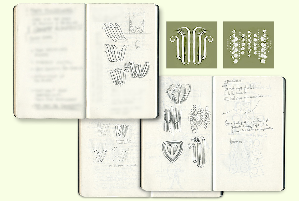
As much as some of the directions I’d explored went over well, they felt too personal. The firm works with individuals and small companies, but also with government agencies, serious research institutions and large corporate accounts. Considering her client base, Dr. Wertheim felt that a somewhat more hard-edged look was called for, which is reflected in the second round of sketches:
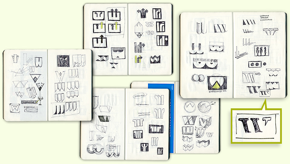
Together, we picked five of these sketches to take into digital form—you can see the tiny little check marks next to the thumbnails—and finally decided on the abstract W being completed by the speech bubble, symbolizing the idea that a thought properly expressed completes the picture. Aesthetically, the speech bubble connects this logo to my book 344 Questions?, to the Public Speaking mural, the ink & circumstance columns, and of course, all the way back to the Deep Thought poster. So it fits right in, which makes me happy.
Usually, the first idea that comes to me grows and evolves, and retains a strong presence in the final piece. The big exception to this is logo design, where tons of thumbnails jump all over the place, and help me work out more obvious solutions. With logos, the best idea often appears very late in the process.
In this case, I was confident in what I had to show, and considered the second round of sketches finished. Which evidently loosened something in my brain. I scribbled the winning entry just as Dr. Wertheim was entering the room. Needless to say, I believe in everything I present—I have learned the hard way not to show decoy comps—but it’s always a good day when my client and I have the same favorite.