ZÓCALO IDENTITY
Zócalo Public Square is a Los Angeles-based nonprofit that has also become a unit of Arizona State University. They publish intellectually frisky essays on political and cultural issues of the day, and host smart public events both locally and all over the world. For their 15th anniversary they decided to undertake their first major rebrand.
Well, they decided that they wanted a new logo—a logo that might appear on their website, but maybe would only show up at their live events. Then Zócalo invited me to help, and I did that thing I do, where I talk about things that are possible; and as soon as things seem possible, they often become necessary. Zócalo Public Square was getting a complete makeover!
Getting to brand or rebrand an organization is always an exciting challenge. You get to unify the way the organization sees itself with the way you see them and with the way they could be! This job is made inifinitely easier when you’re dealing with people who are clear about their identity, clear about their ambitions, and empowered to make decisions. I couldn’t have asked for better partners in this project than the team at Zócalo.
In the early stages of a project I usually show a few options ranging from the safe to the ambitious. Over the course of many meetings and discussions Zócalo never once chose the easy way out. They went for the ambitious option every time! When people ask how good work happens, this is it: mutual respect and trust.
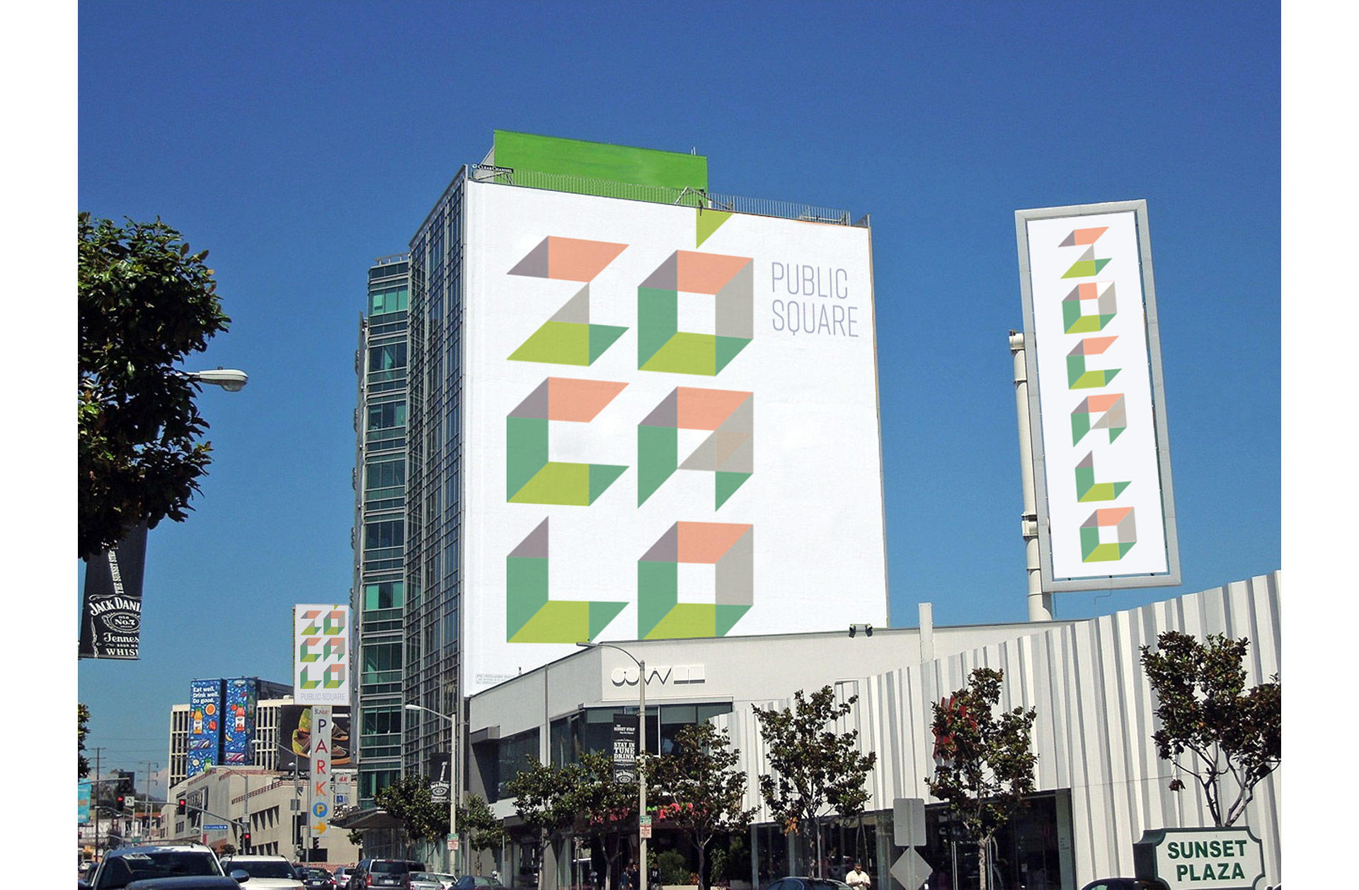
We needed a visual identity that could be equally at home online, at public events, and when used in conjunction with their partners, such as the Smithsonian, UCLA, and KCRW. The new look centers around a wordmark of squares expanding into the third dimension, growing from flat rectangles into zócalohedrons (known coloquially as ‘cubes.’) To me, the greatest thing about Zócalo is that they look at culture and current events from new and unexpected angles. I wanted the new identity to reflect that almost cubist approach to seeing the world.
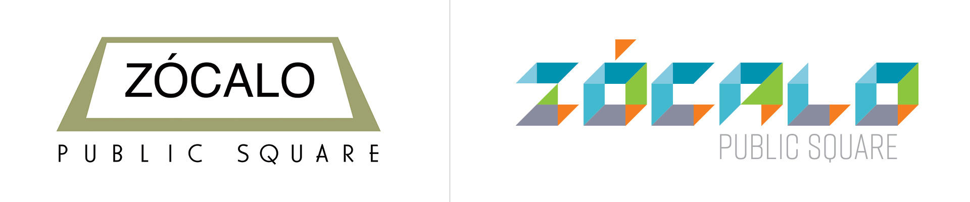
The main logo before and after
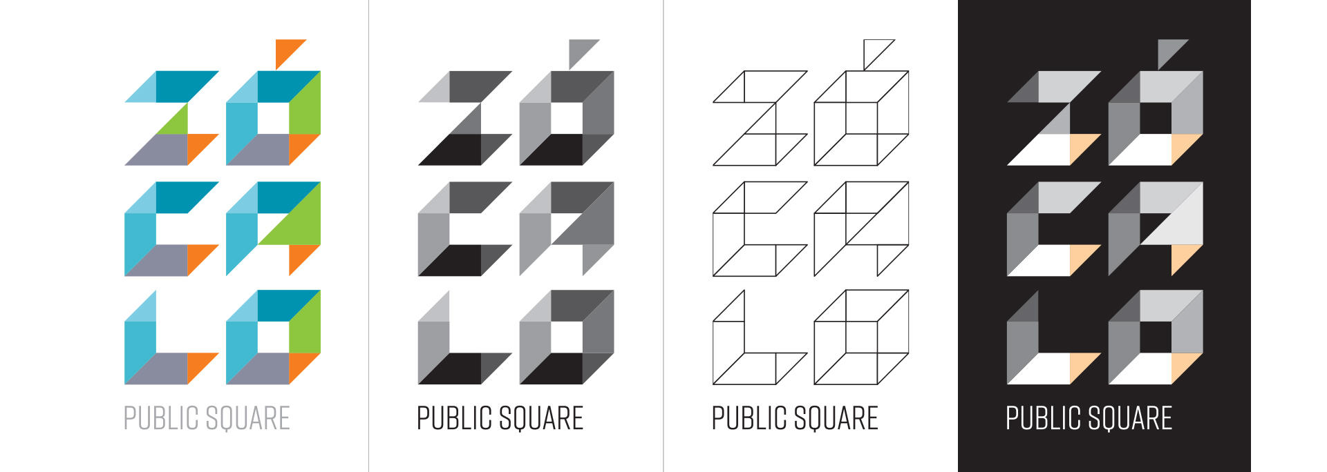
Across applications, the mark appears in a variety of colors, creating depth that lets you see different spatial alignments within each letter, and representing Zócalo’s prismatic look at culture. Adding a brazen and mutable color palette is reflective of the team and their joyful spirit of putting on a show for the Zócalo community. It also gives us a lot of flexibility to create event- and partner-specific visuals going forward.
You can see these color versions and many more on the Zócalo website and on the individual business cards of all Zócalo team members. On the site, the main masthead logo will change once every day, along with all related menu and accent colors. (We toyed with the idea of changing the logo with every visit, but it was starting to feel a bit psychotic.)
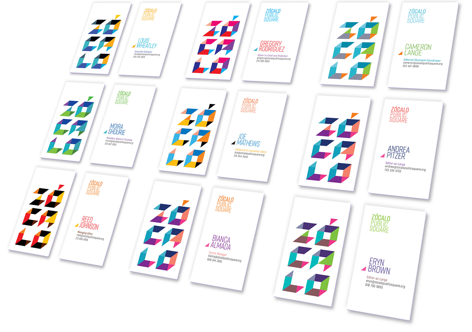
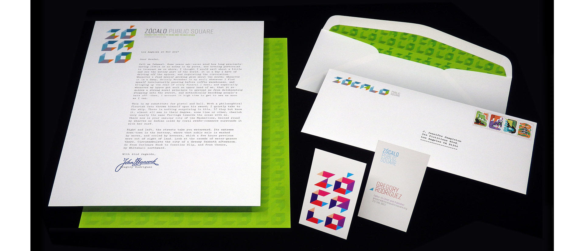
The business cards also show the first instance of the vertical stack version of the logo. Not all marks lend themselves to such distinct reconfigurations, but when it is possible as it was here, it’s a deeply useful tool to maximize the impact of the logo in different spaces. The Zócalo logos also exist in a number of different sizes and color modes, so it can always look its best regardless of circumstance. At last count, we’re up to 96 variations in the asset kit.
Speaking of the business cards, Zócalo gave me the opportunity to print the first letterhead of my career. I’d designed business cards for the Open Intelligence Agency a while back, and I’ve certainly comped up letterhead designs for other clients, but somehow it never came together. Yetis and books and movie titles, yes. But this basic unit of graphic design currency? Not until now. I’m glad it finally happened! With custom lined envelopes, no less!
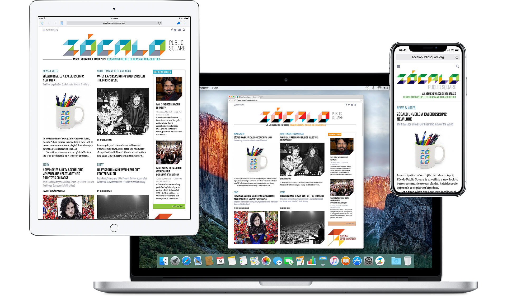
Of course, the main work was to update the Zócalo website. Initially, the team simply wanted a new masthead for the home page, but I suggested giving the whole site a bit of a spit polish. We decided to leave the basic layout of the site as it was to avoid having to tinker with years and years of content. Instead, web developer Joe McGarry helped us update the typeface choices, and implement a long list of little layout tweaks that make the whole site feel fresh without having to rebuild from scratch:
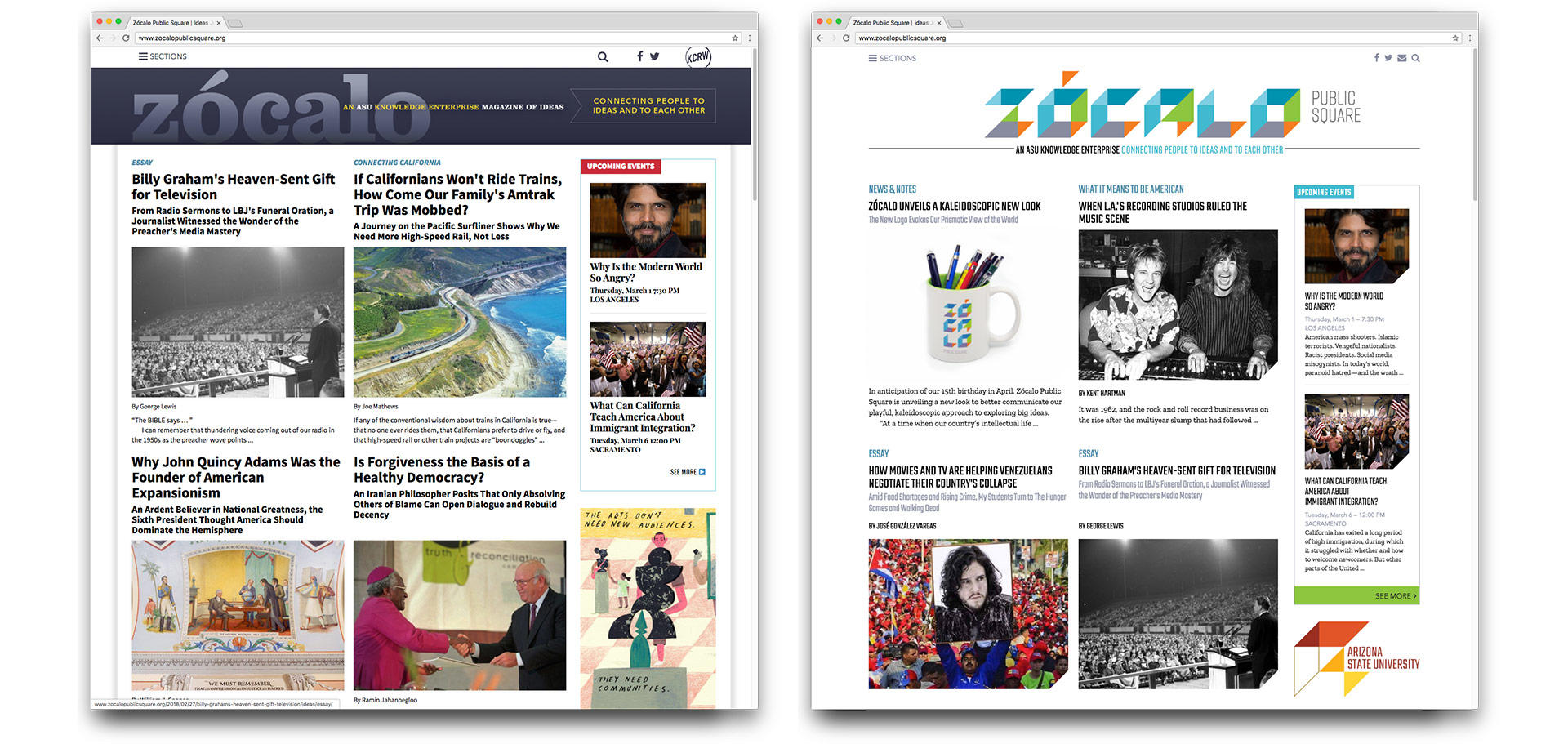
The Zócalo home page before and after
As part of the redesign I suggested adding spot illustrations to the site to bring little islands of space and beauty into the regular grid of articles. Happily, the team liked the idea, and now Zócalo has an Illustration Editor, and that editor would be me. I’m excited to introduce great new illustrators to the Zócalo audience.
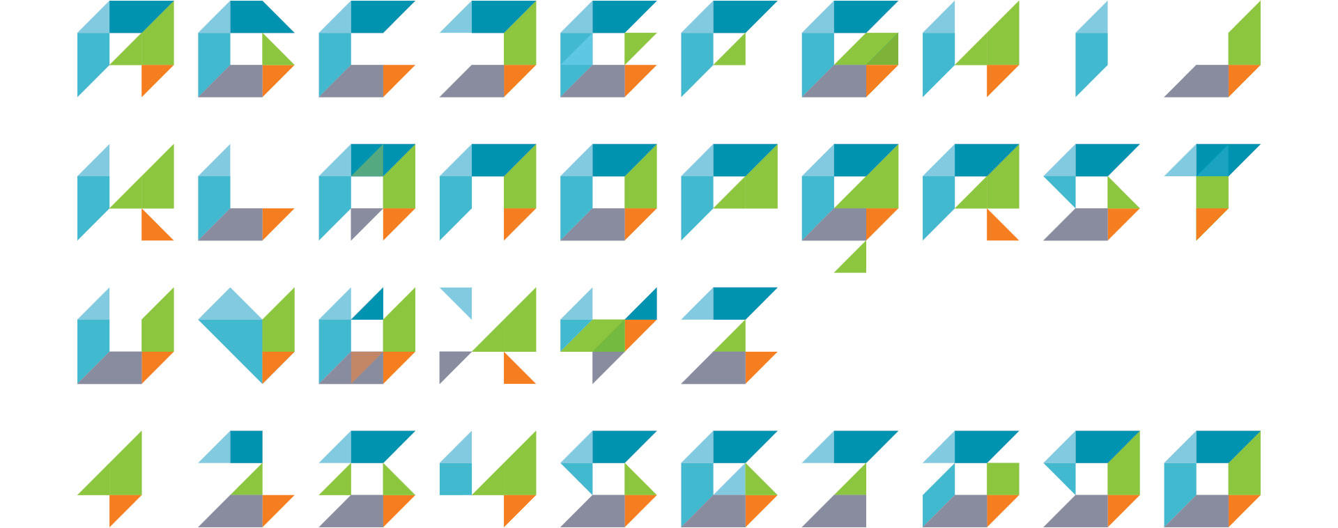
As I kept working with the Zócalo logotype, I (predictably) became tempted to expand the Zócalo logotype into a full alphabet. And predictably, I acted on that temptation at the earliest opportunity. Please say hello to Zócalo Gothic:
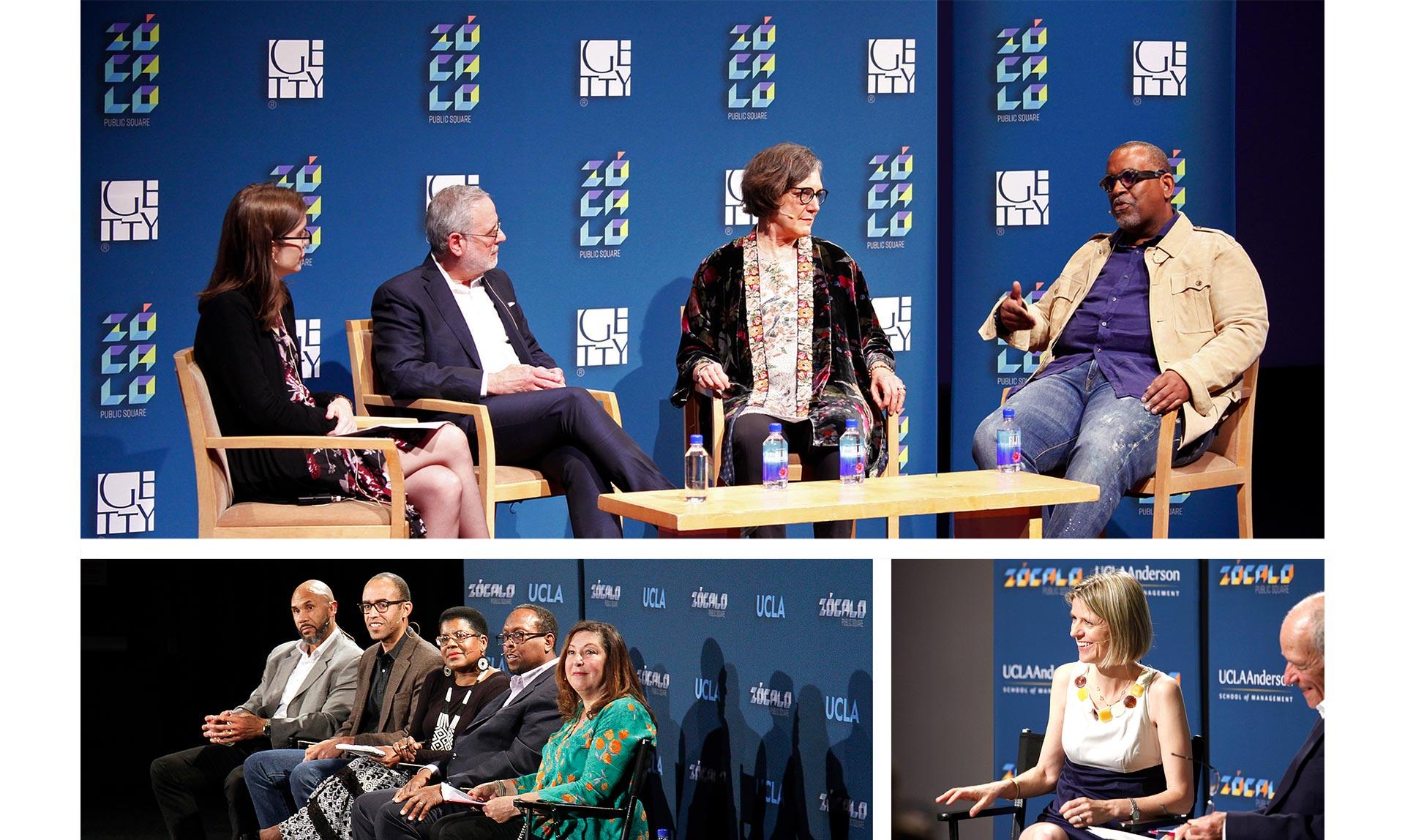
Another major application of the new identity is in the step-and-repeat banners used as backdrops for events. Here are the first few that have already been produced:
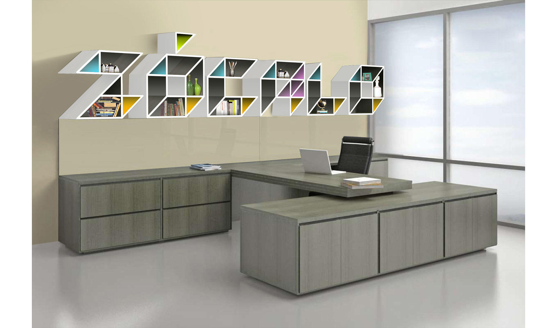
Of course, some things remain to be done. That’s why we have mockups:
And if you’re looking for a craft project, we’d really like to build this:
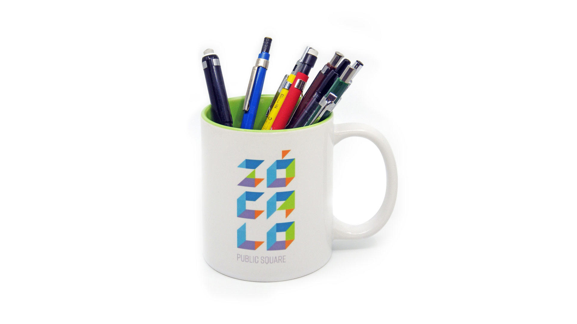
This one, though? This one’s real:
Also real, surprisingly? Zokie, the Zócalo Giraffe. I always think that good companies should have a good mascot. In this case, I suggested a giraffe—a peaceful, stylish animal with its head above the fray. Zokie here has her own bio page on the Zócalo website and a journalism degree from Columbia. She came into being with the help of my friend Jen Gubicza at ZooGuu Plush. As you can tell, Zokie is a giraffe that has seen things:
