344 LOVES YOU
One of the great privileges of my life so far has been the fact that Doyald Young counted me among his friends. We’d exchange e-mails in the wee, wee hours of the night—the first notes of his day, and the last of mine. We’d chat on the phone, and we’d meet for lunch. We’d talk about design, politics, and life. We’d gossip. And every now and again Doyald would honor me by asking for my help.
Sometimes he’d send me designs to look at, sometimes he’d show me things on his computer after we’d had lunch. In those cases I’d usually make a few suggestions, then ask if I might sit down at the computer for just a second. Which Doyald allowed. Grudgingly. He’d let me fiddle for a few minutes, and then he’d say something like, “Well OK. I think that’s enough. Thank you.” Thinking back, I blush at my impudence, but I’m pretty sure we both got a kick out of it.
Beyond my occasional fiddling, I also got to name some things for Doyald. When he started teaching a new lettering class at Art Center College of Design it was supposed to be called something like “Lettering Logotypes.” Which struck me as drab, so I suggested “Doyald’s Got Curves.” And so it was rechristened. There are students who have this title on their report cards and transcripts. You’re welcome.
From this sprang the title of Doyald‘s lettering workshop at the Y Conference in San Diego. The initial title was “Logo Comps” or “Doyald’s Comps.” I suggested “Dangerous Curves.” A pun. A recycled pun. I know. But also fun. Everybody liked it. Doyald did, too, but he was skeptical:
“Dangerous Curves—I like it. It stops the reader. Catchy, though I’m not quite sure what it implies (or infers). A play on road signs? A suggestion that some curves are difficult to handle? Is ambiguity OK?”
“Dangerous Curves, as in Gina Lollobrigida.” I replied. “Dangerous to the lusty eye of the lettering connoisseur. Ambiguity is always OK if it can in any way be construed as sexy.”
And so it was, and later it became the title of Doyald’s great third book. He wanted to call it—oh, I’ll get this wrong—“Sketching for Logotypes” or “The Art of the Logotype Pencil Sketch.” When Debbie Millman interviewed him on her radio show “Design Matters” he mentioned that I wanted him to call the book “Dangerous Curves,” but that he felt it was a bit breezy and frivolous. Well, Debbie cut him short and said, “Doyald, you have to call it ‘Dangerous Curves’!” And so he did. Though he was a bit grumpy about it. He already had a perfectly good title, but not even Doyald could say no to Debbie. In the end he came to like the title, and was always very sweet about giving me credit.
Before he died Doyald was finishing work on another book that was intended specifically to teach art of lettering. So, naturally, this book would be “Learning Curves.” Use it once and it’s a pun, twice it’s a recycled pun, and by the third time… it’s branding! Ta–dah!
The example typeface for this last book was a formal script Doyald had been developing for years. A few of his friends had suggested names, but Doyald wasn’t sold. He asked me if I’d help, and as always I was flush with pride to step up. From a long list of names he chose “Young Galant.” Which is a gorgeous, flawlessly produced typeface, which you can (and should) buy on his website.
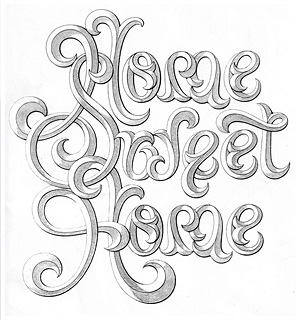
Now, what does all this have to do with anything? Well, Doyald hated being indebted to anybody, and he felt indebted to me. So he called. “Stefan, I am in your debt, and I don’t like it. May I give you some money?” “Doyald, please! Your money’s no good here.” “Well, Stefan… is there anything I can do for you?” In a flash of inspiration I asked him if he’d be willing to letter my little mantra—344 Loves You—in the style of his famous Home Sweet Home design. Doyald fell silent for a second or two. “Stefan, may I give you some money?”
He told me that he was a much younger man when he’d lettered Home Sweet Home. He wasn’t sure if he could find that style again, or if his hands would cooperate. But Doyald was a dear, generous man, and he couldn’t resist a challenge. And while he was then in his 83rd year, his hands would have given any surgeon’s hands a run for their money. Needless to say, he created an absolutely gorgeous illustration of my little affirmation. His original pencil drawing measures 10 x 10 in. (25.4 x 25.4 cm) and hangs framed in my office. If there should ever be a fire here, it’ll be the thing I grab.
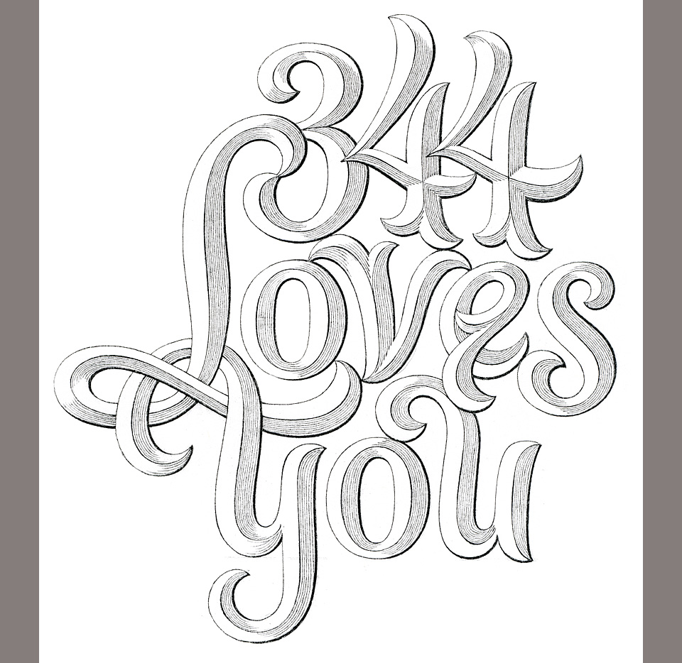
Doyald’s photocopy of his original drawing. He liked the sharp contrast.
Now, the plan was that I’d make the drawing into a greeting card I could include with books or as part of company correspondence. Doyald gave me a scan to clean, which I did. I placed his design on a metallic ink background, and was all set to print. But Doyald was not happy with the way I’d cleaned up the drawing. It was nowhere clean or sharp enough for him. I may be big on precision, but next to Doyald I was a model of looseness. Here is one of the samples I’d sent him. Which one did he pick? None of them.
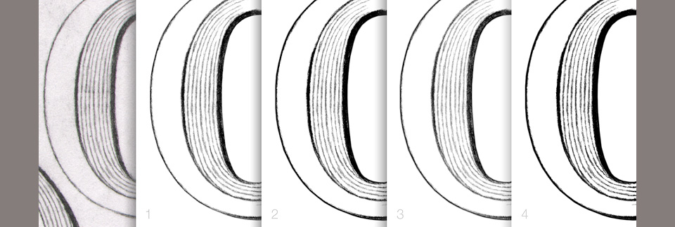
The first four of a dozen attempts at striking the right balance between nuance and crispness.
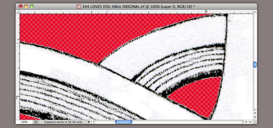
Doyald and I were both obsessed with the problem of scanning a pencil drawing in a way that achieved a pure white background without obliterating the subtlety of the line. (See my struggle with the Fingerprint Manifesto for example.) He and his partner Jim had been fiddling with different approaches for years. They’d found it best to start with a scan of a contrasty photocopy, while I preferred scanning the original. But this was Doyald’s turf, so I started work on a 48-bit scan of the piece in the winter of 2009. It took me months of a half hour here, and hour there, and still I never got it finished. It was too much! Take a look at this screen shot! It’s insanity! I’m ashamed to say that I was getting a bit cranky that I couldn’t get the file masked to Doyald’s standards, and so I let the project drift.
In the summer of 2010 Doyald asked me if I was still working on the file. He said something very much like, “I’d like to see this thing finished before I die, you know.” The thought hit me: Why don’t we sidestep the masking and emboss this? For this, David Mayes at Typecraft tracked down the best die engravers in the Western United States.
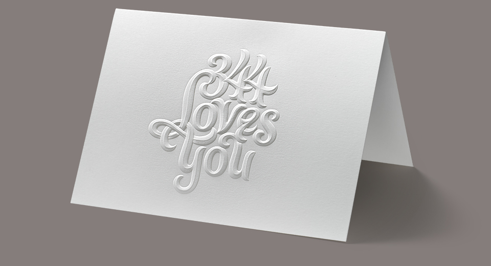
Among them was Dave Meyer at The Ligature here in Los Angeles. Dave had been friends with Doyald for the past 30 years, and they’d been working together for just as long. Dave was our man. He brought in the engraving and embossing wizards at Metal Magic in Phoenix, Arizona. And they went to town! They traced the entire design as a vector file, milled a brass die on a CNC machine that they later finessed by hand. From there it went back to The Ligature where we printed the final card you see at the top of this post.
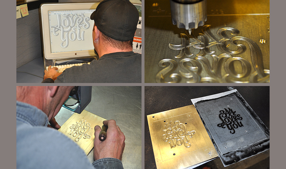
The master craftsmen at Metal Magic
A problem with dies is that there a no proofs. You hand over the design, you make notes on what should be raised, ad what effects you’d like to see, but beyond that it’s a trust exercise. Between Doyald and Dave Meyer and myself we decided to spend a few hundred extra dollars to do a test die of just the e in “loves” and the u in “you.”
We got the test pressing back right after Doyald had gone into the hospital to have an operation on his heart. I was waiting for word on when I could visit him, but the word didn’t come, and Dave (who’d been friends with Doyald for over 30 years) said, “I think we shouldn’t wait.” So we went ahead and had the whole die done, and printed the cards. I sent a copy to Doyald’s partner Jim. And then dear, sweet Doyald passed away. It took me a year to ask Jim if Doyald had seen the card. I wanted so much for him to be proud of it, and I knew that he’d had misgivings about making his drawing into an embossed card. But Jim tells me that he saw it, and that he liked it.
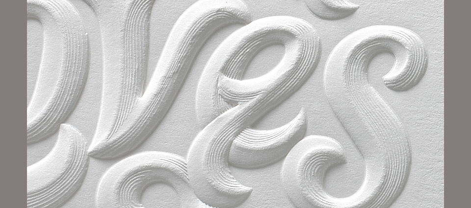
Look at the beautiful detail work on that die! Incredible.
So there’s the story of the 344 Loves You card. And a little bit about my sweet, amazing friend Doyald. Who I wish was still here. I’m so grateful that I got to know him, and I’m so happy to have his wonderful drawn gift here with me every day as I do my work. Doyald was himself until the very end, and he hadn’t planned on going. He had work left to do. I’m sure it must have annoyed him terribly to leave “Learning Curves” unfinished. But he got to do the work he loved until his final days, and until the end he kept getting better and better at it. May we all be so lucky.
If you’d like to know more about Doyald, please watch the beautiful lynda.com documentary “Doyald Young—Logotype Designer.” You’ll fall in love with him, too.