BARRINGTON STAGE COMPANY
Having spent two intense years working with Carol Chiavetta at Blue Man Group I was delighted when she asked me to help her rebrand her new home, the Barrington Stage Company. Barrington is an independent theater under the direction of Julianne Boyd, who originated future Broadway successes like her revival of “On The Town,” and most famously “The 25th Annual Putnam County Spelling Bee,” the producers of which later put on the 826LA “Spelling Bee for Cheaters.” Being asked back by a previous client is always the highest honor, and I wanted to help Carol create something beautiful that would stand out around town.
The Barrington Stage Company is part of the vibrant summer theater scene in the Berkshires region, which often serve as an incubator for future Broadway shows. So there is a well established love for theater in the community, and with that also comes some healthy competition. With this rebranding, we wanted the company to stand out both in terms of style and visual impact—while staying within a responsible budget, of course.
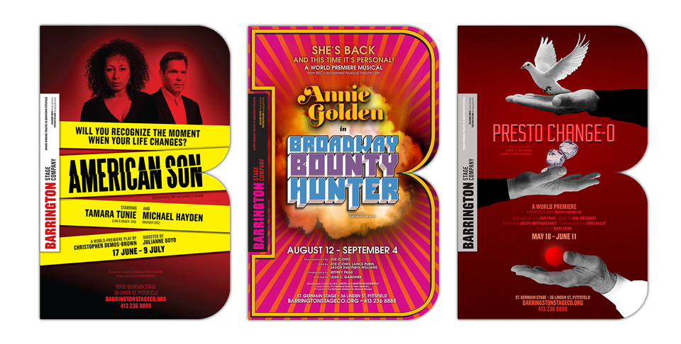
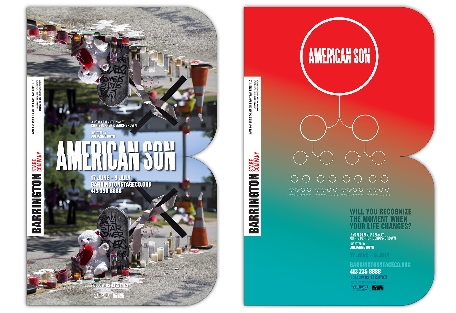
The most visible part of the company’s branding is the way the individual productions are advertised locally, so I suggested that we turn each poster into a giant logo. Instead of creating a logo mark and then forcing it into individual show designs, we’d cut the poster itself into a big old uppercase B, and place the bedrock information—theater name, tagline, and key personnel—into a vertical banner along the left side, creating the negative space of a slab serif letter. This way, each show poster would feel like part of a cohessive identity while allowing maximum freedom to create unique visuals for each individual production. (And we’d get to reuse the same B die each time, saving cost.)
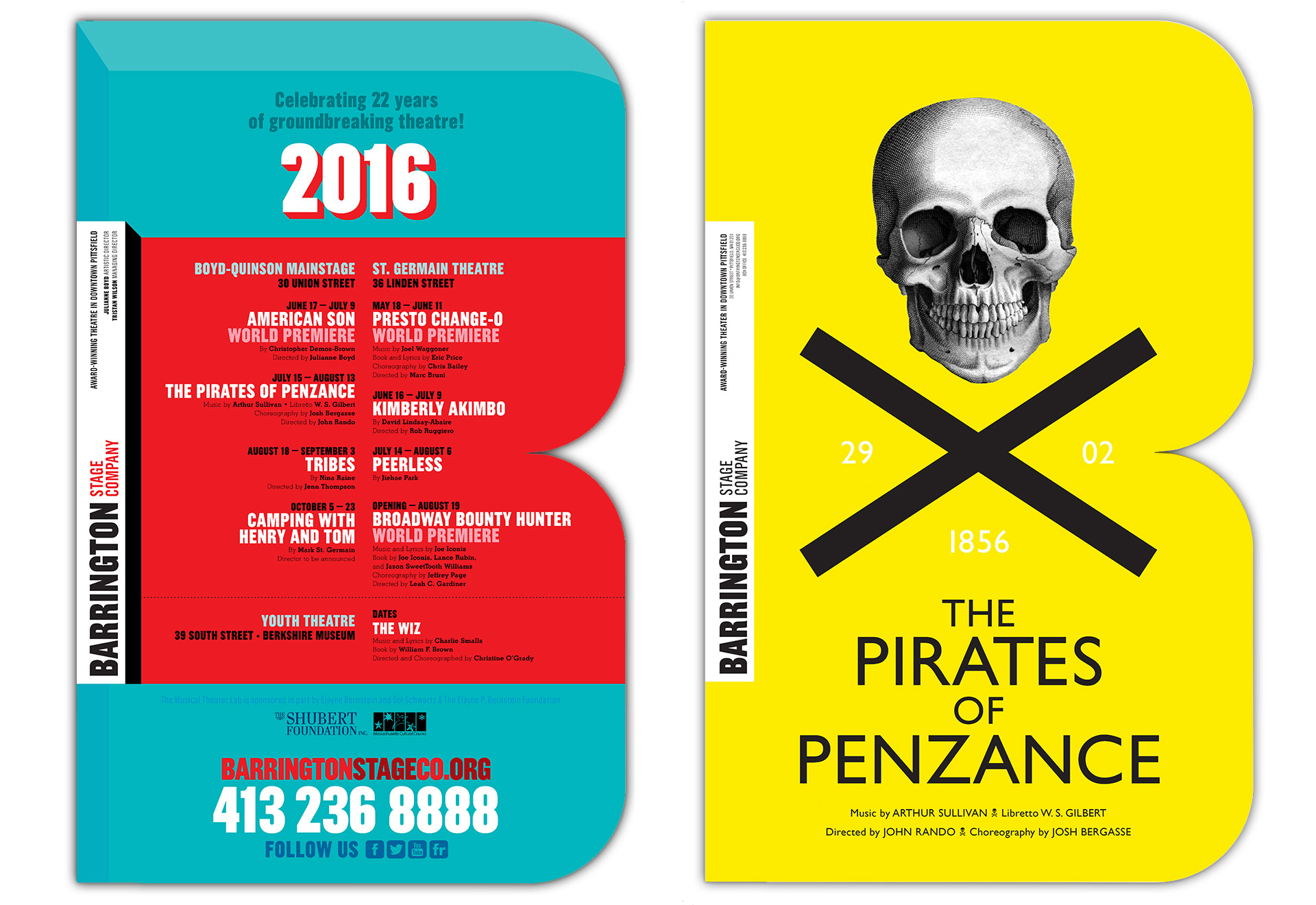
Happily, Julianne loved the idea, and I ran with it—creating a season brochure, billboards, newspaper ads, and building designs all contained within their own big B’s.
Beyond the three posters shown above I also designed a poster for the full season program, and one for a new production of “The Pirates of Penzance.” That Jolly Roger poster was my personal favorite, but didn’t quite fit the aesthetic of the actual show, so the company’s in-house designer Elizabeth Nelson took over and designed a cool poster of her own. Which is, of course, the point of a good identity—making it useful to other designers—and it’s a pleasure to see it in use!
As far as the first three posters are concerned, two were easy, one was hard. The design for “Broadway Bounty Hunter” was a hole-in-one. The musical, with music and lyrics by Joe Iconis, is about Broadway legend Annie Golden finding a new career off off off off off Broadway, as a bounty hunter tracking down a fugitive in the Amazon jungle. The whole thing is modeled on 1970s blaxploitation movies. For their pitch the show’s creative team had already put together a rough logo that was basically a riff on the movie “Shaft.” I just went farther down that same road, using period appropriate typefaces, including Shaft’s own ITC Pioneer for the main title and Kabel for the body copy.
If you’re a fan of typefaces, you may already be aware that Pioneer was created by Ronne Bonder and Tom Carnase in 1970, so that makes sense. Kabel goes back to German type designer Rudolf Koch in 1927, not one of your funkier times or places, but there you have it. “Annie Golden” is set in the lovely typeface Reina, designed in 2011 by Argentinian type genius Maximiliano Sproviero.
The orange and purple rays are a lift from the poster for the movie version of “Modesty Blaise”—the world’s deadliest and most dazzling female agent, as we all know. The golden frame… hell, I might have come up with that one myself. I do know that I created the fiery explosion behind the type by colorizing clouds I’d photographed outside my office. I added a snappy tagline for good measure, and the team decided to keep it. As you can see, the final poster remains essentially unchanged from my first comp. Sometimes I get lucky.
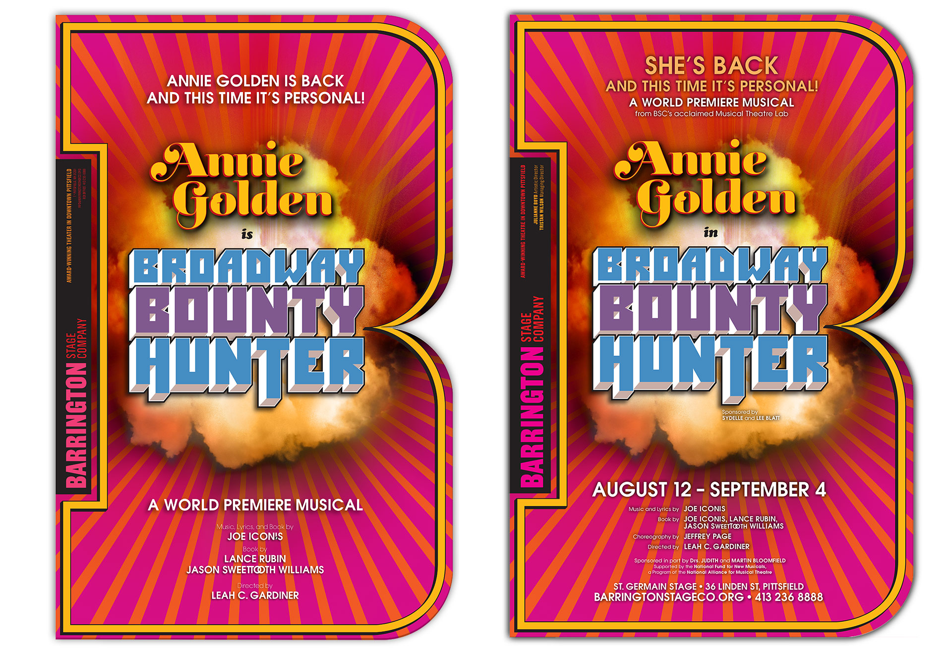
First comp (left) and final poster (right). Sometimes things just work out right away.
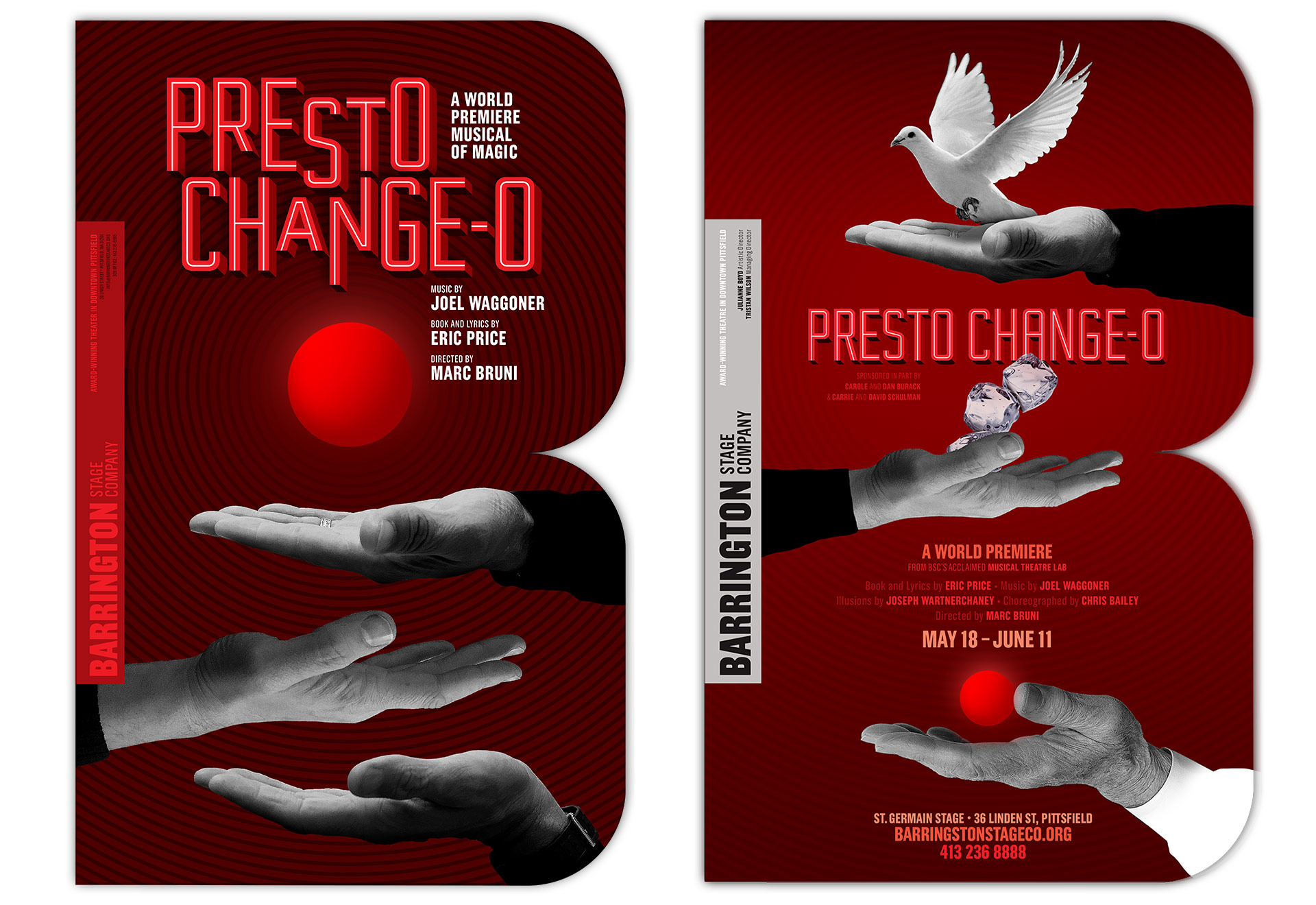
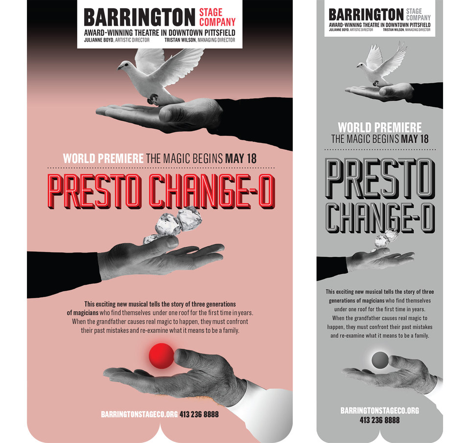
The show “Presto Change-O” is a musical by Eric Price and Joel Waggoner, and tells the story of a family of magicians. The grandfather who deals in classic tricks like making a red ball appear and disappear; the father, a Vegas magician in the mold of David Copperfield; and the son, an endurance magician in the style of David Blaine. Like Blaine, his signature magic trick is being frozen in a block of ice. The humble red ball becomes a symbol of true magic in the show, so I started with the idea of three hands coming together to levitate the ball. The team liked the idea of the three hands to symbolize the three main characters, but felt (quite correctly) that each hand could tell more of its generation’s story. Thus, the dove, the ice cubes, and the red ball.
The grandfather’s hand belongs to Harry Montgomery, one of the owners of Typecraft, the father’s belongs to one of my friends at my Ralph’s checkout counter, and the hand that holds the cubes is mine. The main title lettering is an adaptation of the 2014 typeface “Industry” by American type designer Mattox Shuler.
So those two were easy. “American Son” was a different story. “American Son” is a new play by Miami playwright Christopher Demos-Brown. It deals with a recently separated interracial couple reuniting at a police station after their son’s car has been found abandoned by the side of the road in Miami-Dade County. It’s an intense look at race in today’s America. It’s not a breezy night at the theater. I wanted to create a poster that would have mystery to draw you in, but also give you a sense of foreboding that bad things were afoot. The image of a small car, abandoned in a wide open space with its doors open, seemed both vulnerable and ominous. What happened here?
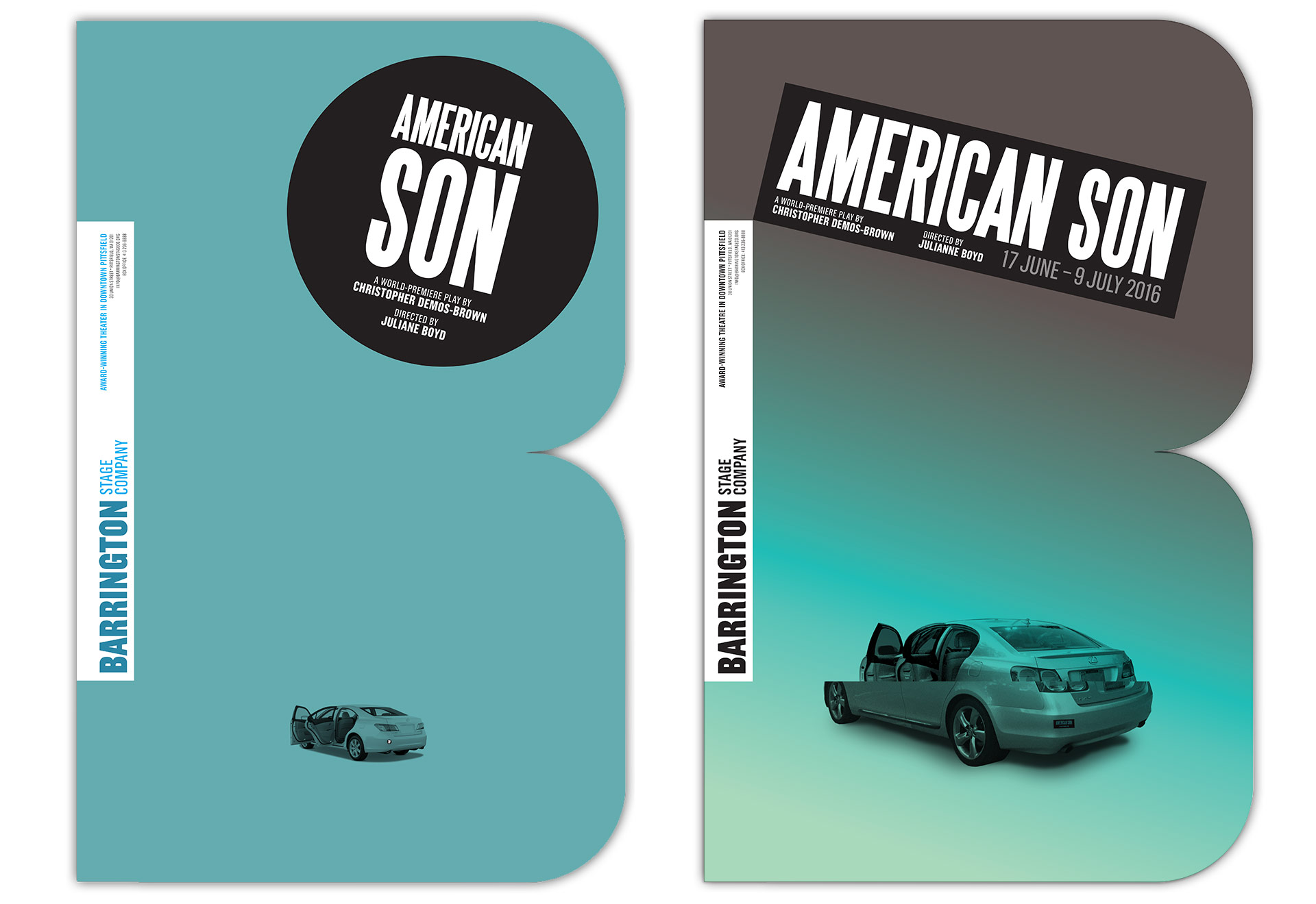
The text of the play specifies the car as a late model Lexus. Happily, Joe Nuñez at Typecraft owned one at the time I was working on the poster, and was kind enough to let me photograph it for the poster. My first draft of the design had the title in a round sticker—another reference to the play, where a bumper sticker plays a pivotal role, and an homage to Paul Sahre’s posters for the Soho Rep. Director Julianne Boyd felt that a round sticker wouldn’t read as a bumper sticker, so I changed over to the more traditional rectangular proportions.
Beyond this, Carol asked me to suggest a tagline for the play, and I immediately seized on the thought that so many factors contributed to the things that happen in the play that it’s hard to point to one incident, one action, one missed opportunity to explain either the tragic situation we find ourselves in as a country, or the shape of your own life. I offered “Will you recognize the moment when your life changes?” and got an immediate yes.
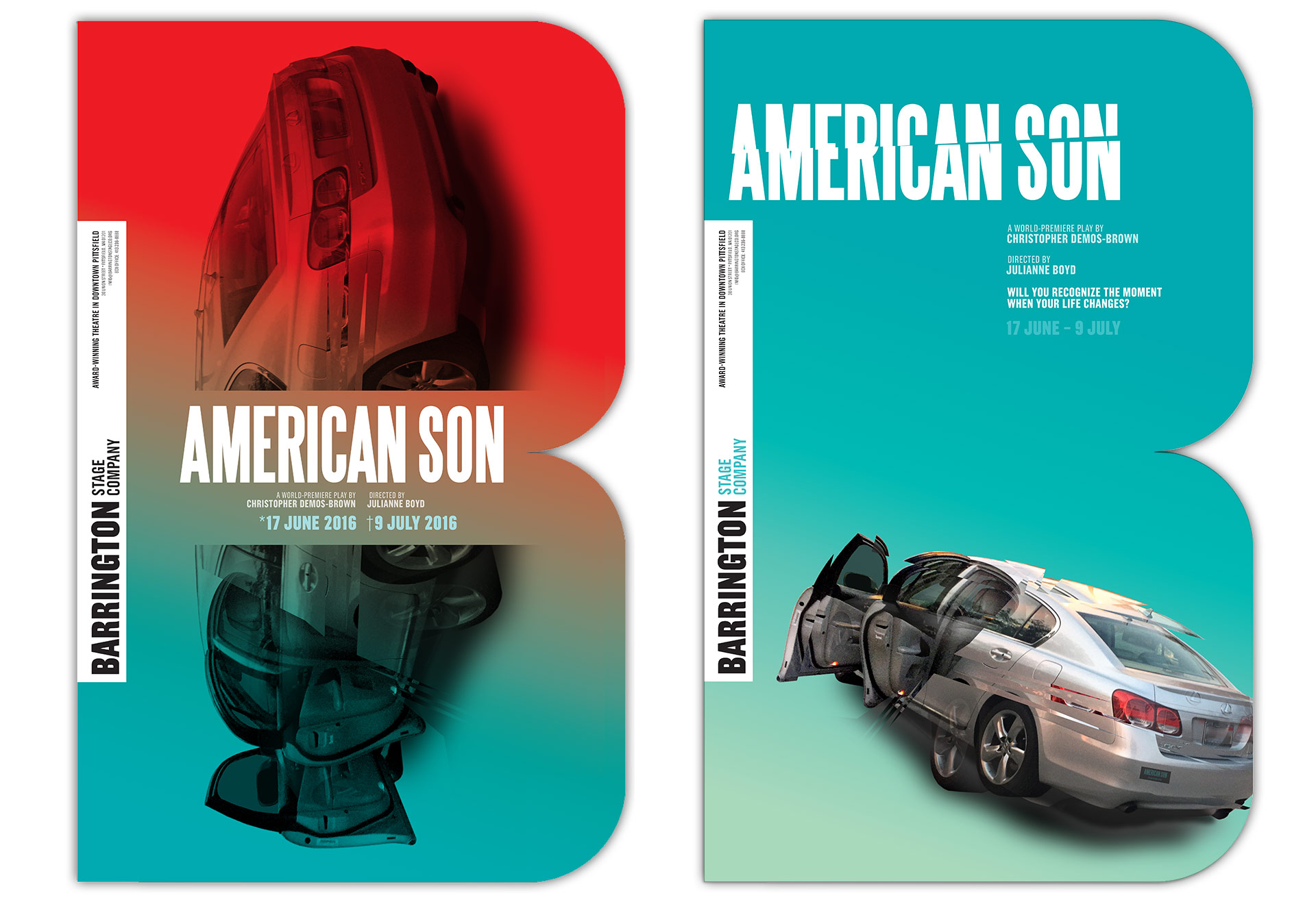
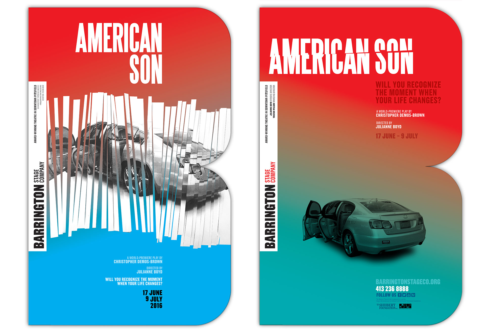
As you can see, we went through quite a few rounds making the car look more distressed; adding red, white, and blue to hammer home the deeply American subject of the play. All along the way, the team was caught between not wanting to give too much away and making the poster too much about the McGuffin, the thing that triggers the plot, than about the plot itself. In the end, they didn’t feel that the car was the right symbol, so I started over from scratch.
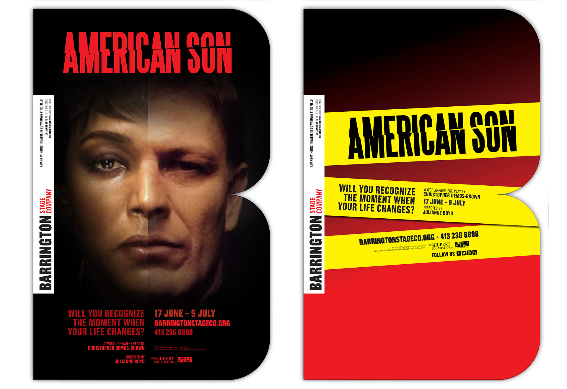
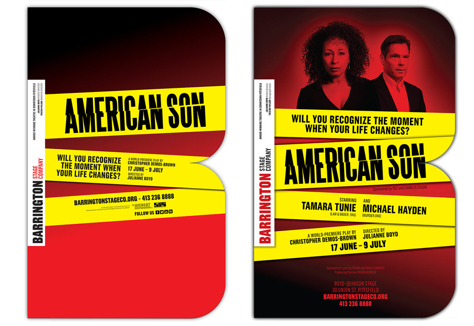
I tried the movie poster route (using Angela Bassett and Sean Bean as stand-ins for the actual cast), and went graphic with crime scene tape. I floated the idea of using photos of impromptu shrines to some of the victims of extra-legal police shootings, but it was too raw an approach to work. I was intrigued by the idea of showing a family tree to show how many generations (and how many decisions) contributed to making the one human being at the heart of the play. But it was too esotheric. The boldness of the police tape won out.
Late in the game, word came down that I had to include the lead actors of the show in the police tape design. Luckily, Carol was able to secure the rights to a beautiful shot of actress Tamara Tunie by Timothy White, and Barrington photographer Justin Allen photographed Michael Hayden specifically for the poster. The typeface is my beloved Grotzek Condensed by Portugese designer Mário Feliciano, which also forms the main identity for the theater.
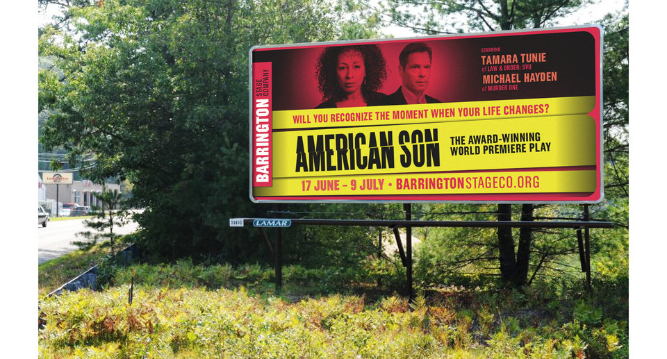
“American Son” also got its own billboard. As you can see, the big B shape is present as a subtle frame. It also makes a stealthy vertical appearance in these print ads for “Presto Change-O.”
When establishing an identity, so much depends on the client putting their weight behind a new direction, and I’m fortunate that the Barrington team are using their new look with enthusiasm! Perhaps one day, we’ll even get to painting the buildings: