OEDIPUS PRODUCTIONS
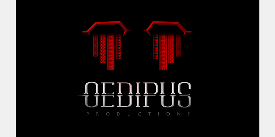
What better way to start a new year than getting to work with one of my favorite clients? NBC tapped visionary director Tarsem to helm “Emerald City,” a retelling of the Wizard of Oz. The titles for the show were handled by Aaron Becker, but Tarsem asked me to design the logo for his production company, Oedipus Productions.
My connection with Tarsem reaches back to his 2005 classic “The Fall” — both in book form and on the film titles. I love the man, and always have fun working for him, so this was a very happy call to receive.
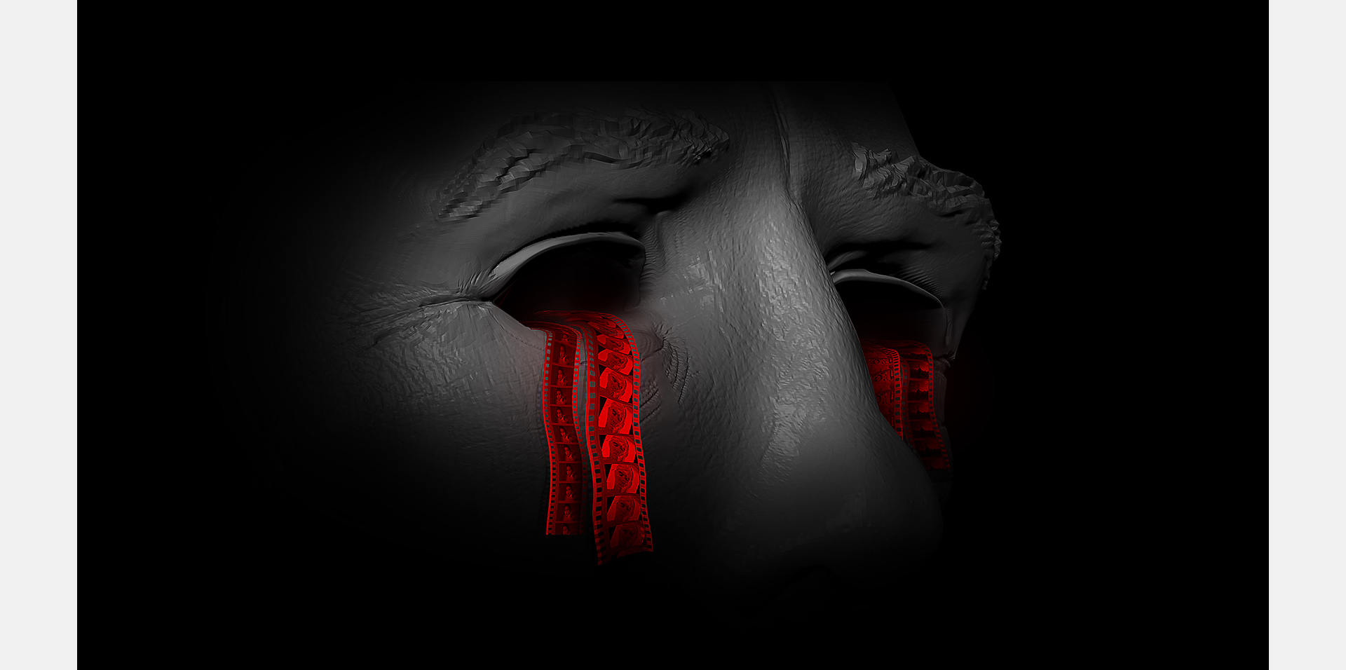
Tarsem already had an idea for the logo. His producing partner Nico Soultanakis had suggested that we illustrate the part of the Oedipus story where he stabs out his own eyes with the brooch he has just ripped from the dress of his dead mother/wife. But instead of blood dripping from his eyes, we’d have film strips—a suitably epic image for a man who specializes in mythical imagery.
Of course, this was all happening on a short deadline, so I stayed up late creating a 3D model of a Greek-ish bust whose eyes I could make bleed. The face turned out to be fairly straightforward, but the film/blood was a challenge. As many variations as I tried it always looked a bit hokey. As a backup, I tried a more stylized version of the eyes. That’s the look that resonated with Tarsem and that you see in the finished title card above.
For the typography, I wanted to create something sharp and pointed to symbolize the needle of the brooch Oedipus uses to stab himself. I tried out a super minimal logo based on Greg Lindy’s excellent typeface Gustan. I turned the crossbar of the E into a needle piercing the eyeball of the O. It was a bit on the nose, perhaps, and felt too insubstantial on screen. That said, if anybody at Paramount or CBS would like to buy the OE combination as a new Star Trek icon, do let me know!
![]()
Instead I turned to something more typographically muscular, building a set of heavy, condensed letters from scratch. Splitting the logotype in half created subtly violent points and edges that invoke more than represent the brooch needle. This version also felt both ancient and futuristic, which is how I see the images Tarsem conjures for his films.
Aesthetically, I also wanted to create a connection to the titles of Mirror Mirror, Immortals and The Fall. I hope his fans will pick up on it.
![]()
The word “Productions” is set in Garda by Francesco Cresci.
As a nice little detail, the film strips feature images from Tarsem’s films. And as they are film strips, they glow with projector light that subtly plays across the surface of the letters below.
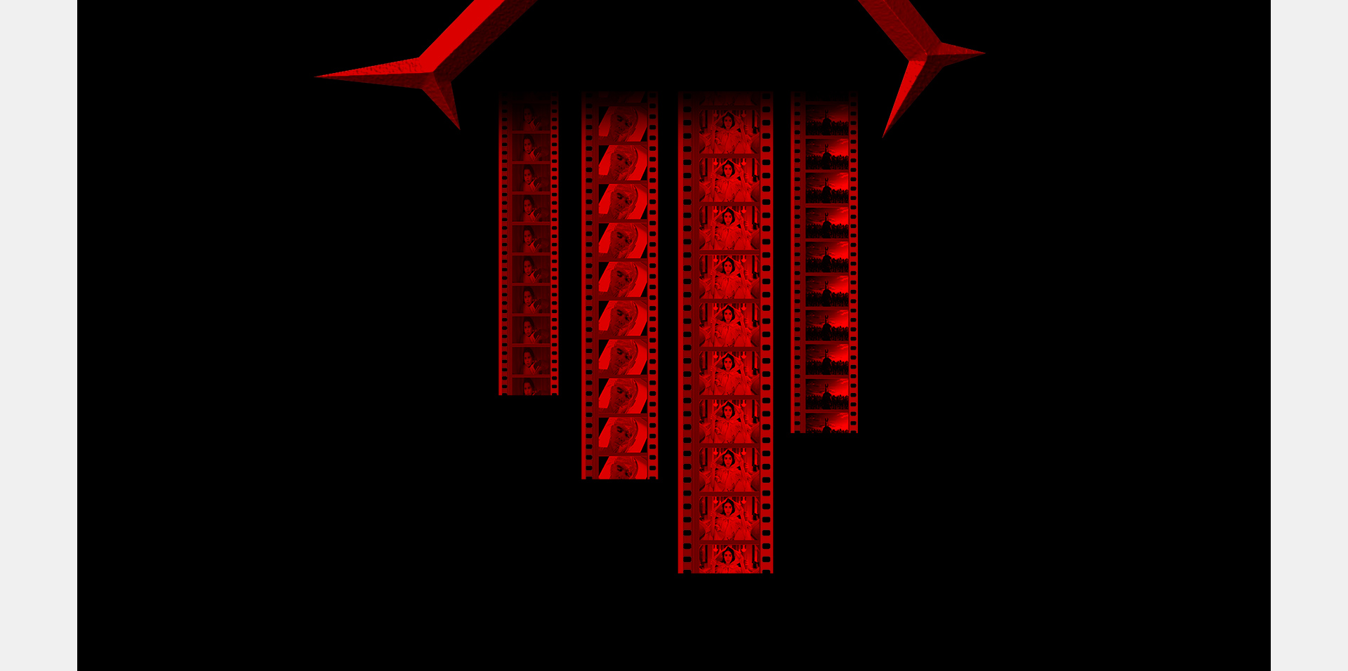
From left to right: The Fall, Self/Less, Mirror Mirror and Immortals
“Emerald City” looks like it’ll be fantastic! I can’t wait to watch, and I’m excited to have this small aesthetic connection to a new Tarsem fever dream!