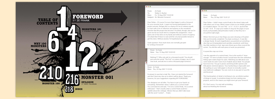
100 DAYS OF MONSTERS
When the only tool you have is a hammer, every problem starts looking like a nail. And when you get into making books, any collection of more than a handful of like things will spark the thought, “You know, these would make a great book!” So when the Daily Monster website took off, the idea of gathering them in a book wasn’t far behind.
- Buy one
- on Amazon
Initially, I had visions of a little black-and-white book of nothing but drawings, but an interesting thing was happening on the site: People were starting to write stories about the Monsters—Good ones! Funny ones! Good funny ones!—and those stories became an integral part of the whole Daily Monster project. Clearly, they’d have to be included and exalted in any book about this little journey.
Once I had finished the first 100 Monsters I took a little break from drawing and animating, and set out to find a publisher. My friend Megan Patrick at HOW Books took one look at the proposal and said, “We’re in!” As I mentioned on the page about the website, HOW had been a part of the Daily Monsters’ creation, and I already knew everybody there from illustrating their magazine cover and from judging one of the competitions. They were a great home for this book.
Between Megan and editor Amy Schell we quickly agreed on a fun, compact format, and I sent over my cover idea. I wanted one of the grumpier Monsters out front, because I thought things could get way too cutesy really quick. I also wanted to show my hand in the process of drawing that Monster. The title would appear as pseudo-branding on the side of the pen. In the store, my hand would be covered by a one-color paper band with giant lettering that could hold all the marketing copy you’d ever need. This is a little trick that grew out of working with record companies. Nobody cares about the aesthetics of a cover, as long as it delivers the payload: FEATURING THE HIT SINGLE! BONUS TRACKS! NOW WITH 10% MORE AWESOME FREE!
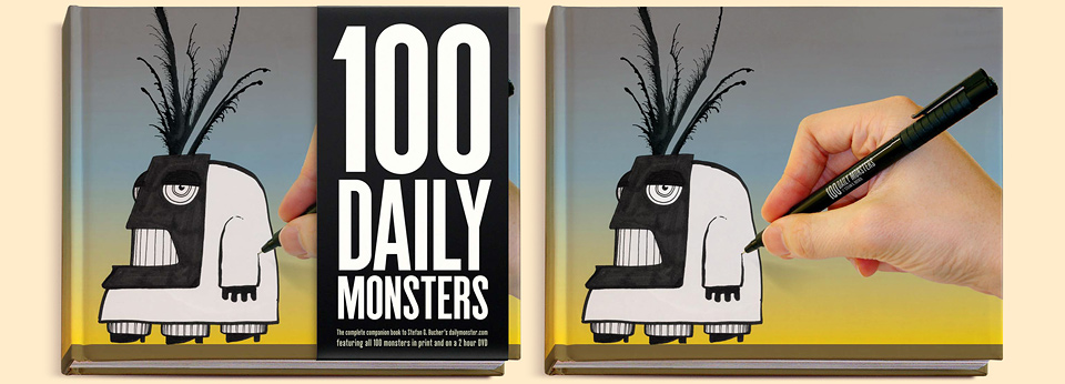
Well, it didn’t fly, and for good reasons: 1. Paper bands rip the second you look at them. 2. Designers won’t buy a book if it shows any sign of wear, and 3. we didn’t want to shrink-wrap the book. People needed to be able to check out the book, and get drawn in. Only on You Deserve a Medal did I learn that you could easily slap a giant sticker on a book. The thought never occurred to me at the time.
Thus, the team at HOW suggested we nix my hand, and just put all the title lettering into that space instead. They loved everything else. Following the Cover-Totentanz I had performed on All Access I thought that I should count my blessings, declare victory, and get out. In retrospect, all that type made a really cool, minimal cover into somewhat of a compositional hodgepodge. It needed that hand, it needed the open space. I should’ve started working up alternative covers from scratch, but I didn’t have the clarity of mind to figure that out at the time. It’s certainly not a bad cover. I think. I’m just saying, if ever there is a second edition, I demand that my hand be reinserted forthwith. (Wait… That sounds wrong, doesn’t it?)
We also had a brief skirmish about the name of the book. It’s tradition, really. You can’t make a book and not fight about the title. (Unless it’s this book.) To me the name of the book had always been 100 Daily Monsters. The characters were called Daily Monsters, there were 100 of them in the book. Done. Title locked. And let’s not forget that thousands of people were visiting dailymonster.com every day at that point. But HOW Books wanted to reach out beyond the web audience, where they felt that the name “Daily Monster” might suggest a calendar. “A faulty calendar,” I countered, “that only takes you through April 10th?” Because I was, as ever, convinced of my obvious rightness.
Of course, HOW were entirely correct not to rely on the web audience alone, but more about that later. More immediately, we were batting around title ideas. Things were beginning to look a little grim when one of the publisher’s suggestions came in: 100 Days of Monsters. “100 Daily Monsters = bad, but 100 Days of Monsters = good?” I asked. And so it was, and it could’ve been so much worse, and 100 Days of Monsters reminded me of Three Days of the Condor. It had a nice ring to it. Sold.
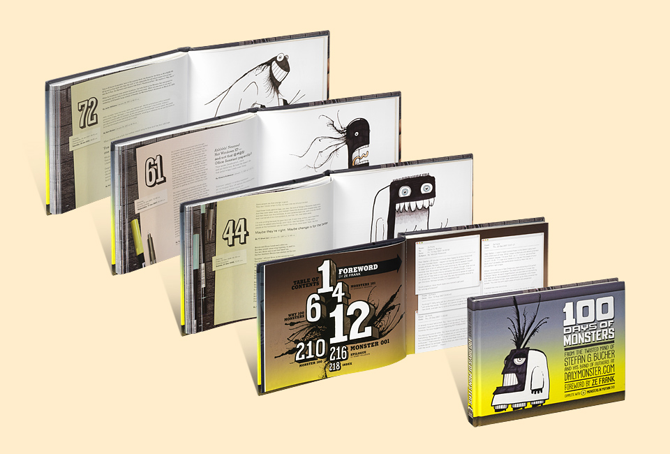
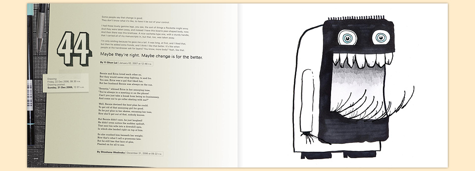
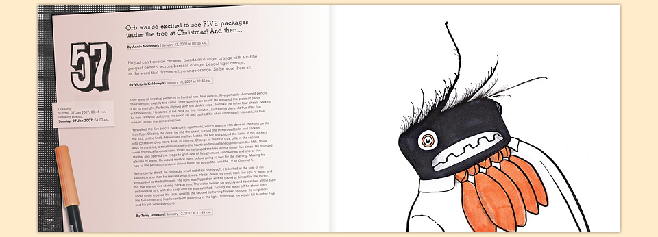
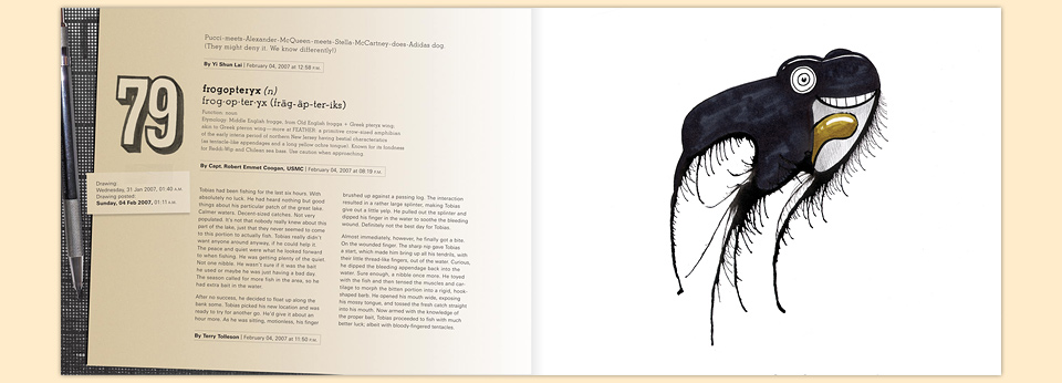
The design of the actual pages went swimmingly, and after a few productive rounds of back and forth we had something that we were all happy with. I thought it would be fun to show the date and time each Monster had been drawn, next to the time I had actually posted it online. That way you could see which Monsters I’d drawn back to back.
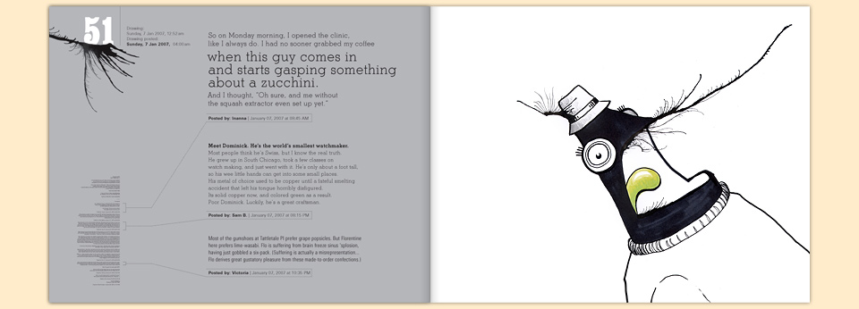
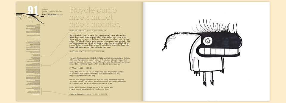
All the Monsters were on the right hand side of each spread, and I’d select my favorite stories for the left. (Not an easy choice, lemme tell you! It’s much easier to pick photos.) Each story got a time code, too. One of the cool things for me was seeing the stories roll in from all over the world. I could follow the start of the workday as it traveled around the globe. The first stories would come from Britain—usually from Simon Darwell-Taylor—then things would jump to New York, travel across the country, through my back yard, and on to Australia and Asia. My greatest joy was always seeing people react to each other’s stories with encouragement and even with the occasional pickup game of Exquisite Corpse. On the far left side of the spread, I’d reproduce all the posts for each respective Monster, to show which had inspired the most creativity during the original run. I liked the info porn aspect of it. Plus, infinitesimal typography is inherently fun!
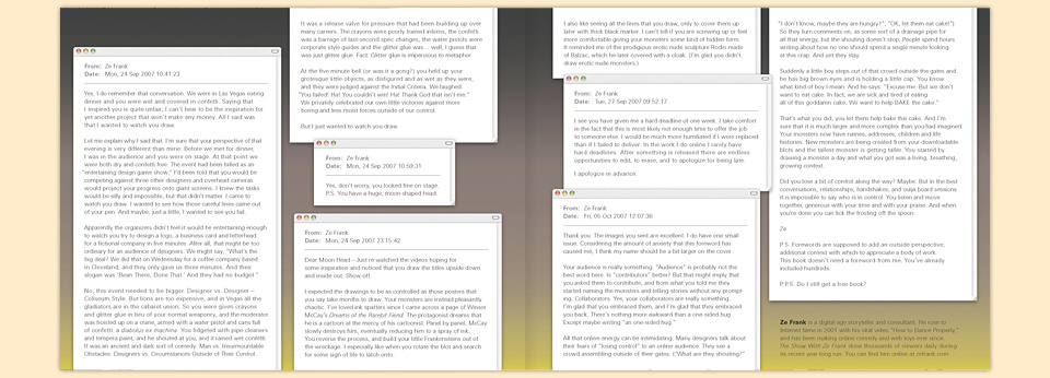
Around this time, the Daily Monsters were included in that year’s American Illustration annual, which—if you don’t follow that scene—is a huge honor. Animation legend J.J. Sedelmaier was the jury chair, so I sent him a Thank You note. I told him about the Monster book, and I asked him if I could come visit him next time I was in New York. To my great delight he said yes, and my pilgrimage was on. Next thing I knew I was on a train to White Plains. I proudly told J.J. all about the book, and showed him the above sample pages. “Nice! That’s great! Boy, it’s too bad they’re not letting you design the book, too.” I made sort of a Scooby-noise and told him that these were, in fact, my designs. “Really? Because these pages look nothing like you.”
J.J. then gave me the best analysis I’d ever heard of why the Monsters work. “There’s no fourth wall. It’s always completely apparent that there is one person creating these characters right in front of you, and that needs to come across on the page.”
There you go.
I was totally floored. So simple. So accurate. And if anybody else had told me the same thing, I’d have probably gone all huffy and defensive. As it was, I thanked the man profusely, and set about redoing the whole layout. Which fell into place as if it had just been sitting there, waiting for the fog around my head to clear.
From there on in everything was fun. Slow, laborious fun. Each spread is a sheet of paper resting on my cutting matt, as seen in the videos. On each piece of paper sit some of the pens I’d been using in the process. If there is color in a particular Monster, it’s that color pen next to it. Everything is shown at 100% scale, so if you were to set the book on my cutting matt, it would line up perfectly. (And then a giant boulder will chase you down a dark tunnel and out of the house. It’s a whole Indiana Jones thing. I advise against it.)
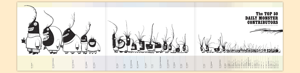
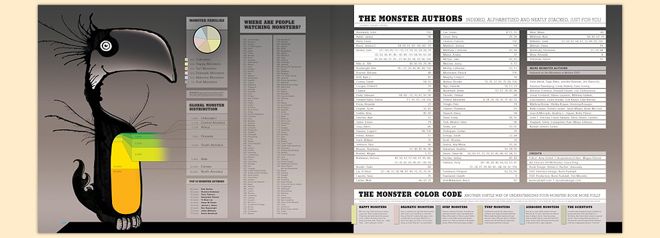
Instead of using typefaces for the Monster numbers and the pull quotes, I made each by hand. I drew sheets and sheets of numbers, and traced all the pull quotes at 200% scale, so they’d be nice and crisp in the book. And as I’m all about adding value, I created a snazzy foldout chart of the most prolific contributors. (The Top 3 were Sam Berkes, Victoria Koldewyn, Terry Tolleson, by the way.) Sadly, we couldn’t quite afford that foldout, because we were also including a free DVD with the book. Instead, I squished all that information into one big old overloaded info graphic index spread with a custom stat-belly Monster.
Before
After
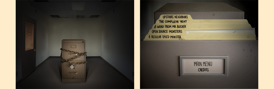
Oh, did I not mention the DVD? It gets short shrift sometimes. Over the years I’ve heard from a surprising number of people who didn’t realize it was even there. It’s cleverly laid into into the inside back cover, and it was produced with great love and care. I don’t usually ask for help on my projects, but DVD authoring was way outside my wheelhouse, so I called on designer Ken Rudolph.
Together we cooked up a cool interface that starts with a chained-up file cabinet, hopping in place, obviously containing Monsters. Once you click on the padlock, the chains come off, and you can open the drawers to call up the original Monster film clips—remastered for DVD resolution—or you can access a whole menu of bonus features.
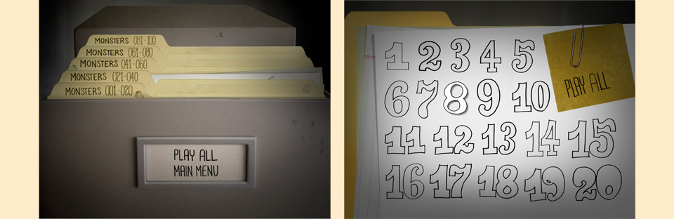
At some point the project got so big that even Ken got overwhelmed, and he brought in Tim Moraitis, who saved our bacon. This is doubly important, because Tim has since helped me out of a number of scrapes, where I’d spun something simple into something so needlessly ambitious that only his special powers of ingenuity could save me. Tim made these menus come to live, and hid a few great Easter eggs, too.
As the DVD kept taking shape, I thought it would be fun to have the title of the book appear with a thunderclap, in homage to the movie Young Frankenstein. I drew a three-dimensional stone version of the cover lettering, and Ken & Tim animated it. In the process I decided that I could do a better job on that type, both here and on the cover. The cover had already been approved, but I took one more swing at those letterforms, and they did come out a lot nicer.
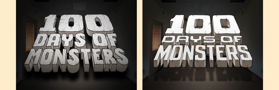
The shadow on the final title on the right looks too sharp, I know, but with the lightning flash it’s just right.
Except, the staff at HOW disagreed. They liked the previous version. They also liked having problems that had been solved stay solved. They told me to change the lettering back. And, as is a recurring theme in my work, I was tired and cranky, and I said, “No.”
When these moments roll around, I always feel in the right, and later come around to the fact that things would’ve probably been fine either way. In this case, years have gone by, and I was clearly right. My second version was and is better. No question. But man, this was the thing we fought over. And I did that ridiculous thing, where I said, “Fine then. I’ll send back the advance, and I’m taking this book elsewhere.” I’m sure somebody at HOW could’ve pointed out that this would’ve put me in breach of contract, but as they are grown-ups, they said, “Fine. You win.” Then they added, “But make no mistake: This new type will cost you sales.” Proving that they’re not all the way grown up, either. Neener, neener, neener.
Did it cost us sales? I doubt it, but it’s hard to say. We all agreed that the book had an audience beyond the Graphic Design / Illustration shelves at the bookstore. And as it’s still the Law of the Universe that a book can’t be shelved in two separate areas, we placed it in the Humor category. “Graphic designers and illustrators will know about the book, and seek it out,” we thought, “and this way other people can discover it, too.”
When the book came out in March of 2008, other people did not discover it, and neither graphic designers nor illustrators knew it existed. I’m not one to pass the blame, but something else happened in March 2008 that really didn’t help when it came to selling even a very reasonably priced humor book. Allow me to quote Wikipedia:
Alan Greenspan, ex-Chairman of the U.S. Federal Reserve, stated in March 2008 that the 2008 financial crisis in the United States “is likely to be judged in retrospect as the most wrenching since the end of the second world war.” A chief economist at Standard & Poor’s said in March 2008 he had projected a worst-case-scenario in which the country would endure a double-dip recession, in which the economy would briefly recover in the summer 2008, before plunging again. Under this scenario, the economy’s total output, as measured by the gross domestic product (GDP), would drop by 2.2 percentage points, making it among the worst recessions in the post World War II period.
“Who could resist picking up all this Daily Monster goodness for $20 at the store or $13.50 on Amazon?” Many. Back then, many people were perfectly able to resist. And you know what? Despite the economic apocalypse, a lot of that is still my fault. Because we got amazing press! The book was reviewed in Wired and in all the design magazines, it got all kinds of love online, I’m told it even popped up in the Wall Street Journal. But I had made the book as a time capsule of the website experience, instead of reinventing the whole thing as something new, that really played with the book format. It’s a great love letter to the little family that formed around the Daily Monsters original run, and I’m very proud of it, but I could’ve done a much better job making the book an invitation for people who hadn’t seen the Monsters before.
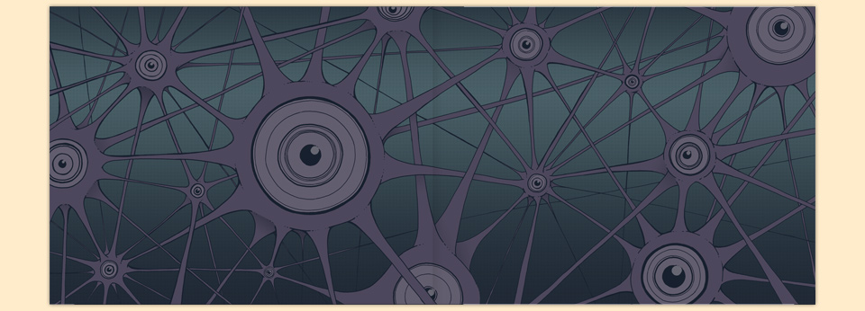
After all that text, you deserve an image: The Monster Brain front end paper, made from PMS 5255 and 5473.
I wish I’d talked about that part with my friend Ze, who is brilliant at many things, but seems to have a special talent for creating spaces that bring people together. I did, however, invite him to write a foreword for the book. One of Ze’s offhand comments had been part of what inspired me to start filming myself while drawing. Moreover, his support of the Daily Monsters when they launched had been absolutely pivotal in the success of the project. It brought so many creative, motivated people to the site! I thought he was the perfect choice to write the foreword, and boy, did he deliver. I just read through it again now, and it’s a stroke of genius. He really encapsulated the whole thing perfectly, and the piece still cracks me up today. If you’re viewing this site on a Retina display, zoom in. If you’re on a regular screen (like me) it means you didn’t shell out hundreds of extra dollars for the New Crispness. Invest ten bucks of those savings in an increasingly rare first edition copy of this book. You know, the one without the hand on it.