KIENHOLZ: TELEVISIONS
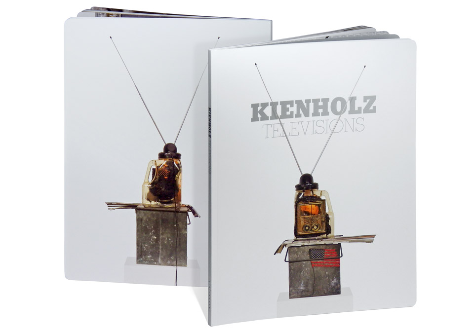
Edward and Nancy Reddin Kienholz are pioneers of installation art and assemblage sculpture, and are known (among other things) for their critical stance against modern culture. This show at L.A. Louver collects a number of their television sculptures—everyday objects made into non-functional mock TV sets, as well as actual televisions modified by means of poured concrete or fire to be inoperable. It seemed only proper to document the show with a catalog design inspired by TV Guide.
L.A. Louver had produced two previous Kienholz catalogs in years past and wanted to maintain the same 8.5 x 11.25 in. format they’d used before, creating a neat little series. We briefly looked at changing the catalog to a horizontal orientation to mimic the 4:3 aspect ratio of vintage televisions, but the work looked better in the vertical format. We kept the television screen allusion by rounding the corners of the catalog, creating a full TV screen with each spread.
The pieces themselves had been photographed a number of times over the years, usually in a gallery or museum setting—complete with a range of floors and backdrops, and in widely varied light. The sculptures are made of such a wide array of distressed materials that showing them surrounded by even more textures robbed them of their power. Of course, L.A. Louver had always planned on reshooting all the pieces for this catalog, but I suggested that we forego the usual gallery backdrop in favor of an all white environment. Why should Apple products have all the fun? Presenting the televisions as one would advertise modern technology gives them a lot more punch on the page. It strips away any nostalgia that might build up with a warmer, homier setup. It forces you to view them as present day objects.
We used silver ink on the cover of the book and on the title pages, both to stay in the mode of aggressive advertising aesthetics and to reference the many chrome and metal parts in the work itself. And let’s not kid ourselves, printing with silver is fun, particularly if you get to use it in big blocks. It’s just so damn shiny! Silver type also brings about one of my favorite optical illusions. As you change your position relative to the page the silver parts appear lighter or darker, making the typography look either bright white on a gray background or gray on a lighter background. I took a bit of film of this at the press check:
The second voice is that of Bill Heron, one of the pressmen at Typecraft.
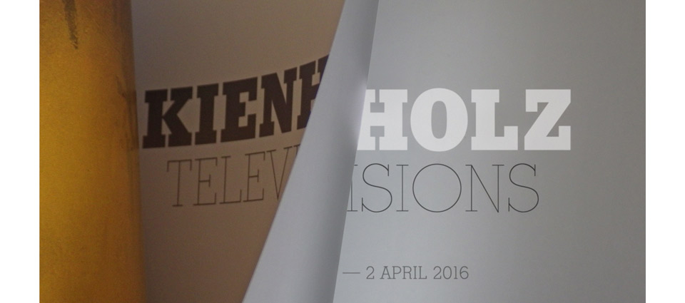
The page layouts for (my) art catalogs tend to be fairly minimal. As much as I would love to bust a move, the typography can’t distract from the artwork. That said, I’m no monk. If I can sneak in a little bit of flair readers won’t notice right away, I’m very happy to do it. In this case, I took inspiration from vintage issues of TV Guide and used their little channel icons instead of page numbers. Back in the early days of color television, TV Guide would mark black and white shows with a little BW hairline icon after the title of the program. I nicked that idea for the sculptures to mark which of them had been created as a solo effort by either Ed or Nancy and which were collaborations.
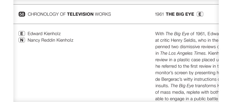
The detail above is the beginning of a narrative timeline of television sculptures giving background information on all the pieces in the show and on other works not on display. Putting the timeline together was a heroic editorial effort handled by L.A. Louver’s Christina Carlos and Lisa Jann. You don’t really appreciate great editorial work until you don’t have that kind of support on other jobs. It’s always a pleasure working with Lisa and Christina.
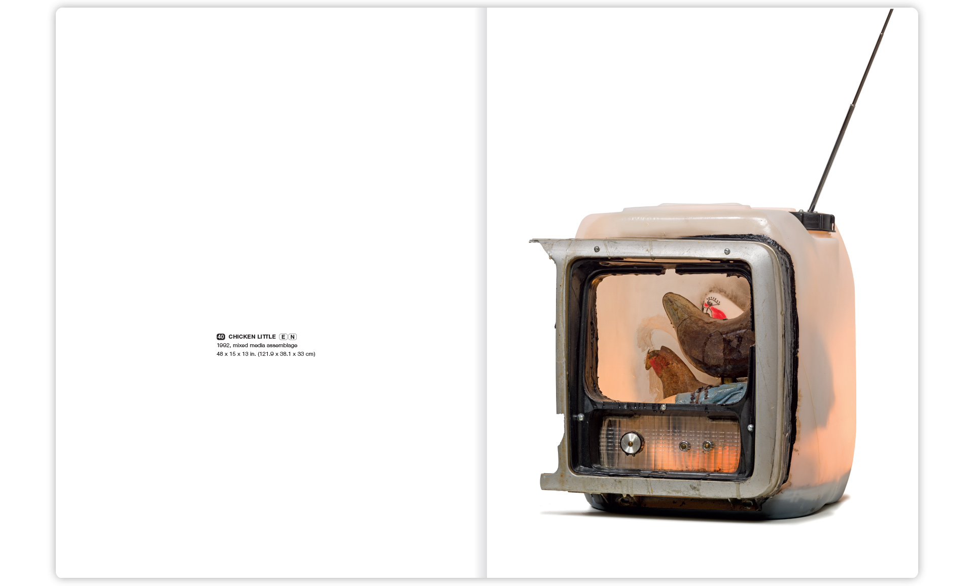
Ed and Nancy’s pieces are so full of fascinating details that key sculptures were accompanied by closeup shots, so you can get a better sense of what’s actually happening. All the images for this catalog were shot by photographer Jeff McLane, who did a particularly excellent job here. (He also shot my own 2015 gallery show.)
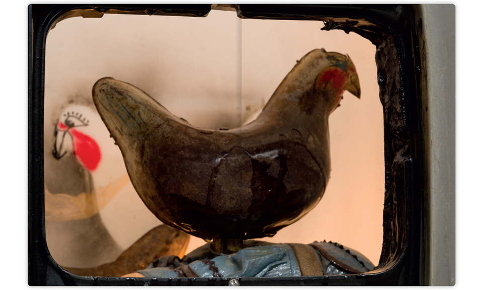
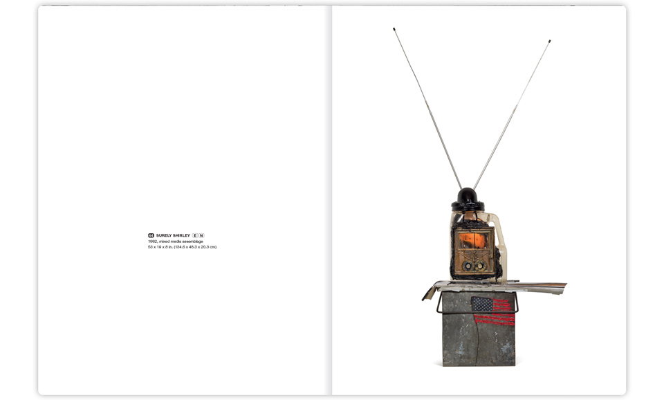
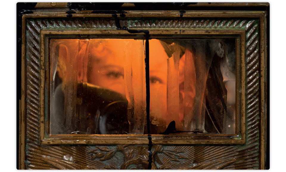
I love that detail. Those are some fine chickens! Another personal favorite came from the sculpture shown on the cover—”Surely Shirley”—which shows a closeup of Shirley Temple’s eyes through the window of an old brass mailbox.
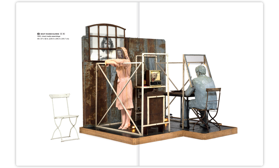
Even though we shot the sculptures on a white backdrop, there is a difference between real life white and a perfect white on press—a zero’ed out white where no ink at all is put on paper. To that end each sculpture had to be cut out in Photoshop and outfitted with a properly adjusted shadow. This is usually work that’s handled by the prepress production staff at the printer’s. As it is, however, I’ve acquired a reputation as being somewhat of a stickler for precision. Due to this, the pre-press folks at Typecraft now insist that I do my own damn silhouettes, thanks very much. Fiddling around the edges of the folding chairs in the sculpture “Bout Round Eleven” was just one of the many retouching moments where my usual work grumbling veered into adult territory. But if you want it done right, you just have to grit your teeth and get it done.
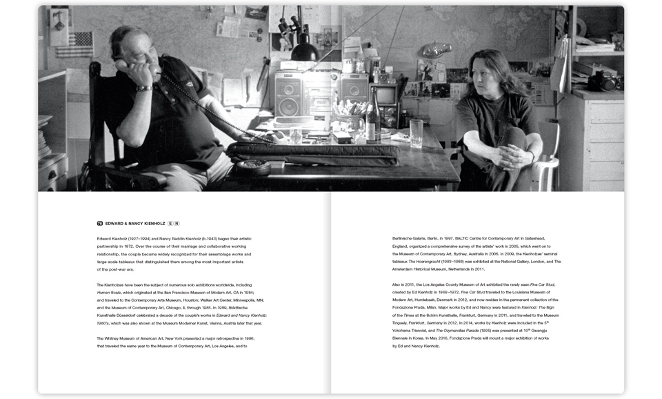
The catalog wraps up with a short biography of Ed and Nancy. I’m including it for you here only because I love that photo of them in their studio. There’s so much going on there, even in this fairly severe crop:
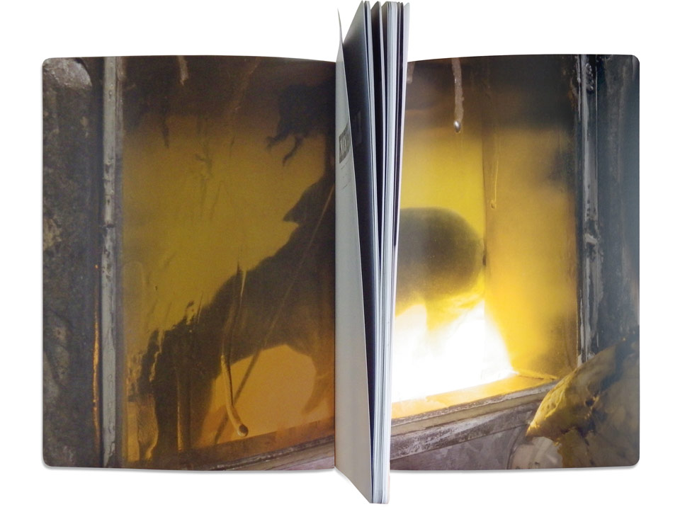
And finally, I’d experimented with a few different solutions for the book’s inside covers. The gallery and I were both fond of an old school TV test pattern with a series of color bars, but we were scooped by an Apple TV billboard campaign. Instead, we went with a detail from the sculpture “Death Watch.” Riding into the sunset… very slowly…