LINDA WANG
Once you work on the same kind of assignment more than a few times, you can get typecast. Following the work I’d done for Maverick and Interscope I was becoming the soundtrack / bubblegum pop / adult contemporary guy. Which was fine, of course, but also left me eager to branch out. When a mutual friend recommended me to violinist Linda Wang, I was excited that I’d get to design an album of classical music. Something new!
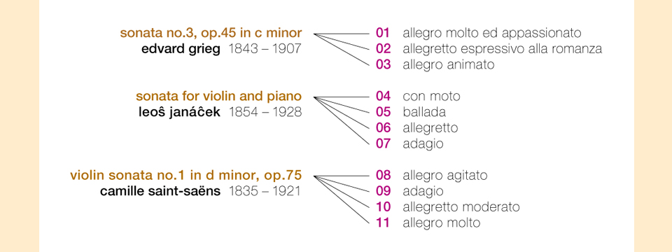
Linda was releasing the album through her own label, MGS Productions. She was a pleasure to work with, and gave me great insight into the emotions of the pieces she had chosen for the CD. All lived on the fringes of the violin repertoire. They hadn’t often been performed or recorded, but were worthy of being played more.
As Linda summed it up for me, the Grieg is probably the greatest of the three pieces, and reminded her of Nordic landscapes. The Janácek is the least accessible—a “tortured, war, alienated artist type thing,” whereas the Saint-Saëns is the most brilliant and straightforward.
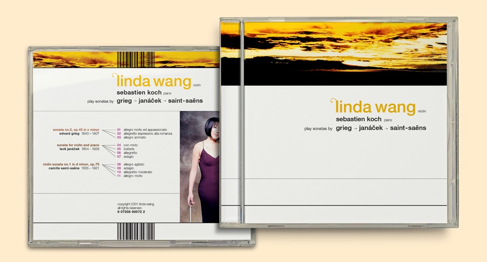
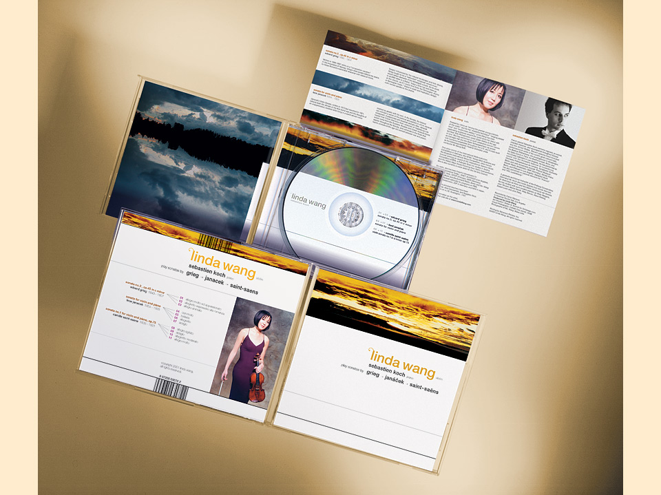
Based on this, I suggested that we represent each sonata through different images of clouded sky—a dramatic shot from my airplane wing collection for Grieg, a moody sliver of the view from my porch for Janácek, and a fiery African sky for Saint-Saëns shot by my friend Colleen Cox. These would accompany the notes about each piece Linda had written for the booklet.
In the process I fell in love with Colleen’s photo, and decided to put a larger crop on the cover, too. This was the one decision Linda wasn’t immediately happy with. She had done a session with photographer Blake Little, and wanted to put one of the resulting shots on the cover. Who wouldn’t? Perfectly reasonable. But also so boring! If you can still find a record store somewhere near you, flip through a stack of classical music CDs. One after another will have on its cover a pretty photo of a pretty person cradling or sidling up to a pretty instrument. Why do another one like that?
As with John McCarty, the reason is that the CD was then still a major calling card for less established artists. It had to serve as a headshot as well as deliver music. Luckily, Linda liked the more minimalist cover, and we compromised by putting her photo on the back. Of course, I’d have preferred keeping the back as minimal as the cover, but I certainly understood Linda’s point, and it was her album. Ahem.
Speaking of the back cover, I was so happy about the structure of the sonatas, because they lent themselves to a nifty little info graphic treatment. Which I then reused in several places on All Access and inside the booklet of the Big Advice CD.
The little swoosh on Linda’s name is a holdover from the Whitney CD. It felt so perfect for a violinist. One of my high school art teachers once told me that paintings hang together by the fact that you never get your brushes completely clean. A little bit of the last color always makes it into the next. I’ve always liked that sentiment. (Probably because it takes a great excuse for recycling and gives it some poetic flair.)
As a special little Easter egg, the clouds on the inside cover—another shot from my front porch—reflect in the silvery top of the CD if you open the CD case to a 90° angle. The whole thing felt very elegant—as it should—and I’m still proud of it today. Though I would’ve spaced the type out a bit more to let in some air. I should’ve known better. I was young.