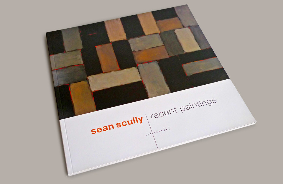
SEAN SCULLY: RECENT PAINTINGS
The design can’t be about the designer. — I’ve always hated that line. I still do. I think it’s crap. But when you’re doing a book or a catalog about an artist’s work, you do need to suck it up and get out of the way.
Catalogs are both a sales tool for the gallery and a historic record of the art. You’ve got to keep it together on the design and save the showboating for another gig.
The first project I did for L.A. Louver was the catalog for Rogue Wave, a group show of young artists. Which really didn’t follow that rule. At all. Rogue Wave revealed a lot about my ambitions as a designer. But there it was about creating a unifying space for 28 very diverse artists—long after the two included shows had closed. In the case of Sean Scully: Recent Paintings, my second Louver project, it was a much different assignment and a much different process. I was able to go to the gallery and view the actual paintings before the show opened. It made a huge difference in my appreciation of Scully’s work. Any arrogant snark I might have harbored about contemporary art immediately vanished standing face to face with the work. It became abundantly clear why these paintings are collected by major museums worldwide.
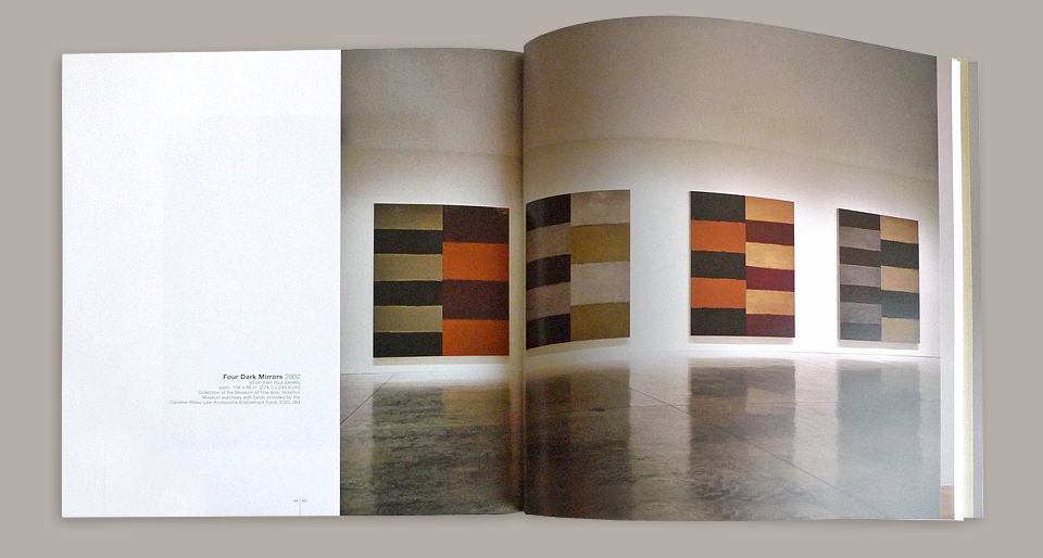
Here’s a quick dossier on the man: Sean Scully is an Irish-born American painter/printmaker. His paintings have layer upon layer of color overlaid upon itself to create interesting textured surfaces. Exquisite groupings of color blocks abut stripes, sometimes forming checkerboard-like patterns. Layered colors look uniform from afar but are actually delicate lattices—much like looking at four color printing close up, but done with paint. The seams between the larger color fields are gorgeous—like lava cracking the ground. If you get a chance to see one of his pieces up close, do it. They’re quite something.
This book is an early model for what would grow into the standard format for my L.A. Louver catalogs. Rogue Wave had been all about being clever with the format. As with much of my music work it was about cramming as many clever tricks as possible into a small space. With this catalog I let the design take a backseat to the paintings. As it should be. Quiet graphic elements here and there, like the way the type lines up with the floor line in the photos, and the positioning of the white space in proximity to the painting. Just a few nice little touches all playing a supporting role to the art.
Around this time I was already working on the STEP columns and fiddling with the Upstairs Neighbors, which made it a lot easier to actually be of service to my clients instead of claiming every job as a means of self-expression.