THE ART OF LYNDA.COM
lynda.com is an award-winning online learning company with over one million members. If you need to know how to do anything on your computer, they will have a class that shows you how. I used the site to teach myself Adobe AfterEffects for my presentation at the AIGA Make/Think conference. At the urging of my friend Sharon Kempner, company founders Lynda Weinman and Bruce Heavin came to see me deliver that talk, and we’ve been finding ways to make fun things together ever since.
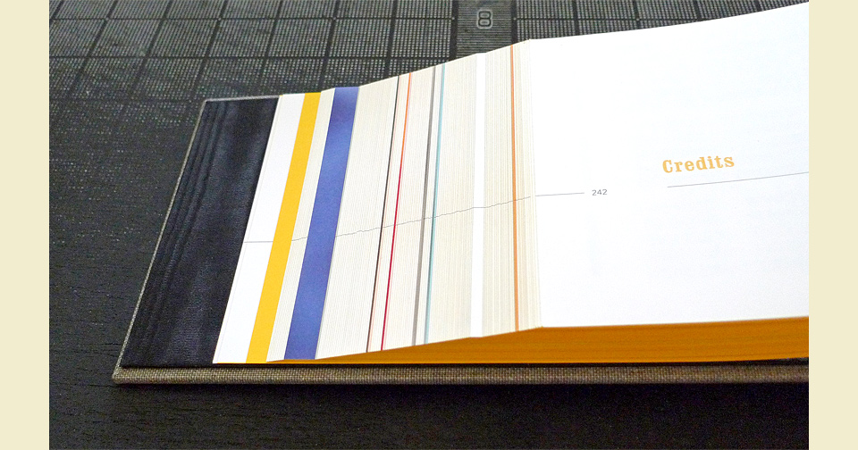
While the vast majority of their offerings now lives online, lynda.com still produces a line of classes on DVD. Lynda and Bruce use the DVD cases as a chance to work with some of their favorite illustrators. Over the years they’ve commissioned Don Barnett, John Derry, Richard Downs, and Maria Rendon to create custom artwork for the series. Being an Art Center trained illustrator, Bruce also contributes his own covers. In 2011 they asked me to select my 100 favorite pieces from this collection, and gather them into a 242-page limited edition book—THE ART OF LYNDA.COM—that they could add to the holiday gift baskets they were preparing for their employees.
On that basis, we set the edition size at 500. This allowed us to print the book as 6-color separations on the HP Indigo digital press at Typecraft, which can achieve far brighter colors than regular CMYK offset printing. I got lucky there, because the range of highly saturated, incredibly varied pieces would’ve been hell to press check.
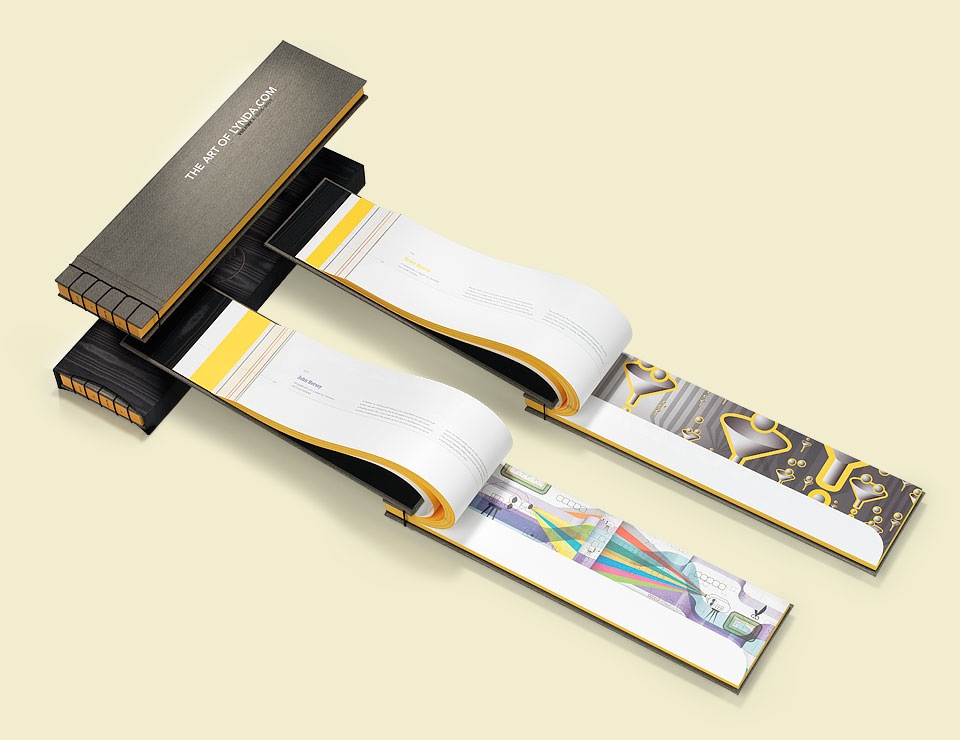
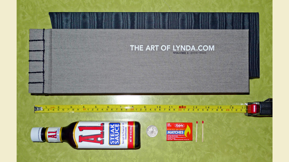
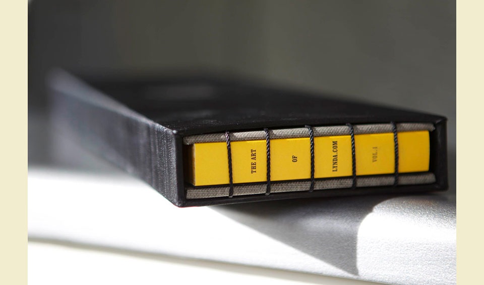
The artwork itself dictated the format. All the DVD illustrations originally live as a slim band that runs along the top edge of each case, flowing down into a curved point at the bottom right corner of the band. To show the illustrations properly, the book needed to have an extreme Cinemascope format. We settled on 16 x 4.25 in. (40.7 x 10.8 cm).
So large was the format that we couldn’t print even 4-page signatures on the Indigo, which is limited to 13 x 19 in. (33 x 48.3 cm) prints. Even though we had to go page by page, we didn’t want to perfect bind the book—for fear of terrible floppiness—and decided on a beautiful Coptic stitch binding instead.
Having stiff cover- and backboards lends the book stability, and the custom slipcase protects the whole thing. Sounds easy enough. What we didn’t count on was that binding over 2.5 lbs. (1.13 kg) of book on a 5 inch spine would make the whole affair sag in the center. If you picked up the early prototypes you’d get a big, beautiful fan of pages drooping out of the bottom of the book. This would not do.
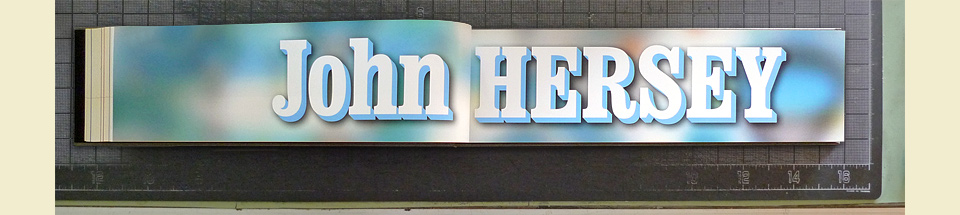
Each illustrator got a stylish divider spread. Big type is just so satisfying.
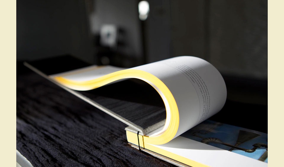
We tightened the binding. We added more holes. We tightened the binding more. We got nowhere. Finally the good people at Roswell Bookbinding in Arizona suggested that we perfect bind the book and then add the Coptic stitch. This made me sad. One of the great joys of the Coptic stitch is that you get to see the raw fore-edge of the book. Which we were painting Lynda.com yellow. But it had to be done. So we quickly printed 500 matching yellow spines for the purpose. At that point it occurred to me that I could insert the title between the binding string. Which made the bindery hate me more. These things are not supposed to be aligned with anything. But as always, Roswell came through for us.
After that, all the fancy embossing on the cover, back, and slipcase… it still took a few test runs, but it seemed highly manageable by comparison. It’s rare that I can just go to town on the special effects, but Bruce and Lynda wanted this book to be a real treasure for their team, so I pulled out all the stops.
A nice side effect of printing digitally was that we could send finished, trimmed book blocks to the bindery. The design prominently features bleeding hairlines. With regular printing signatures, there is a great deal of movement as you trim the pages. Those hairlines would dance all over the place when you fan the finished pages. Because we could provide finished blocks—all pages trimmed in order—it’s one solid line along the left fore-edges. The same is true of the curved hook on the right edge of the book. Everything aligns perfectly from page to page. Nobody ever notices that sort of thing, but to a print nerd that’s a real achievement. The whole book is a union of new technology and old world craft. It’s also a very handy weapon if you need to defend yourself against robotic attack bats.