CREATIVE REVIEW COVER
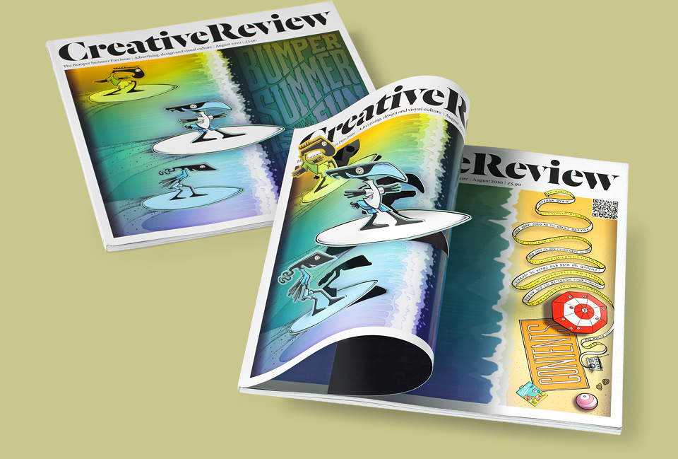
Following my appearance at Design Indaba the good people at Creative Review—specifically writer Eliza Williams and editor Patrick Burgoyne—made me the featured designer of their August 2010 issue. On top of that, they asked me to design the cover. (Or rather, they asked me if I’d design the back cover, and I had the cheek to negotiate.) Seeing how it was the Summer Fun issue, I thought it was my duty to represent California and offer up some surfin’ pop-up Monsters.
This was one of those ideas that popped into my head fully formed one afternoon, and made me feel all kinds of pleased with myself. And this time it actually worked! Instead of turning into kind of a disaster.
Luckily, Patrick loved the idea, and was willing to give me the table of contents page for the beach part of my design. He also challenged me to really trick things out, as this all fit great with his concept of making this like the summer issues of old kids’ magazines—full of games and riddles. In this spirit, the beach features three separate encoded messages, two of which lead to more riddles, and then there’s an Easter egg, too. CR reader Alex Johns claimed the prize (a signed copy of the Monster Book) after just a few days, but if you’re in a decoding mood, please have at it. You can download a larger version of the beach here.
This was my first prototype. So minimal. Surfin’ Bauhaus Safari.
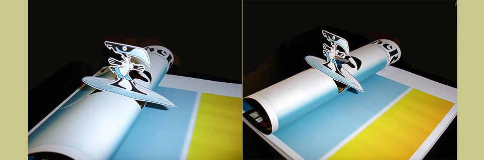
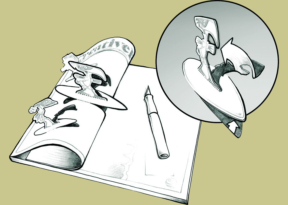
My hope had been to perforate and score the surfers on the cover, so readers could just pop them up. Unfortunately, this turned out to be prohibitively expensive. I offered to pay for the extra cost, but anything perforated or die cut also has an excellent chance of getting scuffed up during shipping. With an audience of designers, any imperfection will cause copies to be returned as damaged. It just wasn’t worth the risk. Instead I drew up this little how-to illustration to alert people that they should cut up the cover to get the full effect:
Another great benefit of the article was that I got to have my portrait taken by the amazing Jill Greenberg! I’ve been a fan of Jill’s work for years, so getting to be her subject was a huge honor and a real thrill. And just the tiniest bit intimidating, too. Not so much because my time slot was sandwiched between two bikini models, but because my emotional range in front of the camera apparently veers from foolish grin straight to deep scowl, with not much in between, especially at 10 A.M. Needless to say, Jill made me look great anyway:
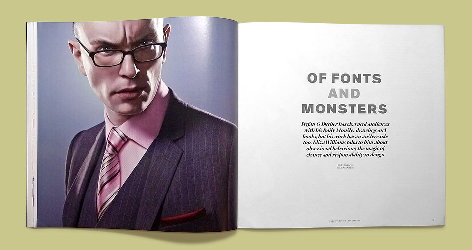
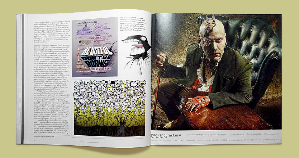
That’s not me on the right page. The opening photo was serious enough.
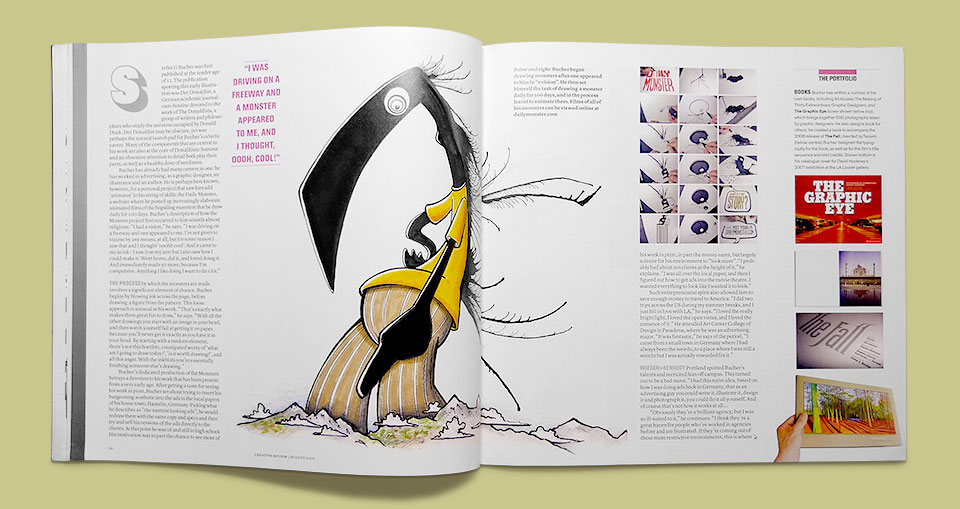
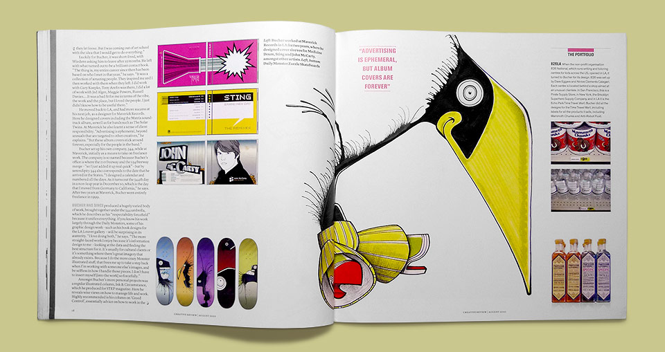
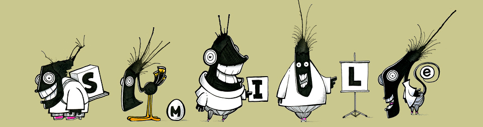
Lots of fine 344 action, as you can see, accompanied by a very generous article about my work. And as if that weren’t enough, Patrick and CR art director Paul Pensom asked me to illustrate the section title for the Summer Fun bits, and to create five mini-Monsters they could hide on their site. The person who found all of them first, and unscrambled the word, won a nifty digital camera. Not too shabby. This is the aforementioned section title:

The five little hidden Monsters, together at last:
Lastly, here is that Easter egg. It’s not the magazine. Or the 344 logo. Give me some credit. Look again:
