The PACIFICA POSTER
Some projects come together quickly and easily. Others take more of a push. And then there is this poster of the Pacifica, a Terran Escape and Survival Asteroid. This one took me a full six years to complete. Are you a fan of long, convoluted case studies that delve into the minutiae of art making, print production, and general neuroticism? Well then, this one’s for you!
- Buy one
- from me here
Ever since childhood, I’ve been a walker. Walking clears my head and sharpens my mind. I have some of my best ideas while walking.
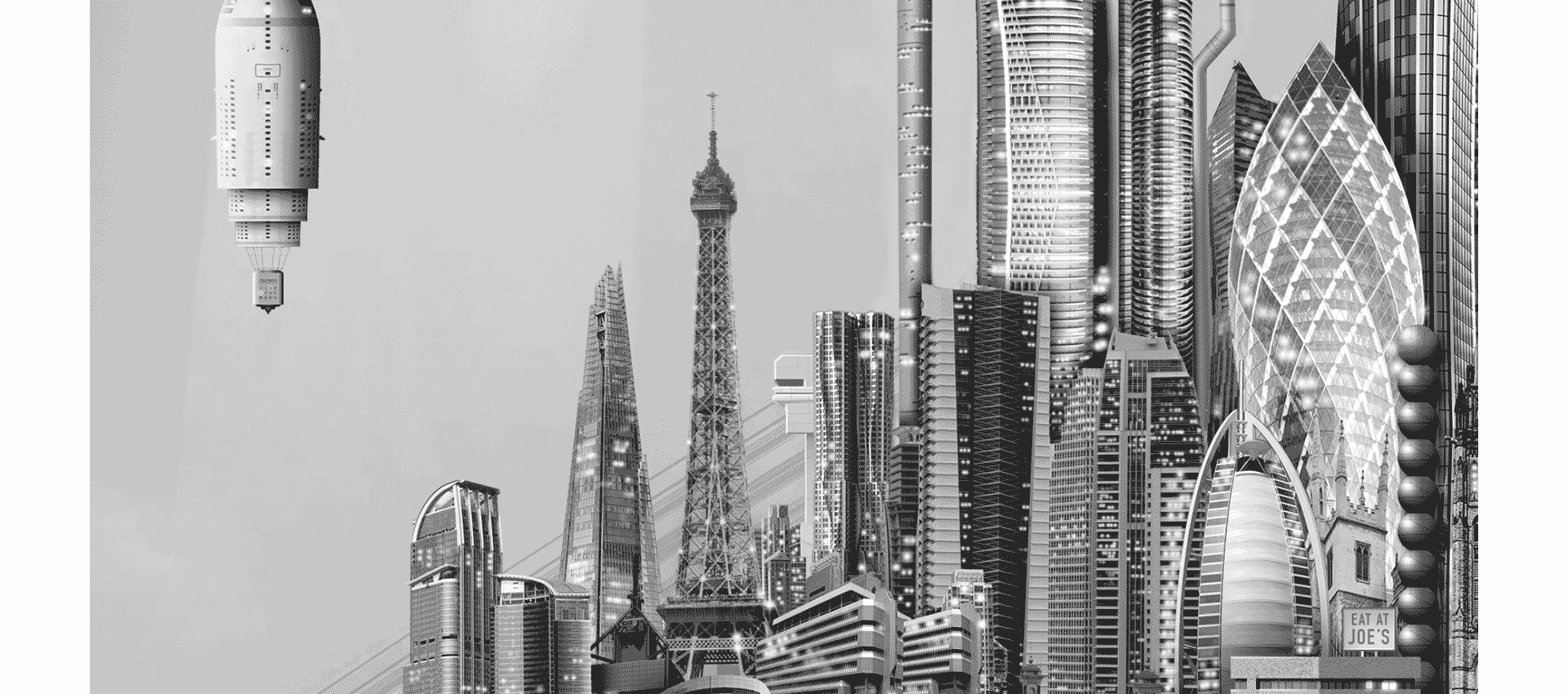
On August 1st, 2013 a new image appeared to me during one of my walks. I saw a pill-shaped asteroid with tilted rings of Saturn, floating in space, cut in half, hosting a sparkling domed city. I saw spaceships parked on a platform like cars outside a fancy hotel. I loved exploring the space in my mind, and decided I should make the idea into a new poster. I knew it would be ambitious, but I looked forward to the challenge.
What followed were six years of twists and turns.
Here’s what happened:
First Sketch—1 August 2013
It’s always a bit of a mystery just where new images come from when they flash into my mind. At the time the asteroid first appeared to me, I was still addicted to The Simpsons: Tapped Out, a mobile video game that lets you build your own town of Springfield. I’d spent an absolutely embarrassing amount of time building my town—over two years—and I thought, “If you’d spent those same hours making your own buildings each day, placing them into your own city drawing, you’d really have something!” Mix in my obsession with space travel and science fiction, and the origin of this particular vision isn’t all that mysterious.
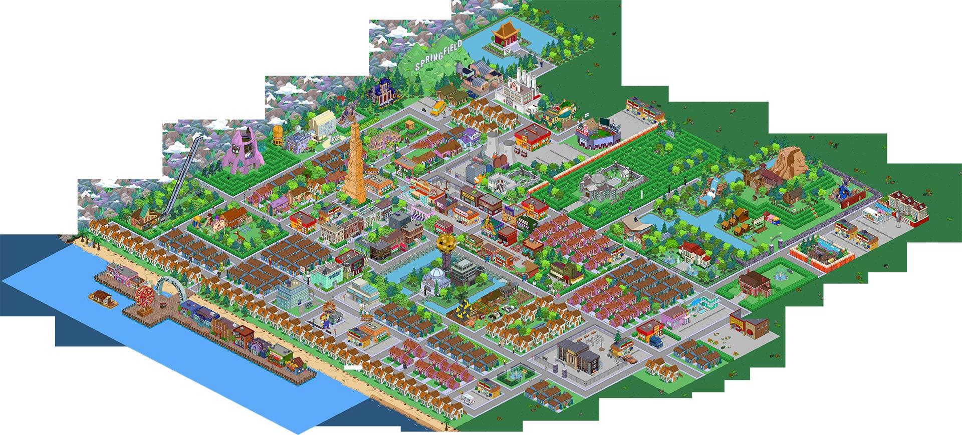
An intermediate state of my Springfield, a study of depression channeled into obsessive behavior
In my mind, the illustration would be a white-on-white architectural rendering. I didn’t quite know how to make this happen at the time. This was three years before I’d discover the magic of ZBrush. Instead, and as it should be, I started with a detailed pencil sketch. As you can see, a lot of the major elements were present from the start:
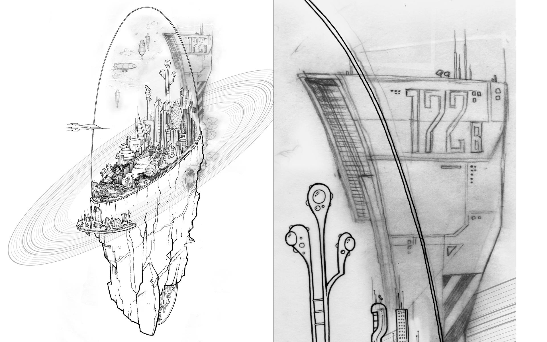
This sketch is an assembly of about six letter-sized sheets of vellum, augmented with additional patches
Beyond this point I didn’t quite know how to proceed. I remember a few half-hearted attempts at creating a pseudo-3D rendering in Photoshop. When that didn’t work I thought I’d make the whole thing into an immensely detailed pencil rendering. Adopting the Simpsons: Tapped Out method was ideal for this approach. As in the game, the city would grow organically, starting with the first settlement of construction workers, and evolve from there. For a few days I designed a little building each day, and then wrote a brief story about how it came to be. This way I wouldn’t just have an epic illustration, I’d write a sci-fi novel along the way, too, without getting all anxious about it. This lasted for three days.
I’m a patient and diligent worker. Sometimes. Mostly. On certain things. This was not one of those things. I got frustrated. Making things of beauty is what drives me, and I couldn’t see how these first attempts would ever turn into something beautiful. I shoved the whole affair into a drawer to focus on other, even more obsessive work instead.
A little while later, I was invited to create a gallery show about my work, and I decided to make it a retrospective of all the work I would do in the future. I thought that this would be a great opportunity to finish the asteroid. I still didn’t know how to make it happen on my own, so I decided to hire help. My friend Rick Morris connected me to FX artist Jacob Moranville, who kindly agreed to create a digital 3D model based on my design. All my troubles seemed solved.
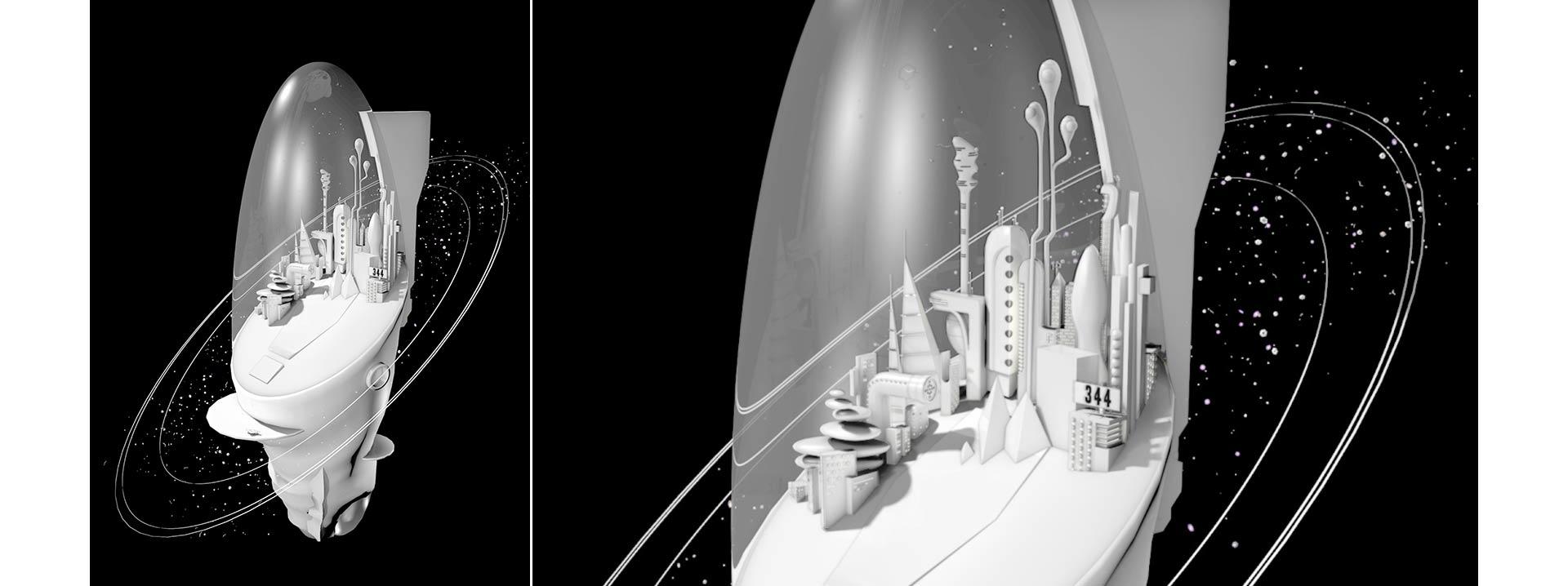
An early stage of Jacob’s model
But of course, they weren’t. It was great to work with Jacob, and he was dedicated to making a difficult project happen. At the same time, my work depends on a level of obsession that is hard for others to duplicate, particularly in the absence of adequate funding. Jacob did a ton of work, but it wasn’t enough to make the result feel both natural and awe-inspiring.
In theory, I should’ve learned his software, and started playing around with the model myself. But I had to create decades of future work, and there was no time. Instead, I took the model Jacob had made, and simply reduced it in size until it looked good enough for the show. This is no reflection on his work, simply an acknowledgment that sometimes there’s not enough time and money to do what needs to be done. As it was, the framed print looked nice in the show, and added a fun element to my future résumé.
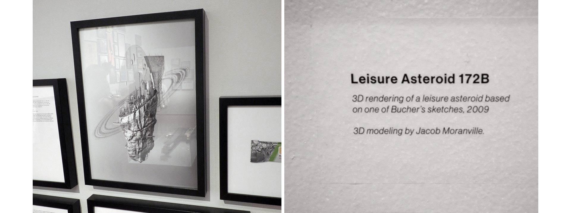
Jacob’s final model in the “Everything” show at Brandstater Gallery
Following the show, I was exhausted, but also wanted to check items off my list. I wanted to print this damn poster already. Perhaps I could add the necessary detail in Photoshop. Jacob was an effects guy used to working for film and TV. He lived in an RGB world that topped out at 4K resolution. He had initially rendered the file in a way suitable for film—it looked crisp on a monitor, but didn’t have enough resolution for print. Even at 300dpi, something was wrong with a setting somewhere, and the render looked fuzzy. (Looking back through our correspondence, it turns out that the sample rate was to blame.)
In advance of the show Jacob had gone to heroic efforts to create a proper print-ready render. From his messages I got the impression that smoke was billowing from his computer. The finished file was in the gigabyte range.
Now I wanted to refine that crisp render. There was just one issue: I could no longer locate the file. At the end of any project, I consolidate the files, back them up to discs, and then delete the originals from my drives to clear space. When I did this for the show, I must’ve backed up the wrong data. I had plenty of files, but all of them were fuzzy. I don’t remember crying or cursing. I simply put the files in my backburner folder, and did some breathing exercises. I moved on.
But then, unfinished projects bother me. Ideas find me, and when they do, it’s up to me to make them real. Leaving ideas in limbo is an abdication of my responsibility. It gnaws at me. So every few months I’d go hunting for the missing file. I simply couldn’t believe that I’d been so careless as to delete it. But it truly was lost. Which turned out to be a blessing in disguise. I decided that I’d use the fuzzy file and replace all the elements with high resolution images, piece by piece. The original render would become the skeleton for an elaborate quasi-collage.
This turned out to be the key. Over the course of months I gathered photos of beautiful buildings, I gathered rocks on my walks to scan textures I could apply to the asteroid, I built airships from photos of present day jetliners. The file swelled to many times its already massive size. I had a good time!
Before and after—using the fuzzy render as the foundation for the final art
Paying work would come in and divert my attention, but I kept returning to the asteroid, adding little bits and pieces, refining others. I was looking for a natural end point, but couldn’t quite see it. The rocky bottom of the asteroid made a cameo in the poster for the 2515 Re:Pressurize Conference, and when I was invited to pitch a book to a publisher in New York, the whole asteroid took a star turn on the cover mock-up. That book, The Shock of the Next, hasn’t happened yet—few publishers want to advance the money necessary to write the art history of the next 500 years—but you can see that the asteroid kept nagging at me.
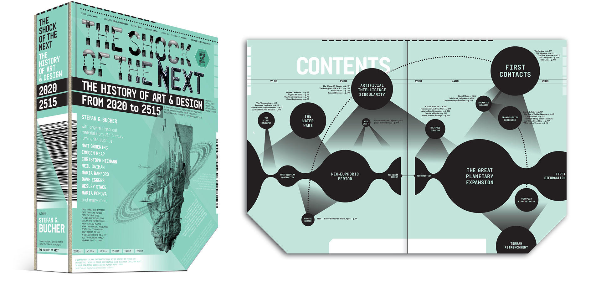
One day, I’ll make this book happen. So many stories to tell…
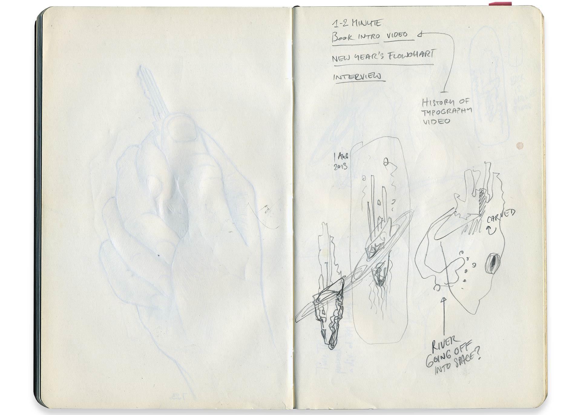
At this point, I had started work on the LetterHeads book. My publisher, Chris Heiser at Unnamed Press, was telling me about the various sci-fi novelists on their roster, and I had an idea! What if I gave my illustration as a prompt to his authors, and had them write short stories about life on this asteroid? We could print the stories on the back of the poster. We could even turn the whole thing into a little book! Chris was excited about the idea, and asked that I write a brief introductory story to set the tone for the authors.
On this I procrastinated. Then the LetterHeads demanded more of my attention, and some events in my personal life required trips abroad. The story lingered, and so did the poster. By the time I was ready to get back to it, the LetterHeads book was in stores, and its success was modest. This killed the momentum of doing a multi-author poster. Had I pushed for it, perhaps it would’ve happened, but I was embarrassed that I hadn’t delivered a hit for Unnamed Press. Instead, I pushed ahead on my own. I have a deep-seated fear of writing, but I found that I loved coming up with a story for the asteroid.
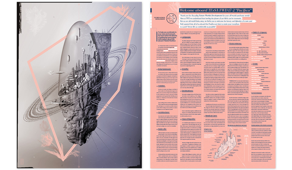
The asteroid evolved from a glorified cruise ship in space to a Terran Escape and Survival Asteroid (TEsSA), originally conceived as a lifeboat for refugees from Earth following a planetary collapse. But the story would happen further in the future, after the original crisis had waned, and the asteroid had been retrofitted to once again become a luxury residence. Every aspect of the TEsSA grew a backstory, and I turned the design of it all into an exercise in excess for myself. I usually try to keep things minimal, so as not to get in the way of the content. This time I wanted all the moves.
It’s the little things.
Along the way, I named a friend’s consulting firm—Future Worlds Development—and gave him a logo. Sadly, the business didn’t come together after all, so I took back the identity and turned it into the corporation that would build and operate the TEsSas. Made for a perfect fit, and I’m happy the logo got to see the light of day! Jorge Verdin composed the audio. More about him in just a little bit.
I want to work for this company.
As I got close to publication, I hesitated. I’ve been printing posters since 2001, and I’ve been sending them to more or less the same list of friends each time. I love giving gifts, particularly by mail. It seems romantic in an Old World sort of way. Over the years, though, the posters have become more and more elaborate and expensive, and I wanted to reach a bigger audience with this poster—maybe not even a bigger audience, but a new one! After being scared of Kickstarter for years, I thought that it might be perfect for this project.
I worked with my friend David Mayes at Typecraft to cook up some fun specifications for the poster. I had always seen this poster as using only two colors—a black plate for the illustration, and a solid peach back. But of course, as soon as we started talking in earnest, things got more involved. We’d use metallic inks, touch plates, varnishes… I produced a little video to introduce the whole thing to the Kickstarter audience:
Once done, I showed this video to a few trusted advisors. They made some very sensible suggestions that would require minor edits. I was a day away from launching the Kickstarter. I was on my way! It took me about twenty minutes of fiddling with the video to somehow irretrievably screw up the AfterEffects file. If you’re familiar with the program, I accidentally moved the audio out of synch somewhere deep in the nested precompositions, and could not figure out how to fix it. This time I may have cried a little bit. I definitely cursed.
The next day, I received the call to make a book for Godfrey Reggio, and the whole asteroid project went on the backburner again. A few months went by, I reshot the entire video from scratch, and it was much better for the effort:
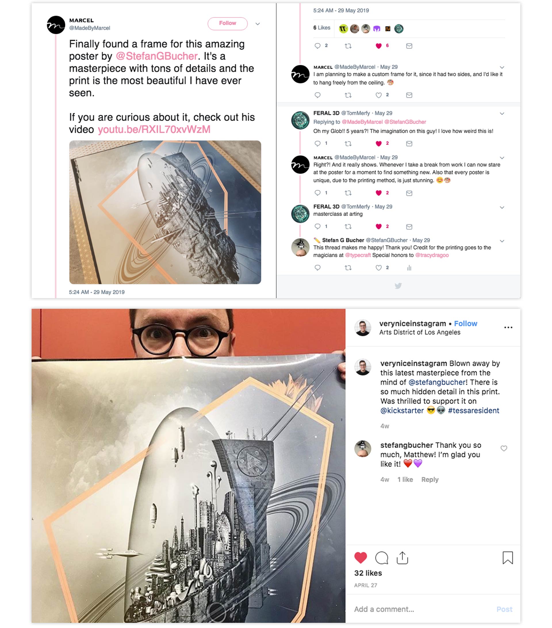
You can see the whole Kickstarter page along with the production updates as they happened right here. The Kickstarter itself went like a dream! We blew past 100% funding in fewer than 36 hours, and it kept going from there. I was completely floored by the outpouring of support for this crazy project! It was just a joy to see! In the end, we reached 240% funding.
Of course, my first call was to David Mayes to add more bells and whistles to the poster. We’d use a black touch plate to get a crisper image, and we’d add a gritty spot UV coating that would give the print a luxurious feel. This extra silk-screened layer would also let me hide a few extra Easter eggs in the art.
As a thank you to my backers, and as a little push to the Kickstarter finish line, I asked my friend Jorge Verdin of Tremolo Audio and the Nortec Collective project Clorofila to compose a Love Theme for the Pacifica. What he came up brought me so much delight that I put together a little music video for the 30-second edit. The full track went to all backers and continues to be a bonus gift to anyone who buys the poster on my site.
It’s like the Love Boat… in space!
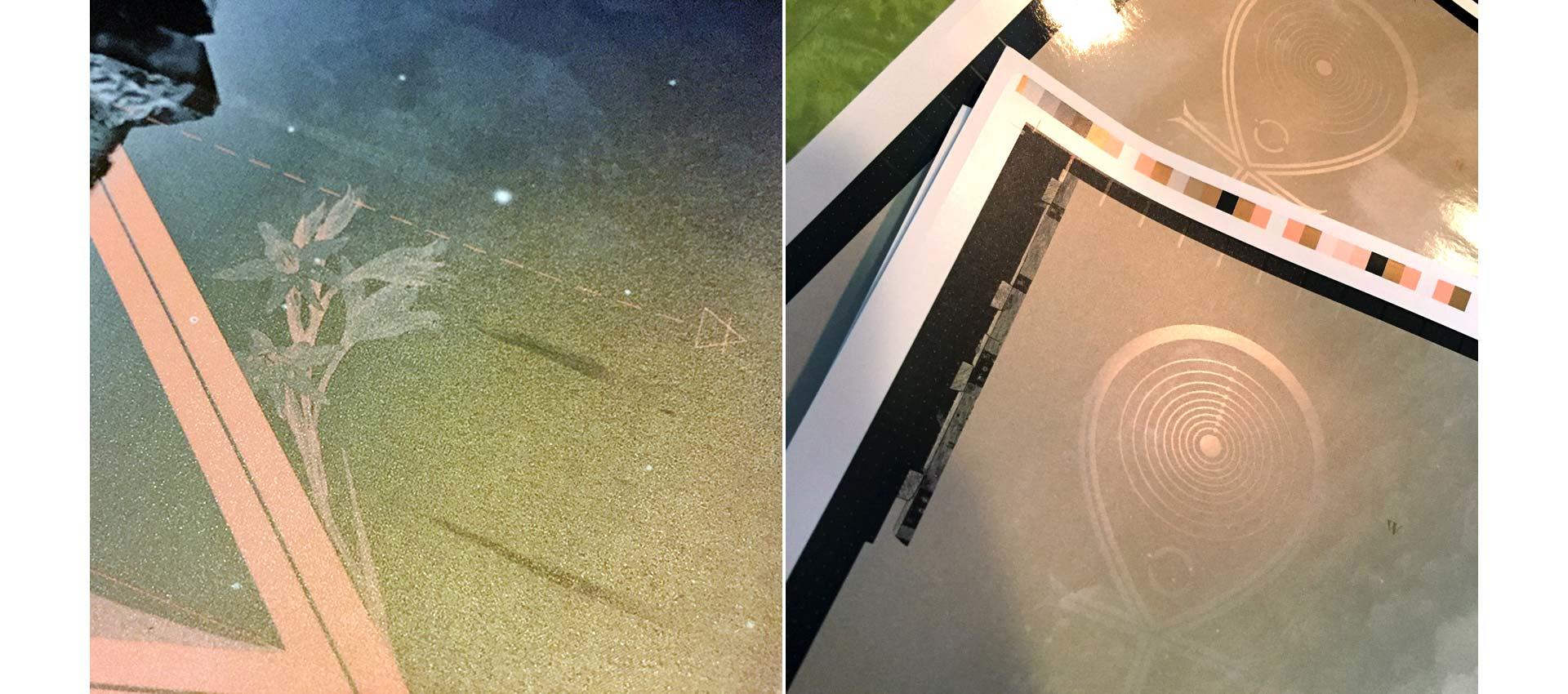
Under the watchful eye of Typecraft’s prepress expert Tracy Dragoo, I spent a few weeks breaking down the artwork for print. This turned out to be much more difficult than expected. For one thing the peach and metallic inks don’t get along. For another, I wanted different parts of the peach plate to print on top of the metallic ink and others to knock out the metallic ink. (If you’re not familiar with offset printing, knocking out means that the first ink color to lay down on the paper leaves an empty area that is filled by a subsequent ink color.) Overprinting is easy, knocking out is easy. Doing both on the same plate breaks the software. I had to make my own separations. That took me a few weeks, and it looks like this:
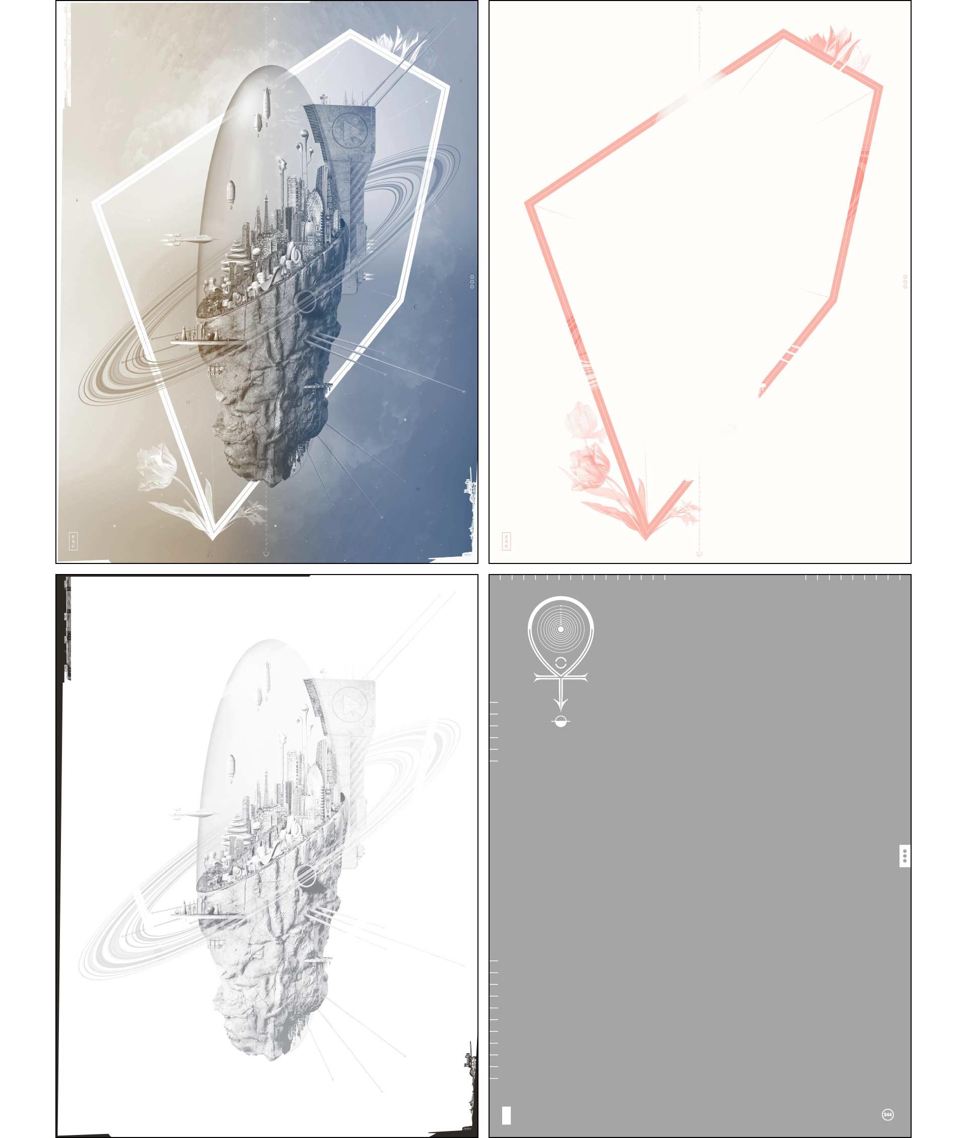
Split fountain, peach, black touch plate, silk-screen varnish
Around this time, I also stumbled on—wait for it—the long lost crisp render Jacob had done after the gallery show. It had been in the right folder on the right drive all along, but somehow I’d kept missing it. So now I had to integrate that file, and modify all the little Photoshop patches I’d used to disguise the fuzziness. But it was worth it. The end result looked much crisper still!
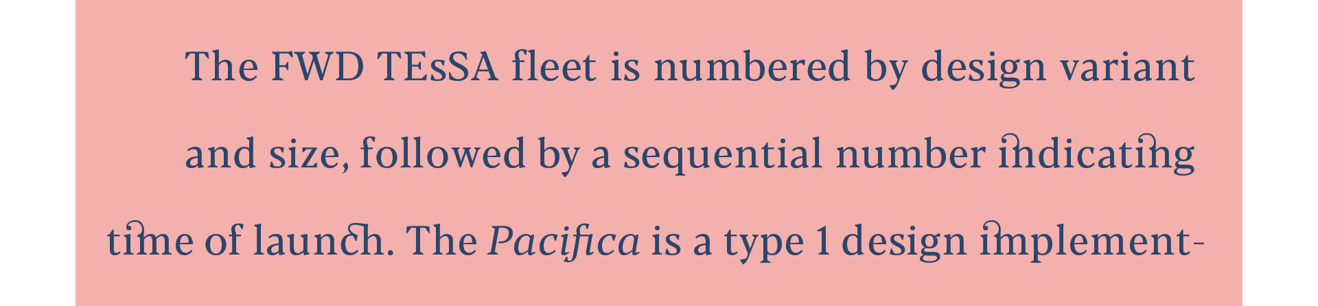
Beyond that, I got into fine-finishing the typography. I’d set a challenge for myself: I’d design the entire poster using only two typefaces—Rene Bieder’s supremely useful Franca and Blacker, designed by Cosimo Pancini and Andrea Tartarelli. Both felt great to me when I first did the layout, but when I actually looked with the eyes of a man ready to go on press, Blacker (while beautiful of shape) turned out to have serious issues with the built-in kerning pairs—the default space between individual letters. I had to manually revise the kerning on the entire story. That’s 2,464 words and 12,733 characters. This took some time, particularly as I had chosen to justify the type for a textbook look. To make justified type look beautiful is a slow and exceedingly delicate process. I won’t be doing it again anytime soon.
Oh, I’m sorry, is that driving you crazy? Don’t come to me for pity.
All along the way, I kept refining the color separation with Tracy, looking to anticipate problems on press. It took us to Round 14 to make the file as bullet-proof as we could think to make it. There was only one problem: The Round 14 file got corrupted. Tracy couldn’t open it. Neither could I. I had to go back to Round 13, remember what I’d done, and replicate it as best I knew how. More fiddling, more kerning. But we got it done! We were ready to go on press.
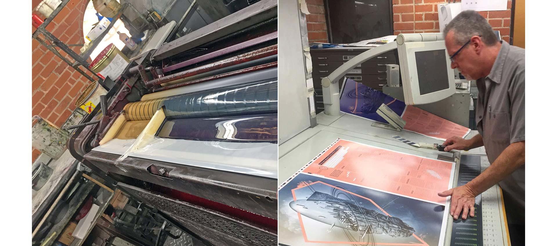
Around Typecraft I’m known to be somewhat demanding on press. This is mostly because when I print art catalogs for L.A. Louver, it’s vital that we match the actual color of the artwork as closely as possible. It can take a lot of time to get the best result, making adjustments to one part of the press sheet without causing trouble on another in the process. On my own projects I’m a lot more easy-going. Sometimes things happen on press that I hadn’t anticipated, but that delight me. When it’s my own art, I can embrace those moments of serendipity.
With this poster, many unexpected things happened. None serendipitous. Most of the things Tracy and I had planned for—and that had been on the mind of Typecraft owner J.J. Gish and production manager Mark Burks—came off beautifully. The split fountain? Worked like a charm! What none of us had anticipated was that the two metallic inks would have massive dot gain—ink spreading beyond the dots as they appear on the printing plate. Usually, images get noticeably crisper from proof to press. In this case, the image looked like we’d fed soggy paper through an inkjet printer. It looked horrible.
The split fountain / Pressman Bill Heron being heroic
We also encountered significant banding—gradients showing up not as a smooth transition from light to dark, but as stairs steps of solid colors. This can be mitigated by adding noise, which I had done, but not enough. I had spent literally years sweating every detail of the asteroid, but had forgotten to look at the background. Remember Jacob, who had done the underlying render? He was a video guy, and something about the video codec he used created wild patterns that had not been visible on screen. They were very visible now.
On press, your most precious commodity is time. The meter is running, and you can’t be indecisive. We immediately recognized that fiddling with ink levels wouldn’t do enough to help us. We pulled the split fountain plate, adjusted the file to open up the mid-tones significantly, and tried again.
I’d made a big adjustment to the file, because it’s easier to run more ink should the plate be too light than to go from a dark image to a light print. With the press waiting there’s no time for dainty moves. And yet, once the new plate was on press the change was… minimal. We were baffled. Now what?
We made another plate for the metallic ink. We made a new plate for the black ink, reducing the resolution to create more space for the ink to gain without making the print look muddy. Then we did it again. That obliterated some of the minute details I’d put in the art, and it hurt, but you have to do what you have to do to make the project happen.
Somewhere along the way, the part of the press that seals each sheet with a protective coating went kaputt. Which was fine by me only as it gave me time to retouch Photoshop errors in the image that I hadn’t seen until we changed out some of the plates.
I’ve been printing since I was 12 years old. I’d never once experienced a press check like this, and I hope never to experience another one like it again. We were on press for ten hours for one sheet. Worst of all, about four hours in, we got to the point where we no longer had a working plan. And that’s what really feels awful—when you’re just flailing. Remember that 240% Kickstarter funding level? We burned right through all of that and then some. But what else was there to do? We had to keep trying. We had to get this done, and so we did. It’s a testament to my friends at Typecraft that I was allowed back in the building after all this.
Next, the sheets went to the silk screen company in the City of Industry. I drove out for a press check of the gritty UV layer. At this point I’d become entirely skittish. I’d asked if we could run tests both with the gritty finish and the high gloss lacquer, just in case. Good thing I did, because the gritty coating, while fun to touch, looked uneven on the sheet. The gloss, however, looked great. We switched. But not before I was told that I’d have to sign a waiver.
As it turns out, the UV coating can sometimes have an interaction with Pantone inks. What kind of interaction? The coating sometimes eats the ink. Makes it change color. Makes it disappear. When would we know? “Could happen within 20 minutes, could happen in six months.” Well, heck, where do I sign?
Gritty good, spotty bad / Matte vs. Gloss
Acting with an abundance of caution, I had 150 sheets set aside without coating, just in case my backers suddenly found themselves with magically disappearing ink. So far, so good.
There was only one thing left to do, and that was mailing the posters to my amazing Kickstarter backers. Several had ordered untrimmed press sheets, and I’d asked for a small quantity of uncut sheets to fill those orders (and hopefully to sell a few more). Well… due to an administrative snafu all the sheets got cut. Luckily, I had saved a handful of sheets from the varnish press check, so I could fill the existing orders. Of course, a few poster tubes got dented in the mail, too, so I had to send out replacement posters. At this point I would’ve been surprised had anything gone smoothly.
As you can see, the whole project was fraught from start to finish. After the press check from hell I had a hard time looking at the finished poster. Yes, educational failures are the point of R&D work, but I let myself go into the headspace of seeing only the mistakes, only the things I could’ve done differently. But in the end, people received their posters, and wrote me kind and lovely notes. You know how people say, “That made it all worth it”? That did actually make it all worth it.
Nice people? Or nicest people?
Thank you to all my backers for their support, thank you to my printers for having my back, and thank you for letting me tell you the story behind this poster. Should you want one of the prints for yourself, you can still order one at this link.