GLAM TEAR STAIN
Designing the CD packaging for the band Solar Twins was one of the great formative projects of my early career. I couldn’t have been happier when Solar Twins mastermind David Norland called me to create the visuals for his first solo album “Glam Tear Stain.”
David and I have been great friends ever since the Solar Twins days, and it’s been a pleasure hearing his scores for films such as “My Dinner With Hérve” and for one of the great rock documentaries of all time, “Anvil: The Story of Anvil.” We’ve collaborated on fun things over the years, including this little Daily Monster New Year’s Song, but “Glam Tear Stain” has been our first “official” project since that first album back at Maverick Records.
David and I both know that working for friends can be fraught, and we had several conversations about how to tackle the art for this album without putting any strain on our friendship. Primarily, we set the intention of giving each other lots of peaceful escape routes, should they become necessary.
Here’s an example: Having heard the gorgeous music, I immediately wanted to go all out on the artwork and production. But I didn’t push. Instead, I let David know that if all he needed was quick and dirty digital artwork, I’d be there to help. Happily, he’d signed with Denovali Records in Germany, who were excited to release the album with all the bells and whistles—digitally, on CD, and as a limited edition clear vinyl.
When it came time to start designing, I put the album on repeat, and began making things. Waiting for inspiration is a fool’s game, and part of what makes me a professional is that I have techniques that let me produce even in the absence of fairy dust. In this case, however, the music was so emotionally resonant and evocative that the images just kept coming. Dozens of covers took shape over the course of a week, and all made me happy. This happens very rarely, and it feels almost miraculous when it does.
Sometimes my designs get a bit ornate, so I wanted to proceed with that awareness. To make sure that each of the covers for this albums would be iconic, I took some time to explore fundamental compositions. These sketches formed the backbone of my more detailed explorations, so I wouldn’t get lost in the fiddly bits.
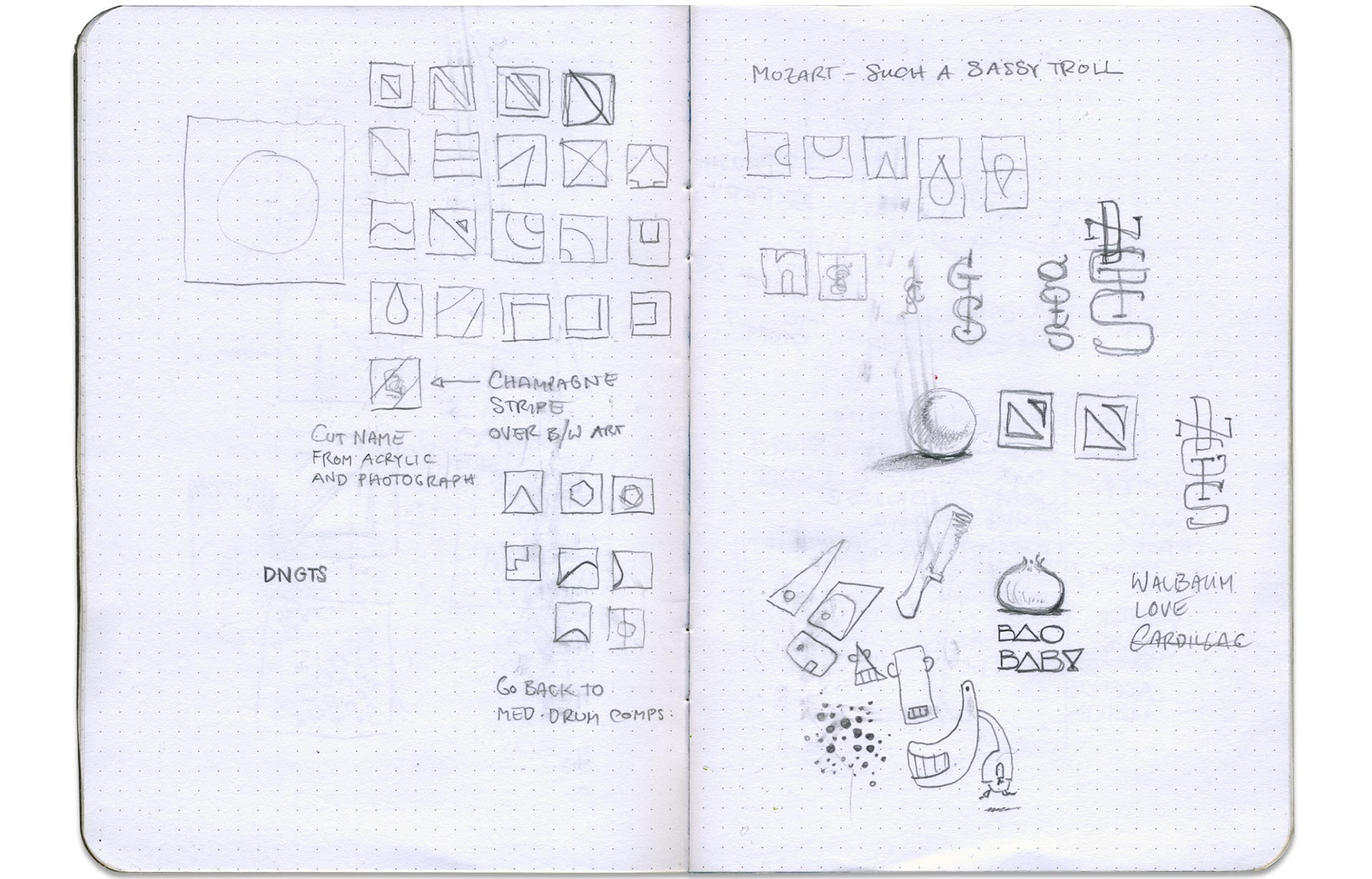
Over the years, I’ve made the mistake of bombarding clients with options. It’s a symptom of insecurity. “Yes, it’s just art, but look how hard I’m working for you!” I used to think that clients would be grateful. After all, so many of them love to ask, “Can I just see it in blue? And maybe with this thing moved over a little bit?” Of late I’ve realized that inundating clients with options is an abdication of my duty. It’s an important part of my work to form an opinion, and to recommend the best path forward. In some instances I will show one design, and one design only. Usually, I’ll present three initial directions—enough to have a range of choices, but not enough to bewilder.
How do I choose those three directions? If I’d be frustrated if any of the presented designs were chosen, I don’t show it. I only present what I’d love to produce. This makes the process much easier for all involved. Of course, it also means that picking one design I love kills two others that I also love. Luckily, I can show them to you here:
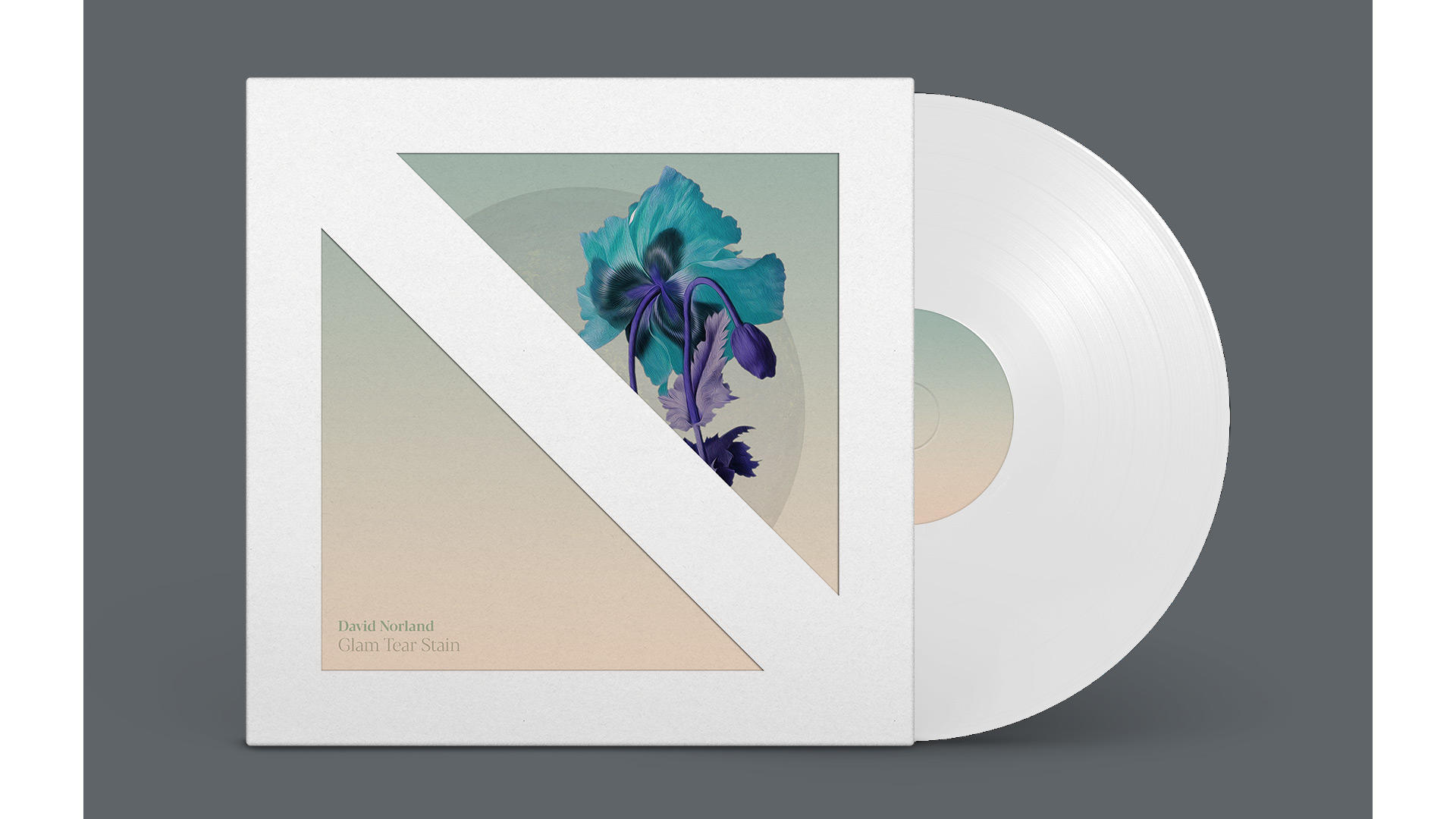
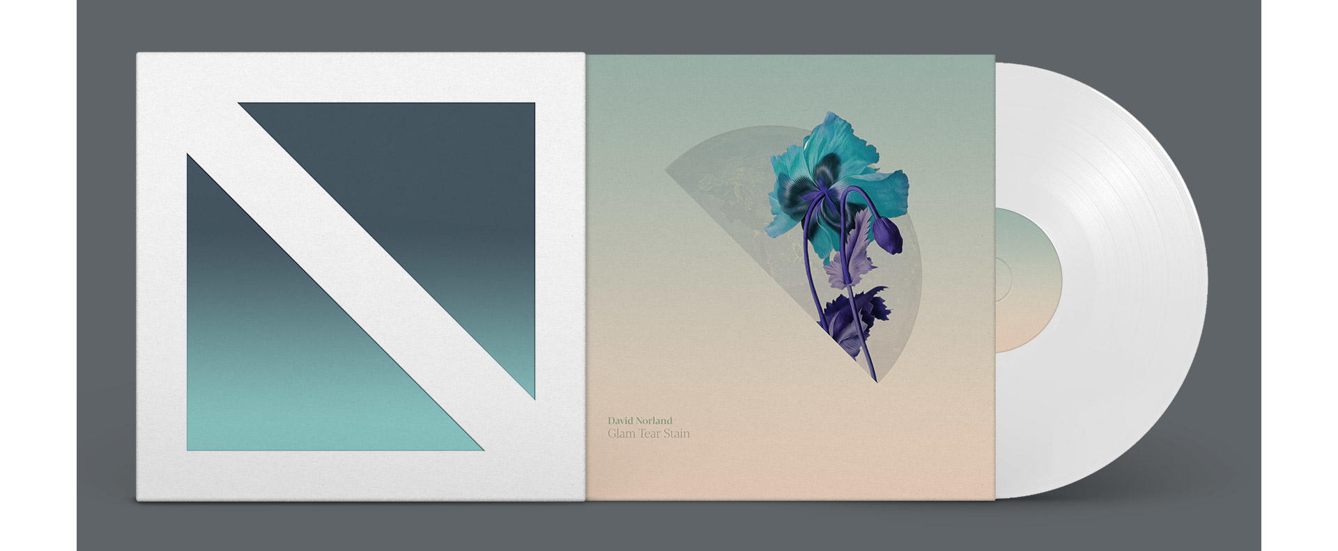
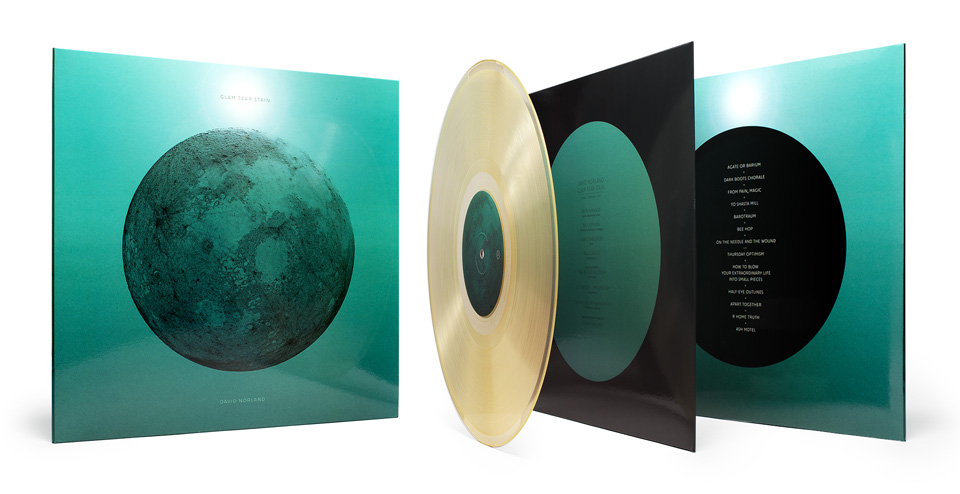
The direction above featured a prominent diecut on the front cover, revealing the sleeve underneath. That sleeve shows Earth at night, centering on David’s native Britain. The flowers are inverted poppies—one blossoming, the other fading—to symbolize a midpoint of life, looking back with some sadness, but also hoping for a rebirth. And in case you missed it, the diecut hides a giant N for Norland. As I said, I wanted each cover to feel iconic.

The giant N returns on the second direction, with the top right serif doubling as a hint of the letter D for David. The minimal cover art is offset by the flowers by Renaissance painter Jean-Baptiste Monnoyer.
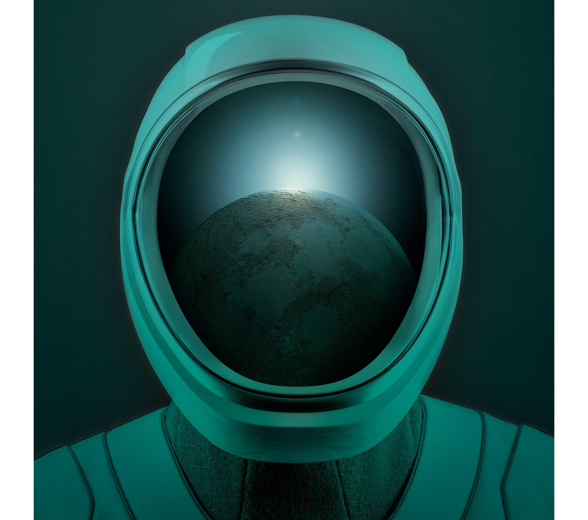
As much as I love those covers, I’m happy David chose the lunar option. I don’t get to say this often, but… it came to me in a dream. (And for once, I had a notepad by the bed.) We both felt that the image of an eclipsed moon connected with the music most naturally. It’s simple and iconic. And a veiled reference to “Dark Side of the Moon”… well, thats’ not so bad, either.
I’d mocked up each design in a Spotify window for the initial presentation, and the lunar cover held up great as a tiny little square. David’s management and label loved it. We were all set to go. I fleshed out the details for the vinyl edition, and adapted the artwork for the CD format. Production proceeded smoothly, and the final product turned out great!
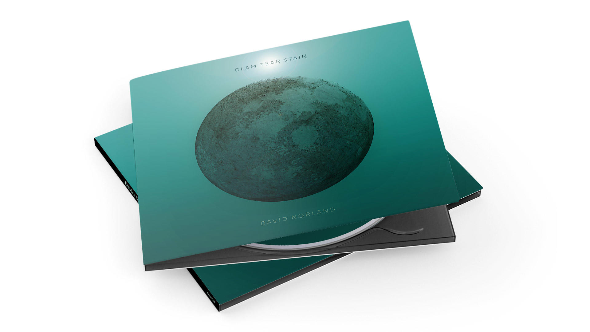
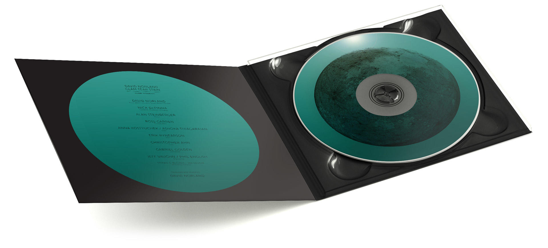
Glam Tear Stain—CD edition
David also invited me to take a crack at a video for the lead single “Agate or Barium.” He and I spent a day in downtown Los Angeles, shooting footage of people moving through the city, and I spent a few days creating different edits. In the end, the video I cut didn’t feel quite right to David. Here was another point where our earlier discussions about process paid off. No feelings were hurt. David went on to make a beautiful video with filmmaker Dan Popa and editor Martin Pensa, which you can watch here. In the meantime, he has been kind enough to let me post my version here. I saw it as a journey through life, from constriction to openness and ultimately expanding past the corporeal:
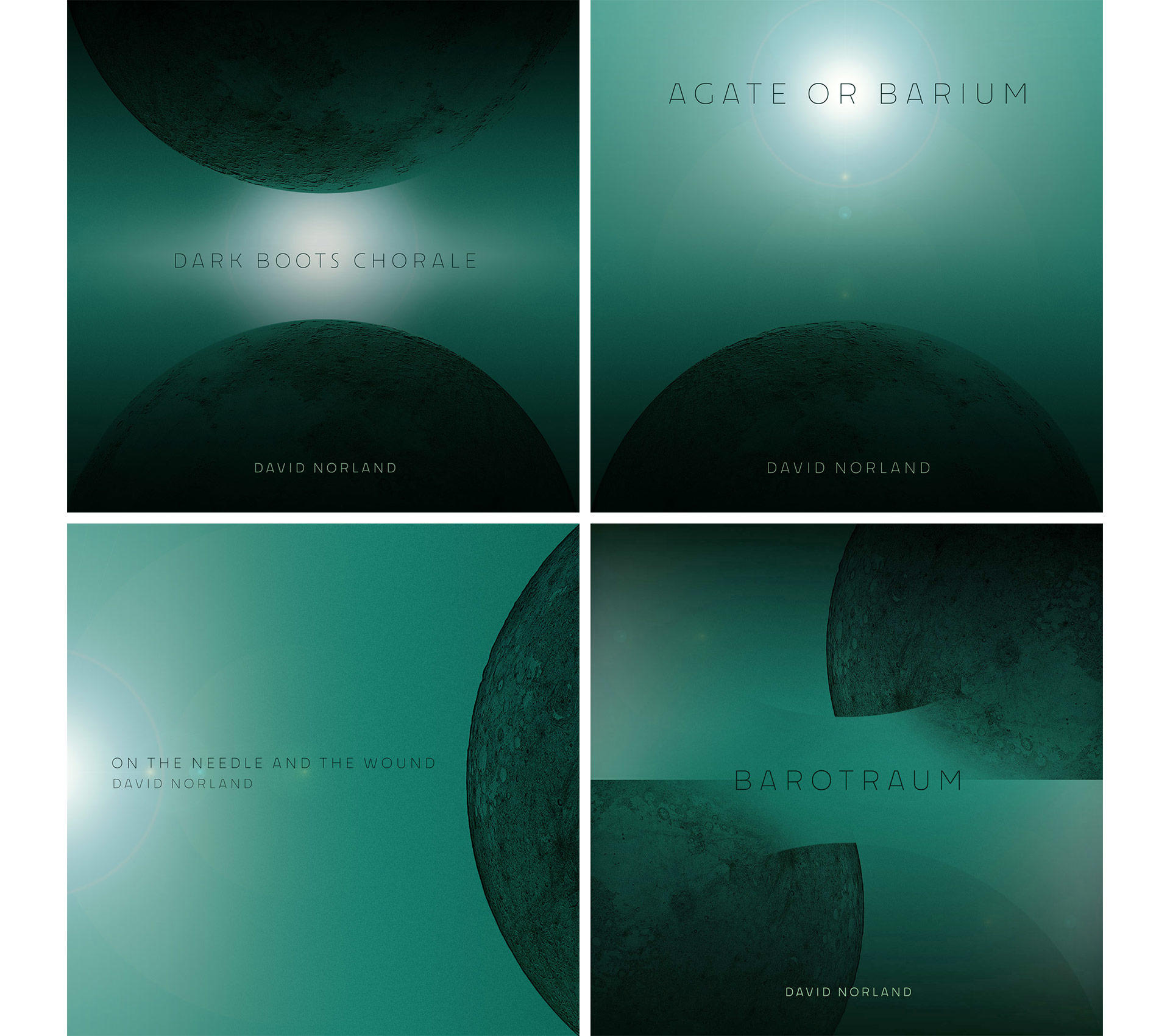
The label did need a few simple little online graphics as single covers, which I was only too happy to provide. It’s always fun to remix art you’re already happy with, and our moody moon was so beautifully adaptable:
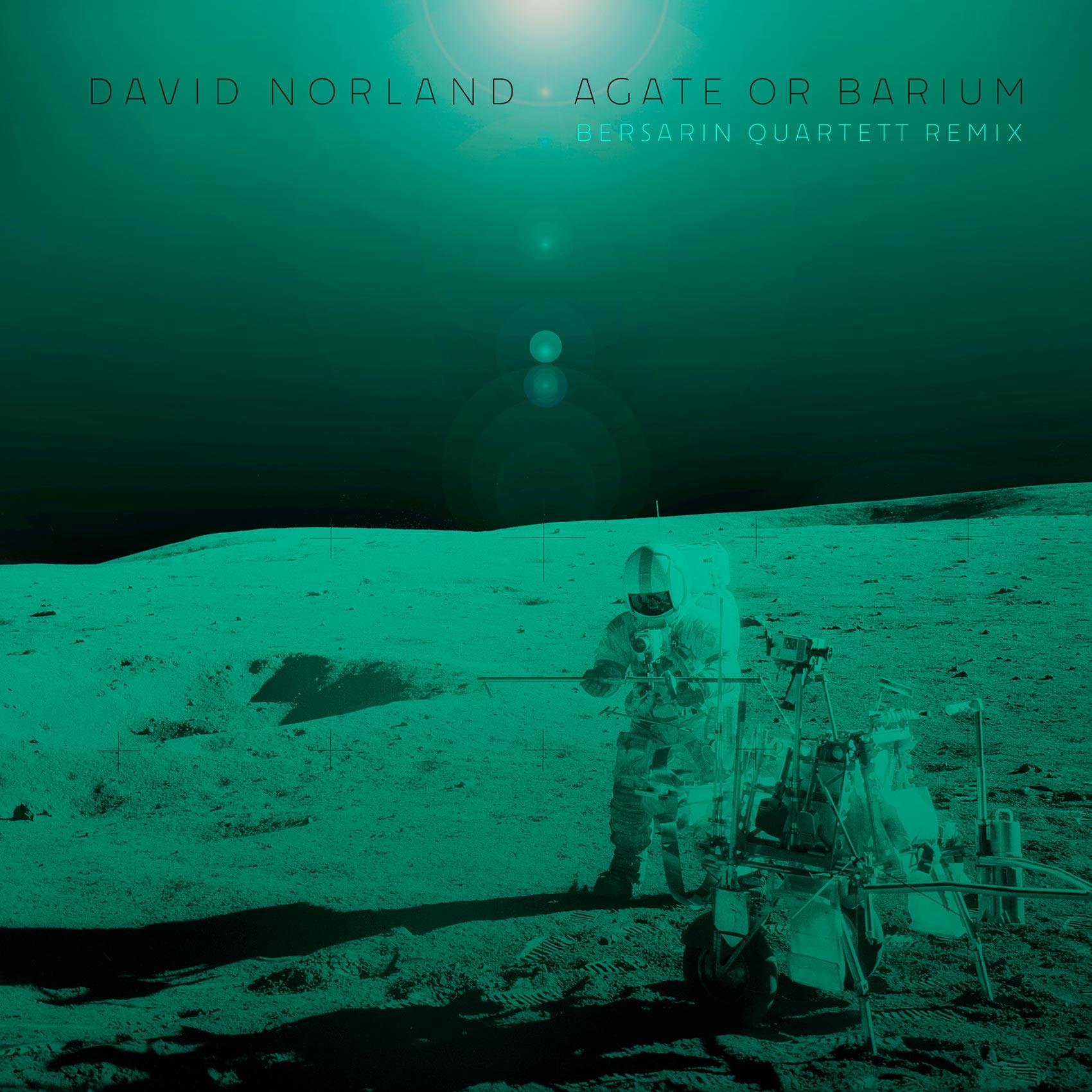
And of course, remixes are represented by visitors to our musical planetoid:
Lastly, I also provided a few minimal animations of the cover that could serve as Instagram teasers. I’ve assembled four of them into a little compilation for you here, accompanied by the beginning of the album track Barotraum:
You can find the music on all major streaming platforms, but if you’d like to order a physical copy of the album, you can do so here.