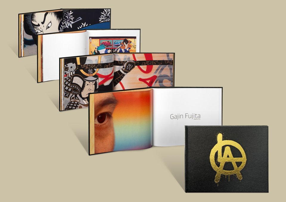
GAJIN FUJITA—MADE IN L.A.
Gajin Fujita has always been one of my favorite artists on the L.A. Louver roster, and I’d been thinking about what I would do with this catalog for a few years before it actually happened.
Having been born to Japanese parents in L.A., and starting his career as a tagger, Gajin creates epic canvasses of sex and battle in a classic Japanese style, on top of a layer of L.A. graffiti. His work is amazing, and I knew that it would look spectacular in print.
- Buy one
- on Amazon
My original plan for the cover was to put out big sheets of chipboard and have Gajin tag them with spray paint. We’d then cut the boards down to size and use them for a case-binding in the style we’d already used for Juan Uslé.
I had mentioned this idea to gallery owner Peter Goulds and managing director Lisa Jann a few times in passing, and usually received a reaction of, “OK. Let’s think about it more when we get there.” When I presented the idea to Gajin it was a much more definitive reaction. “Hm. Yeah. No way.” Onwards and upwards.
Luckily, the title of the show—Made in L.A.—referred to a graffiti tag that appears in a number of the paintings, so it was a natural for the cover. Debossing turned out to be the best way to reproduce it, so I vectorized the L.A. circle tag, and ran the thing through a number of test impressions, fine tuning the debossing die dot by spray-painted dot. (This is one reason why some of my clients love me and some of my clients “love” me.)
Extra credit to L.A. Louver for letting me run the cover without the name of the artist or the name of the show, both of which appear on the spine. Peter has a fine sense of creating a desirable object.
To that very end I tried to persuade him that we should bind the whole book in gold, and emboss the L.A. tag in black. The fine folks at Typecraft asked the equally fine folks at Roswell Bookbinding in Arizona and they made a shiny, shiny dummy for me. Which didn’t fly. Sadly. But the mirrored alternative—gold tag on black leatherette—was a hit with all involved! It’s the same material as Gajin’s sketchbooks, so he felt an immediate connection. He took possession of the blank dummy and had it travel between his friends, who filled with great drawings and tags. And I want it. But that’s beside the point.
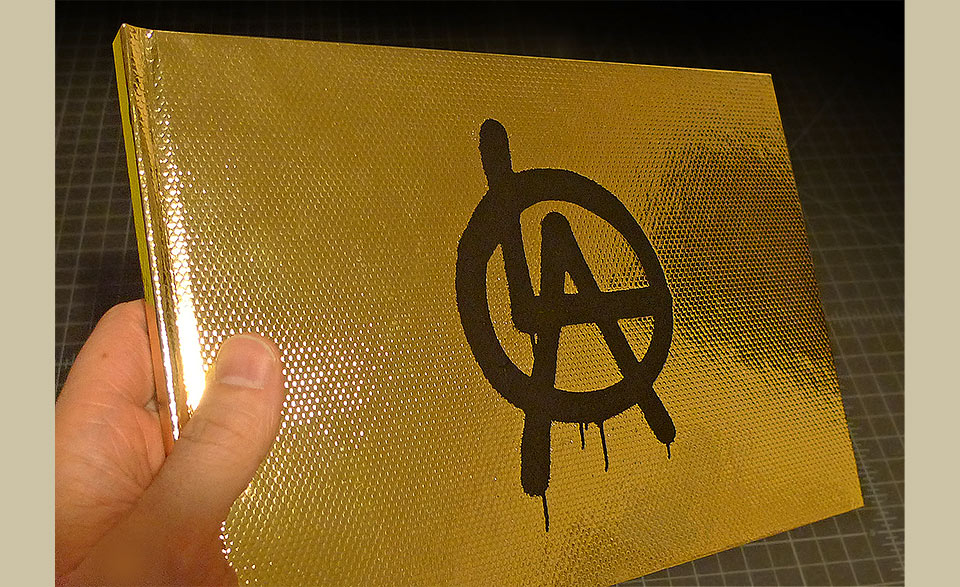
The critique boiled down to “It’s just too Gucci.” The matte black debossing foil scratched like crazy, too.
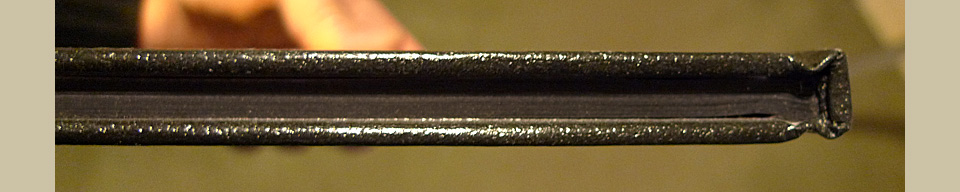
There was some debate as to fore-edges of the paper. Should they be gilded? Should they be black? Initially I wanted contrast, but in the end it looked gaudy that way. Instead the black book now has black fore-edges. Much like Paul Sahre used on the Victore book. (It’s an homage to Paul, this. When you know the person it’s called an homage. Works much better with a big, fat book like that, but ours is nice, too.)
Once you go bl… You know what? Never mind.
Quite some time was spent discussing the detail shot of “East vs. West,” which is the middle spread in the main image above. The full painting—reproduced as a three-page foldout with gold backing—features two warriors on steeds, with lances, jousting. One is wearing a New York Yankees armor, the other dons L.A. Dodgers armor. Going with the title “East vs. West” the Yankees warrior charges from the left, when—geographically—he should really be coming from the right.
Why is this important?
It’s important, because we wanted to highlight the L.A. warrior. It’s a show by an L.A. artist in an L.A. gallery and the Yankees can kiss our asses. That’s why. (Team spirit. Like I know from sports.) With the Western pattern of reading the eyes go from left to right. Having the face on the left, with the lance pointing at the right, there is a sense of motion and progress. But the L.A. warrior was facing to the left, putting his face on the right spread. Which stops everything dead. No good. But should we give the spread to New York in the interest of flow? In the service of mere aesthetics? Well… yeah. But we agonized over it.
It’s nice when you’re not the only one worrying about the minutiae. And so it always was with L.A. Louver. Sadly, this was my last major piece for them. Too many things had come into my life, demanding attention. I couldn’t handle all of them without losing my mind on a more permanent basis, so I had to make the painful decision to move on.
I miss the work, I miss the people, but I’m very proud of all the things we did together over the course of seven years. Eight catalogs, a number of brochures, dozens of invitations, gallery graphics… Such an honor, and such a rare opportunity. And all based on answering a job posting on the Art Center alumni board. This is the only job I ever got that way.
Worked out pretty damn well, I’d say.
Oh, a word about the printing of this job: It worked incredibly well! Some paintings cause nothing but heartache and hurt on press. Not so Gajin’s art. The colors popped, the metallics shimmered. These paintings just wanted to be printed. Phew!
Only later did I find out that the signatures—the gathered booklets of 12 or 16 pages each that get gathered into a complete book—had accidentally been formatted for perfect binding. Which means that each page had an extra quarter inch on the binding side that can’t be trimmed off for saddle stitching. Quel malheur! The team at Typecraft ran the entire job again over the weekend without telling anybody. And that’s why they’re amazing. I can’t tell you how happy I was not to know about all of that until months later.