THE GRAPHIC EYE

This book was a crime of opportunity. In the fall of 2007, RotoVision’s then acquisitions editor, Liz Farrelly, was spending a few days in Los Angeles to meet with potential new authors. I told her that I wasn’t looking to make another book, certainly not so soon after 100 Days of Monsters, but she said, “Just come meet me.” After chatting with her for an hour I had talked myself into putting together “The Graphic Eye.” I suspect a Jedi mind trick.
- Buy one
- on Amazon
Throughout our initial meeting I told Liz that I didn’t want to do another design book. All Access had been such a bear, and I didn’t want to revisit the experience. When the conversation turned to our past employers, Liz told me that she’d once worked with Edward Booth-Clibborn, the creator of the “American Photography” competition and series of books. Of course, American Photography 17 had been my first big book project, and I’d never had a better design experience.
From that came an idea. I knew that many of my design friends were frustrated photographers. I, too, had a whole folder full of photos I’d taken that I thought were pretty cool. What if we created a version of the American Photography book comprised entirely of photos by graphic designers? We could call it “An Eye for an Eye—Graphic Designers Behind the Camera.” I really didn’t want to do another book, but a photography book? I love selecting and sequencing photos. And so it happened that I said Yes.
My friends Marian Bantjes, Bryony Gomez-Palacio, and Paul White of Me Company kindly offered me their beautiful photos as the seed crystal for a book dummy that would help RotoVision present the book to potential buyers. Having them involved also convinced many other designers that this wasn’t a completely stupid idea. With this type of book the first people on board always make everything else possible. I’m grateful that Marian, Bryony, and Paul trusted me. They also let me breathe a sigh of relief, because their photos confirmed that other designers did take great photos, and lots of ’em!
The actual design process was a pleasure. My list of usual suspects sent in a treasure trove of great pics, ranging from anthropological snapshots to highly polished compositions. Their entries were augmented by contributions from around the world when RotoVision sent out a call for entries to their entire mailing list. As with American Photography 17 I printed baseball card sized versions of all the selected images, and pieced together what I hope is an evocative sequence on the office floor.
What do I mean by evocative? Whenever I do this sort of thing I work to link the images from page to page in some way—by subject, by color, as an unexpected contrast—and create an unbroken string of associations throughout the book. I try to structure the whole thing as a piece of music, with changes in volume, interesting chord changes and breaks. I doubt that it comes across that explicitly, but I hope that when somebody picks up the book they can feel that everything connects.
Fairly early into the process of making the book RotoVision sent good news: They had sold the U.S. rights to the book to Chronicle. As it turned out, Chronicle placed the projects in the hands of the same team I’d worked with on Jona Frank’s book Right. This was great! I’d been working hard to get the Upstairs Neighbors book published with Chronicle years earlier, and now this honor had just fallen into my lap!
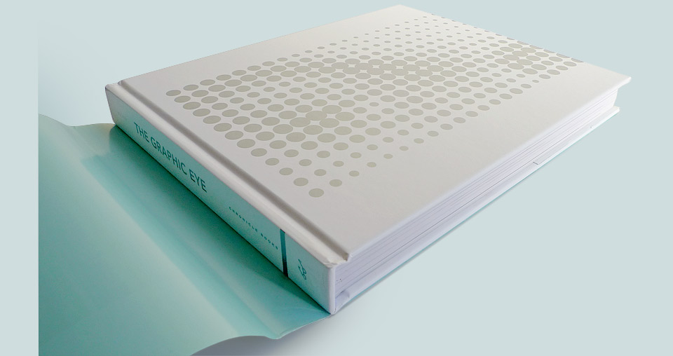
The interior of the book would remain unchanged from the British original, but Chronicle wanted a different cover. Usually, they’d have assigned one of their designers to do this, but as they had had a good experience working with me previously they let me have at it. This led to the interesting problem of designing two separate covers for two separate clients for the same book. I found the whole process quite nice, because I had two chances of getting a cover I loved. I think it made me a bit more agreeable on any single sticking point, but RotoVision and Chronicle might disagree. As a special bonus Chronicle decided to upgrade the book from a soft- to a hardcover.
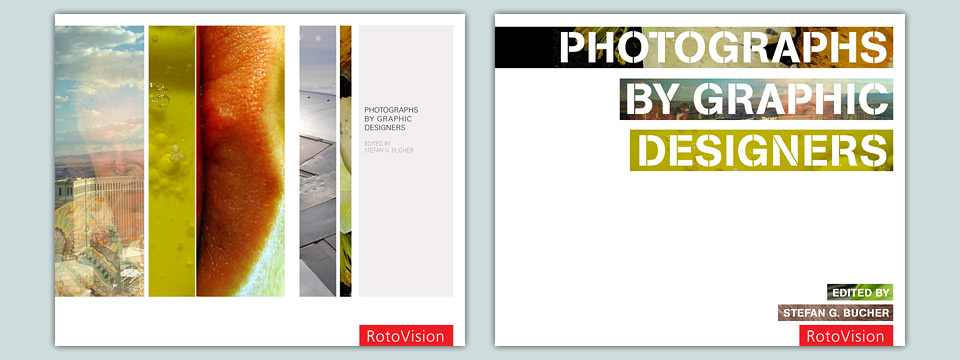
For the initial pitch and for the dummy I presented a fairly pragmatic design: Let’s show lots of images, add a touch of varnish over the titles, and let’s have the most direct and descriptive title possible. Buyers tend not to appreciate anything clever or poetic. Forget about repurposing song names or album titles. The idea book title in the Amazon age is composed entirely of search terms. Therefore: Photographs by Graphic Designers. Thud.
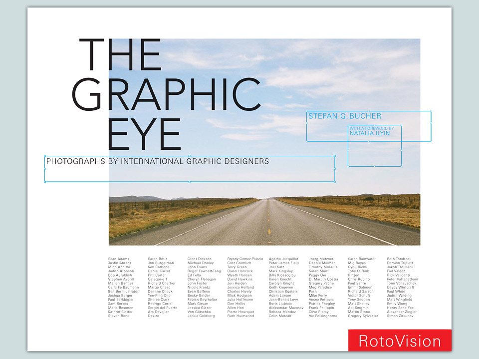
For the first round of actual cover comps I revived my All Access idea of having all the contributors’s names on the cover. The subtitle and author bits would appear in quasi-InDesign text boxes. I always think those look great on the page. Not to skip to the end, but look for them on some other thing I’ll design a few years from now.

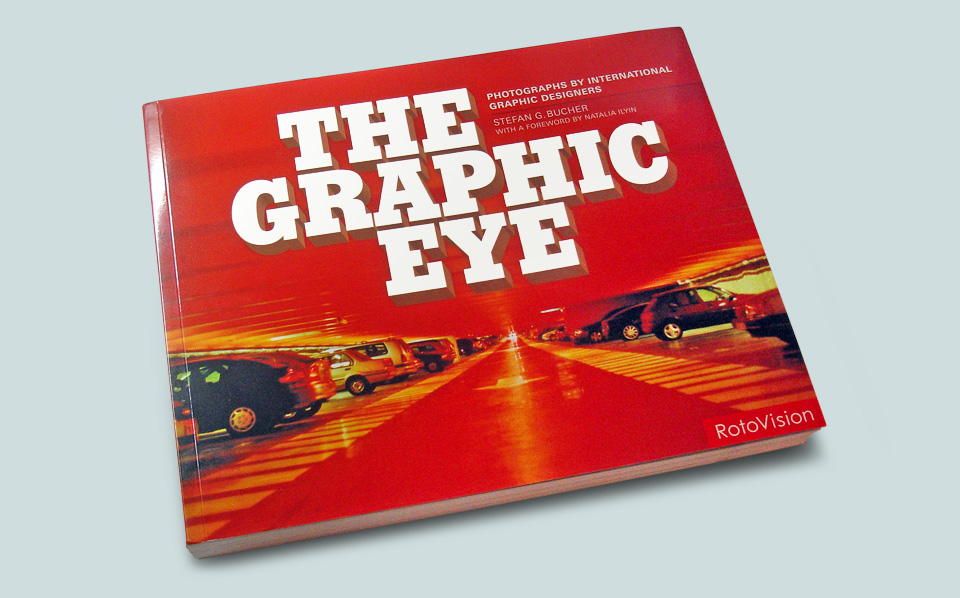
Lastly, RotoVision told me that special effects covers tend to sell better, so I thought, why not a ViewMaster cover? Special effects covers are often cost-prohibitive, and they tear. Apparently, graphic design books are returned due to scuffs and tears at a higher rate than books from other categories. Shocking. This suited me fine. I put all my weight behind the “road to nowhere” photo by Beth Tondreau:
A special little issue was how to integrate the RotoVision logo. The color, size and corner placement were mandatory. I’ve known people who feel that one had best ignore the logo entirely, and make it clear that it was placed by others. I think that’s wimpy. Suffering is resistance to what is. And that logo definitely is. Why not build a design from the corner up?
Incidentally, this was also the cover I presented to Chronicle. They said, “OK, we like that one. Could you make the type a bit bolder, though?” The stereotypical client request, yes, but also perfectly reasonable. The title was set in Avenir, and I could’ve just bumped the weight from light to roman, medium or bold. But I was feeling feisty, and I didn’t want to get into haggling about sizes and weights, so I said, “Bolder type? You got it!”
Team Chronicle looked, recognized what I was doing, sighed, and said, “OK, OK, we get it. Could you maybe just bump up the weight of the Avenir to medium or bold? “Consider it done.” So that was easy. At this point, trying to be smart, I was keeping the U.K. and U.S. approvals totally separate. That didn’t fly. Of course, RotoVision wanted to see what I’d shown to Chronicle. I sent them the BIG & BOLD round… and they loved it. Of course they did. But to tell you the truth, I kinda did, too. Incrementalism kills, but this type was ludicrously big, and that’s fun. I asked them if they liked a particular image, and they suggested the parking garage by Agathe Jacquillat of FL@33. Done deal.
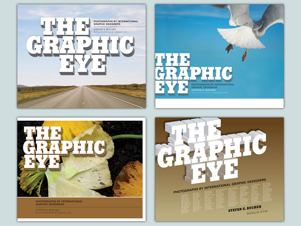
Over on our end of the world, Chronicle asked me to run through a few different image options. The open road wasn’t really grabbing them. I’m forever a sucker for a good vanishing point, but I could see their point. This was a benefit of having previously worked with them on a project that didn’t have my name on the cover. It’s easier to build trust when it’s not your baby. Plus, we did have a deep bench of cool images:
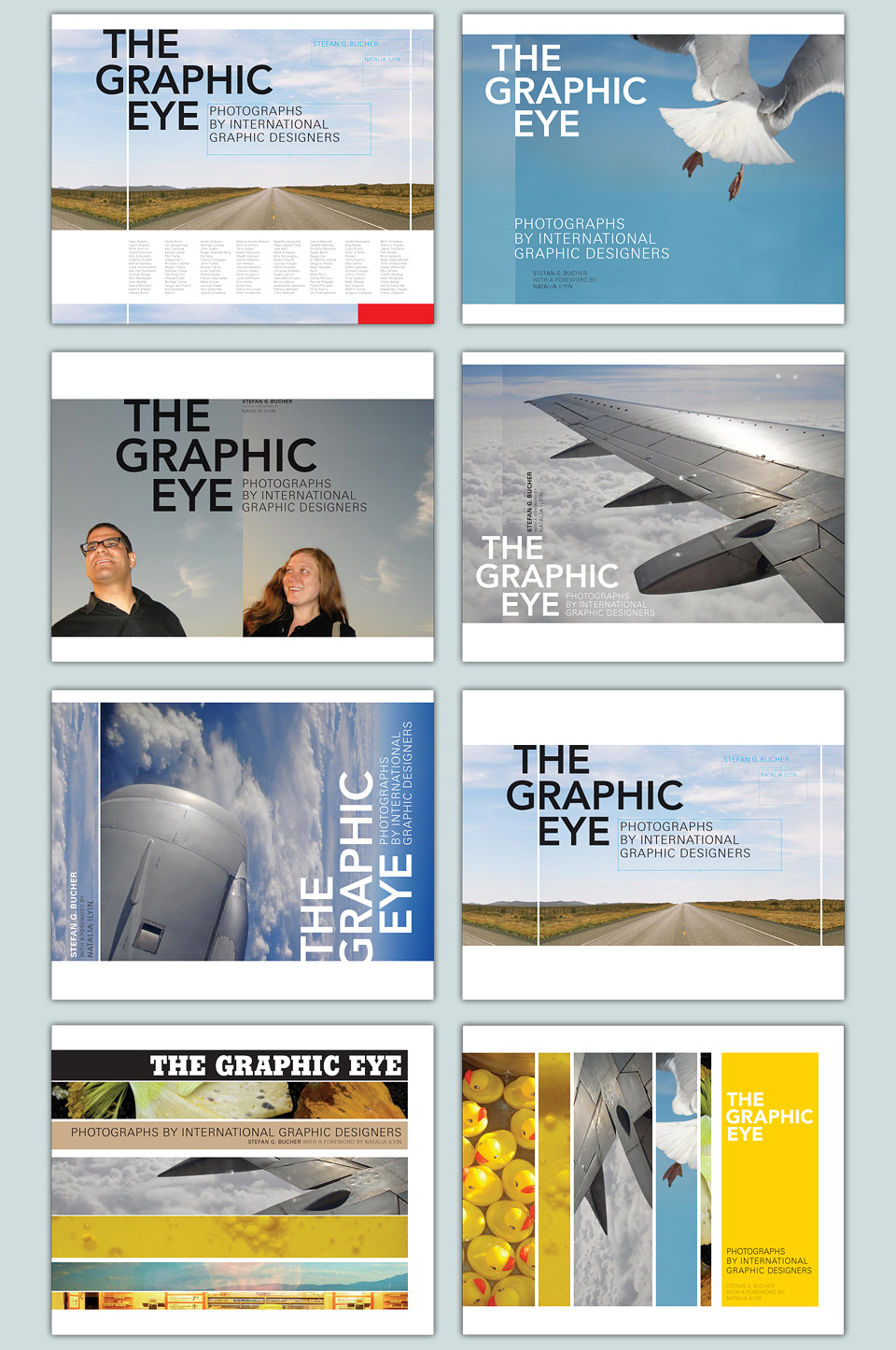
As you can see, I wasn’t done pushing for the road shot, and put it into my favorite layout. It’s the one to the right of the jet engine. After that, one more round followed, which included the great orange radio by Simon Malz who designed this website, and Marian Bantjes’ photo of berries on her scanner glass. That was one of the very first images she’d sent me, and I liked the symmetry of having it win the race at the last second. But in the end it was Adam Larson’s lifeguard station—here still on the far left of the big comp—that claimed the main cover slot, flanked by Nicole Frantz’s raven and Julia Hoffmann’s signage.
At the very last minute, Chronicle wanted to change the subtitle of the book to “Photos From Graphic Designers Around The Globe.” Where did the name come from? I do not know. But to me it sounded like a sack of gravel rolling down a hillside. I suggested “Photographs By Graphic Designers From Around The Globe.” I was told—sternly—that the author had no vote on the re-titling of international co-editions. I was also told—begrudgingly, but kindly—that my subtitle was better, and that I should never meddle with this sort of thing again. Noted. Commutation of Sentence gratefully accepted. We had ourselves not one, but two covers!
By this time you might be wondering if there is anything inside this book. Yes. Yes there is:
Now that’s what I call image sequencing!
One of the bonus features of making books is that you get to ask one of your friends to write a foreword. In this case I leaned on brilliant writer and culture critic Natalia Ilyin, who kindly added her wit and insight to the project. And now our names are linked in print. For me, it’s somewhere between collecting autographs and getting matching tattoos. Somehow. The metaphor may need work. I’m just proud that Natalia was happy to be a part of the book, and wrote a great foreword.
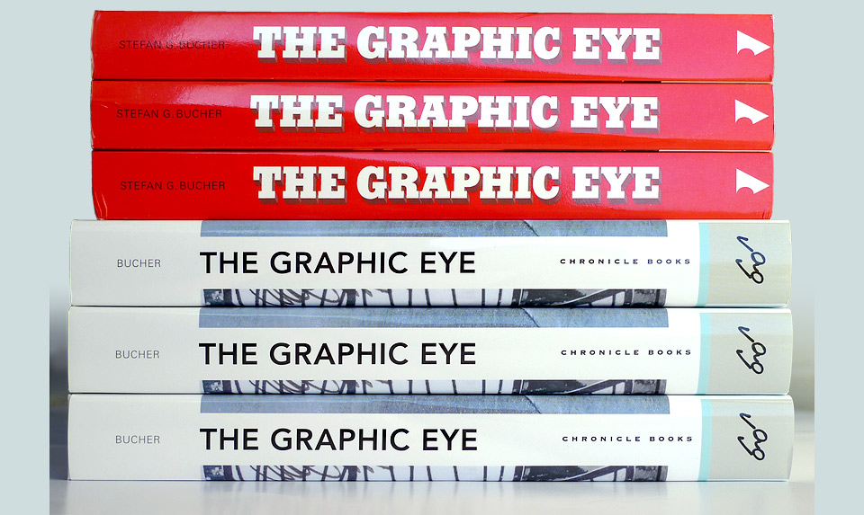
The spine of the American edition of the book is my personal favorite (of my own spines).
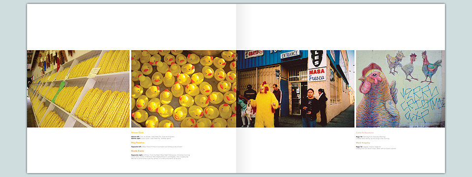
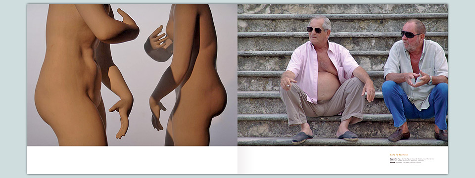
I fleshed out the whole project with a few special sections spotlighting designers whose photos particularly struck me, and then applied myself to the task of designing the index. Whenever possible, I try to do something special for the index. I had cribbed the idea of showing minis of the images from Gary Koepke’s design of “American Photography 14” when I designed AP17. It seemed right to reprise the idea in a very compressed form.
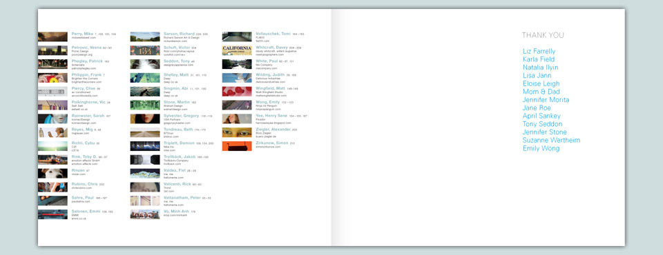
Another very important part of each book: The Thank You Section
By the time I got to this part of the book I couldn’t bear to tear apart my image selection and sequence to make room for another few spreads of index. And who needs little bios or addresses or phone numbers anyway? I always found that demeaning. You can’t look up an artist’s phone number in the back of an art catalog. A design book shouldn’t become the yellow pages. I included the URLs for everybody’s website. That’s plenty.
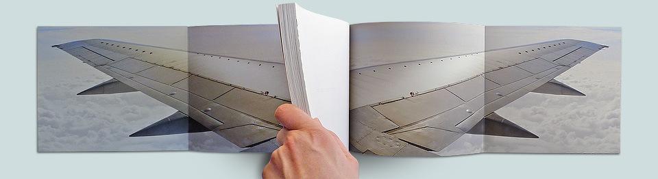
Rare is the image that doesn’t look better flipped. Sweet, sweet U.K. edition foldout symmetry.
Lastly, I added a few fun little bits and bobs to the packaging of both the U.K. and U.S. editions. The Brits got big airplane wing foldout paperback covers. Over here, we added a Tiffany blue flood to the inside of the dust jacket—one of my favorite cheap thrills, as you can see from Right, David Hockney, and Jonathan Lasker—and a nice silver graphic on the actual case binding. As with so many things, stand far enough away and the image will reveal itself to you. And as with so many revelations, it’ll make you think, “That’s it? Really? Ugh.” But I hope it’s at least a little bit fun.