GAJIN FUJITA: TRUE COLORS
One of my great pleasures is working with artists I admire—and doubly so when I get to work with them repeatedly over long stretches of time. I’ve been a fan of Gajin Fujita’s work for almost twenty years. We worked on his first L.A. Louver catalog “Made in L.A.” in 2011, and have done a number of exhibit announcements and special projects together, including his limited edition L.A. Library Card. But nothing beats making a book, and I was excited to have another opportunity to put my skills in Gajin’s service for this major catalog of his latest works.
- Buy one
- at LALouver.com
Throughout the design and production process, I was inspired by Gajin’s intricate and vibrant paintings. His blend of traditional Japanese art forms with modern street art sensibilities creates a tornado of visual energy. As always, I aimed to create a worthy container that allowed his art to shine in print.
The design of the catalog took shape in close colaboration with Gajin and his wife Angela Fujita, L.A. Louver Founder Peter Goulds, Managing Director Lisa Jann, Communications and Research Coordinator Mimi King, and Head Archivist and Research Specialist Lauren Graber. Their valuable insights and feedback helped me refine the design and bring Fujita’s vision to life. As always, my friends at Typecraft did a wonderful job translating all our grand ideas into a gorgeous tangible object.
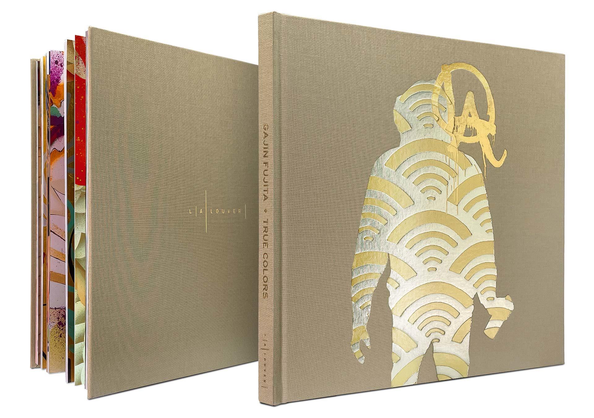
The catalog cover itself is based on an idea by Lisa Jann, who thought it would be appropriate to feature Gajin’s first self-portrait, part of the painting “Home Field L.A.” Fujita is seen in silhouette, wearing his hoodie, wielding a spray can, covered in a traditional Eastern textile pattern symbolizing transcendence through the metaphor of water rippling. The pattern also evokes the WiFi symbol, connecting the old ways and the new.
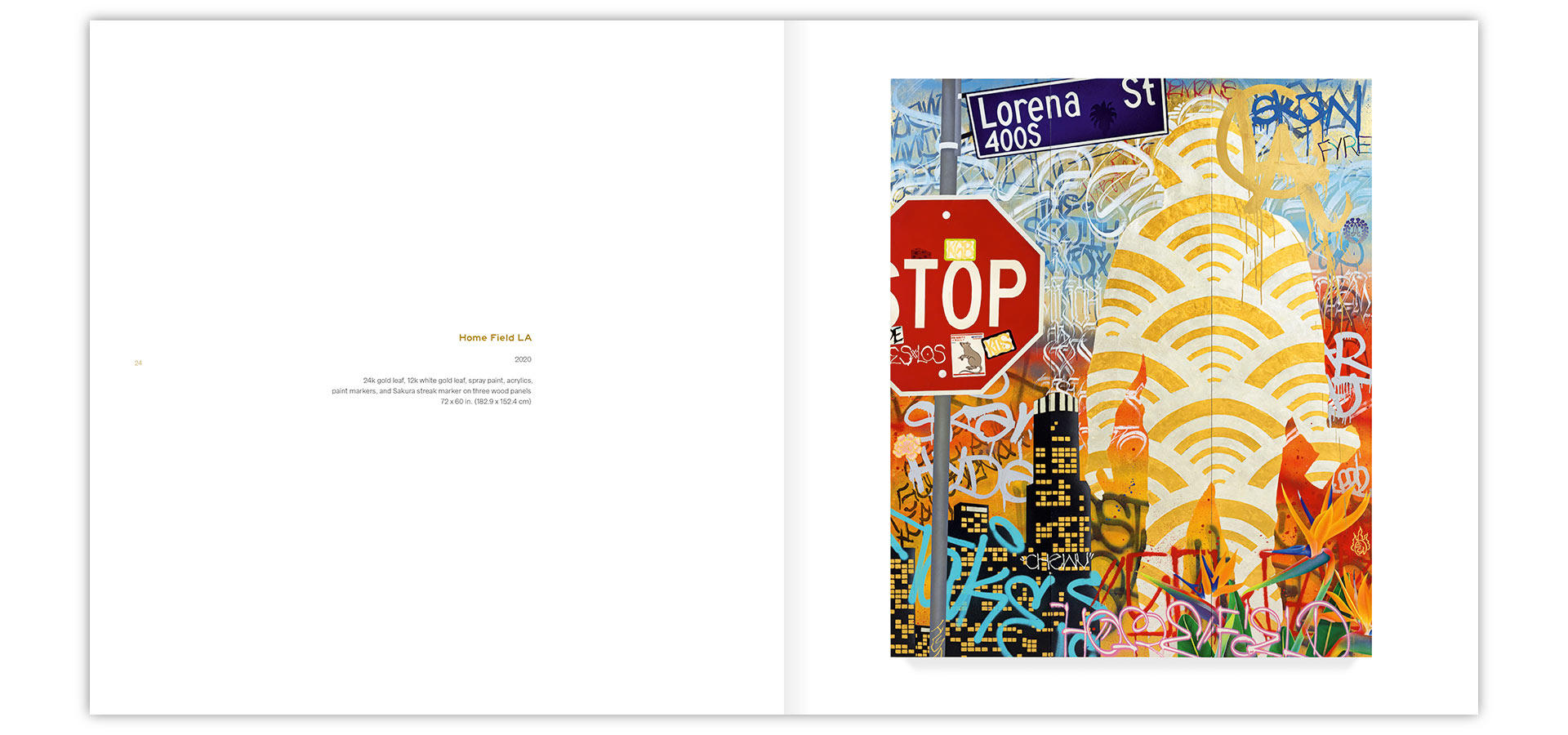
“Home Field L.A.” as featured in the catalog. Please note that the title typeface—Highway—is based on the font used on California freeway signage.
Gajin uses various forms of gold leaf in his works, and I thought it would be nice to reproduce that for the cover by recreating the figure as a silk screen print usng metallic inks on cloth. The gallery liked that idea, and it seemed fairly straightforward.
Unfortunately, sourcing a silk screen printer who had experience printing on book cloth turned out to be impossible. We briefly discussed printing a paper emblem of the figure and glueing that into a blind-debossed indentation on the cover, but we wouldn’t be able to get the necessary level of detail on the shape.

A spread from the catalog showing stages of “Home Field L.A.” taking shape
In a somewhat dejected mood I mumbled, “Too bad we can’t do this as a registered foil stamp.” I still remembered the difficulties of using two separate foil stamps on the cover of L.A. Louver’s catalog for artist Juan Uslé. This seemed much more ambitious, so I’d never even asked. But my print rep (and good friend) David Mayes said, “You know, I bet they can do it. Let me ask.”
Lo and behold, the bindery was much happier with the debossing idea than with my initial silk screen plan. It was another reminder not to negotiate against yourself. Always ask for what you actually want. You never know what’s possible!
I set to work creating a vector version of the figure, starting with a solid layer of silver, followed by the water symbols, and finally the LA graffiti tag. I set up the shapes to print on top of each other instead of interlocking them like puzzle pieces. This would give us a bit more of a margin for error during production and actually mimicked Gajin’s original artwork.
For a touch of extra difficulty, we needed the artwork to bleed off the bottom edge of the cover. With a paper cover, you’d just print to the edge of the sheet, then wrap that sheet around the edge of the board. We couldn’t do that here, because debossing happens after the cloth is already glued to the board.
We ran a test, stamping the foil onto the cloth before mounting it to board. That gave us the precise bleed we wanted, but did away with the debossed effect. The foil also had a tendency to crack where it wrapped around the edge of the board. We decided to stick with debossed foil, accepting that there might be a bit of variation in getting the artwork right up to the edge. As it turns out, the bindery did a great job and kept the bleed looking crisp.
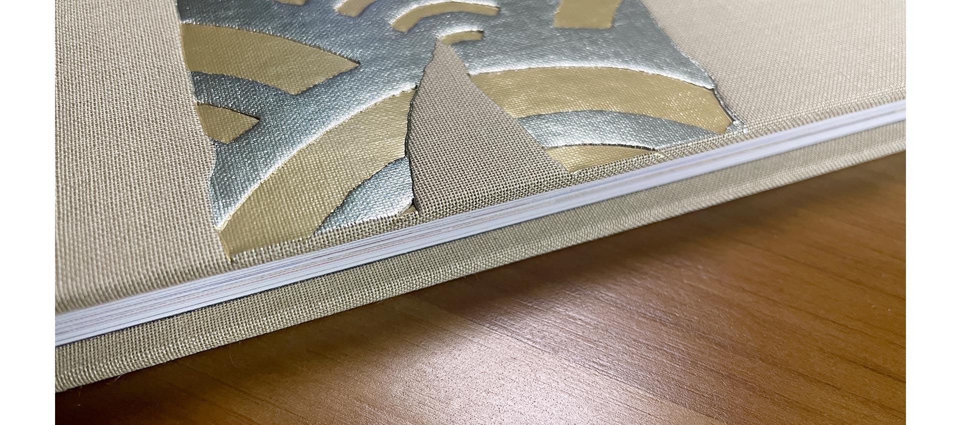
Behold the finesse!
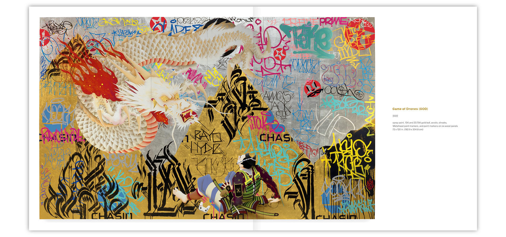
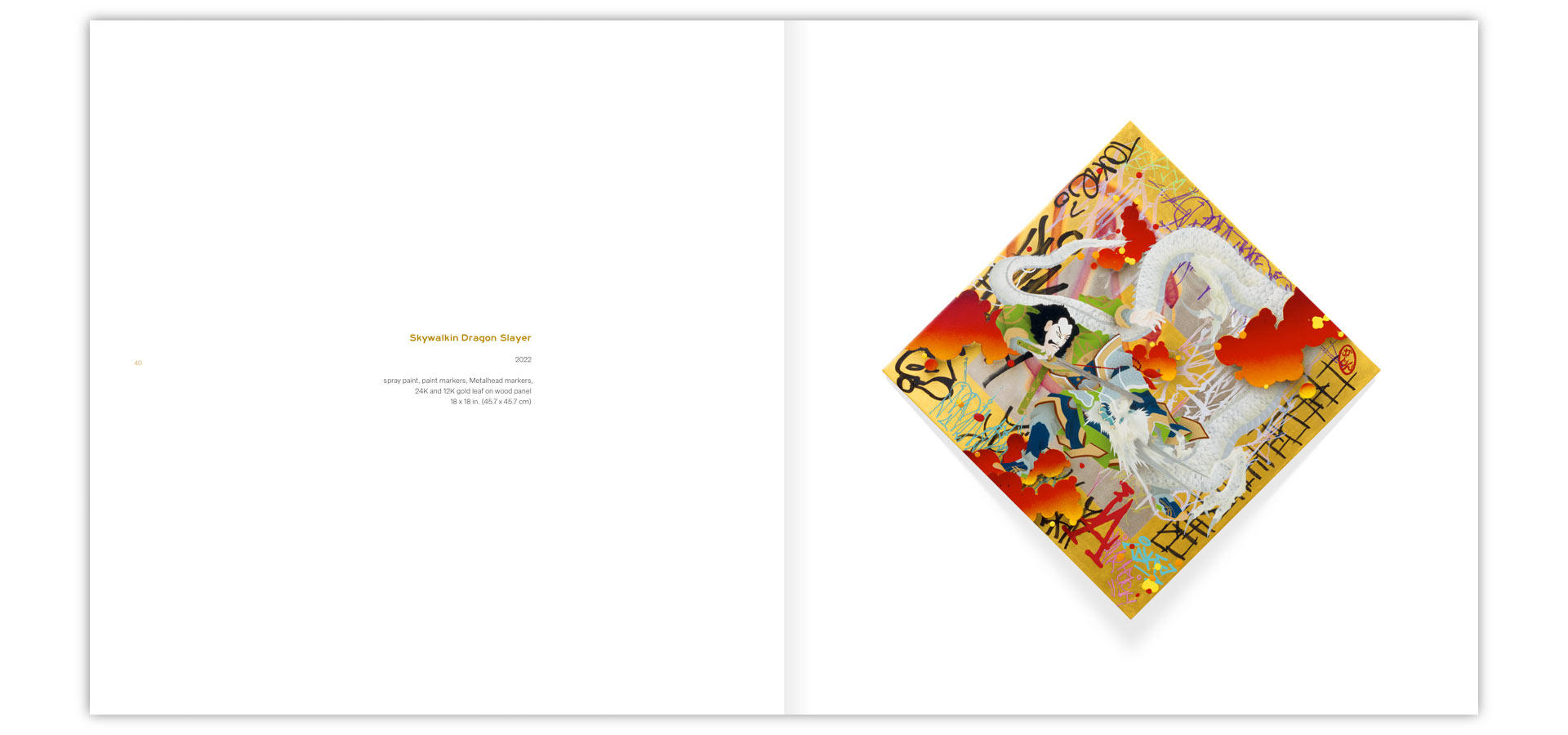
The major challenge for the interior of the catalog was how to properly reproduce Gajin’s paintings. He uses highly saturated colors that are difficult to maintain in a CMYK print. More than that, each painting takes shape on a background of yellow and white gold leaf. Face to face, each painting is alive as lights dance across the exposed metal.
Traditionally, artwork is documented with straight-on photography that’s evenly lit to give the greatest color fidelity. Unfortunately, that sort of setup turns silver to gray and gold to a dirty yellow. I asked the gallery if we could re-photograph the artwork in a different way to better capture the true look of the pieces.
This would mean a significant investment of time and money when we were stretching things already. But happily, L.A. Louver is committed to showing the work at its best, so we forged ahead. I asked photographer Robert Wedemeyer to shoot each piece once in the traditional way, then lit with a strong spotlight from the left, and once more with a spotlight from the right. I’d then layer the three versions in Photoshop and blend different areas of the three lighting setups to create an ideal lighting scheme to capture the full luster of the works.
You can see a demo of the process here, as applied to the epic “Game of Drones (GOD)”:
Here’s the final spread in the book:
More work went into selecting and adjusting detail shots of key pieces, so the colors would shine on press. Here is an example taken from the painting above. Among other issues, the fluorescent pink had turned dark purple in the photos, and as the main color was partially covered by translucent turquoise, restoring the pink tags to something that would approximate the original colors took many hours, many test prints at the eleventh hour, and dozens of adjustment layers. It had to be done, I’m glad I was there to do it, and I’m grateful that L.A. Louver and Typecraft were just as dedicated to an optimal result as me.
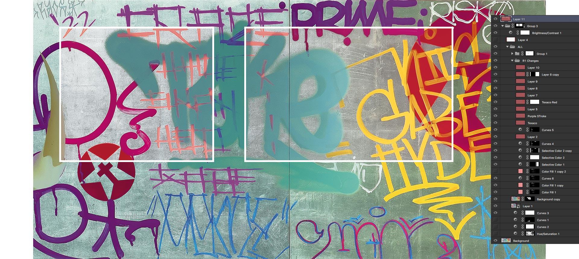
The outlined rectangles show the finished color adjustments.
Special mention must go to press operator Bill Heron and feeder Jesse Flores who’ve worked with me for years. They do the often unsung but massively important work of making sure all of the digital magic shines as it becomes metal plates and ink colliding on a behemoth Heidelberg press. It’s equal parts, science, magic, and taming an ill-tempered industrial beast, and they do it incredibly well!
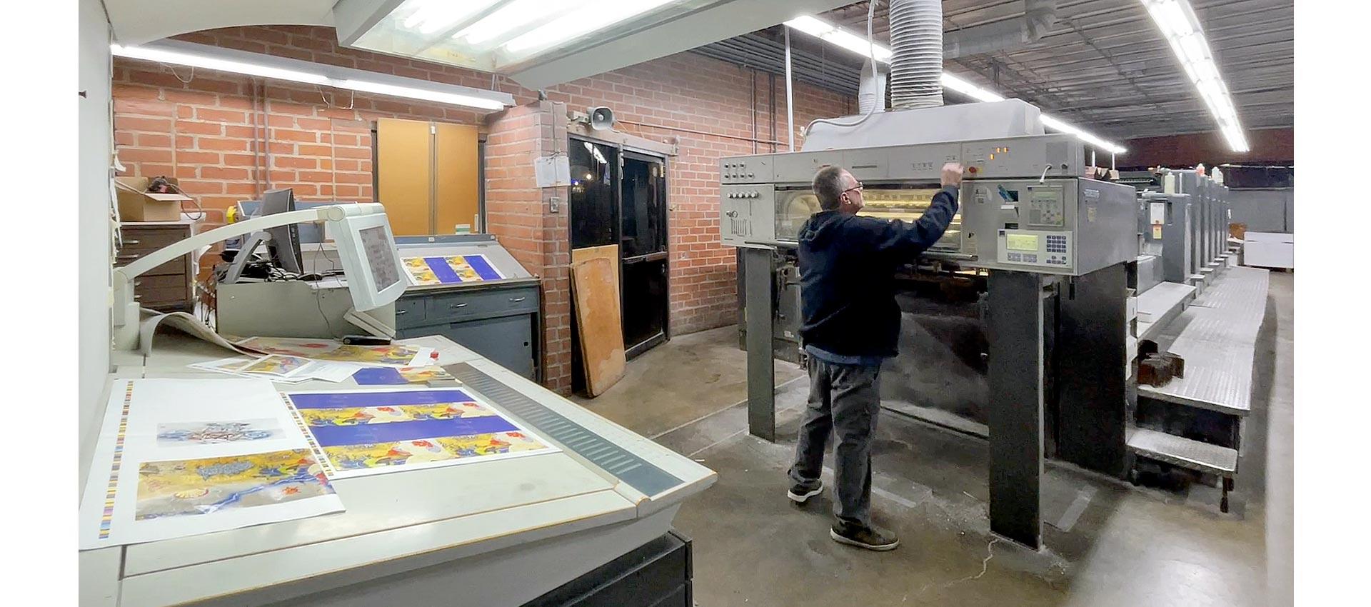
Bill helms the color dials out front, and Jesse (hiding in the back) makes sure the machine keeps humming.
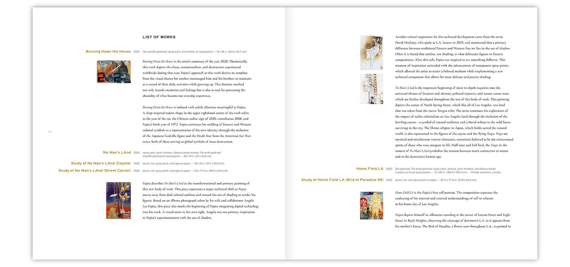
Another special feature of this catalog is a heavily annotated list of works. L.A. Louver’s Mimi King interviewed Gajin about the myriad details that make up his works, and condensed these interviews into brief guided tours that give the audience a chance to understand the conceptual richness of each work more fully. It’s the first time the gallery has added such a section to their catalogs, but I hope it won’t be the last. I’ve followed Gajin’s work for almost two decades, and I still found this section eye-opening!
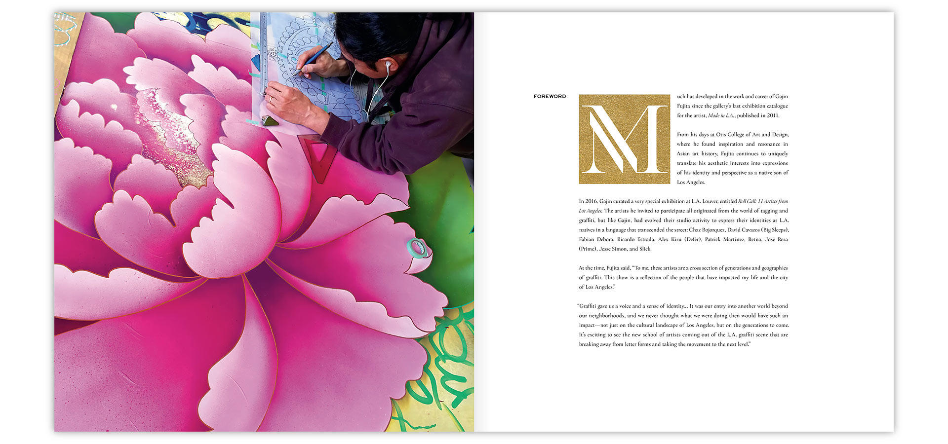
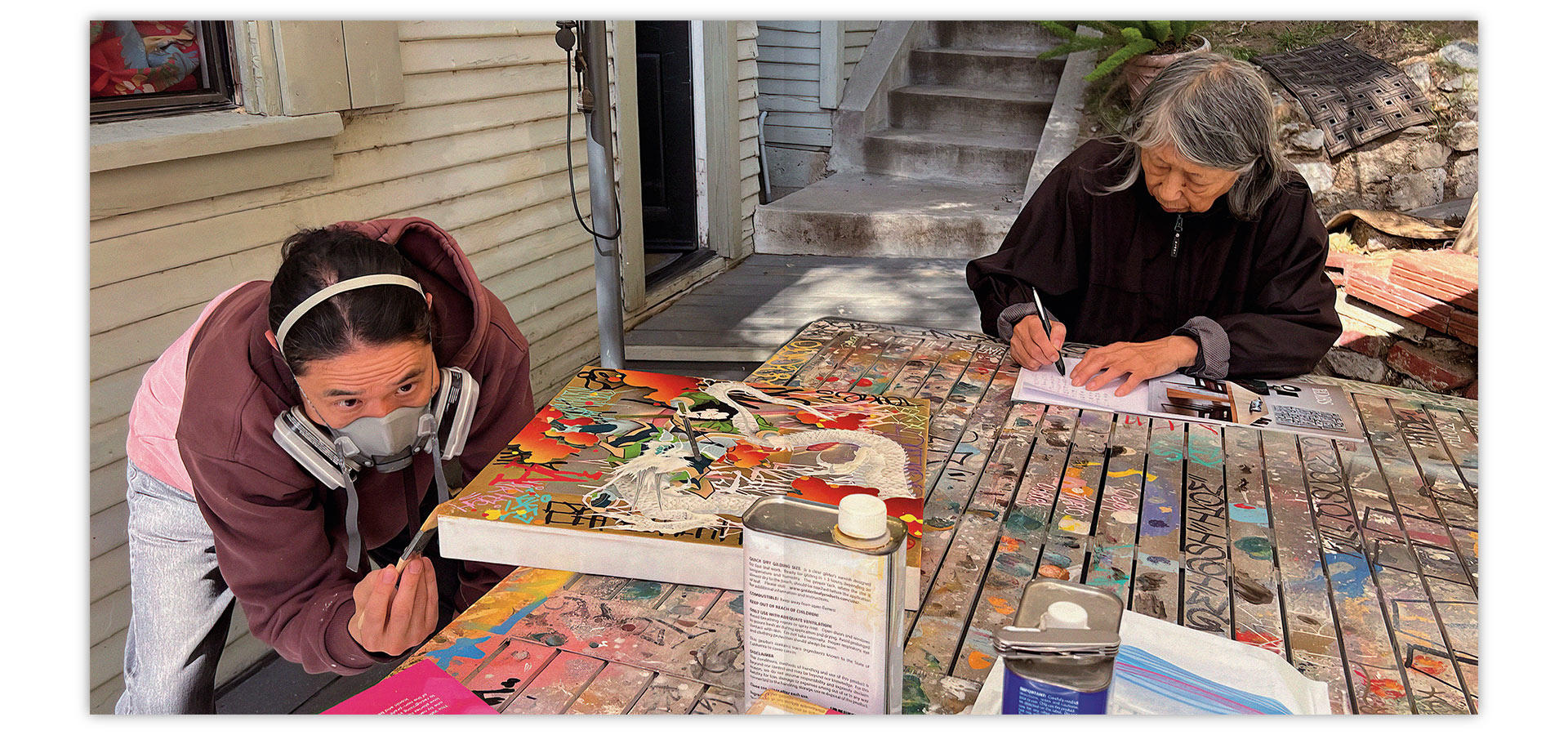
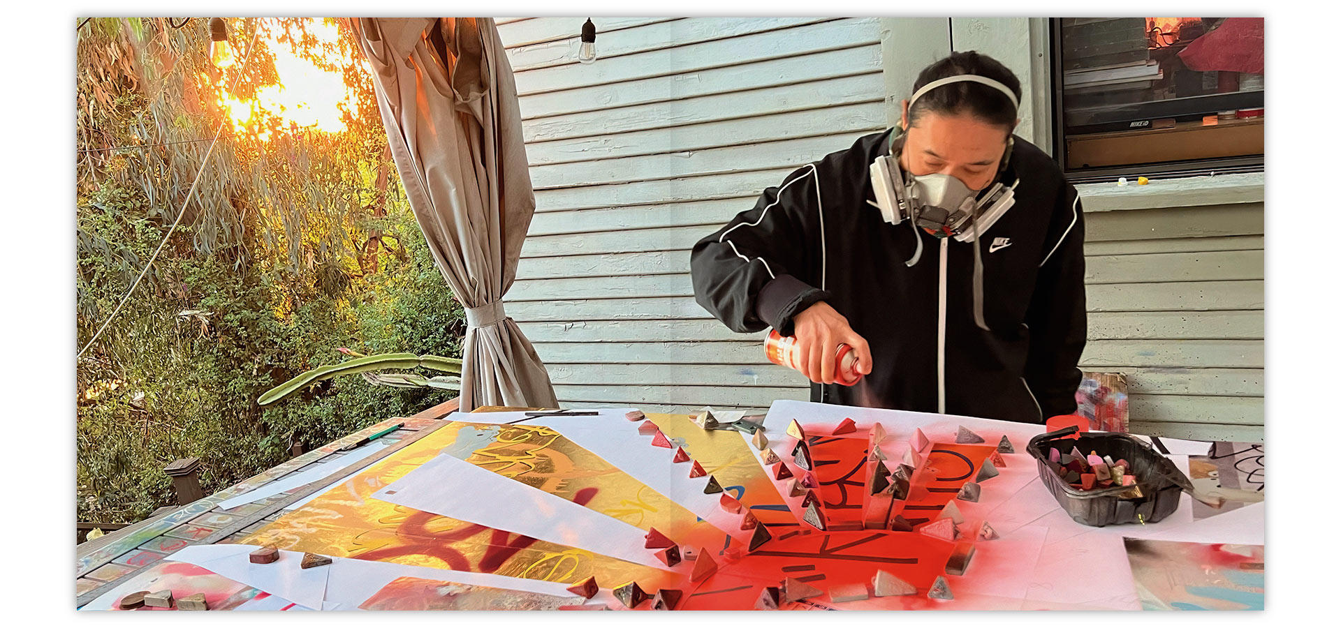
Lastly, we had access to a treasure trove of behind-the-scenes photographs taken by Gajin’s wife, Angela Fujita. Gajin’s process is unique and fascinating, and I’m excited that we got to give the audience a look at the creation of these works. Being able to create and preserve this record of the pieces taking shape is a modern luxury. Imagine if we had this wealth of insight into the work of the Old Masters! These catalogs are our contribution to the cultural record, and I think we were able to place something very special into the human time capsule with this book!
As always, it was an honor to contribute to a stunning exhibition with this catalog, as well as the exhibit graphics and promotional materials. It’s an honor to help bring Gajin’s art to a wider audience. I’m proud that the catalog represents the richness and depth of his talent with integrity, and truly captures the intricate details and bold colors that make his work so extraordinary. I’m grateful for another incredible opportunity to work with a visionary artist and the intrepid team at L.A. Louver.