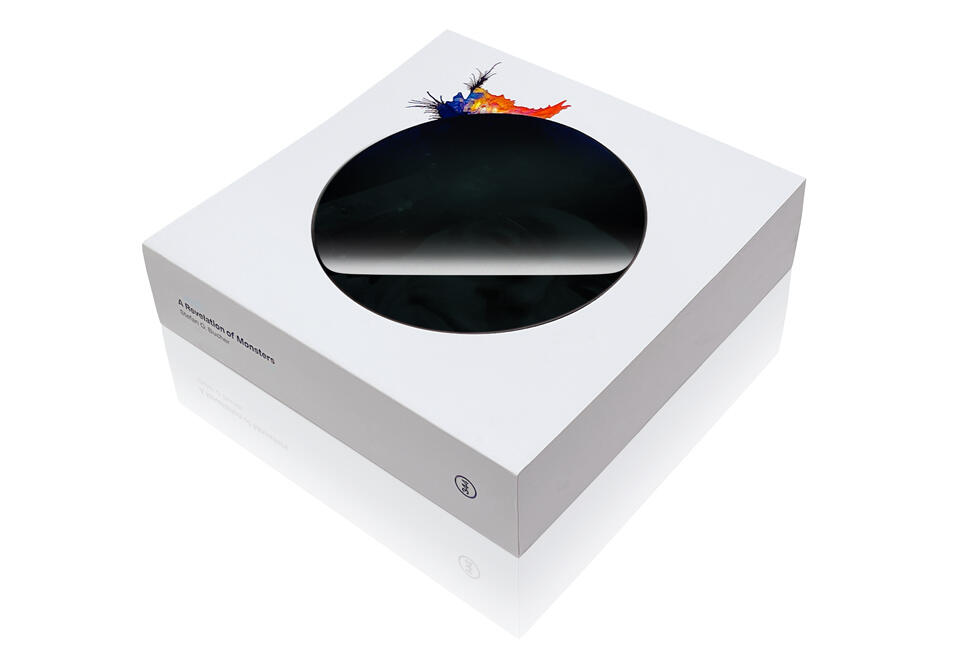
A REVELATION OF MONSTERS
Over the years I’ve done an awful lot of work, but if there is one project that’s most closely identified with me, it’s probably the Daily Monster—neurotic little characters drawn from random ink splats. I first started bringing these sprightly creatures into our universe in 2005. They turned into a little bit of a popular thing in the earliest days of YouTube. From that came talks and murals and a book and the Saks Fifth Avenue Yeti and all sorts of interesting things. The Monsters literally took me around the world and back. On the eve of their 20th anniversary it struck me that I’d never published a collection of my favorite Monsters.
Partly, that’s due to format. Ever since they first showed up in my ink well as “Upstairs Neighbors,” the Daily Monsters all start out the same way: Under the watchful eye of the video camera, I put a blob of ink on a piece of paper and blow on it with a duster can. Then I simply find the Monster hiding in the ink splash and draw it, so you can see it, too.
That’s the origin of the title, by the way. I always experience the Monsters as revealing themselves to me. Therefore: “A Revelation of Monsters.” Plus, they’re revelsome creatures, so it works out well that way, too! More on the title later.
Usually, I draw the Monsters upside down, because it’s more fun for you to watch. The whole thing is also time-lapsed, because it’s a busy old world and I don’t want to make undue demands on your schedule. Here is the first ever Daily Monster:
Along the way, the Monsters have become many things—they’ve been tiny artistic performance pieces, they’ve been the seed crystals for thousands of wonderful stories posted by visitors to my original blog, and they’ve always been a way to connect with people and to connect them to each other. I already documented a lot of that in the book “100 Days of Monsters,” which serves as a time capsule for the first 100 Daily Monsters.
Since then, I’ve drawn hundreds upon hundreds of Daily Monsters, and after almost 20 years, I felt it was high time to put together a book that looks at them as drawings first. A lot of Monsters became popular for their stories, or for a particularly likable character. Some made for fun animations or they ended up on the side of buildings.
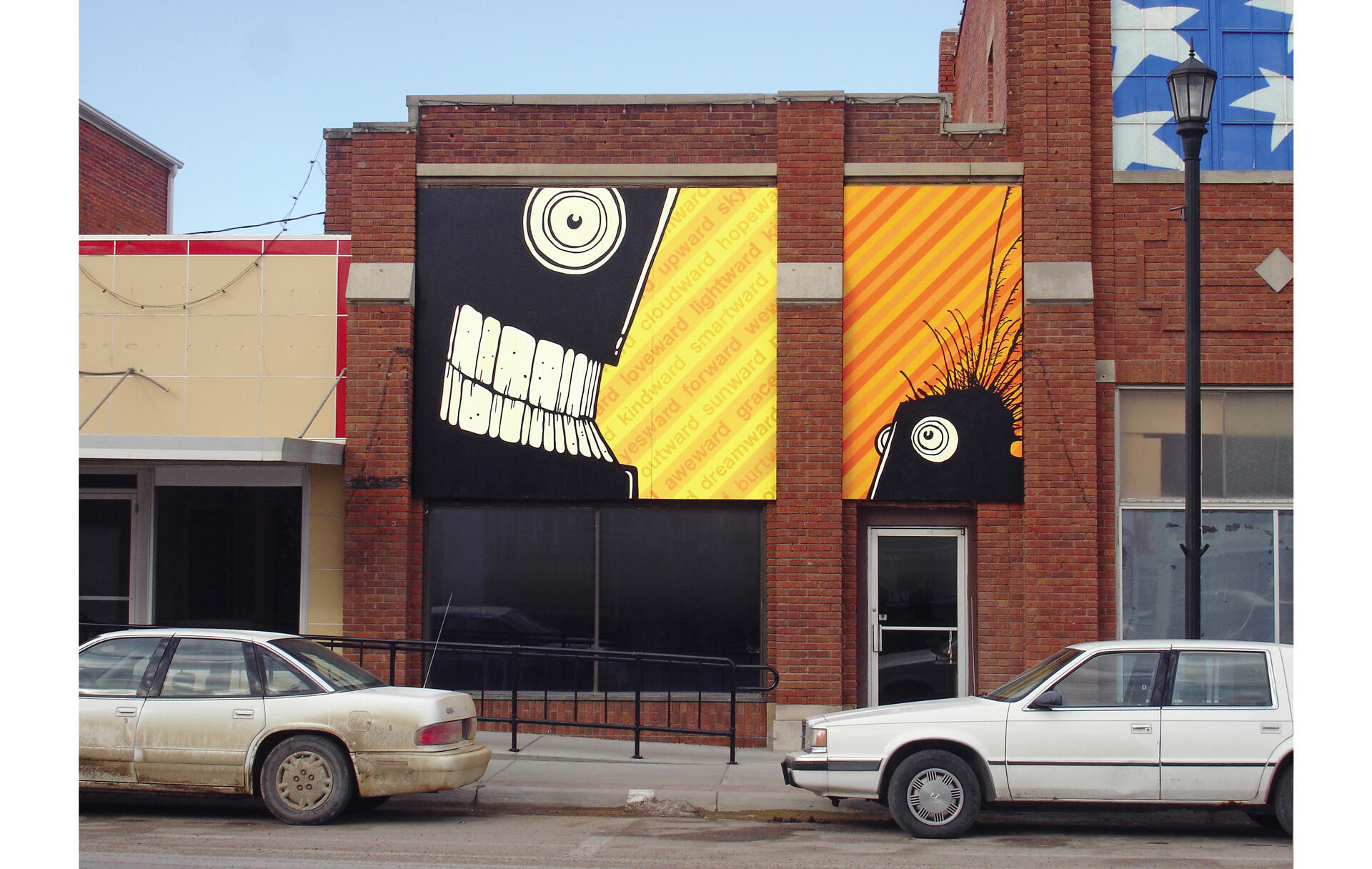
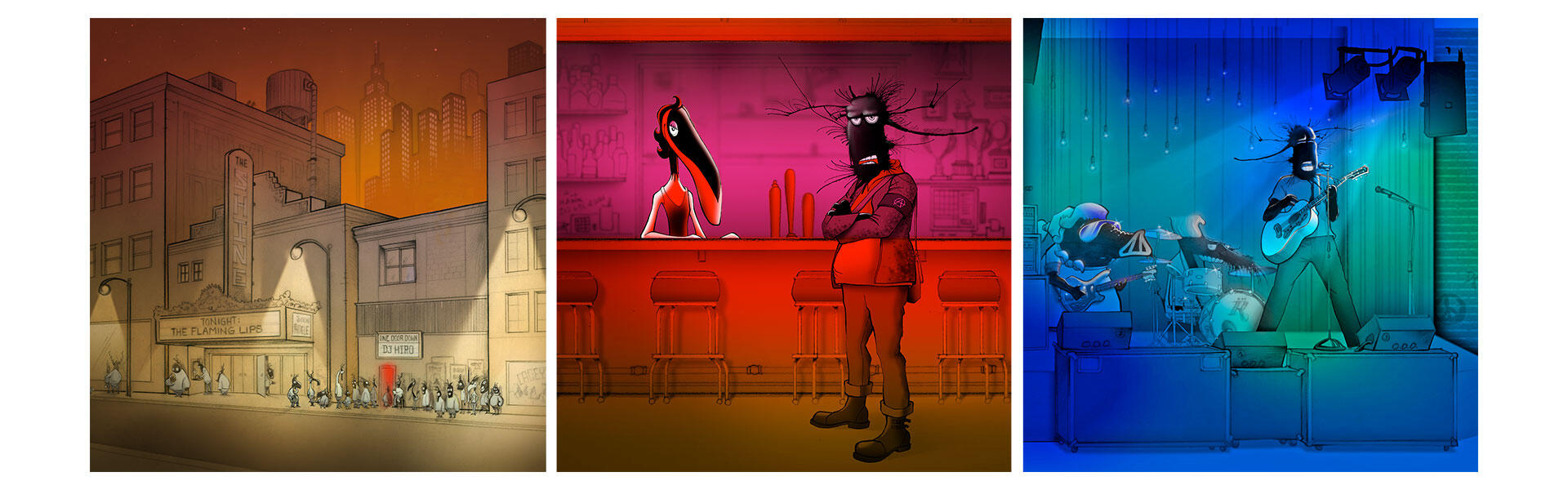
The monster mural in Seward, Nebraska
For this book, I wanted to gather my favorite 250 drawings—the Monsters that make me proud as an illustrator, where it feels like I got all the lines just right! And I wanted the whole thing to get the proper art book treatment I’d perfected making exhibition catalogs for L.A. Louver. I knew it would be almost impossible to get this done through a traditional publisher, so I turned to Kickstarter. Here was my pitch:
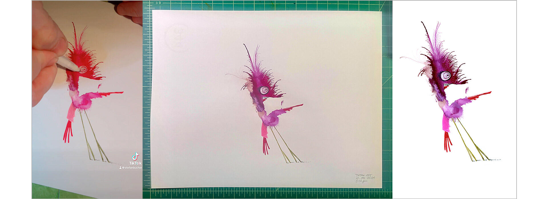
If you’d only ever seen the Monsters on screen, this book would give you a whole new look at the characters. You’d get to see the drawings all crisp and clean, without camera distortion and at much higher resolution, so you can really enjoy the details. Here’s a side-by-side comparison of the same Monster as a screen grab from the original video, the original drawing, and the way it’d show up in the book:
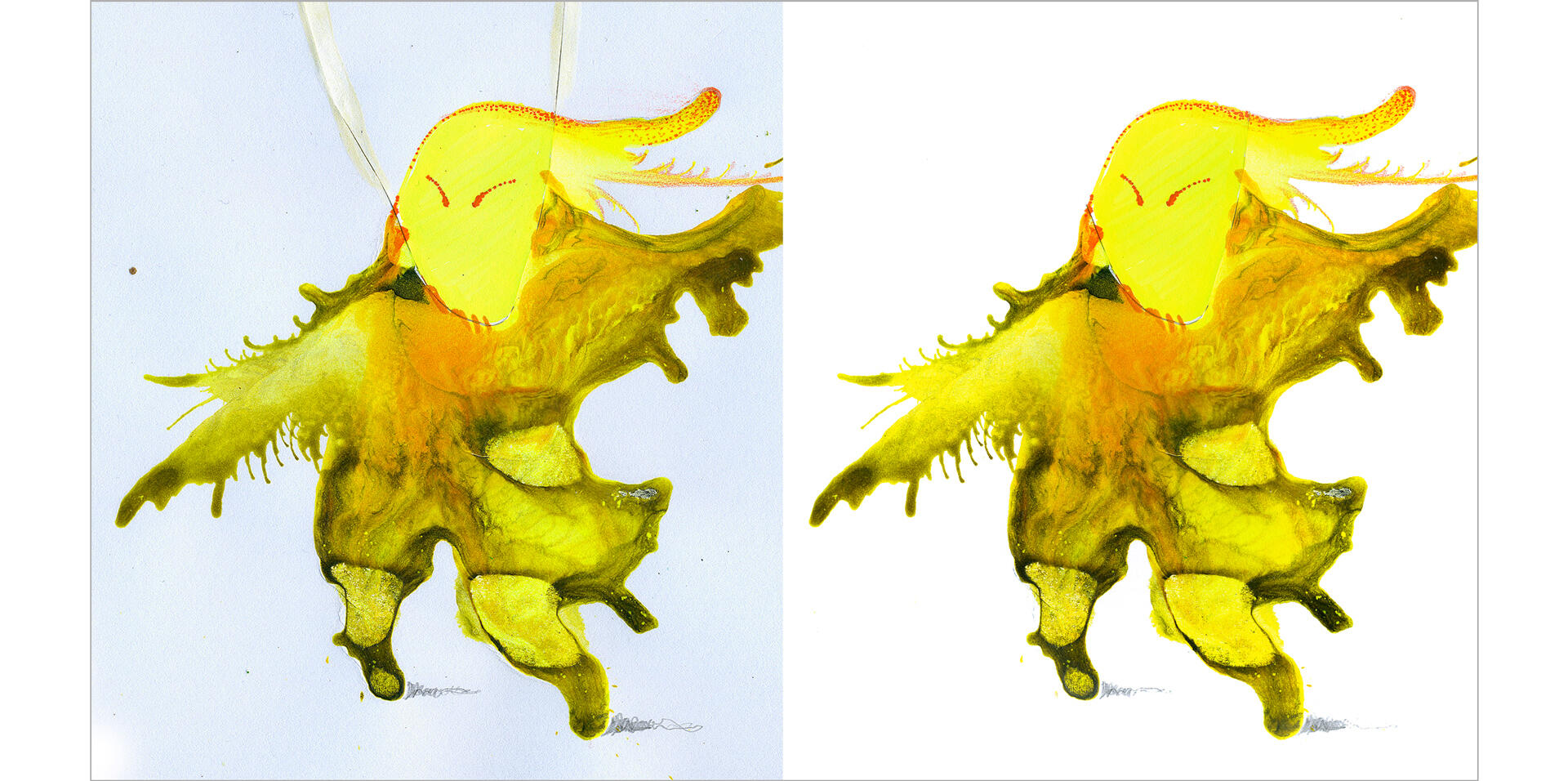
I put in endless hours making good scans and adjusting the files to look their very best. Here’s a before and after:
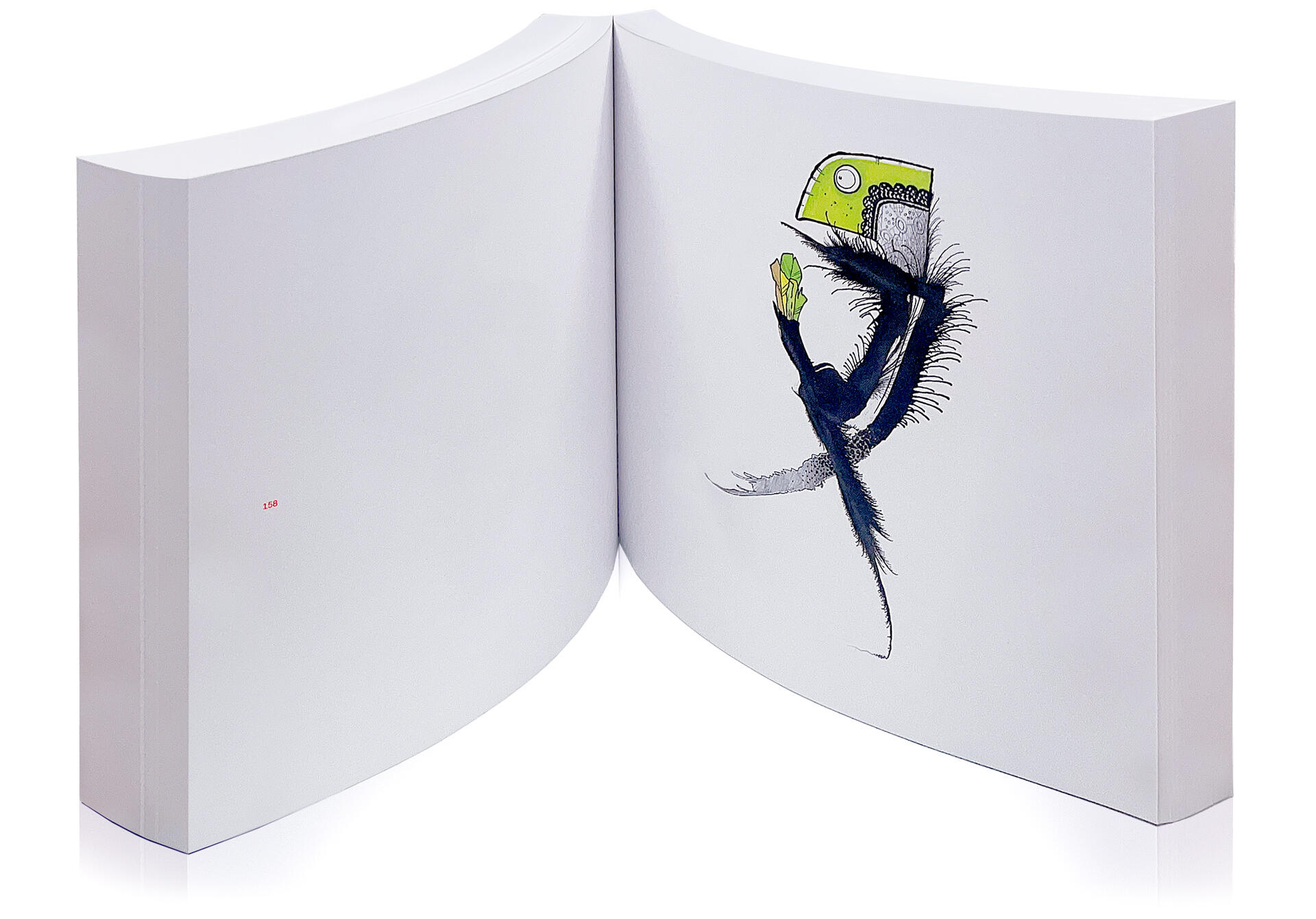
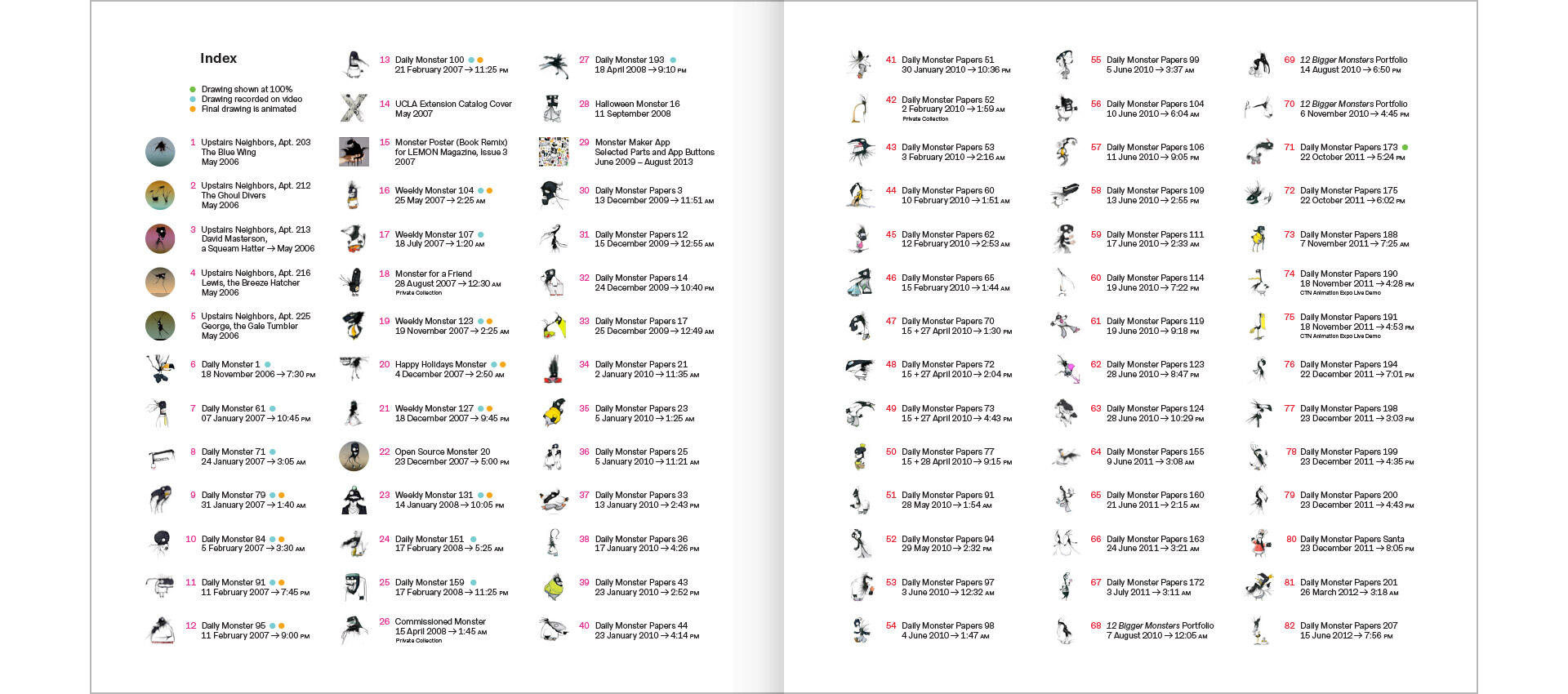
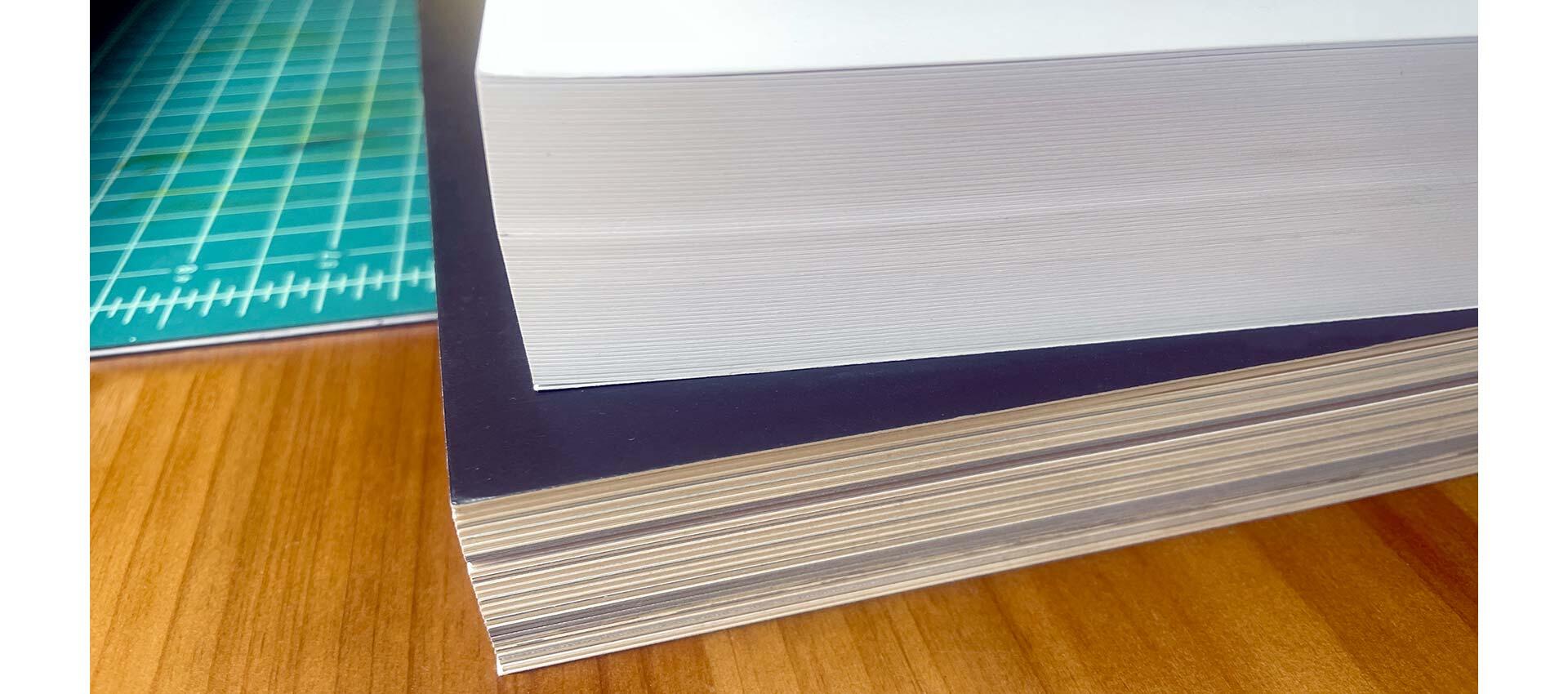
The book is a 7x7 inch square with 512 perfect-bound pages. My original hope was that it’d end up being over an inch thick, but then I upgraded to a thicker paper, so we got to 1 5/8 inches (4.2cm to my metric friends). The final weight came out to 2 pounds and 12 ounces (1,250 grams)—a solid little brick of Monsters. Here are a few sample spreads, so you can see the super minimal layout and the index.
Yes, of course, there is an index. Whenever I do a Daily Monster drawing, I note the time on the sheet, and the index has that information. Readers are able to know when each drawing came to be down to the minute! (Frankly, any art book that doesn’t give you the exact minute of creation is short-changing you. Just saying.) I also marked which Monsters were filmed (106), which had additional animation (12), and which drawings appear in the book at their original size (12).
One challenge was taking drawings I’d made with vibrant inks and reproducing them using only four-color-process printing. We used the Indigo digital press for this, so the range of available colors is a little bit greater than on a traditional offset press, but the most vivid colors still get squished down significantly.
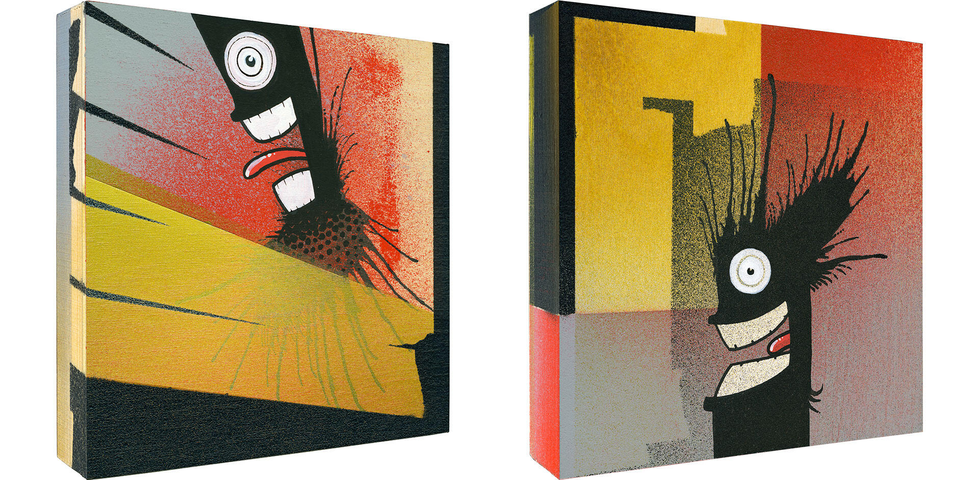
As we went through the process of color proofing, I spent literally hundreds of hours working to trick the machine to give me a little bit more color than it would usually provide—either literally with more ink or through some optical trickery. But there is always going to be loss, and I just have to make peace with that fact again and again on every project. Here are two examples of what I’m talking about:
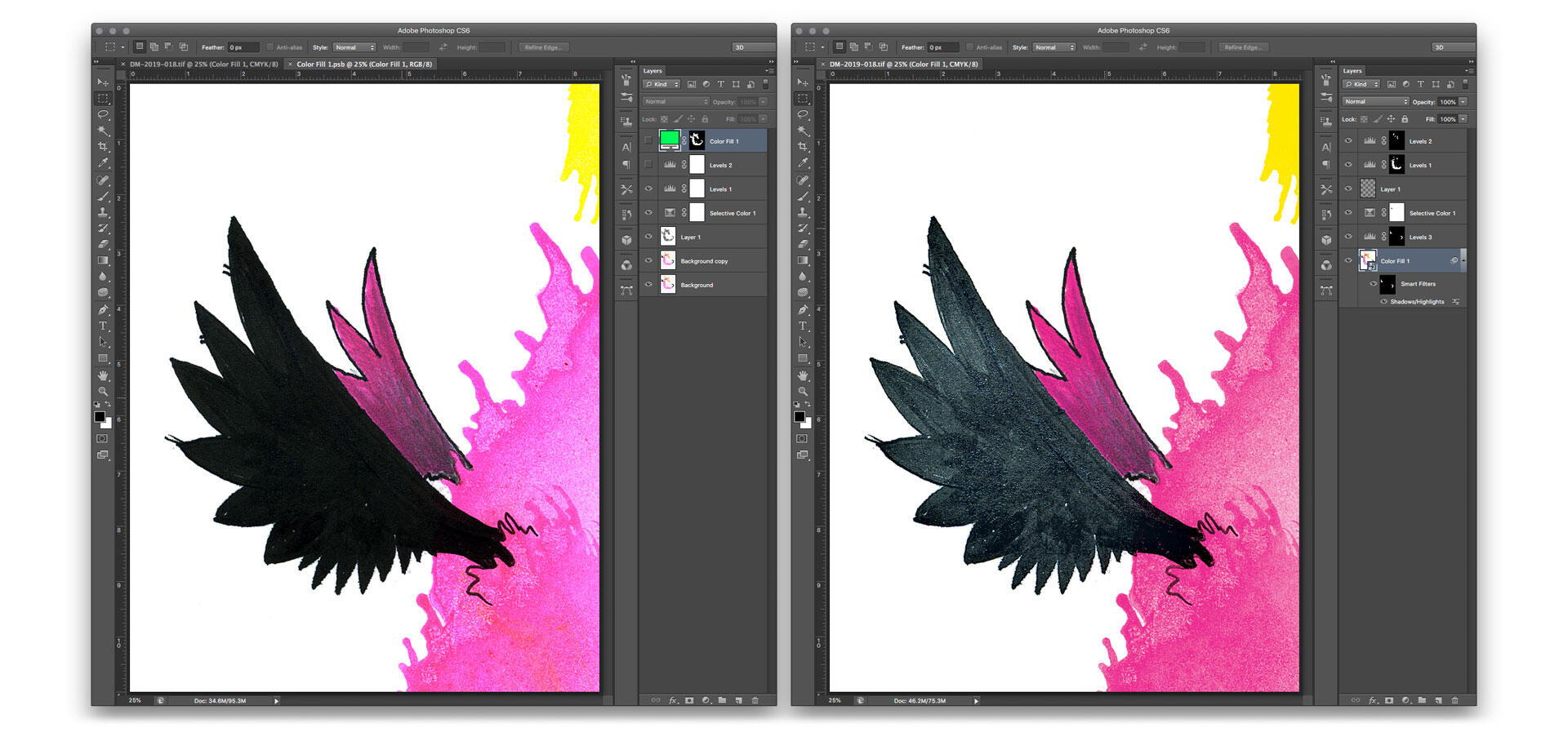
You can see how the bright pink becomes a sort of a muddy gray brown red. I was able to fix that with a number of adjustment layers and switching between RGB and CMYK modes case by case. With some images the press would react well, with others it would get worse. It was a lot of trial-and-error. It can be frustrating, and it’s definitely costly. But I always kept in mind that for a lot of the drawings this will be the only time people get to see them, so I felt a responsibility to do right by them.
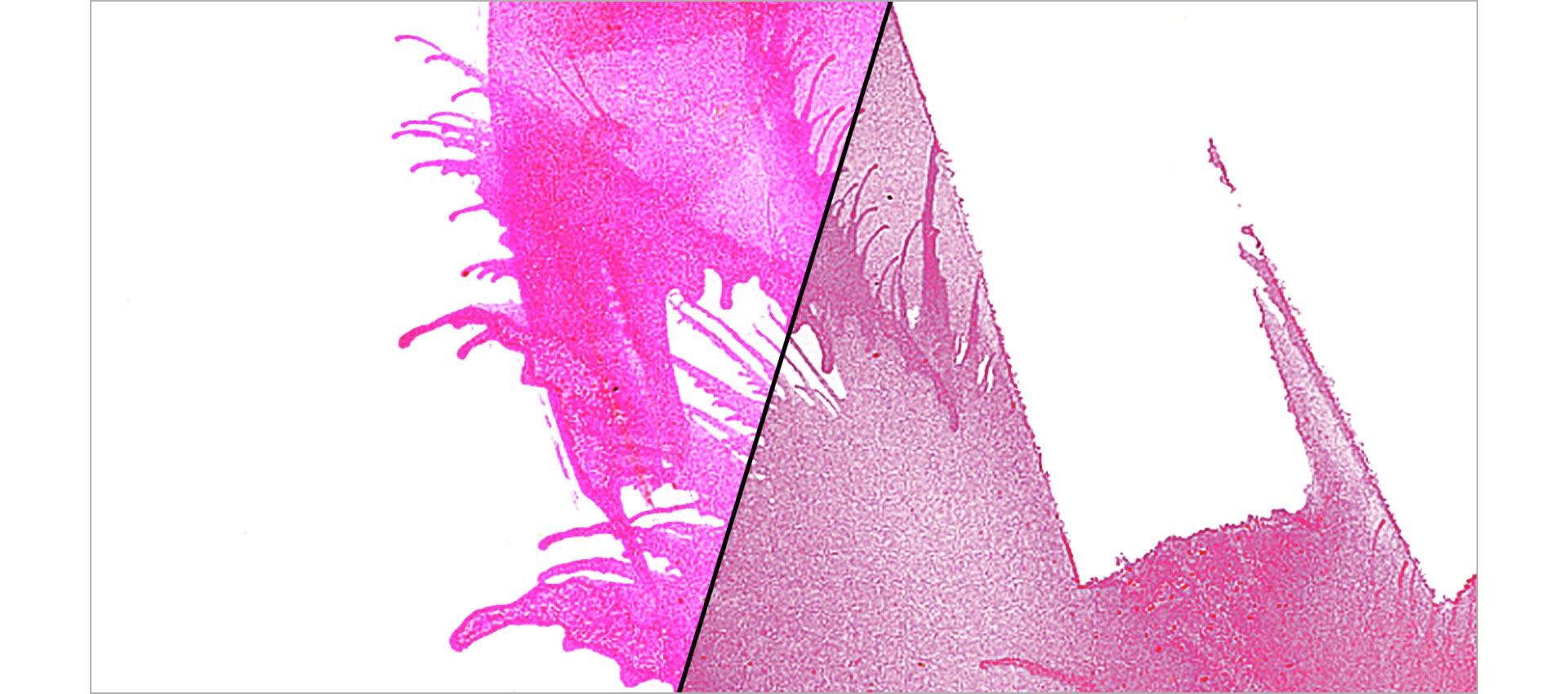
This is about the best I was able to get out of that image on press. You can see the original scan on the left—after I’d masked the background paper—and the color adjusted final on the right. It’s not perfect, but it’s what was possible.
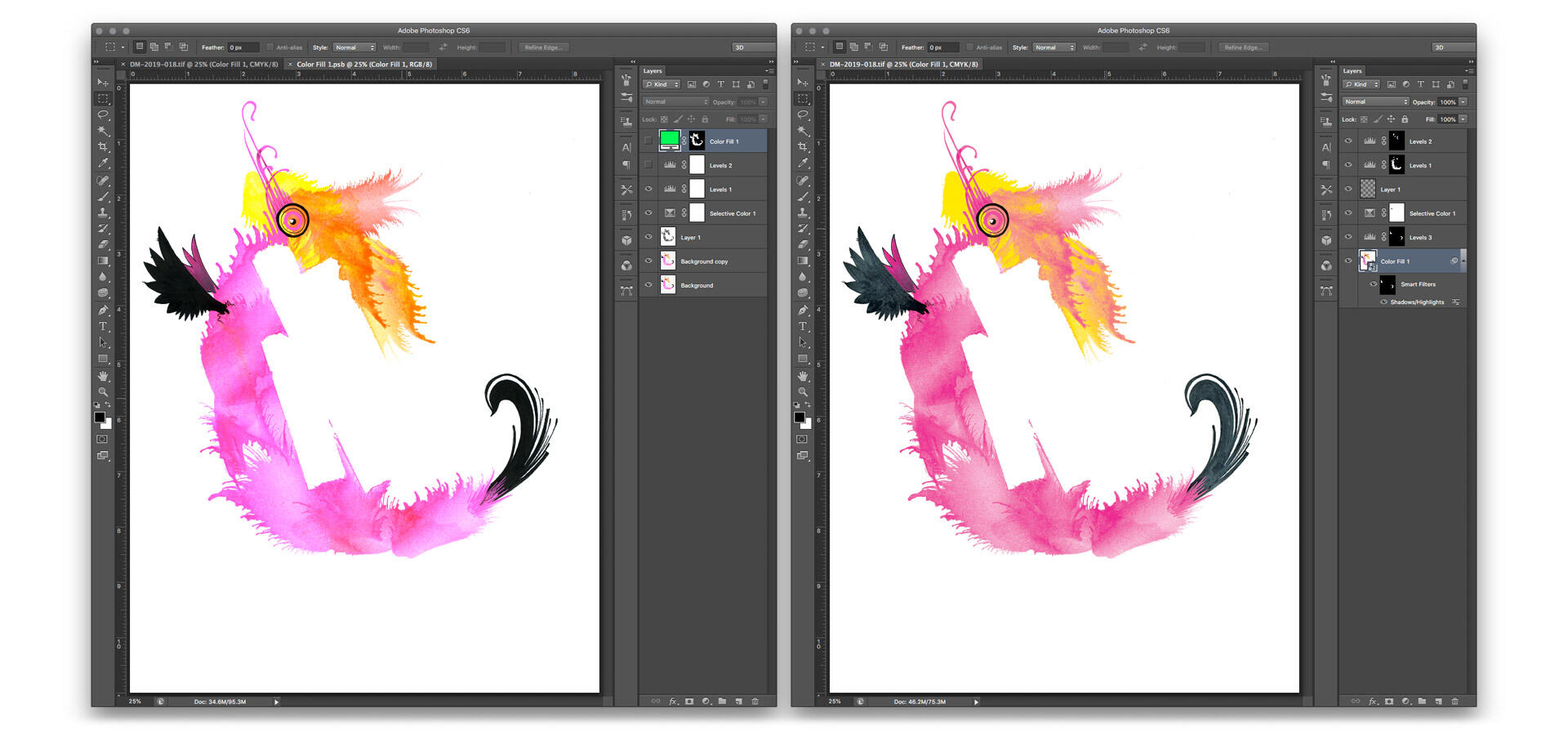
Here’s another thing to notice: Look at the black wings. Without adjustments, those would print as solid black shapes. But the original drawing has all sorts of texture and detail. So I had to go in to every drawing to mask and brighten the blacks in a way that allowed those details to print—but without robbing them of their punchy contrast. Fiddly work, and again, trial and error on press, but so worth it! The printed pieces ended up feeling pretty damn close to the originals.
Greens are always a particular heartbreak. I learned that on the first catalog I designed for David Hockney. There is only so much you can do. At the time, I used to mutter, “Why can’t the man use paints that will reproduce better?” But then I got myself a bottle of fluorescent green ink, and of course it’s magical and I ended up using it all the time.
For a hot minute, the printing world was all abuzz about switching from four-color-process to six colors, and that would’ve done wonders for greens like this. But most print clients choose price and speed over quality, so the market wasn’t there to sustain the process, and it’s very hard to find a printer who even offers hexachrome printing. And so… the truly verdant greens don’t survive being reproduced in books.
Speaking of the original drawings—I’ve held on to all of them. Over the years, I’ve made a handful of custom Monsters on commission, but I’d never let go of the drawings I filmed. I just couldn’t bear to part with them. After 20 years, I think that was the wrong call. These Monsters deserve to see the world. They shouldn’t stay locked up in my vault forever. So I offered them as premiums to Kickstarter supporters. It was my way of setting them free.
Mailing out a few dozen drawings was a surprisingly emotional process. Life feels increasingly perilous, and I’m not getting any younger, either. Sending these Monsters out into the world was a bit like blowing on a dandelion. It makes me happy to know that some of these characters get to be part of other people’s homes. A few people told me they’d hang them in their kids’ rooms, and it’s such an honor to think that they might be part of childhood memories.
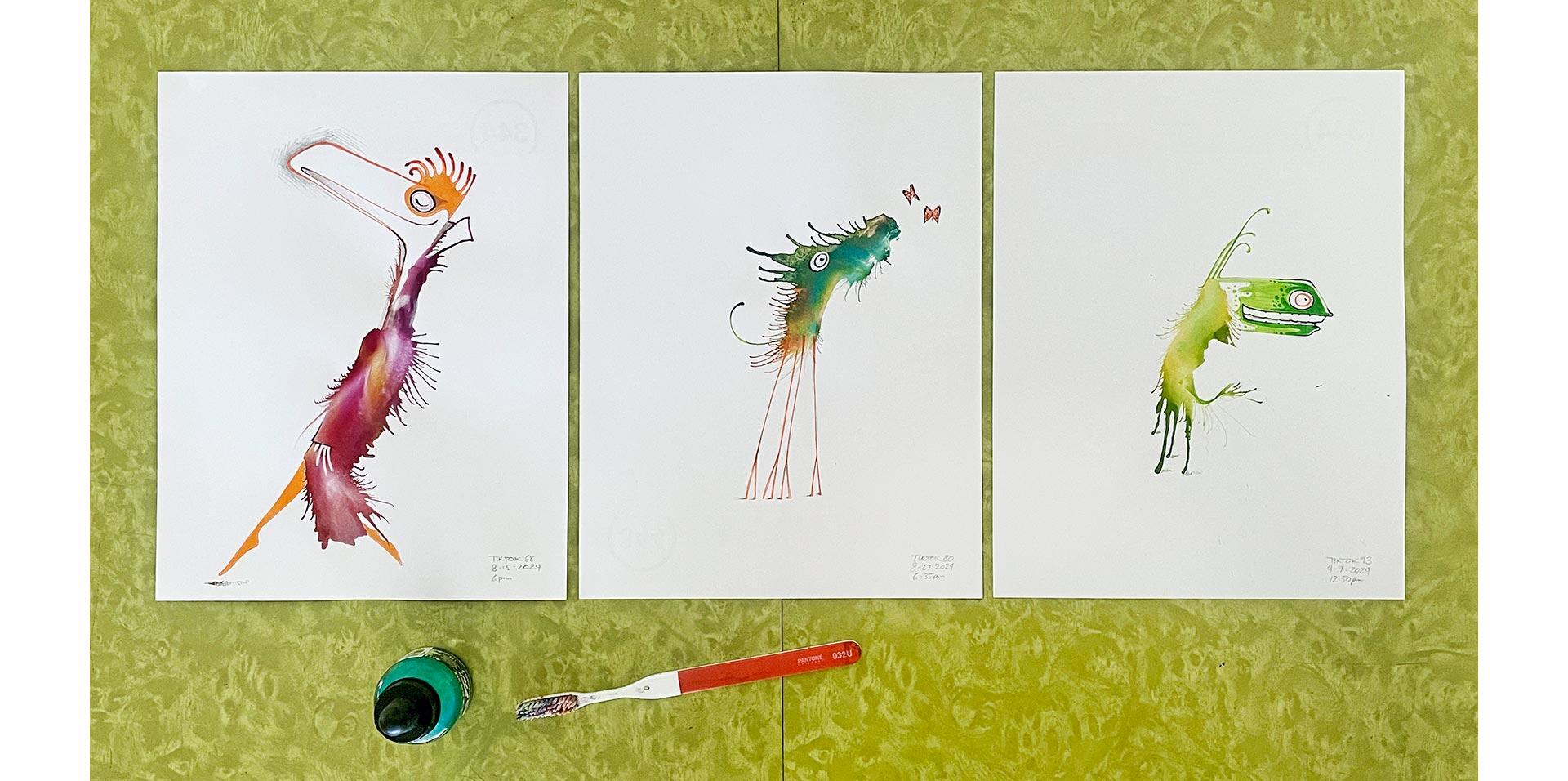
For a few years I made Monsters that I’d post specifically to Instagram. I didn’t film the process, but I’d show the original drawing on my desk. Here are two examples:
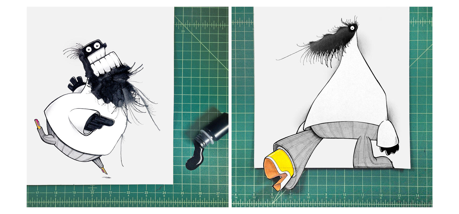
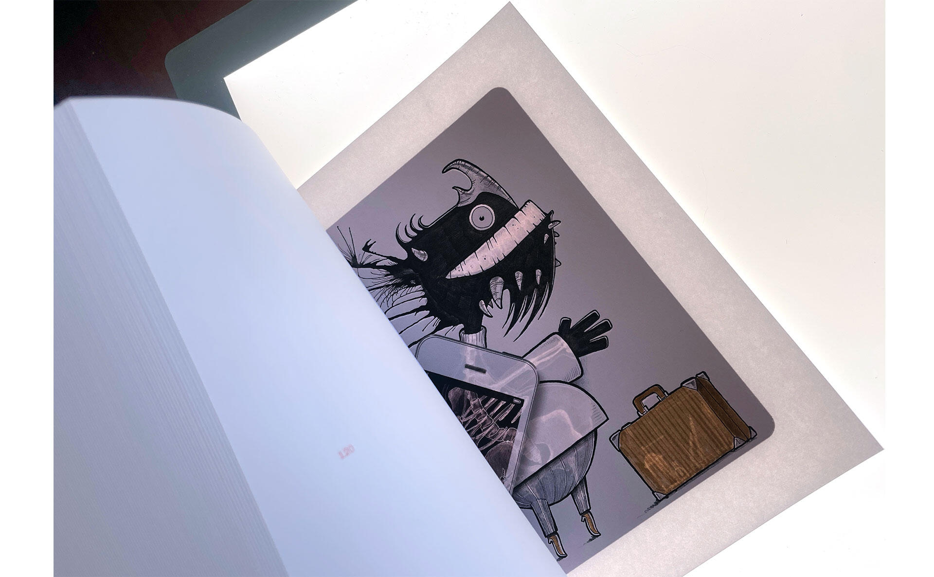
Over time, I started adding moving elements. One of my particular favorites was an X-ray monster. The idea came to me after discovering the “invert colors” function on my phone. I drew the character, and then drew a skeleton of that character on tracing paper. I filmed a closeup path of the skeleton with an old iPhone, set the colors to invert. As I replayed the video on the old phone, I filmed myself with my current phone as I moved the old phone across the drawing in the original motion. That created the illusion that I was using a handheld X-ray scanner. I did so many takes, trying to make it look convincing, but it never quite came together. So I just filmed myself moving my old phone across the drawing, removed the screen in Adobe AfterEffects, and put in the Xray that way. That really sold the effect I was going for:
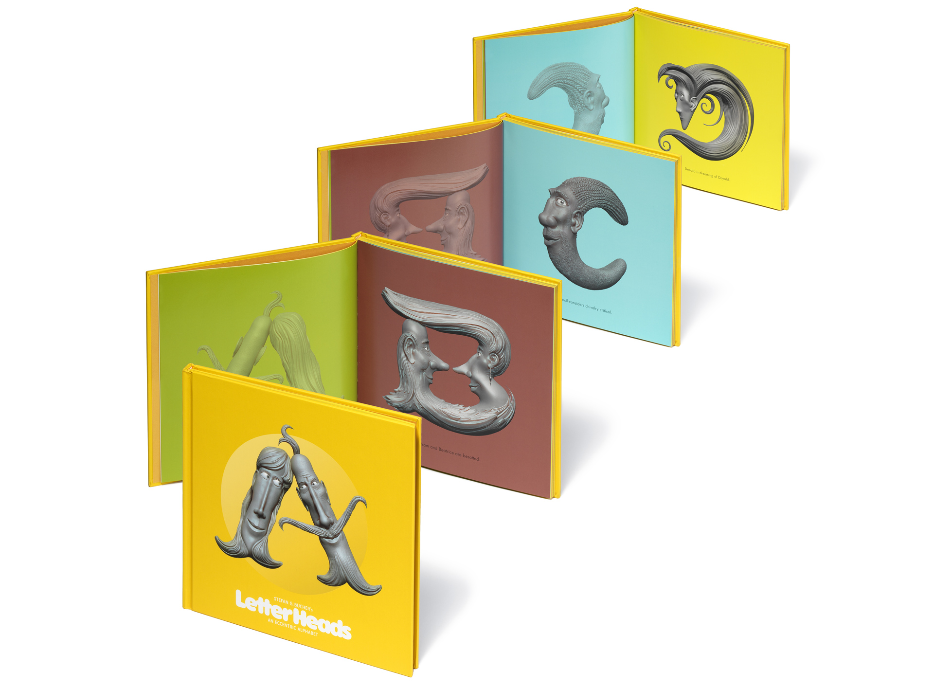
Now, how do you show that in print? It was easy enough to add a phone mockup to the drawing to show a bit of the X-ray, but I also wanted to show the whole X-ray. The obvious solution was to flip that drawing and place it on the subsequent page. I used the same idea for the 3D sculpted characters in my LetterHeads book:
And it looked great! What I hadn’t planned on was that you’d get the full X-ray effect if you held that page of the book up to the light! I was so delighted that I wanted every reader to know about it. So I printed up a hundred little inserts—”Please hold this page up to the light!”—and slipped them into each book before I wrapped and shipped it.
The book also gave me an opportunity to show some side quest Monsters hardly anyone had ever seen before. There was the original Upstairs Neighbors book that started it all, a cover for the UCLA Extension catalog, a Monster poster for the art and design magazine LEMON, drawings for the Monster Maker app and from the 12 BIGGER MONSTERS portfolio. There was the Monster-adjacent family of characters called the Lom, shape-shifting aliens on Earth on a culinary cruise of the galaxy, and production art for a Monster TV show called Magnetic Bones that never quite got off the ground. And there were monster paintings and drawings I made for people I love.
Magnetic Bones production art
The challenge on these last two paintings was that I hadn’t photographed them at the time; instead I’d scanned all sides of each panel on my flatbed scanner. What you’re looking at there are digital builds of each piece. I put in a fair bit of work trying to get across that I used gold spray paint. Given my less than professional approach to documenting these pieces years before, they turned out surprisingly well in print! (I’m pretty sure that the right one perished in the Eaton fire, so I’m glad I still had the scans. Maybe I’ll get a chance to recreate it one day.)
I should say a few words about the origins of this book as a physical object. The initial spark to start the book came when I received a cold call from a printer in New York. I do all my stateside work with my friends at Typecraft, but I’m always curious what other printers are up to. These folks are able to print on bible paper, which has been on my wishlist for literally decades, and it’s somehow incredibly difficult to source—especially for a short print run. So I wanted to see if I could create a project to let me play with this material. What kind of content did I have in sufficient quantity to fill a few hundred pages? Monsters, of course.
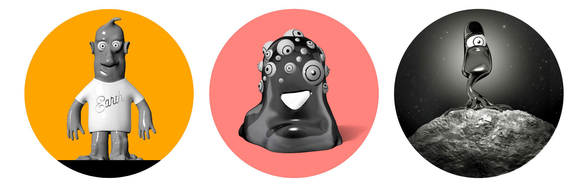
Meet the Lom
The idea of having a few hundred monsters on semi-translucent paper appealed to me. I thought that they’d form interesting new shapes as they bled into each other in the book. I designed two sample signatures—16-page sequences—and invested in a hand-bound mockup. From this biblical origin came the title “A Revelation of Monsters.” Which, as I mentioned at the outset, works really well to describe how the characters originally appear.
The dummy looked good, but it didn’t wow me. 512 pages on bible paper amount to just over a half inch of thickness, which just doesn’t feel substantial. Also, bible paper has gotten better over the years. I was hungering for the rough, slightly crinkly paper I remember from the hymnals of my childhood. The new paper is a lot smoother and is much more reliable in terms of print quality—which is great, but wasn’t the tactile and ASMR thrill I was looking for. The cost was a factor, too. The printer had a minimum of 500 copies, and with tax and freight, the whole thing would’ve cost over $8,000. If I wanted to finance this through a Kickstarter, I’d have to raise over $12,000 just to break even. I get so queasy asking people for money even in a professional capacity that the idea of raising that much cash with personal appeals to friends seemed super uncomfortable to me. And the dummy hadn’t bowled me over. So I let the project rest.
But with the seed for the idea planted, I kept turning it over in my head. I had made books through Blurb for my Book Design 101 class and for the expanded reissue of 344 Questions, and was happy with their quality. When I plugged the 512-page 7x7 inch book into their system… well, first of all, there’s a 440-page limit, and the price for that is $126 plus tax and shipping. So that was a non-starter. But that got me wondering if it would be feasible to do the book with Typecraft.
My friend David Mayes kindly had a dummy made for me, and when that mockup came in, it did knock me out! It was a gorgeous brick of paper—so thick that it felt like a hefty slice of a cube. This felt like an object I wanted to see in the world. And the cost? Well, it was somewhere around $60 per copy. But I could really dial in the color and do some fun stuff on the cover that you can’t do with an online order. If I sold 100 copies on Kickstarter, I’d still have to charge about $80 to cover cost, so I decided to put some cash of my own in to get the Kickstarter goal down to $4,000. That was still a lot of money to ask from people, but it seemed possibly doable.
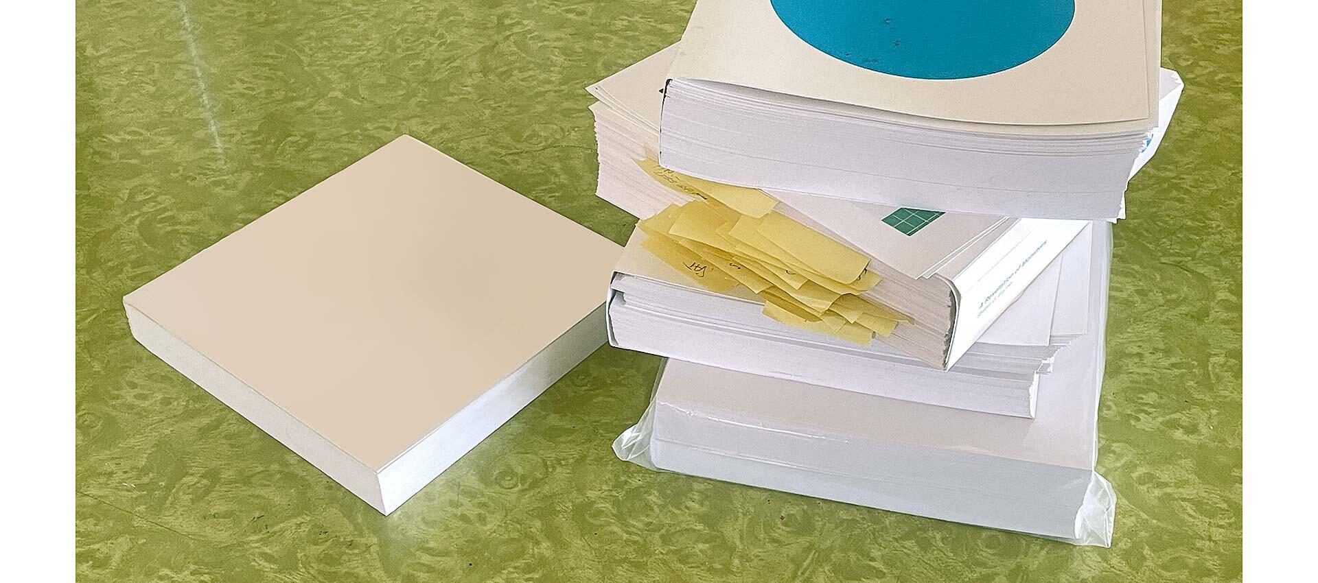
The original blank dummy and a stack of color proofs
I gave up my Facebook and Instagram accounts years ago, so I was a little nervous about being able to get the word out. I really didn’t want to hit people up individually and go, “Hey brother, can you spare 600 dimes?” I underestimated the kindness of people out in the world. We hit the $4,000 goal in under 24 hours. And in the end we got to over $7,300, so I got to add some bells and whistles to the book!
Right away, I upped the paper to a heavier weight, which created some extra cost on shipping, but it was so nice! And it made the book an inch and a half thick, and that’s cool. It also makes this my thickest book, edging out American Photography 17 by a quarter inch. That one’s still the heaviest, though, at five pounds and 11.5 ounces.
David had shown me that they now had a digital process of applying a thick UV gloss varnish to paper. Traditionally, this was done with a slk-screen process, which is time-consuming to set up, and because of that it’s costly, especially for a short run of books. With this new process it would add about $1,000 and it’d be super precise! The gloss also goes on super thick and looks like glass. So obviously that had to happen.
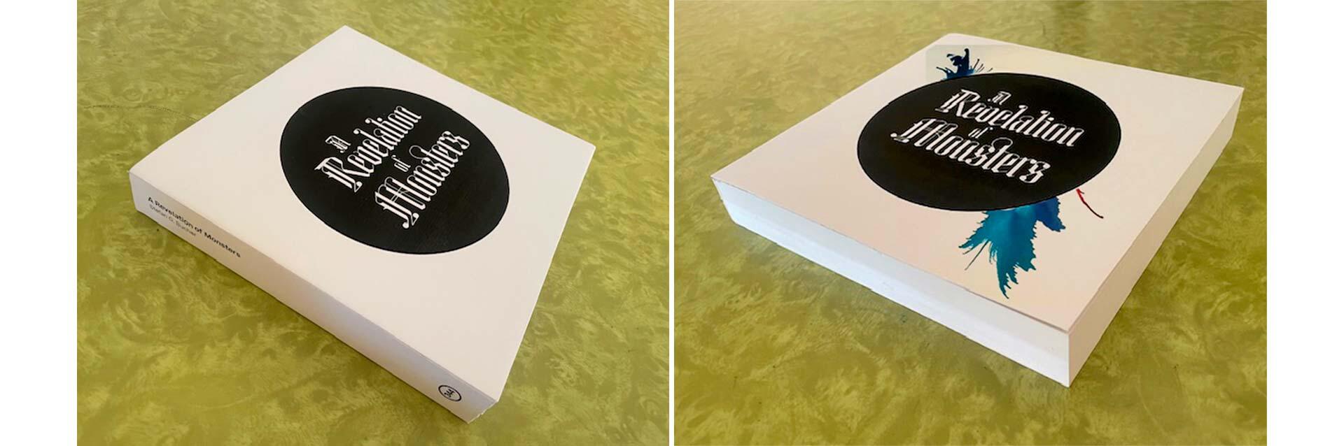
Initially, the quick cover of the bible paper mockup was still stuck in my head—the title rendered in the gorgeous blackletter typeface Tannhäuser by designer Ruslan Abasov enclosed in a black circle to symbolize the drop of black ink that came at the start of each original Daily Monster. I mocked up the design and sent it to my friend and colleague Simon Malz in Germany to see what he thought. He suggested adding some ink splashes to the black circle to show more of the process right away, and to add some color. I thought that it was a really good idea, but got quite busy. I was so taken by the starkness of the white brick, so I wanted to preserve that serenity.
My original mockup on the left, and on the right, one of the ideas Simon sent me.
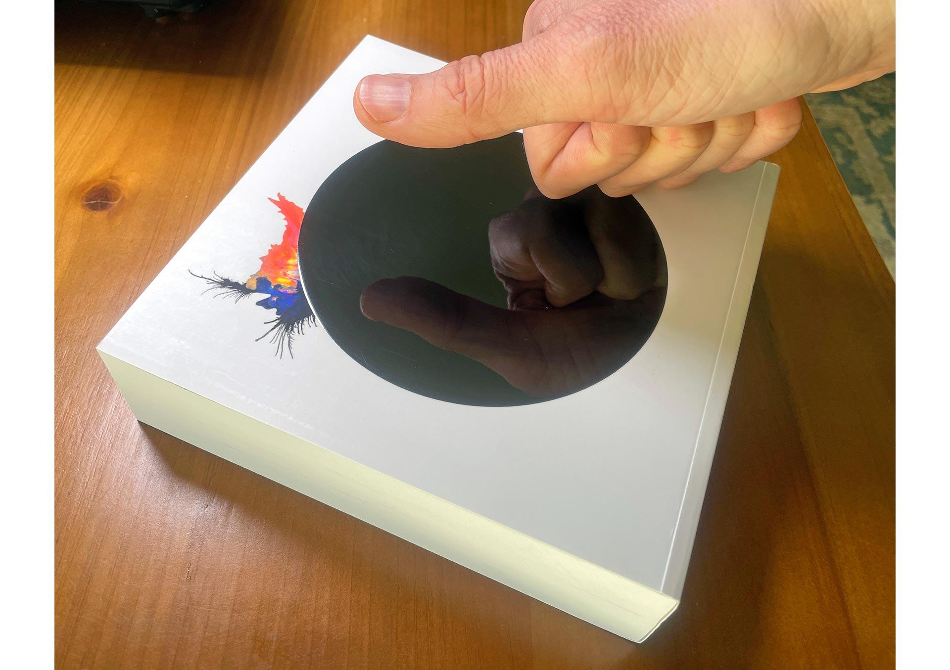
How to simplify the cover? Easy: Take away the title. What would I need it for? This wasn’t going into book stores. Shelf presence was a non-issue. This would be an art object sold directly to backers. And besides, the title would be on the spine. Over the years, I’ve often pulled my punches on the design of my own book covers, because I wanted them to be bookstore compatible. I wanted to reach a larger audience. A book that no one buys is of no use to anyone. But would the Letterheads book have looked better with just that big A on the cover? What would the first Monster book have been with just a drawing and a giant 100 on the cover? This was my opportunity to go full graphic designer on a book. So… ink splash added, title gone! (The Tannhäuser type remains as the title page inside the book.)
The white brick dummy also influenced the design of the pages. I loved that the edges were pure white, so I decided not to have any artwork that bled off the page. That’s why a few Monsters have a white frame in the book, for example. Which is a look I’ve enjoyed ever since the late Tony Arefin suggested it for some of my Nike advertising comps back in my Wieden + Kennedy days in 1997. Keeping the edges clean makes the final book a little bit more perfect.
The production process was long and fiddly. The Kickstarter launched in early October of 2024, wrapped up on November 4th, and I’d set the delivery date for February. I was fully expecting to deliver in time for the holidays, but wanted to give myself a buffer. And a good thing, too, because November 2025 happened, and I had to hop on a plane to Germany to check in on my Mom for a few weeks, and then the retouching… all the retouching… Well, I already told you all about that. We did four rounds of all the drawings, I think? Some drawings got five or six rounds. In the end, I signed off on the final files in mid-January.
Printing went smoothly, and then we got the covers back from the UV coating vendor, and they looked… OK? Ish? The gloss was mottled. Orange peel is what they call the effect. It wasn’t the piano lacquer finish I’d seen on the samples they’d shown me. So that became one of those moments where I became a problem customer for saying, “OK, that’s not what I said yes to.” And of course they hadn’t done a test print, they just coated the whole run.
So then there’s arguing, and just trying to figure out what actually happened, and “Do we really need to do it again?” and “Who pays for that?” It’s hugely awkward and uncomfortable, because I’m friends with the people who do this with me, and I want to stay friends with them. But I also want the thing I saw in the showroom. Especially when it’s something that actual people paid for with their actual money, because they believe in me. So tensions ran a little high there for a while, and then Typecraft reprinted the cover and the vendor redid the coating. And, as I later found out, they did all of that a third time because of some new hiccup on the second attempt. But in the end it was done and it looks perfect. Which makes it all worth it. To me, anyway.
If that high gloss varnish is something you ever want to do on one of your projects, the problem was this: The UV coating gets applied to paper that’s laminated with a thin plastic film. You’d think that the paper that’s underneath the plastic wouldn’t make a difference. That’s what we thought, too—even the vendor who does this day in and day out—and we were wrong. We had to replicate the specs of the sample book David had shown me exactly. As much I felt bad for being a pain in everyone’s ass, I did feel better for having conducted a little bit of science with the team. Now we know one more pothole to avoid. And of course, Typecraft came through for me with a beautiful finished product, as they always do!
In a world of fast and cheap and “good enough,” this is why making ambitious things of high quality still matters: That’s where you find out new things. It’s where you learn how to make everything just a little bit better from then on!
And then, after all of that, there’s still shipping! Am I going to make this case study even longer by telling you about shipping? Yeah. Sorry. I am. Here we go: Why does the shipping matter? Because the people who supported me in this project deserved to get something special in the mail, something delightful. I wasn’t going to just throw the book in a box and send it off. Each box became a little gift.
First, I had to open each shrink-wrapped book to inscribe and sign it—carefully so as not to create a visible crease at the hinge on the cover. After that, I had to protect that glorious lacquer. I could’ve had the books re-shrink-wrapped after signing them, but then how would I keep track about which book I’d personalized for whom? (I’d suggested inscribing title pages before binding the books, but that was not really an option, because some books get tossed in the process. Some copies gets crinkled or dented, for example, or there’s too much glue or too little glue.)
So I inscribed the books, inserted a small tag with the name of the recipient, and then wrapped them in craft paper belly-bands. David Mayes and I cut those to size one night at Typecraft. I secured that belly-band with a piece of matte black tape and sealed it with a round 344 LOVES YOU sticker I had custom made just for this project. Then I wrapped the whole thing in cling wrap to protect it against moisture. Some of these books had to travel halfway around the world, and you never know where it’s rainy. One backer sent me a photo of the soaked and mud-splatterd mailing box—the book was fine!
The Kickstarter orders came to just shy of 60 copies, and I had a few off-platform orders right after the close of that, so I ordered 75 to be on the safe side. Usually the printer will overshoot by a few copies, but this book was so tricky that they barely made it to 75 books. In other words, if a book got damaged in shipping, I didn’t really have a way of replacing it. So I had to make sure to protect each copy as best I could.
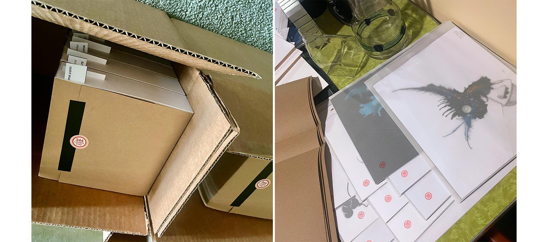
People who had bought original drawings received them with their book in sturdy Priority Mail boxes, with their original art sleeved in a beautiful clear vellum envelope, stamped with the 344 LOVES YOU seal, backed by a sheet of uncoated black paper. That envelope got stuck into a folded up poster from the 344 archives—“Everything Is Going Exactly As Planned” or the 2515 design conference poster.
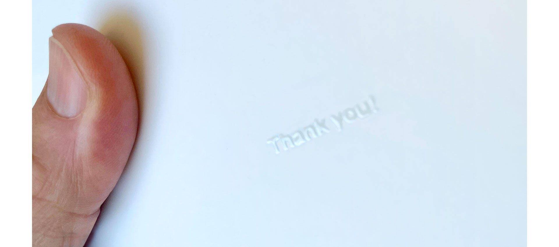
The people who bought the book by itself got it in a special little box sized as close to the book as possible, padded with thin newsprint paper—more ASMR. Everybody got 344 bookmarks and a few buttons—the 344 logo and “I’m not a control freak, I’m a control enthusiast!” Of course, everybody got a handwritten Thank You card with the gorgeous lettering by Doyald Young. I wanted people to have a moment of real delight when they opened their box. There’s too little joy in the world these days, and I wanted to create some.
And that’s that. It’s a small book to encapsulate 20 years of work—an attempt to create a little record that it happened and that it was fun! I’m so grateful that I had the opportunity to make the book, and to make all the work in it. The Monsters have taken me all over the world and back. They’ve brought me love and friendship and kindness. And best of all, they brought me notes from people telling me how it showed them a way of making art themselves, and how it allowed them to connect with people in their life in a new way. That’s not a bad thing to have been a part of. And now there’s a proper souvenir of all of that.
And that’s why the back cover of the book has this little touch of clear varnish: